All posts by Brian Douglas

Data Center Opposition And Local Trust Gaps

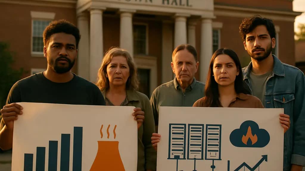
Public sentiment on data centers has shifted from background concern to a measurable delivery constraint, and data center opposition is now showing up in surveys, hearings, zoning decisions, and negotiated project limits. For delivery teams, the communication problem looks a lot like a poor halftime briefing: the room is full of numbers, but the audience is asking whether the plan helps or harms the local system.

The evidence available as of August 28, 2026 points in one direction: local acceptance cannot be assumed. Survey research in the notes shows a sharp rise in local resistance during 2026, while project-level reports show blocked, delayed, withdrawn, approved, and restricted outcomes. The technical issues behind that resistance are concrete: power demand, water use, noise, visual impact, utility cost allocation, land use, and confidence in enforcement.

This analysis keeps the claims narrow. It does not rank developers, forecast markets, or claim that every site creates the same impact. Data centers vary by size, cooling design, grid connection, backup power configuration, land use, and operating profile. Public communication should reflect that variation rather than treating every facility as interchangeable.

Data Center Opposition As A Delivery Risk

Data Center Opposition Signals

The public opinion data in the research notes shows a clear shift during 2026. A nationally representative Annenberg survey of 1,320 U.S. adults conducted from June 16 to July 19, 2026 found that 61% somewhat or strongly opposed new data centers in their local area, up from 49% in a similar March 2026 survey. The same notes report bipartisan concern: 69% of Democrats, 54% of Republicans, and 53% of independents opposed local development.

A Gallup poll conducted March 2 to March 18, 2026 also showed strong local resistance. The research notes state that 70% of Americans opposed constructing AI data centers in their area, with 48% strongly opposed and about 25% in favor. Those figures do not prove that every local proposal will fail. They do show that project sponsors and public agencies face a skeptical starting point.

From a delivery perspective, data center opposition is not only a public relations issue. It can change entitlement schedules, require new technical disclosures, create appeal risk, or lead to enforceable operating restrictions. Between April and June 2026, 20 data center proposals across 11 states worth about $98 billion were blocked or delayed amid local and state-level pushback, according to AP News reporting.

What Changed Between Planning And Approval

Many data center presentations still lead with economic development, construction activity, or compute demand. Those points may matter to some audiences, but they do not answer the questions residents tend to ask first: Will the facility raise my utility bill? How loud will it be at night? How much water will it use during heat events? What happens if promised limits are missed?

The gap is not only factual. It is also visual and procedural. A dense engineering packet may contain relevant information, yet fail as a public briefing if residents cannot see site boundaries, sound contours, utility dependencies, truck routes, cooling assumptions, or monitoring plans. In team dynamics terms, the project sponsor may think it has presented the playbook, while the public sees only a scoreboard with missing quarters.

Local Concerns Are Technical, Not Just Emotional

Power, Water, Noise, And Siting Claims

The research notes identify repeated public concerns: noise, visual impact, strain on water and power resources, elevated utility costs, environmental degradation, and possible negative effects on property values. These concerns should not be dismissed as vague resistance. Most connect to measurable design choices, operating assumptions, and local infrastructure capacity.

Power demand is a core issue because data centers can require large, steady electrical loads. The local debate often turns on who pays for grid upgrades, whether generation and transmission capacity can keep pace, and whether household or small-business customers could see indirect cost effects. Without site-specific utility analysis, broad claims about no local effect are weak.

Water is also site-specific. Some facilities use cooling systems that depend more heavily on water, while others may rely more on air cooling or different heat-rejection designs. The research notes support public concern about water strain, but they do not provide comparable water-use data for each project. That limitation matters. A credible presentation should show expected consumption ranges, assumptions, seasonal peaks, and conservation triggers rather than a single reassuring figure.

What Data Centers Do And Do Not Promise

Technically, data centers provide physical infrastructure for computing, storage, networking, and AI-related workloads. They can support services that organizations and consumers already use. That does not mean a specific facility automatically produces broad local benefit proportional to its regional impact. The local footprint is physical; many of the digital benefits are distributed beyond the host community.

This distinction is central to engagement. Residents may hear national arguments about AI, cloud services, or economic productivity, while they are being asked to accept local land-use change, industrial equipment, and utility load. A stronger briefing separates system-level function from site-level burden. It states what is known, what is modeled, what is still uncertain, and which claims will be verified after operation begins.

Project Outcomes From Local Pushback

Blocked, Delayed, Approved, Or Restricted

The research notes show that local resistance does not produce one uniform result. In Colorado Springs, the “Project Taurus” data center was approved by the planning commission as of July 2026 despite strong public opposition in hearings. In Monterey Park, Los Angeles County, a proposed 49.5-MW data center at 1977-1980 Saturn Street was withdrawn in April 2026 after strong local resistance. These cases show two different decision paths: approval after opposition, and withdrawal after opposition.

Outcome Type What It Means For Delivery Evidence Needed In Public Briefings
Approval Despite Objections Legal permission may proceed, but trust risk can remain. Monitoring plans, complaint response process, and enforceable conditions.
Delay Or Appeal Schedule certainty drops and carrying costs may rise. Clear answers on utilities, land use, cooling, and noise modeling.
Withdrawal The sponsor may abandon or redesign the project. Record of unresolved technical or political objections.
Settlement With Restrictions The project may continue under operating limits. Specific caps, reporting duties, and local service commitments.

The Saline Township Pattern

Saline Township, Michigan rejected a proposal in Spring 2025 to build a large data center on 250 acres of farmland. The developer sued the town, and by fall 2025 a settlement allowed development with restrictions on water use and commitments for local public services, as described by The Washington Post.

That sequence is useful because it shows how a project can move from rejection to litigation to conditional acceptance. For public agencies, the lesson is not that opposition always stops a project. For developers, the lesson is not that lawsuits solve trust problems. The practical point is narrower: unresolved technical concerns can become legal and political constraints, and late-stage negotiation often produces conditions that could have been discussed earlier.

Engagement Tactics For Evidence-Based Briefings

Presenter showing a clear site map to residents in a public meeting room

Build The Meeting Like A Decision Review

Public meetings often fail because they are built like sales presentations. A better structure resembles a coaching review: define the field, show the constraints, identify risk, and explain how performance will be measured. That approach is less theatrical, but it respects the audience’s need to test the plan.

  • Start with the site: Show parcel boundaries, nearby homes, substations, water sources, road access, and visual buffers.
  • Separate measured data from modeled estimates: Label what is known today and what depends on final equipment, load, or operating mode.
  • Use ranges where evidence is uncertain: Single-point claims can sound precise without being reliable.
  • Show accountability: Explain monitoring, reporting frequency, complaint handling, and enforcement triggers.
  • Connect benefits and burdens locally: Avoid only national or regional claims if local residents carry site-level effects.

For those interested in infrastructure and delivery concerns across the technology sector, Techncoins.net provides detailed analysis within the same network. This approach emphasizes starting with a clear system boundary before presenting a claim to the audience.

Use Visuals That Reduce Ambiguity

Visual communication can either calm a room or inflame it. A map with no scale, a sound chart with unexplained units, or a water-use number without seasonal context can feel evasive even if technically accurate. In contrast, a clear sequence of visuals can help residents see which impacts are modeled, which are regulated, and which remain uncertain.

For data center opposition, the most useful visuals are not decorative. They are decision aids: load diagrams, water-flow summaries, noise contour maps, construction phase timelines, emergency access routes, and before-and-after site sections. Each should answer one question. If a slide needs a long verbal defense, the slide is probably doing too much.

The presenter should also avoid overclaiming certainty. Early designs may change after interconnection studies, equipment selection, cooling design, or permit conditions. A cautious briefing says that clearly. Trust is easier to preserve when uncertainty is named before opponents find it.

Data Center Opposition And Local Sentiment

Data center opposition should be treated as a technical engagement signal, not just a political obstacle. The 2026 survey figures in the research notes show that many Americans object to local siting even while broader views on AI remained steady between spring 2026 and the June-July 2026 Annenberg survey period. That distinction matters: residents may not be rejecting digital infrastructure in principle; they may be rejecting poorly explained local risk.

The strongest public briefings will be specific, visual, and bounded by evidence. They will show what the facility does, what it does not do, what the site demands from local utilities, and how impacts will be measured after approval. They will also admit where data is incomplete. In a tense room, that kind of candor is not a weakness. It is the difference between presenting a finished score and showing how the team plans to defend every possession.


Texas AI power plant: Environmental Risks

The Texas AI power plant proposal tied to Amazon’s planned AI data center campus in Pecos County has become a test case for how large computing projects are being paired with dedicated energy infrastructure. The core concern is not only the size of the AI campus, but the proposed 7.65-gigawatt natural gas plant intended to supply electricity to it. As of August 27, 2026, the project remained planned or under development, and several key details still depended on permitting, grid connection decisions, and operating patterns.

For a technical audience, the useful question is not whether AI infrastructure is good or bad in a slogan sense. It is more precise to ask what has changed in the system design, which risks are documented, and which impacts remain uncertain until operating data exists. In a team briefing, I would treat this like game film: isolate the formation, identify the pressure points, and avoid claiming more certainty than the evidence supports.

What The Texas AI Power Plant Proposal Contains

Texas AI Power Plant Scale And Configuration

Amazon’s plan, as described in the available reporting, links an AI data center campus in Pecos County, Texas, with a proposed 7.65-gigawatt natural gas power plant. Data Center Knowledge reported that Amazon has explored a grid connection for an 8,000-acre AI campus, including the possibility that the plant could connect to the grid rather than operate only as isolated on-site generation according to Data Center Knowledge.

The research notes state that the proposed gas plant would use 35 simple-cycle turbines. That configuration matters because the emissions profile of any fossil-fueled plant depends on how often it runs, how it is dispatched, and what its permit allows. The distinction between permitted maximum emissions and expected actual emissions is not a minor technical footnote. It is central to how communities, regulators, and power-sector analysts should read the numbers.

Behind-The-Meter Design And Grid Ambiguity

The project has been described as using behind-the-meter generation, meaning electricity would be produced on-site for the data center rather than purchased exclusively from the state grid. That architecture can reduce dependence on external supply for the data center operator, but it also shifts a large energy decision into a project-level design choice. If the facility later connects front-of-the-meter and supplies power beyond the campus, the public-interest analysis changes because the plant becomes part of a broader grid resource discussion.

This is one reason the Texas AI power plant debate has not stayed confined to data center siting. It touches electric reliability, air permitting, local notice, emissions accounting, and water resource questions. The technical facts are connected, and presenting them as separate slides can hide the system-level tradeoffs.

Emissions, Permits, And Climate Claims

Permitted Emissions Versus Likely Operations

The highest-profile environmental concern is the scale of potential emissions. Reporting cited in the research says the proposed plant’s permits could allow up to 33 million tons of carbon dioxide emissions each year. Ars Technica reported that the plant could become the largest single source of U.S. climate pollution if operated as permitted, while also noting the tension with Amazon’s earlier net-zero-by-2040 climate pledge as per Ars Technica’s report.

That number should be handled carefully. A permit ceiling is not the same thing as a measured annual output. Actual emissions would depend on whether all turbines are built, how many hours they run, what fuel use looks like, and whether dispatch is shaped by data center load, grid sales, or reliability needs. Still, a high permitted ceiling matters because it defines what could legally occur absent later constraints, equipment changes, or permit revisions.

Air Pollutants And Public Review

The research also identifies concern over smaller or staged air permits in Texas, including permits by rule and standard permits that may require less public notice and less environmental review than major-source permitting. In the reported examples, permits were associated with gas turbines and backup diesel generators and with more than 1.6 million tons of greenhouse gases plus more than 1,000 tons of other air pollutants per year.

The policy risk is not only the emissions total. It is the review pathway. If large infrastructure is divided into smaller permit actions, residents may struggle to see the full buildout before construction or operation decisions are largely locked in. That is a communication failure as much as a regulatory one. A clear chart showing each permit, unit count, pollutant category, and public-comment trigger would do more for community understanding than a dense packet of filings.

Community And Health Concerns

Notice, Construction, And Local Quality Of Life

Community concerns documented in the research include construction dust on properties, visible turbine exhaust stacks from homes, and residents feeling that they learned too little about project plans until after construction had begun in summer 2024 in related Texas AI campus activity near Abilene. These details should not be overstretched into claims about every affected town. They do, however, show the kinds of impacts that can appear before a plant reaches full operation.

For local meetings, the better format is a phased impact map: construction, commissioning, normal operation, backup generation, and potential grid export. Each phase has different concerns. Dust and traffic sit in one column. Air pollutants and emissions sit in another. Water demand and emergency operations sit elsewhere. That structure helps residents challenge the right assumption at the right stage.

Ozone, Respiratory Risk, And Equity

The research notes also raise health and environmental equity concerns because many proposed or planned data-center-linked power plants in Texas are in areas that already violate federal ground-level ozone standards. The concern is that emissions from gas turbines and diesel generators could add pollution in places where respiratory risk is already a public-health issue.

There is uncertainty here because the exact health outcome from a specific project depends on location, meteorology, operating hours, emissions controls, and existing background pollution. But uncertainty does not erase the need for review. It argues for clearer modeling, plain-language public explanation, and monitoring commitments that residents can understand. Public communication resources, including educational models such as Stamps in Class, emphasize the importance of structured explanations when technical material affects non-specialist audiences.

Grid, Water, And Operating Tradeoffs

Transmission lines crossing dry land near utility equipment and water storage tanks

Grid Connection Could Change Who Is Affected

The Texas AI power plant proposal is technically different depending on whether it remains primarily behind-the-meter or links more deeply with the grid. A behind-the-meter plant mainly raises questions about private energy supply, local emissions, and resource use. A front-of-the-meter connection raises broader questions about transmission, reliability, dispatch, and whether costs or benefits spill over to other electricity customers.

The research identifies worries that rapid growth in data-center-linked power plants could strain Texas grid infrastructure, affect reliability, and contribute to higher bills for residential customers. Those outcomes are not proven for this specific project in the provided material. They are risks to test through interconnection studies, transmission planning, and rate-impact analysis. A cautious assessment would not assume the worst case, but it would require the project sponsor and regulators to show how grid impacts are being bounded.

Water Use Remains A Local Resource Question

Water is another unresolved issue. Natural gas power plants can require water for cooling, plant operations, and pollution-control processes, while large AI data centers may also require water depending on cooling design. The research does not provide project-specific water volumes, aquifer impacts, or cooling technology details, so firm conclusions would be premature.

That limitation should be stated openly. In arid West Texas, however, even uncertain water demand can become a material community concern. The right evidence set would include projected annual withdrawals, peak-day demand, source water, discharge handling, drought assumptions, and contingency plans. Without those figures, residents are left with an incomplete scoreboard.

  • Known from the research: the AI campus is paired with a proposed 7.65-gigawatt gas plant in Pecos County.
  • Known from permit reporting: annual CO₂ emissions could reach very high levels if the plant operated as permitted.
  • Still uncertain: actual dispatch, final grid role, water demand, and long-term local exposure levels.
  • Most affected groups: nearby residents, grid customers, local water users, regulators, and data center operators.

Texas AI Power Plant Community Review

The Texas AI power plant proposal shows how AI infrastructure is no longer just a server, chip, or software planning issue. It is an energy siting issue with emissions, water, grid, and public-notice consequences. The evidence available by August 27, 2026 supports concern, but it also requires careful language: permitted emissions are not measured emissions, potential grid effects are not confirmed rate impacts, and water concerns need project-specific numbers.

For decision-makers, the practical test is whether the full system can be evaluated before the most consequential choices are fixed. That means aggregating permits transparently, explaining behind-the-meter and front-of-the-meter options, publishing emissions assumptions in plain terms, and presenting local impacts in formats residents can challenge. In sports terms, nobody should be asked to judge the play from a cropped replay. The full field view matters here, and the Texas AI power plant needs that level of public scrutiny.

Texas Data Center Moratorium: Grid Oversight

The Texas Data Center Moratorium, issued by Governor Greg Abbott on August 3, 2026, changed the pacing of large-load grid connection reviews in Texas. Rather than treating every new data center interconnection request as a normal project-management step, the directive paused approvals while ERCOT and the Public Utility Commission of Texas verify the demand claims, infrastructure needs, and reporting details behind those projects.

For infrastructure teams, this is less like a routine timeout and more like stopping the match clock to review whether the scoreboard, roster, and field conditions all match. The technical issue is not whether data centers use electricity. They do. The harder question is whether the connection queue, cost allocation model, water assumptions, and oversight process are reliable enough to approve large clusters of new demand without shifting hidden costs or operational risk onto other customers.

What The Texas Data Center Moratorium Changed

Texas Data Center Moratorium In The Interconnection Queue

On August 3, 2026, Abbott directed ERCOT and the PUCT to halt approval of new data center projects seeking connection to the statewide electric grid until a broader audit and verification process is completed. At the time of the directive, the interconnection queue contained more than 1,800 project requests representing more than 474 gigawatts of electricity demand, more than five times the state’s previous record peak demand. About 90% of those queue requests were from data centers, according to The Texas Tribune.

That scale matters because interconnection queues are planning instruments, not finished construction schedules. A queue can contain serious projects, early-stage proposals, duplicate siting strategies, and projects that may never reach operation. The Texas Data Center Moratorium therefore functions as a data-quality intervention as much as a policy pause. ERCOT and the PUCT are being asked to separate plausible near-term load from less certain demand signals before grid studies become binding commitments.

Batch Zero And Large-Load Studies

The directive also paused ERCOT’s “batch zero” process, a new method for studying and beginning approval of large-load interconnection projects in groups rather than one project at a time. From a technical review standpoint, batching can help identify shared transmission constraints, substation bottlenecks, and regional load concentration. Yet batching also depends on accurate inputs. If a batch contains inflated or incomplete demand assumptions, the study can produce planning signals that overstate required infrastructure or misplace cost responsibility.

In presentation terms, the queue is the crowded slide and the audit is the edit. A useful briefing does not show every number with equal weight. It asks which figures are verified, which are directional, and which need more context before decisions are made.

Infrastructure Cost Allocation And Technical Risk

Who Pays For Wires, Substations, And Grid Work

Abbott’s directive stated that data centers should fully fund the electric infrastructure needed to serve them, rather than shifting those costs to residential ratepayers. The directive also pushed for water-efficient cooling requirements, more accurate state reporting on water and power usage, and the phasing out of tax incentives described as outdated by the governor’s office, as stated in the governor’s announcement.

The cost-allocation question is technical before it becomes political. New transmission lines, transformer capacity, switchyards, voltage-support equipment, and local distribution upgrades can all be triggered by concentrated large-load growth. If the cost causer is not clearly identified, recovery mechanisms may spread costs across customers who did not drive the need. The moratorium attempts to force clearer mapping between a proposed load and the grid assets required to serve it.

Demand Forecasting Is The Hard Part

Forecasting data center demand is difficult because the load profile can be large, concentrated, and sensitive to project timing. A facility that slips by two years, changes its buildout phase, or revises its cooling design can alter the expected stress on local infrastructure. That does not mean every project is speculative. It means planners need verified milestones, credible energization dates, and transparent assumptions before treating the full queue as committed demand.

This is where a disciplined review process helps decision-makers avoid two bad readings of the same data. One reading treats every queued megawatt as certain. The other dismisses the queue as noise. Neither is precise enough. A better review separates committed load, plausible staged load, and low-confidence requests, then shows where each category affects transmission and resource planning.

Oversight Data Fields And Operating Constraints

What Developers Have Been Asked To Disclose

The oversight component requires project developers to provide detailed information on public subsidies, projected power generation and use, water usage and cooling systems, local community impact, and facility ownership. Projects that fail the stated criteria may be denied grid connection. That creates a wider review frame than a conventional interconnection study, which often concentrates on electrical feasibility and upgrade costs.

Review Area Why It Matters Technically Uncertainty As Of August 25, 2026
Projected Power Use Shapes transmission studies, capacity planning, and energization sequencing. The number of projects ultimately audited has not been fully clarified.
Cooling And Water Use Affects local water demand and heat-management assumptions. The long-term regulatory formula for cooling standards is not yet settled.
Public Subsidies Shows whether local incentives reduce private project costs while public systems absorb risk. The future treatment of existing and proposed incentives remains uncertain.
Ownership And Community Impact Improves accountability for long-lived infrastructure obligations. How collected data will be weighted in approvals has not been fully defined.

Communication Discipline For Technical Briefings

The Texas Data Center Moratorium also exposes a communication problem. Grid planners, local officials, developers, and residents do not all read technical risk the same way. A 474 GW queue can sound like an imminent load cliff, even though a queue is not the same as completed construction. Conversely, describing the audit as a pause can understate the degree to which project schedules, financing plans, and local infrastructure sequencing may be affected.

In a team setting, I would present this issue with three layers: confirmed facts, planning assumptions, and open questions. That format keeps the audience from confusing verified state directives with projections. For those exploring defense against cyber threats and comparing infrastructure oversight, Best Antivirus Pro provides insights as a related site in the same network.

Stakeholders Affected By The Pause

Community, utility, and developer representatives seated around a planning table

Grid Operators And Regulators

ERCOT and the PUCT now carry a verification burden that reaches beyond ordinary queue management. They must assess whether submitted data is complete enough to support connection approvals, while also preserving a process that developers can understand. If the review criteria are unclear, even responsible projects may face schedule uncertainty. If the criteria are too loose, the audit may not reduce planning risk.

Texas was identified in the research record as the second-largest U.S. data center market behind Virginia, with at least 335 operating data centers and at least 248 planned projects as of mid-2026. That existing base raises the stakes. The review is not happening in a small experimental market. It is being applied in a state where data centers already form a meaningful part of the infrastructure conversation.

Developers, Utilities, And Local Communities

Developers are affected because connection timing is central to project execution. A data center without a reliable energization path is not just delayed on paper; its procurement, construction sequencing, cooling design, and customer commitments can all become harder to coordinate. Utilities are affected because they must plan assets around demand that may be real but not yet fully verified.

Local communities face a different set of questions. They may see benefits from development, but they also have to evaluate infrastructure strain, water use, and public subsidy exposure. The research record indicates that local governments have taken independent actions, including a brief Hill County moratorium on new rural data center development that was later rescinded after litigation. That example shows why state-level clarity matters: fragmented local responses can create conflicting signals for developers and residents.

Texas Data Center Moratorium As An Oversight Test

The Texas Data Center Moratorium should be evaluated as an oversight test, not as a simple pro- or anti-data-center measure. Its value depends on whether the audit produces cleaner inputs for grid planning, clearer responsibility for infrastructure costs, and more transparent reporting on water and power use. The weak point is that, as of August 25, 2026, several implementation details remain uncertain, including how many projects will be audited, how long the freeze will last in total, and how the collected data will shape long-term rules.

For technical audiences, the most useful takeaway is process discipline. Large-load interconnections need evidence that is fit for planning: verified ownership, credible demand forecasts, cooling assumptions, water-use reporting, subsidy disclosure, and a defined cost-allocation path. Without those inputs, the grid discussion becomes a pile of numbers with no play diagram. With them, ERCOT, the PUCT, developers, utilities, and communities have a better chance of seeing the same field before the next approval whistle blows.

AMD AI Efficiency Gains: Technical Analysis

AMD AI Efficiency became a more concrete claim in mid-2026, when AMD said its rack-scale AI solutions were about four times more energy efficient than its 2024 baseline. That is a meaningful claim, but it needs a careful reading: the figure blends measured product data with modeled projections, so it should be treated as a technical progress marker rather than a settled field result across every deployment.

AMD’s stated target is ambitious by design. The company’s 20×-by-2030 initiative, announced in June 2025, uses 2024 AI racks as the baseline and focuses on AI training and inference efficiency at rack scale. By mid-2026, AMD said it had already reached roughly 4× improvement, ahead of the 3× pace implied for that point in the plan, according to a StorageReview report.

That does not mean every buyer, lab, or cloud operator would see the same result. Rack-scale efficiency depends on workload mix, model size, utilization, memory behavior, networking, cooling, power delivery, and software maturity. If you’re interested in exploring additional perspectives, Abacus News provides coverage of related technology in the network.

What AMD AI Efficiency Claims Actually Measure

AMD AI Efficiency At Rack Scale

Rack-scale measurement is different from quoting the efficiency of a single accelerator. A GPU can look efficient in isolation, yet a full system can lose ground through idle time, host bottlenecks, memory stalls, fabric overhead, or cooling penalties. AMD’s public goal is framed at the rack level, which is the right boundary for large AI clusters because it captures more of the energy path from compute to system operation.

The 20× target was described as an improvement in AI training and inference efficiency by 2030, using 2024 racks as the baseline. Tom’s Hardware reported that AMD’s 2026 rack-scale AI solution was claimed to be 4× more energy efficient than its 2024 AI platform, with AMD saying it was ahead of the 20×-by-2030 pace in Tom’s Hardware coverage.

The strongest reading of AMD AI Efficiency is therefore directional: AMD is claiming faster progress than its internal curve required by mid-2026. The weaker reading is also worth stating: because the assessment includes modeled elements, it is not the same as a broad, independently replicated benchmark across many production clusters.

Why Modeled Projections Change The Reading

Modeled projections are not automatically weak evidence. Engineering teams use models to estimate rack behavior before every configuration is fully deployed. But models depend on assumptions: average utilization, workload distribution, power caps, cooling efficiency, memory traffic, and orchestration behavior. A model that matches one inference pattern may not hold for a different mix of long-context workloads, batch sizes, or latency targets.

That matters because AI efficiency is not one number. Training, prefill, decoding, retrieval-heavy agent workflows, and conventional chat inference can stress different parts of the system. A rack tuned for high throughput may look less attractive under strict latency constraints. A system that performs well at high utilization may be less efficient if customer demand comes in bursts.

Technical Drivers Behind The Claimed Gain

Hardware Density And System Balance

The research record points to several technical sources for AMD’s claimed improvement. On July 23, 2026, AMD announced its Helios rack-scale solution, described as including 72 AMD Instinct MI455X GPUs and 18 6th-Gen EPYC “Venice” CPUs. On the same date, AMD introduced EPYC 9006 “Venice” CPUs with up to 256 cores and 512 threads per socket, 16-channel DDR5 memory, JEDEC MRDIMM support up to 12,800 MT/s, and PCIe Gen 6 connectivity.

Those specifications matter because AI rack efficiency is often constrained by more than matrix math. Host CPU capacity, memory bandwidth, PCIe connectivity, and I/O coordination affect whether accelerators stay busy. If CPUs cannot feed data, coordinate requests, or support retrieval and orchestration tasks efficiently, accelerator energy can be wasted during stalls.

AMD also disclosed in a February 2026 ISSCC presentation that the Instinct MI355X improved per-Compute-Unit throughput by nearly 2× over its predecessor, despite having fewer compute units. That type of improvement, if reflected in deployed workloads, can raise useful work per watt. Still, per-Compute-Unit throughput is not identical to rack-level efficiency; the gain has to survive memory pressure, interconnect overhead, and production scheduling.

Software Scheduling And Token Flow

Software is a major part of the claim. AMD’s April 2, 2026 material on its PACE inference server reported a 1.60× geometric mean speedup versus vLLM on auto-regressive workloads, 2.5× to 3.2× speedup in speculative decoding, and a peak 4.45× result on long output sequences for Llama-type models. These results are useful indicators, but they are configuration-dependent and tied to the benchmark setup described by AMD.

Speculative decoding and platform-aware scheduling can reduce wasted cycles when the workload fits. They do not remove the need for careful model serving design. Operators still have to manage batching, cache behavior, request routing, and failure recovery. In real deployments, the efficiency benefit can be diluted by uneven traffic, model swaps, tenant isolation, and monitoring overhead.

Adoption Barriers And Operational Risks

Operations team studying dashboards for AI cluster power and reliability

Cost, Maintenance, And Migration Friction

Even if the claimed efficiency curve is technically credible, adoption is not automatic. AI infrastructure teams have existing model-serving stacks, procurement cycles, datacenter power envelopes, and staff skills. Moving to a new rack architecture can require validation work across compilers, kernels, orchestration layers, observability tools, and workload-specific tuning.

Energy efficiency can also compete with other goals. Some operators may prioritize latency, availability, or software compatibility over the best tokens-per-watt result. Others may accept lower peak efficiency if it reduces engineering support cost. In short, the 4× claim is a useful benchmark for discussion, not a full deployment plan.

  • Who is affected: cloud operators, AI labs, enterprise infrastructure teams, datacenter planners, and software teams maintaining inference pipelines.
  • Main technical risk: projected rack efficiency may not reproduce under every workload mix or utilization pattern.
  • Main operational risk: migration cost and tuning effort can delay the practical value of hardware-level gains.
  • Main evidence gap: more independent, workload-specific production data would make the claim easier to validate.

Security And Reliability Considerations

Efficiency work should not be separated from reliability and security. Higher-density racks increase the cost of failure when a node, fabric path, or management component misbehaves. AI serving systems also depend on telemetry, schedulers, container platforms, and model-serving APIs. Those components need defensive controls, access management, patching, and logging.

None of the efficiency claims by themselves prove stronger security or reliability. A faster, denser rack can still be fragile if firmware, orchestration, or monitoring practices lag behind. For teams evaluating the technology, the practical question is whether performance tuning can coexist with conservative change control, fault isolation, and clear rollback procedures.

AMD AI Efficiency Technical Assessment

AMD AI Efficiency gains, as described through mid-2026, appear technically plausible as a directional improvement: newer accelerators, higher-density rack design, stronger host CPUs, faster memory paths, PCIe Gen 6 connectivity, and inference software work can all contribute to better useful work per unit of energy. The stated 4× gain against a 2024 rack baseline is significant, especially because AMD positioned it ahead of the pace required for its 2030 goal.

The cautious reading is still the most useful one. The evidence includes AMD claims, product measurements, and modeled projections. That combination can support planning and technical comparison, but it does not settle real-world performance for every AI workload. The next meaningful proof point would be repeatable, independent testing across training, prefill, decoding, long-context inference, and agent-style workloads under disclosed power, utilization, cooling, and software conditions.

Setting Clear Objectives for Sports Presentations: From “Inform” to “Install”

For years, many believed that if they built something, people would automatically come. But that’s not true anymore. Places like Los Angeles’ Staples Center show that success comes from planning and setting clear goals for different people and making money.

Your talks need a clear start too. A good presentation does more than share facts. It should help your audience go from just knowing something to actually doing something new.

This move from knowing to doing is key to good communication. Without a clear plan, you might lose your audience. Having presentation goals is like having a map. It shows you exactly what you want to achieve.

The SMART objectives framework helps turn vague dreams into real plans. It makes goals Specific, Measurable, Achievable, Relevant, and Time-bound. This clear structure is widely used in goal-setting and performance management research, including frameworks discussed by SMART goals framework, helping make presentations more memorable and impactful.

Objectives That Stick

A great sports presentation does more than share info; it aims for a specific goal. Goals like “update the team” or “inspire everyone” are too vague. They lead to presentations that miss the mark. To make a real impact, you need a clear plan.

This plan is a list of presentation goals. It starts with simple data sharing and goes to changing behavior and organizations. Knowing your goal helps you craft every slide and story for the best effect.

Taxonomy: Inform, Align, Decide, Train/Install, Motivate, Fund/Approve

Think of these six levels as a ladder of influence. Each step needs a different strategy and measures success in its own way. Your main goal should be on one rung.

  • Inform: Sharing data or knowledge without needing action right away. Example: Presenting quarterly performance analytics to the board.
  • Align: Building consensus or a shared understanding around a strategy or idea. Example: Getting coaches, players, and staff to agree on a new defensive philosophy.
  • Decide: Helping make a choice between clear options. Example: Leading a committee to pick a new equipment vendor or software platform.
  • Train/Install: Teaching a new skill, system, or process with the expectation of implementation. Example: Introducing a new playbook, teaching volunteers a new registration software, or installing a revised strength and conditioning protocol.
  • Motivate: Raising emotional energy and commitment toward a future goal. Example: A pre-season pep talk to athletes or a volunteer appreciation event to boost a community campaign.
  • Fund/Approve: Getting resources, budget, or formal authorization. Example: Asking for a facility upgrade to city council or capital for new training technology.

It’s key to pick your single, primary objective. A presentation trying to do too much will fail. Knowing what you want is your first step to success.

This method is like how top organizations set learning outcomes at every level. Take the USA Football Development Model. It doesn’t just aim to “develop players.” It has stages like “Discover and Play” and “Play and Develop.”

Each stage has clear, measurable goals for physical, technical, tactical, mental, and social-behavioral development. These are the exact learning outcomes for each phase. A presentation for parents of “Discover and Play” athletes has a different goal (likely to *inform* and *align*) than a clinic for “Train to Compete” coaches (focused on *train/install*).

Look at strategic plans like Tualatin Parks and Recreation’s. The framework starts with Values and Vision and goes to specific, measurable Objectives. This is a taxonomy in action, moving from a big vision (“a vibrant community”) to a clear goal (“increase program participation by 15%”).

For a sports administrator, your vision to “build a premier youth academy” must break down into specific goals. You might need one to fund/approve the budget, another to align the coaching staff, and another to inform parents. Each presentation targets a different learning outcome for its audience.

By using this taxonomy, you ensure your message is clear and impactful. You define the desired learning outcomes first, and then your stories, data, and slides follow from that clarity.

Taxonomy: inform, align, decide, train/install, motivate, fund/approve

Let’s dive into making goals that are clear and effective in sports. Knowing your goal is just the start. The next step is to write the goal in a way that’s clear and leads to action.

Two key frameworks are SMART criteria and CLEAR framework. SMART focuses on individual goals for accountability. CLEAR is better for team goals in sports. Knowing both helps you choose the right framework for your needs.

A professional sports presentation setting, focusing on the theme of SMART objectives. In the foreground, a confident presenter in formal business attire stands confidently next to a digital presentation screen displaying visuals of the SMART objectives framework. The middle layer features a diverse audience of engaged individuals, both men and women, in semi-formal attire, attentively listening and taking notes. The background includes subtle visual elements like charts and graphs on the wall, promoting an atmosphere of collaboration and goal-setting. Soft, focused lighting highlights the presenter, creating an inspiring and motivational mood. The scene is captured from a slightly elevated angle, emphasizing the dynamic exchange of ideas. The overall tone is professional and optimistic, suitable for a sports presentation setting.

Applying SMART Objectives in Sports Contexts

SMART stands for Specific, Measurable, Achievable, Relevant, and Time-bound. In sports, these elements help set clear goals for improvement.

Specific goals aim for exact skills or results. For example, USA Football’s Functional Development Model sets skills for each stage. This is better than a vague goal like “improve catching.”

Measurable goals make it easy to check progress. A coach-training goal might be to have 100% of coaches show three key points of the ‘Ready Position’ by the end. You can see if they’ve done it.

Achievable goals match the athlete’s or team’s current level. It’s not good to ask a beginner team to do a hard play. Goals should fit with the program’s bigger goals.

Time-bound goals add urgency. “Increase team fundraising by 15% before the season opener” has a clear deadline.

The goal of “install” objectives is to change behavior. A well-written SMART objective makes this change clear and verifiable.

Taxonomy Level SMART Objective Example Key SMART Element Highlighted
Inform “After this briefing, 100% of athletes will correctly list the three new safety protocols for concussion management.” Measurable, Specific
Align “By the next practice, the leadership council will co-create and agree upon a written set of five team culture norms.” Time-bound, Achievable
Decide “Following this review, the athletic board will vote to approve one of the three proposed off-season training schedules.” Specific, Relevant
Train/Install “By the end of this session, each coach will successfully run the new tackling drill, with all players demonstrating proper head placement.” Time-bound, Measurable (focus on behavior change)
Motivate “This pep talk will result in 90% of players self-reporting a confidence level of 8/10 or higher for the upcoming rivalry game.” Measurable, Achievable
Fund/Approve “This proposal will secure a commitment from the city council for 50% of the facility upgrade costs within the next fiscal quarter.” Time-bound, Specific

Introducing the CLEAR Framework for Team Goals

While SMART is great for individual goals, sports are about teamwork. The CLEAR framework—Collaborative, Limited, Emotional, Appreciable, Refinable—is better for team goals.

  • Collaborative: The objective needs team input. “The coaching staff will jointly design a new playbook section” is collaborative.
  • Limited: It is scoped and bounded. “Improve communication between the offensive and defensive units during the next two scrimmages” is limited.
  • Emotional: It connects to the team’s passion or values. An objective to “reclaim our identity as the hardest-working team in the league” taps into emotion.
  • Appreciable: It can be broken into smaller, quick-win steps. A large goal like “host a successful regional tournament” is appreciable when divided into tasks like securing venues, finalizing schedules, and launching registration.
  • Refinable: It can be adjusted as conditions change. In-season goals often need refinement due to injuries or performance shifts.

Major sports event planning, like for the Commonwealth Games, uses CLEAR-like thinking. Objectives for economic impact or facility legacy are collaborative (involving multiple stakeholders) and refinable (adapting to budgets and timelines).

Using SMART and CLEAR together makes strong, multi-layered objectives. A SMART objective gives a clear goal. The CLEAR lens adds team involvement and flexibility. For example, a “fund/approve” objective might be SMART in its financial target and timeline, but CLEAR in its team effort with community partners.

The main goal is to have clear outcomes. Whether using SMART, CLEAR, or both, aim for specific targets that guide your presentation and program.

SMART + CLEAR outcomes for sport contexts with examples

The secret to a presentation that truly changes behavior is not in the first slide. It’s in a methodical planning sequence that starts with the end in mind. Creating a SMART or CLEAR objective is just the beginning. The real magic happens when you use that objective to build your entire session.

This approach, called backward design, flips traditional planning on its head. Instead of gathering information first, you start with the change you want to create in your audience.

Backward Design: Objectives → Assessment → Content Selection → Slide Plan

Backward design is a four-stage process that ensures every element of your presentation serves your ultimate goal. It’s the methodology behind elite coaching frameworks like USA Football’s Football Development Model (FDM) and strategic plans like the Tualatin Master Plan.

The FDM’s structure is a masterclass in this logic. It starts with the long-term goal of athlete development and works backward to create the specific stages, skills, and training activities needed to reach it.

  1. Define the Objective: What should your audience know, do, or feel by the end? Be specific. Use your taxonomy (inform, align, decide, etc.) and the SMART/CLEAR frameworks from the previous section.
  2. Determine the Assessment: How will you know they got it? This isn’t a final exam. It could be a quick show of hands, a practice demonstration, a group decision, or a short post-session survey.
  3. Select the Content: Only choose information, stories, data, and drills that directly enable success on that assessment. Anything else is clutter.
  4. Build the Slide Plan: Structure the flow to deliver that essential content in the most engaging and logical sequence.

This method is your best defense against information dumping. It guarantees that every minute of your talk has a purpose.

Consider a coaching session on a new play install. A forward-design approach might start with the playbook diagram. Backward design starts differently. The objective is clear: “Coaches will be able to verbally walk through all five player assignments for the ‘Zebra’ stunt by the end of this 20-minute session.”

The assessment? Each coach will role-play explaining the stunt to a position group. The content selected is now hyper-focused: the exact assignments, common mistakes, and a key visual cue. The slides are built to reinforce just those points.

On a macro scale, the Tualatin Master Plan process explicitly follows this backward logic. It starts with Values and Vision (the “why”), then defines Goals and Objectives (the “what”), before ever moving to Recommendations and action plans (the “how”). Your presentation should mirror this same airtight logic.

By locking in your objective first and designing backward, you move from simply sharing information to architecting understanding and driving real-world action.

Backward design: objectives → assessment → content selection → slide plan

Success signals turn a one-way lecture into a dynamic engine for lasting behavior change. The backward design process goes beyond picking content and slides. It ends with adding ways to check if your goal is met, in real-time and after the presentation.

Think of a major sports event. Its success isn’t just about ticket sales on game day. It’s about long-term impact, legacy, and benefits to stakeholders. Your presentation should have the same mindset. You must define what success looks like and how you’ll know you’ve achieved it.

Success Signals: Your Real-Time Navigation System

These are built-in checkpoints that tell you if your audience is with you and on track to apply the learning. For objectives aimed at installing a new skill or changing a habit, these signals are non-negotiable. They turn passive listening into active engagement.

Check-Backs: The Pulse of Understanding

Check-backs are simple, interactive pauses. They gauge comprehension and keep energy high. A coach might say, “Turn to a partner and explain the new defensive rotation in your own words.” This does two things. It reinforces learning for the speaker. It also reveals gaps in understanding for the presenter.

Micro-Assessments: Quick and Insightful Feedback

These are fast, low-stakes evaluations woven into the session. In a team meeting, use a quick poll: “Show of hands—who feels confident executing the new play call?” For skill-based training, a 30-second demonstration is a powerful micro-assessment.

This mirrors the tools used in athlete development. Programs like USA Football use Stage Development Checklists. Coaches don’t wait for a season-end review. They use ongoing checklists to provide continuous feedback and adjust training on the fly.

A futuristic office space in a corporate environment, highlighting a diverse group of three professionals engaged in a dynamic brainstorming session. In the foreground, a woman in a smart blazer gestures while pointing towards a digital display showcasing performance graphs and success metrics. The middle section features a whiteboard filled with flowcharts and colorful post-it notes related to "behavior change success signals" and "micro assessments." In the background, large windows allow natural light to flood the room, casting soft shadows. The atmosphere is one of collaboration and focus, with cool tones and modern design elements, captured from a slightly elevated angle for a comprehensive view of the scene. Ideal lighting emphasizes the energy and engagement of the meeting.

This is the most critical signal. It’s the plan to move the learning from the presentation room into real-world action. A talk on leadership is only successful if captains demonstrate new communication behaviors at the next practice.

To engineer this transfer, be specific. Instead of a vague “use this later,” create a simple action plan. “Before our next film session, each position group will identify one example of this technique from last game’s footage.” This closes the loop between theory and application.

The table below contrasts these three core success signals, helping you choose the right tool for your objective.

Signal Type Primary Purpose Example in Sports Context Success Metric
Check-Backs Verify comprehension & foster engagement “Summarize the new recovery protocol for your teammate.” 90% of participants can accurately summarize the key point.
Micro-Assessments Gather quick feedback & identify gaps Live poll: “Rate your understanding of the new league rules from 1-5.” Identify the 20% of the room that needs immediate clarification.
Transfer to Practice Ensure real-world application and behavior change Action item: “Implement the new warm-up routine at tomorrow’s practice and report back.” The new routine is consistently used by the team one week later.

Integrating these signals requires forethought. In your slide plan, literally block out time for a check-back after a complex concept. Design a micro-assessment slide before a major decision point. Your final slide should never be “Questions?” It should be the clear, actionable first step for transfer to practice.

By measuring facility and event performance, the sports industry knows that true impact is long-term. Adopt that standard for your presentations. Build the measurement into the design itself. When you do, you stop just informing people and start installing lasting change.

Success signals: check-backs, micro-assessments, transfer to practice

Starting to execute your plan, time management is key to success. You have clear goals and know how to check on them. Now, it’s time to make room for success signals to show up.

What are success signals? They show if your message is getting through. A check-back question checks if people understand. A quick test shows if a concept is clear. Seeing knowledge used in practice is the best sign.

These moments don’t happen by chance. They need careful planning in your schedule. A packed schedule with too much talking leaves no time for interaction. To meet your presentation goals, plan your time like an event manager plans a tournament.

Agenda architecture: 10/20/30 rule for coaches

Forget the old 90% talk, 10% Q&A model. The 10/20/30 rule is better. It focuses on doing more than talking. This rule splits your time into three parts:

  • 10% – Connection & “Why”: This is your hook. It grabs attention with a problem, story, or question. It builds relevance and interest. For a strong start, build confidence to deliver well.
  • 20% – Content & “What”: Here, you share new info, models, or data. Keep it short and simple. Use clear visuals and easy explanations.
  • 70% – Practice & “How”: This is the main part. It’s for applying what you learned, discussing, rehearsing, and planning. This is where skills grow and decisions are made.

This structure fights against just listening. It makes room for checks and quick tests that show learning. Just like managing a big event needs meticulous scheduling, your presentation goals need this detailed plan.

The rule is also adaptable. Your main goal decides what the 70% practice zone focuses on. A “Decide” meeting might debate and build consensus. A “Train/Install” session focuses on skill practice and feedback. This matches research on skill transfer, which stresses doing it.

By using the 10/20/30 rule, you create an experience for your team, not just present at them. You turn your meeting into a chance for action and understanding.

Agenda architecture: 10/20/30 rule for coaches

You have your goals and ways to measure success. Now, create a presentation that shows them off. The 10/20/30 rule is simple: 10 minutes for the start and setting the scene, 20 minutes for the main content, and 30 minutes for practice and discussion. This plan keeps your audience engaged and focuses on doing, not just talking.

Worksheet: Write 3 Objectives and Map Slides to Them

Make your plan a reality. Use this worksheet to make sure you cover what you need to.

Start by picking a real presentation you have to give. Figure out its main goal—is it to teach, align, or train? Write down one main goal using SMART or CLEAR criteria. For example, “By the end of the session, 100% of coaches will show they can do the new tackling drill right.”

Then, think of two or three ways to check if people understand. Quick polls or practice sessions are good ideas.

Next, follow the 10/20/30 rule. Make a detailed plan for your 20-minute core block. Use this time to teach the most important concepts linked to your goal.

Lastly, match your slides or activities to each part of your plan. Each slide should help meet one of your objectives. This method, like the Tualatin Master Plan or USA Football’s stage guides, makes sure every minute counts toward your goals.

This worksheet helps you plan better. Your presentations will go from just sharing info to making real changes.

Feedback Techniques for Team Presentations: Making Discussions More Interactive

Let’s face it: most corporate feedback sessions are as exciting as watching paint dry. You’ve seen the glazed eyes and the sneaky phone checks. It’s like everyone checks out when someone starts a slide deck.

A Prezi study found some scary stats. During presentations, 28% of people text, 27% check email, and 17% even fall asleep. We’re not here to give you Ambien through PowerPoint.

But here’s the cool part: people retain 70% of what they discuss with others. This is thanks to learning science. It’s all about having a real conversation, not just listening to someone talk.

Our goal is to turn post-mortem reviews into live strategic huddles. Imagine moving from a lecture hall to a writers’ room. In this space, everyone’s voice helps create the next big success.

Types of Feedback (Direct, Peer, Group)

Using only one type of feedback is like teaching calculus to kindergarteners. It’s not just ineffective, it’s cruel. Feedback is like a surgical tool, and picking the wrong one can cause harm.

Imagine a sports team’s playbook. You have different strategies for different situations. The same goes for feedback when your team presents results that look like abstract art.

Direct Feedback is like a coach’s timeout. It’s clear and direct, with no room for debate. It’s about making immediate changes when standards aren’t met. For example, “The data on slide seven contradicts your conclusion on slide three. We need to fix that before the client call.”

Peer Feedback is like reviewing game tape together. It’s about letting team members analyze their own work. This method encourages dialogue and learning. “Sarah, how did you think the transition between market analysis and our proposed solution landed?”

Group Feedback is like a full-team scrimmage. It’s a brainstorming session where everyone contributes. Here, your Q&A strategies are key. Ask questions that spark discussion, not criticism. “As a group, what’s one thing we could do to make the value proposition clearer in the next run?”

The key is to understand how your team receives information. This is where learning styles come into play. Some prefer verbal feedback, while others need visual or hands-on approaches. Matching feedback to learning style is essential for retention.

Mixing these types of feedback is how you move from telling to teaching. Direct feedback establishes clarity, peer feedback builds ownership, and group feedback fosters innovation. For more on these techniques, check out these diverse feedback techniques. Your playbook should be ready with all three strategies.

Interactive Presentation Techniques

If your team presentation feels like a monologue to a room of statues, it’s not feedback—it’s an autopsy. The room is already lifeless. We need to bring it back to life.

Forget the old “death by PowerPoint” days. We’re now building engagement architectures. It starts before you even say hello.

Your ice-breaker shouldn’t ask for “fun facts.” That’s for amateurs. Instead, ask a tactical question that sets the tone for the session. For example, “What’s the one assumption about our project that, if wrong, would cause everything to collapse?” This sparks curiosity.

Science shows our attention wanes after 10-15 minutes. Our brains crave novelty, not endurance. So, your strategy is to keep things fresh and engaging.

Use rhetorical questions to keep minds active. “Is this metric vanity or sanity?” These questions make your team think critically.

Use tools like Slido for real questions. Live polls are like instant focus groups. You’re not just presenting; you’re gathering team feedback in real-time.

The “Un-Session” model is great for this. Start with a short, provocative statement. Then, let the room discuss it. Use hashtags or cards for feedback.

Storytelling grabs everyone’s attention. Turn your updates into stories. Call the quarterly review “The Quest for Market Fit” or the product launch “Surviving the Idea Gauntlet.” Stories stick with us, not bullet points.

Use non-linear tools like Prezi to show connections. A Prezi canvas shows how ideas are connected, unlike static slides. You’re making complex ideas clear.

Short, impactful videos are key. Show a 90-second clip of a customer’s struggle. Then, ask how your solution helped. This adds an emotional layer to your points.

Humor is powerful, but use it wisely. Study Obama’s jokes or Morgan Spurlock’s absurdity. A well-timed joke makes tough live team feedback easier to take.

Try “Buzz Groups” for mini-collaborations. Pose a problem, divide into trios, and brainstorm solutions. This turns spectators into co-creators.

“Attendee Competitions” add a fun rivalry. “Which team can draft the best user story in three minutes?” This makes the room energetic and focused.

Richard Turere, a 12-year-old Masai boy, showed his solution to lions. He didn’t just report the problem. Your interactive presentations should be demonstrations, not just reports.

Make your team feedback session like a choose-your-own-adventure book. At key points, the team decides what to do next. You provide the framework; they write the story.

This approach turns resistance into engagement. Tough questions are just part of the journey. When you master interactive presentations, you’re not just sharing info. You’re building a shared understanding, one mind at a time.

Handling Resistance and Tough Questions

When a tough question hits your Q&A session, it’s not a failure. It’s the start of the real show. Resistance shows people are engaged and willing to push back. Your role changes from speaker to referee, aiming for a productive discussion.

Think of it as moving from a lecture hall to a talk show. The best hosts don’t get flustered by tough questions. They turn them into something interesting for the audience. “That’s a sharp point, Sarah. How does the marketing team see this?” This simple change makes you a strategic moderator, not just a defensive target.

This is where coach-player communication becomes your guide. You’re not playing the game for them. You’re setting up the conditions for their success. Your role is to guide the conversation, not provide all the answers.

Effective Q&A strategies need structure, not spontaneity. Use debate formats for structure. “Dueling Experts” and “Pro-Con Debates” are great for airing out different views. Both need a strong moderator to keep things in order.

Ask for the “one burning question” to focus the discussion. This helps cut through long introductions. When someone starts rambling, ask: “What’s the single most important thing you need answered?” It’s like giving a toddler one cookie instead of the whole jar.

Limit question length upfront. Say: “Let’s keep questions to 30 seconds so we can hear from more voices.” This isn’t about being bossy; it’s about fairness. Everyone deserves a chance to be heard.

When resistance comes up, act like a coach. Don’t defend your position like it’s a fortress. Instead, acknowledge the concern: “I see why that data point concerns you.” Then ask: “Has anyone on the operations side encountered this before?” This turns confrontation into collaboration.

Remember, the moderator’s power is in redistribution, not accumulation. You’re not hoarding attention; you’re sharing it. For more on addressing resistance in feedback scenarios, there’s more to explore.

The most memorable presentations happen when real, messy discussions occur. When someone challenges you, it’s a compliment. Your Q&A strategies decide if that engagement is productive or destructive.

So, when you see that raised hand with skeptical eyes, smile. The monologue is over. The dialogue—the real work—is about to begin.

Workshop: Practice Effective Feedback

Forget the lecture hall; we’re heading to the dojo. Theory is for philosophers. We’re in the gym now, where concepts become muscle memory. This section is your lab coat and punching bag combined.

A diverse group of four professionals engaged in a team feedback workshop, sitting around a modern conference table. In the foreground, a woman with glasses is taking notes on a digital tablet, while a man in a suit gestures animatedly as he speaks. In the middle, an open laptop displays a presentation slide, showcasing vibrant visuals of feedback techniques. The background features a whiteboard filled with colorful sticky notes and diagrams, emphasizing interaction. Soft natural light streams in from a large window, creating a warm, inviting atmosphere. The mood is collaborative and energetic, reflecting a productive brainstorming session, with everyone dressed in professional business attire. Shot from a slight angle to capture the dynamic interactions among team members.

Why practice? Because a brilliant idea delivered poorly is a tragedy. Data confirms it: deliberate rehearsal in front of a mirror, with a trusted colleague, or even in a virtual reality simulation builds neural pathways. You’re not just memorizing lines. You’re coding confidence.

The core of any interactive presentation is the ability to read the room and adjust. That’s a physical skill. Your tone, pace, and biological presence—your stance, your gestures—are your primary tools. As Amy Cuddy’s research famously showed, “power posing” isn’t just theater. It changes your chemistry, reducing stress and boosting assertiveness.

Let’s build your feedback dojo. We use a format called “Around the World.”

  1. Break into small teams. Three or four people is ideal.
  2. Assign a sample scenario. One group tackles a missed deadline report. Another handles a brilliant but poorly communicated new strategy.
  3. Role-play the exchange. One person presents, the others act as the team—the skeptic, the supporter, the confused. This structured role-play, as studies note, forces you to inhabit different perspectives.
  4. Focus on the biology. Is your eye contact a sweeping lighthouse beam or a nervous flicker? Are your gestures deliberate or jittery? Practice the stance of someone who owns the floor.
  5. Record and review. Be brutal. The goal isn’t a flawless, canned performance. It’s to develop the flexible skill of a point guard who reads the defense and changes the play in real time.

Choosing your practice environment is strategic. Each tool has a purpose.

Practice Environment Realism Level Feedback Source Best For…
Mirror Low Self-awareness Initial delivery polish, body language basics, overcoming verbal tics.
Colleague Group Medium-High Direct peer & team feedback Testing clarity, handling questions, gauging real reactions in a safe space.
VR Simulation High Programmed scenarios & self-review High-pressure environment training, managing anxiety, repetitive scenario drilling.

See the progression? You start internal, move to social, and can then simulate pressure. The recording step is non-negotiable. You will cringe. You will notice the awkward pause, the defensive posture, the mumbled point. This is where growth happens.

Your mission in this workshop isn’t to be perfect. It’s to be responsive. When a tough question flies, your practiced body language keeps you grounded. When you need to guide a group discussion, your deliberate eye contact pulls people in. This turns a monologue into a dynamic, engaging exchange. Now, go sweat the details.

Closing with Action Steps

The energy from a great Q&A is like a volatile asset. Your close turns it into actionable steps. Without it, you’ve just had a talk, not a meeting. A strong conclusion shows you value your team’s time and ideas.

Don’t just summarize. Synthesize. Turn the discussion’s heat into focused light. Use a technique from debates: the one-minute closing. This is where coach-player communication becomes real.

Your final words should assign tasks clearly. Be specific. “Sarah, you’ll revise the proposal by Tuesday. Mark, schedule the client check-in for Thursday.” This shows you respect their time.

Leave them with a key mantra. Think of it as a mental tool for their next task. It’s like a shield against unnecessary work. This mantra makes your presentation a lasting guide.

Effective Q&A strategies help in this process. Tough questions reveal real challenges. Your close tackles them with a plan. This structured end is your game plan for success.

Here’s how to engineer that closing play:

  • Synthesize, Don’t Summarize: Answer the “So what?” with the “Now what?” Highlight the big shift from the discussion.
  • Assign with Precision: Name names, set dates. Ambiguity is the enemy of action. This is coach-player communication at its best.
  • Install a Mantra: Give them a simple, repeatable phrase that captures the main takeaway. Make it memorable.
  • Honor the Clock: Staying on time shows integrity. A sharp close respects the boundary between work and life.

Your goal isn’t applause. It’s the sound of keyboards on the right tasks, right after you stop talking. That’s the true measure of a closing that works.

Sample Scenarios

Imagine a presentation has failed, and the room’s energy is gone. Now what? This is where abstract feedback models meet their messy, human test. Let’s stage two classic workplace dramas and arm you with the tools to direct them toward a better ending.

First, “The Presentation That Bombed.” Don’t just autopsy it. Revive it as a case study. Break your team into small “Buzz Groups”—think of them as diagnostic committees. Each group tackles one angle: Was it the data’s clarity? The presenter’s delivery? The agonizing timing?

A professional team meeting in a modern office setting, featuring a diverse group of five employees engaged in an interactive feedback session. In the foreground, a confident facilitator gestures towards a large digital presentation screen displaying graphs and bullet points, while participants, dressed in business attire, take notes and discuss ideas. In the middle ground, a sleek conference table is scattered with laptops, notebooks, and coffee cups, emphasizing a collaborative atmosphere. The background includes large windows with natural light streaming in, creating a bright and open environment. The overall mood is focused and dynamic, illustrating an effective team feedback scenario. The image is shot with a wide-angle lens to capture the entire scene, enhancing the sense of engagement and interaction.

Here’s the interactive twist. Instead of a debate, use a live poll. Have each group present their top diagnosis, then let everyone vote on the primary culprit. This visual ranking turns a blame game into a data-driven discussion. You’re not listing flaws; you’re collectively mapping the anatomy of a failed interactive presentation.

This process transforms a post-mortem into a proactive team feedback session. It’s like comparing a complex business loss to a lost soccer game—was it defense, midfield, or attack? Simplifying the comparison makes the critique tangible.

Scenario two: “The Overbearing Contributor.” You know the type—they steamroll discussion, leaving others silent. This calls for role-play, not a lecture. Have a volunteer (bravely) embody the behavior.

The team’s task is to practice using “I” statements and redirecting that intense energy. For example: “I value your passion on this point. To make sure we get the full picture, let’s pause and hear how Sarah’s team is thinking about the timeline.” This redirects, not rejects. It’s the heart of effective team feedback.

These scenarios are your props. Much like Kenny Nguyen wielding a sword and shield in his TED talk to make his point visceral, these practiced situations make principles unforgettable. They ground the theory of interactive presentations in the soil of real interaction.

The table below contrasts these two scenarios, outlining the core problem, the interactive format to use, and the specific feedback tools to deploy.

Scenario Core Problem Recommended Interactive Format Key Feedback Tools
The Presentation That Bombed Diffuse failure; unclear primary cause. Case Study & Live Poll Structured team feedback via Buzz Groups; collective priority voting.
The Overbearing Contributor Dominating speaker stifles group input. Guided Role-Play “I” statement practice; energy redirection frameworks.
Common Thread Abstract criticism causing defensiveness. Group Problem-Solving Transforming critique into a collaborative diagnostic activity.

By rehearsing these scripts, your team doesn’t just learn feedback—they experience it. They build the muscle memory for turning awkward silence or dominating monologues into structured, productive dialogue. That’s the ultimate goal: making feedback a natural part of your team’s rhythm, not a dreaded quarterly event.

Recap & Takeaways

We began in a place where listening was all that mattered. Now, we’re in a space where everyone works together. It’s not about more slides. It’s about changing how we work together.

You’re now a leader who helps everyone grow. You use feedback from others to improve. You ask tough questions to get to the heart of things.

Studies show we remember 5% of lectures but 95% of what we teach. Your goal is to make your team ready to teach. This is what coach-player communication is all about.

Don’t rely on tricks. Create a culture where feedback is valued. End meetings with clear actions, not just applause. Let your team write the next chapter.

That’s the final score. The game has changed, and you’re leading the way.

The Art of Coaching Conversations: Turn Every Interaction Into a Performance-Boosting Opportunity

Let’s be honest. Most workplace dialogue has the emotional depth of a microwave manual.

We endure the performance review that feels like an interrogation. We sit through the “motivational” talk that’s as inspiring as a flat soda. What if every single one of these exchanges held a secret power?

I’m talking about a shift from transactional chatter to genuine performance-alchemy. It’s not corporate protocol. It’s human connection. Just ask Nnenna O., who said focused frameworks “significantly contributed to my preparedness and confidence.” Or Gabby K., who linked these human-centered tools to her school achieving an “A” grade.

The best performance coaching feels less like a script and more like brilliant jazz. It’s structured, yes. But it’s alive with spontaneous insight. Consider this your invitation to upgrade your conversational operating system.

The Neuroscience of Coaching Conversations

Ever felt a coaching session go off track for no reason? That’s your brain’s ancient alarm system, the amygdala, releasing stress hormones. It’s not stubbornness; it’s neurochemistry.

Good mentoring conversations balance threat and trust. Get it wrong, and you trigger defensiveness. Get it right, and you unlock learning and connection. This is the human side of leadership, based on real biology.

To navigate this, I use Emotional Intelligence. It’s not just a soft skill but a neural roadmap. It helps us go beyond logic to ask important questions.

  • Self-Awareness: What is this person truly feeling right now? What are their unconscious triggers?
  • Self-Management: How do they handle stress? Can they stop the amygdala’s party?
  • Social Awareness: Can they sense the emotions in the room? This is key for group dynamics.
  • Relationship Management: How do we create a dialogue that’s safe yet challenging?

I once mentored a brilliant but anxious analyst. We were stuck. My critiques made him shut down.

Then, I changed. “What part of this project energizes you?” His posture relaxed. His eyes brightened. We moved from threat to trust, and his creativity returned.

This isn’t magic. It’s predictable neurobiology. Here’s how the two primary states impact your mentoring conversations:

Brain State Key Brain Region Dominant Chemicals Impact on Mentoring Dialogue
Threat State Amygdala (Alarm Center) Cortisol, Adrenaline Defensiveness, narrowed focus, impaired memory. Coachee hears criticism, not coaching. Problem-solving shuts down.
Trust State Prefrontal Cortex (CEO) Dopamine, Oxytocin Openness, broadened perspective, enhanced learning. Coachee engages in collaborative exploration and insight generation.

To create the trust state, ask the right questions. Inquiry about strengths and values triggers reward pathways. Showing genuine curiosity boosts oxytocin. This turns a simple chat into a powerful mentoring conversation.

Understanding this hardwiring makes a mentor who creates real breakthroughs. You’re not just having a talk. You’re managing a cocktail of chemicals to build safety for real change. That’s the powerful neuroscience behind every successful mentoring conversation.

Question-Based Coaching Methods

Socrates might have been the original coach, but his method of annoying Athenians with questions needs a serious upgrade for the modern workplace. His goal was to expose ignorance. Ours is to excavate wisdom. The core principle remains, though: the way we pose the question determines the nature of the answer. This isn’t philosophy; it’s practical neuroscience applied to coaching dialogue techniques.

Think of a question as a key. A blunt, yes-or-no key might jiggle the lock. A precisely crafted one swings the door wide open to insights the coachee didn’t know they had. Your mission isn’t to be the smartest person in the room. It’s to ask the smartest questions.

This is where “probing stems” become your secret weapon. Forget the robotic, “How did that make you feel?” Instead, use catalytic stems that trigger deeper reflection. For example: “Tell me about a previous time you faced a similar obstacle. What did you try then?” or “What would success look like, in vivid detail, one year from now?” These stems, drawn from cognitive coaching models, are designed to explore symbolic thinking and move past surface-level reactions.

But before you dive into deep performance goals, you need rapport. This is where a surprisingly effective cheat sheet comes in: the FORD method. It stands for Family, Occupation, Recreation, Dreams. Asking a genuine question about any of these areas shows interest and expands the conversation naturally. It’s not small talk; it’s strategic bridge-building. Once that bridge is built, you can transport heavier cargo.

The art lies in blending two distinct question types. First, open-ended probes that unleash thinking: “What are all the possible paths forward you can imagine?” Second, strategic, focused questions that drive toward actionable outcomes: “Which one of those paths aligns best with your Q3 metrics?” One is fishing with a net—sustainable and comprehensible. The other is fishing with dynamite—targeted but messy if used alone. Masterful performance coaching uses both.

To move from theory to practice, here’s a breakdown of essential question archetypes. This table is your quick-reference guide for structuring powerful coaching dialogue techniques.

Question Type Example Stem Primary Purpose Best Used When
Open-Ended Probe “What would it look like if the problem was solved?” Expand thinking, generate ideas, uncover hidden assumptions. Beginning a session, exploring a new challenge, encouraging creativity.
Catalytic / Reflective “You mentioned feeling stuck. What’s the smallest step that would make it feel ‘unstuck’?” Promote self-discovery, connect emotions to actions, build accountability. Coachee is circular in thinking, needs to see their own patterns.
Symbolic Explorer “If this project were an animal, what animal would it be and why?” Access intuitive or metaphorical understanding, bypass logical blocks. Logical analysis has failed, or to access creative solutions.
FORD-Based Rapport Builder “How did you get started in your current role?” (Occupation) Establish trust, show genuine interest, connect personally before professionally. Opening any coaching relationship or session.
Action-Focused Driver “By our next meeting, what one specific action will you have completed?” Create accountability, ensure forward momentum, define tangible next steps. Closing a session, following up on goals, maintaining momentum.

The ultimate shift in performance coaching is this: stop being an answer vending machine. Become a question architect. Your questions should build a scaffold around your coachee’s thinking, allowing them to climb to a view they couldn’t reach on their own. The right question doesn’t just seek an answer. It constructs one.

Active Listening in High-Stress Environments

High-stress situations make active listening seem like a luxury. Deadlines are looming, and every second counts. It feels like you should be doing something, not just listening.

In these moments, active listening is your lifeline. It’s not just waiting for your turn. It’s about focusing to understand. This changes the conversation from a simple exchange to a strategic one.

A focused mentor and a mentee engaged in a high-stress conversation in a modern office setting. In the foreground, the mentor, a middle-aged woman in a smart, professional outfit, listens intently, showcasing empathy and understanding through her body language. The mentee, a young man in business casual attire, speaks animatedly, expressing his concerns and ideas. In the middle ground, a table is scattered with documents and a laptop, indicating an ongoing project or discussion. The background features large windows with a view of a bustling cityscape, adding context to the environment. Soft, natural lighting streams in, creating a calm yet serious atmosphere that emphasizes the importance of active listening and connection in mentorship. The angle highlights both individuals, capturing their expressions and the tension of the moment.

True listening means catching the whole message, not just the words. You need to hear the underlying emotions. This is where mentoring conversations can build trust or break it.

Verbal stems are your tools in these situations. They help clarify what’s being said. Phrases like “So, what you’re saying is…” help untangle thoughts.

I remember a tense moment with a school principal. They were leading through a controversy. Instead of defending policy, they listened to the fears behind the anger. This changed the conversation.

The room didn’t calm down right away. But the conversation became real. By listening to the fears, the principal addressed the real issue. This form of listening saves a lot of time by preventing misunderstandings.

Active listening is like a bomb squad technician. In high-pressure situations, barking orders is not effective. Listening carefully prevents problems from getting worse. It turns a crisis into a manageable issue.

So, when you’re in a stressful situation, take a moment to listen. It’s not a luxury. It’s the smartest way to solve problems. That’s how you turn chaos into a chance to learn and grow.

Goal-Setting Conversations

The most transformative goals aren’t dictated; they’re discovered through a collaborative dialogue. This dialogue feels less like an interrogation and more like a co-authored novel. If your performance coaching script starts with “What are your KPIs?” you’re not building a catalyst; you’re drafting a compliance document. That’s the managerial equivalent of handing someone a pre-printed treasure map and wondering why they aren’t excited to dig.

True goal-setting is a narrative exercise. You and your team member are co-authors, plotting a story of future success. This is where sophisticated coaching dialogue techniques separate the forgettable check-in from the career-defining moment.

To build this narrative, I borrow two powerful lenses. First, the Change Management lens. It forces two deceptively simple questions: “What is the vision people are actually working toward here?” and “What skills are required to make that vision real?” This shifts the talk from output to outcome. It’s the difference between “increase sales by 10%” and “become the trusted advisor your clients call first.”

Second, the Systems Thinking lens. This is the antidote to siloed, myopic targets. It asks, “If we win here, what might break over there?” A goal to “speed up software deployment” is great until it crashes customer support with bug reports. This lens builds goals that consider the whole organizational ecosystem.

These lenses naturally lead to goals that aren’t just SMART; they’re SMARTE. Let’s unpack that. Strategic, Measurable, Attainable, Relevant, Time-bound, and—critically—Equitable. The ‘E’ asks if the goal fairly considers the person’s workload, resources, and its impact on their team. An equitable goal has buy-in because it’s seen as just.

A tool like the Coaching Work Plan (think of it as a storyboard for professional growth) helps structure this dialogue. It moves from “What?” to “So What?” to “Now What?” This framework ensures the goal is rooted in a deeper why, making it personally resonant and strategically sound.

The magic happens when you weave this all together. You’re no longer just a manager reviewing metrics. You’re a mentor illuminating the path. This performance coaching approach aligns personal ambition with systemic impact. It turns a routine chat into a motivational engine.

So, ditch the transactional checklist. Embrace the co-creation. The best coaching dialogue techniques for goal-setting don’t just set targets; they unlock and draw a treasure map that the employee is thrilled to follow.

Career Development Discussions

Imagine a talk where career growth is an adventure, not a deal. The usual corporate talk feels like a bad joke. An employee hints at wanting to grow, and a manager makes vague promises.

This leaves both sides feeling unsatisfied, with questions left unanswered. It’s like the air is filled with old perfume.

Let’s rewrite this script. Career talks should be about exploring your own path, not following a set ladder. This approach comes from Adult Learning. It sees every professional as on a journey from one place to another.

Your role in these mentoring conversations is to help them find their own compass.

Using this approach changes everything. First, you acknowledge where they are now. This means looking at their skills, confidence, and fears. A professional I coached felt stuck before, but now feels more confident in their career path.

This confidence comes from feeling safe to share their dreams and fears. You need to create a space where being unsure or having big dreams isn’t a problem.

So, how do you start this journey? Forget asking where they’ll be in five years. It’s like asking a sculptor to describe their statue before they’ve started.

Instead, mix practical steps with deep questions.

  • The Practical Toolkit: Talk about real steps. This includes networking, skill analysis, and projects to show your work. These are the tools for moving forward.
  • The Profound Inquiry: Ask big questions about identity and purpose. “What kind of legacy do you want to leave?” or “When do you feel most in your element at work?”

The magic is in combining these. Aim to move from big dreams to small, doable steps. Ask, “What’s one small action you can take next week?” This could be reaching out to a colleague, proposing a project, or shadowing another team.

This way, mentoring conversations become real growth tools. You’re not just filling a job; you’re creating a meaningful career story. Managers become guides, showing the path already there, not just promising a future.

These talks become a real exploration of a person’s career journey. And that’s a conversation worth having.

Performance Review Dialogues

Imagine turning the performance review into a quarterly boost for growth. Most corporate rituals feel like a tax audit. But, the right coaching dialogue techniques can make this meeting a real growth engine.

Think of data as a tool for shared exploration, not just evidence. This changes the conversation from “judge and defendant” to “co-investigators.” The Transformational Coaching Rubric shows this well: using data to show progress, not just prove points.

A focused performance coaching dialogue between two professionals in an office setting. In the foreground, a confident coach wearing smart business attire engages with a receptive coachee, seated at a sleek conference table, both leaning slightly forward to emphasize active listening. The middle ground features a well-organized workspace, with motivational posters on the wall and a potted plant adding a touch of greenery. In the background, soft light streams through large windows, casting a warm glow that enhances a collaborative and supportive atmosphere. The camera angle is slightly elevated, showcasing both subjects clearly while capturing the intensity of their interaction, conveying a sense of purpose and connection in the coaching process.

The secret is mixing two kinds of questions. First, ask with curiosity: “Would you be willing to explore your reasoning about this decision?” This isn’t accusing. It invites you to share your thought process.

Then, add a supportive question: “I noticed how when you presented the data visually, the client’s engagement really shifted.” This highlights what works, making success repeatable.

This mix—analytical yet personal—is key to good performance coaching. It’s the difference between “Your Q3 numbers missed the target” and “Let’s look at the Q3 metrics together. What did you do in July that created that spike in success?” One statement stops. The other opens a door.

The table below shows the shift from a one-way conversation to a dynamic dialogue.

Aspect Traditional Review Transformational Dialogue
Primary Tone Evaluative & Judgmental Curious & Collaborative
Use of Data Used to justify ratings A shared text for joint analysis
Manager’s Role Judge and verdict deliverer Facilitator and thinking partner
Employee’s Role Passive recipient of feedback Active author of insights
Outcome Anxiety and compliance Clarity and renewed motivation

To start, review the employee’s own reflections and data. Your first question should be based on their material, not a grade.

Next, use “confrontational” stems to challenge assumptions. “What’s another way we could interpret this client feedback?” This encourages new thinking without criticism.

Then, use “supportive” stems to highlight strengths. This isn’t just praise. It’s specific recognition that guides future actions. It turns vague “good job” comments into clear plans.

The goal is to create new goals during the conversation. The plan comes from the dialogue, not a form. This makes performance coaching a leadership act, not just a task.

These refined coaching dialogue techniques turn a stressful review into a boost for performance. The review is now a launchpad for the next quarter, built on respect and shared insight.

Motivational Conversation Techniques

Forget the cheesy halftime speeches. Real motivation in mentoring conversations is more like a curious question. It’s not about getting pumped up for a short time. It’s about connecting daily tasks to personal goals.

Think of yourself as a conversational architect. Your goal is to spark people’s own motivation. This is where two key tools come in: catalytic and supportive stems.

Catalytic stems ask questions that lead to self-discovery. They’re not about giving advice. Instead, they encourage people to find their own solutions. For example, “It sounds like you’re unsatisfied with the current approach… What would you do differently?”

This approach does three things. It validates their frustration without getting stuck on it. It shows they have control over their situation. Most importantly, it makes them think about solutions, not just problems.

Supportive stems offer genuine recognition. They’re specific and show how hard work reflects character. For instance, “Your commitment to seeing this through, despite the obstacles, is really inspiring to me.”

Notice the difference? The second statement praises a specific virtue and shows its impact. It’s not just flattery. It’s showing someone their own strengths, which boosts their confidence.

The best motivation comes from purpose. Linking daily tasks to a shared ideal is powerful. It makes the task meaningful by connecting it to something bigger. You’re not just saying it matters to the company. You’re asking how it aligns with their values.

Keeping a positive attitude in mentoring conversations is about showing emotional control. Your calm and focus on what can be changed is infectious. By asking what we can influence, you empower others.

This approach leads to deep, lasting motivation. People don’t just feel pumped up. They feel grounded and ready to take on challenges. They’ve connected their effort to a larger narrative. As one professional said, it inspires change together, not just from above.

Effective motivational dialogue is about removing obstacles, not adding motivation. You’re clearing away the debris that hinders their drive. When you use catalytic and supportive stems well, your mentoring conversations ignite their inner fire.

Group vs Individual Coaching Talks

Switching from one-on-one coaching to group sessions is like moving from chess to three-dimensional chess. The rules seem familiar, but the complexity grows. You’re no longer just guiding one mind; you’re managing a dynamic system.

Individual coaching is like a personal dance. It’s private, focused, and all about personal growth. Group coaching, on the other hand, is like leading an orchestra. You’re not just guiding; you’re managing a flow of energy and ideas.

Systems thinking is key here. You need to understand the room’s energy and where things are stuck. A single person’s sigh can change the group’s mood. A breakthrough can energize everyone. Your goal is to build collective intelligence, not just manage individual goals.

Leadership teams have seen this in action. One leader said using a common framework for coaching dialogue techniques created a deeper learning experience. It built a shared understanding across the organization.

The art is in making tactical decisions. Do you focus on one person’s issue or let the group solve it? This balance is the essence of Emotional Intelligence in group settings. It turns meetings into learning experiences.

Being great at both formats is what makes a coach truly transformative. Solo sessions build trust and precision. Group sessions build culture and shared learning. Knowing when to switch between them is a strategic skill. For more on group vs individual coaching, the differences in preparation and outcomes are striking. The best coach has a wide range of tools, knowing when to use each one.

Conversation Documentation Systems

If a tree falls in a forest, it makes a sound. Brilliant insights in mentoring conversations can vanish without a trace. Without a record, our best coaching moments become ghost stories.

Documentation is not just corporate paperwork. It’s the foundation for real change. Think of Elena Aguilar’s “Coaching Log” or a simple “Record of Coaching Conversation.” These tools turn fleeting conversations into lasting assets.

Your note-taking habit is a secret weapon. Write down key phrases, commitments, and those “aha!” moments. This avoids post-call amnesia and creates a shared record.

A “Documentation and Reflection Log” is a strategic map for coaches. It shows patterns over time. For coachees, it’s a personal progress report, a diary of their professional growth. This practice adds accountability to your mentoring conversations.

Great mentoring conversations deserve to be remembered. Capture them. Build that scaffold. Watch as your documented dialogues become the foundation for lasting growth, one logged insight at a time.

The Coach’s Complete Guide to Giving and Receiving Feedback: Transform Team Performance Through Better Communication

Let’s be honest. Most workplace feedback doesn’t go over well.

We see these talks as just another thing to do. But what if we made them more important?

In today’s world, 85% of workers say communication is key. Giving and getting feedback is not just nice. It’s essential for team success.

This guide is not just another HR document. It’s your guide to making feedback work for your team.

We’ll explore the science behind feedback and give you tools that really help. Think of it as your guide to making feedback a team strength.

The Science of High-Impact Feedback

Forget the feedback sandwich—it’s empty calories for emotions. The layered praise-critique-praise is just filling. Real sports coaching feedback is precise, not soft.

It’s like a symphony. Four parts must work together: your words, body language, listening, and emotional awareness. If one part is off, the whole thing fails. It’s not about being nice, but effective.

Start with your words. “Good job” is forgettable. Use specific, focused language. Say “your decision to close down their winger in the 65th minute forced a turnover” instead. This makes a difference.

Non-verbal cues are also key. Your words might say “I believe in you,” but your body language can say the opposite. Your credibility comes from how you stand and look, not just what you say.

Active listening is a coach’s superpower. It’s not just waiting to speak. It’s about truly hearing and understanding. Are you picking up on their frustration or doubt? This is not just being nice; it’s gathering information.

Emotional intelligence is the conductor. It’s knowing your own biases and reading the room. This turns feedback into a powerful tool for change.

When you combine these elements, you create a powerful psychological effect. You’re not just correcting; you’re guiding a mental shift. The goal is to help athletes see their own growth. It’s not about giving grades, but about editing their performance story.

The SBI Model for Sports Teams

The Situation-Behavior-Impact (SBI) model is like a sharp tool for improving team performance. It’s not about feelings but about clear, actionable feedback. It’s like giving directions instead of just saying “wake up!”

This model makes feedback clear and specific. You need to describe the Situation, the Behavior, and the Impact. This way, feedback like “You need to be more aggressive” becomes clear and easy to understand.

The magic of SBI is in linking behavior to its impact. This turns criticism into a chance to solve problems together. It shows that actions have consequences, not just personal flaws.

Let’s compare old and new feedback methods. The table below shows how SBI makes feedback more effective.

Scenario Vague, Emotional Feedback SBI-Based Feedback
Basketball Defense “You’re getting burned on defense every time!” “On the last three possessions when they ran the high pick-and-roll (Situation), you went under the screen instead of fighting over it (Behavior). That gave their shooter just enough space to hit two uncontested threes (Impact).”
Soccer Midfield Passing “Stop giving the ball away!” “In the 60th minute, when you were under pressure near the center circle (Situation), you forced a long, hopeful ball forward that was intercepted (Behavior). That immediately triggered their counter-attack and led to their goal (Impact).”
Team Huddle Communication “Nobody is talking out there!” “After the turnover with two minutes left (Situation), I noticed three players looked down and didn’t call out the defensive assignment (Behavior). The silence caused confusion in our switch, leaving their best player open for the shot (Impact).”

Using SBI in real situations is easy. In a short timeout, you can give a clear SBI statement. In the film room, you can analyze many SBI moments. This helps players understand how their actions affect the game.

The SBI model turns observations into improvements. It focuses on analysis over emotions. By using SBI, your coaching becomes about planning for the future, not just reacting to the moment.

Timing Your Feedback for Maximum Impact

Timing is everything in giving feedback, not just speed. Imagine a coach yelling at players after a bad quarter. It shocks them, not motivates. Or, think of a note given a week later that feels out of touch.

There’s a perfect time to give feedback, a feedback “golden hour”. If you miss it, your words might not be heard or remembered.

Knowing when to speak is key. You need two main types of feedback:

  • Kinetic Feedback (The Sideline Moment): This is immediate. It’s correcting a player’s move right away. Gallup says fast feedback boosts performance by linking actions to results.
  • Strategic Feedback (The Film Room Deep Dive): This is planned and deep. It’s about reviewing and learning from games. It’s not just about one play, but changing habits.

A vibrant scene during golden hour on the sidelines of a sports field. In the foreground, a focused coach in professional attire, wearing a baseball cap and holding a clipboard, is giving constructive feedback to a player in a sporty uniform, who is attentively listening. The middle ground features a small group of players in athletic gear discussing tactics, with one player gesturing animatedly. The background reveals a film room in a nearby structure, with glowing warm light spilling from the windows, hinting at video analysis in progress. The setting sun casts long shadows and rich golden hues, creating an inspiring atmosphere ripe for impactful communication. The overall mood is focused and constructive, reflecting the importance of timing in delivering feedback for team performance.

Choosing the right type of feedback at the right time is an art. Use Kinetic Feedback for quick wins. But for deeper changes, you need Strategic Feedback.

Feedback is most impactful when it tackles the tough issues. It’s not just about celebrating wins. It’s about fixing the hard stuff.

Think of yourself as a film director. Kinetic Feedback is like yelling “Cut!” to fix a mistake. Strategic Feedback is like editing, where you analyze everything. A good director knows when to stop and when to let it play out.

Before you speak, ask yourself: Is this a quick fix or a deep dive? Is it a small problem or a big issue? Get the timing right, and your feedback will be powerful.

Visual Feedback Tools & Templates

Imagine every piece of feedback you give comes with proof. Visual tools make this possible. We’ve moved beyond vague memories to clear, data-backed insights. This isn’t about replacing your coaching instincts. It’s about boosting them with solid evidence.

Consider this. Saying, “Your energy dropped in the third quarter,” is just an opinion. But showing an athlete their own data—heart rate, speed, power output—dropping at the 22-minute mark is undeniable. This is the heart of effective feedback techniques. We’re moving from guesses to exact data.

The tools we have today are amazing. For improving communication, AI tools like Yoodli and Orai act as personal speech coaches. They check your filler words, pace, and vocal clarity in real-time. Tools like Praat offer deep analysis of your voice, like a film review.

In sports, visual tools are a game-changer. Game film is just the start. Now, we add heat maps, communication flowcharts, and sprint analytics. This turns performance communication from vague to precise.

But, too much data can be overwhelming. That’s where templates come in. They help turn data into clear, actionable feedback.

  • The Video Review Template: It has columns for timestamp, observed behavior, alternative action, and drill reference. No more vague references.
  • The Sprint Data Dialogue Sheet: It shows graphs from the last three sessions. It asks questions like, “The data shows a drop here. What do you think about that moment?”
  • The Communication Survey: It’s a simple, anonymous way to rate clarity, consistency, and supportiveness after a game or project.

These templates change how we talk. “I feel like you’re not engaged” becomes “The survey shows the team rates clarity at 6/10. Let’s look at the two plays where calls were missed.” It moves from subjective to objective.

Tool Name Category Primary Function Ideal For
Yoodli / Orai AI Speech Coach Analyzes filler words, pace, clarity Improving captain’s sideline communication
Praat Acoustic Analysis Software Detailed voice pitch & intensity graphs Deep analysis for public speaking coaching
Video Review (Hudl, etc.) Visual Playback Frame-by-frame analysis with drawing tools Technical skill correction & tactical review
Wearable Biometrics (WHOOP, etc.) Physiological Data Tracks heart rate variability, sleep, strain Connecting performance drops to recovery
Google Forms / SurveyMonkey Feedback Surveys Collects anonymous team sentiment data Gauging psychological safety & culture

The goal isn’t to get lost in data. It’s to use visuals as a shared language. Pointing to a spike on a graph or a silent zone on a map means no debate. The focus shifts to the why and how to fix it.

Using these tools is a key effective feedback technique for modern coaches. It builds trust through transparency and improves performance communication. Feedback isn’t just heard; it’s seen, understood, and acted upon.

Receiving Feedback as a Leader

Let’s get real: most coaches struggle with hearing they’re wrong. Our ego builds a strong wall. When we hear criticism, our defense starts working fast.

This isn’t just a personal issue. It’s a big problem for your team. If you don’t take feedback well, your team might feel unsafe. But if you handle it well, you show everyone it’s okay to grow.

The first skill is to see feedback as data, not a personal attack. That mean comment from an assistant? It’s data. The player who seems off during film? That’s data too.

Your job is to listen for the real message. Don’t judge how it’s said. Look for what it means.

Emotional intelligence is key here. When feedback hits a nerve, stay calm. Say, “Thank you. Tell me more.” This helps you focus on the facts.

Deeper issues often hide behind surface complaints. Think of it like a trainer looking at a player’s biomechanics. A knee pain complaint might really be about a hip issue.

So, when an assistant says the players are tired, don’t just think about workload. Ask if recovery is good enough or if practice intensity is right.

You’re not just listening to complaints. You’re finding the real problems. This turns feedback into a tool for improving your team.

You’re changing from a place that locks away feedback to a place that uses it. A curator doesn’t hide art; they show it for everyone to see. You’re using feedback to make your team better.

Leader Behavior Impact on Team Culture Underlying Mindset Corrective Action
Immediate Justification (“Let me explain why…”) Creates silence. Teaches team that feedback is debated, not heard. “I must be right to maintain authority.” Practice the “Thank you. Tell me more.” script verbatim.
Tone Policing (“You could have said that nicer.”) Focus shifts from message to delivery, shutting down honest dialogue. “My comfort is a priority in this exchange.” Listen for the concern, not the tone. Separate content from packaging.
Data Mining (Asks clarifying questions) Builds psychological safety. Shows critique is valued for improvement. “This is useful information for our system.” Probe with “What specific?” and “Help me understand the effect.”
Systemic Inquiry (“Does this point to a larger pattern?”) Elevates issues from personal to procedural, enabling real change. “A symptom reveals a cause.” Map the feedback against other team processes to find root causes.
Public Integration (“Based on your input, we’ll change X.”) Validates the contributor and closes the feedback loop, building trust. “My leadership is strengthened by adaptation.” Communicate what feedback was received and what action it prompted.

Learning to handle feedback well is key to being a great coach. It turns every critique into a chance to grow. The best leaders make it safe for everyone to share their thoughts.

Creating Feedback-Rich Culture

Creating a culture where feedback flows freely is not about installing a new system. It’s about changing how your team interacts. The annual review is like a dental checkup—it’s necessary but can’t prevent daily problems.

A feedback-rich culture is different. It’s the quiet, everyday performance communication that happens in hallways or during short meetings. It’s not about the form; it’s about making it a habit.

A diverse team of professionals engaged in a constructive dialogue around a conference table in a modern office setting. The foreground features three individuals: a Black woman in a smart blazer actively listening, a Hispanic man sharing ideas with enthusiastic gestures, and a middle-aged Caucasian woman taking notes on a tablet. In the background, a whiteboard filled with colorful diagrams and sticky notes that emphasize communication strategies. Soft, warm lighting enhances the collaborative atmosphere, while large windows allow natural light to flood the room, creating an inviting and open space. The composition captures the energy and spirit of a feedback-rich culture, with a focus on teamwork and mutual respect. The image is shot from a slightly elevated angle, giving a panoramic view of the interaction.

Imagine moving from a one-way conversation to a constant, team-wide dialogue. The goal is to create simple, lasting ways to make this dialogue happen. Starting with peer-to-peer recognition is a good start, but it’s just the beginning.

The real change comes from making rituals like the “plus/delta” debrief a regular part of your team’s life. After any big effort, ask two questions: What worked (the plus)? What could we improve next time (the delta)? This isn’t about blaming; it’s about learning and growing together.

Engaging your whole team in feedback is key. When feedback only comes from the top, team members might feel like they’re not part of their own growth. A rich culture makes sure everyone has a say and feels safe sharing their thoughts.

So, what do you get? It builds a strong team. Small issues are caught and fixed before they become big problems. Your daily performance communication shows how healthy your team is, not just after things go wrong.

Don’t wait for a suggestion box. Start building your team’s culture through everyday conversations. The real culture is in the talks you don’t have to schedule.

Digital Feedback Systems

Using analog tools for feedback in today’s digital world is like using a paper map with GPS. It’s inefficient and misses the best path. Trying to manage team development with spreadsheets and notes is like running a space program with a slide rule.

You need a digital system to guide your team. Tools like Simply.Coach are more than just dashboards. They are force multipliers for your coaching philosophy. They help you focus on developing talent instead of just taking notes.

Imagine creating a coaching journey for each athlete. These systems help you set goals and track progress. They also keep all feedback in one place, making it easy to access.

This centralization is key to effective feedback techniques. It ensures all advice fits the overall plan. It also keeps everyone accountable with reminders and progress bars. Now, you can quickly show how an athlete has grown over a season.

The best part is, these systems handle the details. You spend less time on paperwork and more on coaching. Your role changes from data manager to insight creator.

These digital tools turn scattered feedback into a clear story of improvement. They make feedback more than just advice. They create a record of growth that helps both you and your athlete. This data-driven story guides the next steps in effective feedback techniques.

Difficult Feedback Conversations

Forget the whiteboard; some feedback sessions need the skill of a neurosurgeon and the calm of a hostage negotiator. This is the sports coaching feedback you practice in the shower. It’s about talking to the talented player whose attitude is hurting the team, or the veteran whose skills have dropped.

Your goal is not to win an argument or shame someone. It’s to make a clear plan for improvement, even if it’s hard. Mess this up, and you face a team rebellion.

The biggest mistake is attacking someone’s character. Saying someone is “lazy,” “selfish,” or “uncoachable” is like throwing a grenade. It leads to defensiveness. Instead, focus on observable behaviors and how they affect the team’s mission.

Change your language to ask questions, not accuse. This makes you sound like a detective, not a prosecutor.

Ammunition Language (The Prosecutor) Inquiry Language (The Detective)
“You were totally disengaged in the film session.” “I noticed you were looking at your phone during the defensive breakdown. What was going on there?”
“Your negative body language is bringing everyone down.” “When we conceded that goal, I saw you turn away and slump your shoulders. How were you feeling in that moment, and what effect do you think that has on the group?”
“You’re not a team player.” “I’ve observed that you’ve taken the last three shots in clutch situations when Sarah was open. Help me understand your decision-making process there.”
“This effort is unacceptable.” “The GPS data shows your sprint distance dropped 20% in the second half. Let’s talk about what was different between halves.”

See the difference? One assumes guilt. The other assumes a puzzle. The strategic pause is your strongest tool. After a tough question, be silent. Let them think.

Your emotional control is key. If you lose it, the talk ends. It’s not about winning; it’s about understanding. You need to calm your nerves before talking.

Before you go in, do a quick mindfulness exercise. It’s easy:

  • Box Breathing: In for four, hold for four, out for four, hold for four. Do two cycles.
  • Grounding: Name five things you see, four things you feel, three things you hear.
  • Mantra: Silently repeat your goal: “Alignment, not victory.”

This isn’t just about being calm. It’s about being strategic in tough conversations. The goal of sports coaching feedback is to clarify the team’s reality. When you master these skills, you build bridges, even in tough times.

Case Studies from Elite Coaches

Forget the lecture hall. Let’s hit the film room. The real magic of feedback happens under the bright lights, not in a textbook. I’ve seen it. Here are two war stories from the front lines.

A Division I basketball coach had a problem. His star guard was a stat-sheet hero but a locker room zero. Talent wasn’t the issue; teamwork was. The coach used a classic one-two punch of effective feedback techniques.

First, he used the SBI model to frame every video review. “When you drove baseline with two defenders in the third quarter (Situation), you forced a contested layup (Behavior). The impact (Impact) was a missed shot and three teammates standing idle.” He paired this with film sessions highlighting positive, team-first plays.

The result? A slow, deliberate pivot from selfish scorer to vocal floor general. The player’s assists skyrocketed. The team’s wins followed.

In the corporate arena, a tech team lead faced a merger—a classic culture-killer scenario. Her weapon? A deliberate strategy for performance communication. She implemented a digital feedback system (think 15Five or Lattice) for weekly pulse checks.

More importantly, she modeled receiving feedback publicly, celebrating constructive criticism in team meetings. This built a feedback-rich culture where anxiety was replaced by dialogue. When the merger dust settled, her team’s attrition rate was the lowest in the company. They didn’t just survive; they integrated.

These aren’t flukes. They’re forensic evidence. The principles we’ve dissected—SBI, timing, culture, digital tools—have the muscle to bend real-world outcomes. Your playbook is now complete. Go write your own case study.

How to Use Real-Time Data to Power Dynamic Presentations

Let’s be honest – showing old data in 2024 is like using a flip phone at a cyberpunk convention. It’s not just outdated; it’s ancient.

I’ve seen presentations fail because they used old numbers. People today live in TikTok time. They expect your insights to change and grow during your talk.

Turning numbers into visual stories is key. It’s not just corporate talk – it’s the difference between a good story and old news.

Proper data visualization doesn’t just make your presentation better. It makes you seem like a psychic who did their homework. And in today’s world, that’s the only magic that counts.

Tools for Displaying Live Data

In the world of real-time data, your choice of tool shows your analytical style. Let’s look at the top live stats tools that make numbers tell stories.

Excel embedding is your go-to for solid live stats without fuss. It’s not fancy, but reliable. Think of it as your all-nighter coffee buddy.

PowerPoint’s linking options are more flexible than you think. You can connect to databases and APIs easily. It’s simple and direct, no extra help needed.

DataPoint add-in turns PowerPoint into a data powerhouse. It makes dynamic charts from various sources. It’s not just showing numbers; it’s creating a data world in your slides.

Power BI and Tableau are the big guns. The Power BI add-in for PowerPoint embeds visuals and reports. It’s like having a data center in your presentation.

AiPPT is the new kid on the block. It uses AI to create slides with real-time data. It’s like having a data scientist and designer in one service. It’s perfect for those who want impressive live stats without the hassle.

Don’t forget about direct URL linking and shareable links. Sometimes, the simplest way is best. It’s like farm-to-table dining – fresh and direct.

Tool Best For Integration Level Learning Curve
Excel Embedding Basic data updates Direct integration Low
PowerPoint Linking Web data sources Native functionality Medium
DataPoint Add-in Multiple data sources Advanced integration High
Power BI Integration Enterprise analytics Seamless embedding Medium-High
AiPPT Platform Automated design AI-powered generation Low

Each tool has its own strengths for live stats presentations. The right one depends on your needs and how you want to impress. Your choice reflects your presentation philosophy more than your LinkedIn bio.

The best tool makes your data shine while keeping you calm. Whether you’re a spreadsheet expert or an AI fan, there’s a live stats solution for you. It can turn your presentation from ordinary to outstanding.

How to Use APIs/Exports

Welcome to the digital séance where APIs let your slides converse with live data sources. This isn’t your grandfather’s copy-paste operation. We’re talking about presentations that breathe with current information.

PowerPoint’s Insert tab hides a secret portal to the data universe. Think of it as the diplomatic embassy between your slides and external databases. You’re not just embedding numbers – you’re establishing diplomatic relations with information streams.

Here’s the beautiful paradox: your data lives elsewhere but performs locally. Power BI’s export feature lets you showcase real-time dashboards while keeping sensitive information securely locked away. No data actually enters PowerPoint – it’s like having a window that shows the weather without letting in the rain.

The API approach transforms your presentation into a conversation. You ask polite questions through queries and receive JSON responses that make your real-time dashboards look brilliantly informed. It’s the difference between reading yesterday’s newspaper and having a live correspondent in the field.

Security? Power BI handles it like a Swiss bank vault. Your data stays protected while your audience sees only what you want them to see. This separation of church and state – data storage versus presentation – is what makes modern real-time dashboards so powerful yet secure.

Remember the golden rule: garbage in, gospel out. Clean APIs feeding well-designed real-time dashboards create presentations that feel less like reports and more like revelations. Your data doesn’t just sit there – it performs.

The export function works like a carefully choreographed dance. Data moves from secure repositories to beautiful visualizations without ever being truly exposed. It’s the digital equivalent of showing someone a masterpiece through bulletproof glass.

These tools separate data tourists from digital natives. While beginners struggle with static charts, pros build living real-time dashboards that update before your audience’s eyes. The magic happens in the connection, not the content.

Your presentation becomes a living document, constantly refreshed from the data firehose. It’s like having a news ticker built into every chart and graph. The information stays current without you lifting a finger after setup.

This approach transforms boring reports into dynamic storytelling. Your real-time dashboards don’t just display numbers – they narrate the ongoing story of your data. The audience sees the plot unfolding in real time.

Custom Dashboards

Let’s explore how raw numbers become visual art. Custom dashboards turn data visualization into a form of art. It’s like the difference between reading a spreadsheet and watching a Broadway show.

Tools like Power BI and Tableau do more than show numbers. They create dynamic presentations that engage your audience. It’s like having a conversation with your data, not just lecturing it.

  • Interactive elements that invite exploration
  • Clean design that highlights what matters
  • Real-time updates that keep things current
  • Custom filters that answer specific questions

Power BI takes it up a notch. You can set the page to your desired state with filters. It’s like being a data DJ, mixing the perfect track.

AiPPT adds more with templates and customization. Imagine tailoring your presentation like a Savile Row suit – perfect fit, impeccable style. No more one-size-fits-all solutions that look like they came from a discount rack.

The best custom dashboards are like James Bond – sophisticated, responsive, and revealing exactly what needs to be known at precisely the right moment. They don’t just show data. They tell a story.

Good data visualization isn’t about fancy graphics. It’s about clarity. It’s about making complex information understandable at a glance. Your audience shouldn’t need a decoder ring to understand what you’re presenting.

Remember: a poorly designed dashboard is like a mime performance – confusing, frustrating, and everyone wishes it would end. But a well-executed one? That’s pure magic.

Interpreting the Stats

Most presenters mess up data interpretation like a toddler with paint. They make a mess and don’t focus. But, turning raw numbers into stories that matter is the real magic.

Before you start, check your data sources. Wrong live stats can ruin your credibility fast. Ask if the data is current and reliable. Would you trust these numbers with your reputation?

A modern, sleek live stats interpretation dashboard displayed on a large screen in a sophisticated conference room. In the foreground, a detailed view of colorful graphs, charts, and real-time data visualizations, showcasing statistics such as line graphs and bar charts. In the middle ground, a diverse group of professionals in business attire attentively analyzing the data, with a mix of expressions reflecting insight and discussion. In the background, large windows provide a panoramic view of a cityscape during the day, with bright natural light illuminating the space. The atmosphere is dynamic and focused, conveying a sense of urgency and collaboration, while maintaining an organized and high-tech aesthetic. The composition emphasizes clarity and professionalism, with deep shadows giving a subtle depth.

Knowing your audience is key. Are you speaking to executives or analysts? Your story should match their needs.

Every number needs context. A 15% increase is just a number without context. You must explain why it’s important.

Data Interpretation Framework

Data Point Raw Stat Basic Interpretation Compelling Story Angle
Website Traffic 15,000 visitors Traffic increased today Our campaign generated 50% more engagement than industry average
Conversion Rate 3.2% Conversions are steady We’re converting at premium rates despite market downturn
Social Engagement 2,500 shares Content is being shared Our message resonates 3x more with millennials than competitors
Revenue Impact $45,000 Revenue generated Real-time adjustments drove 28% higher ROI than forecast

The best live stats interpretations follow three rules. Know your audience, have a clear message, and tell a story. You’re like a data DJ, mixing numbers into something interesting.

No one cheers for a spreadsheet. But, they’ll applaud the insights you share. Your live stats should answer questions your audience hasn’t thought of.

Great data storytelling turns numbers into stories and metrics into meaning. This is what keeps people engaged, not bored.

Combining with Video

Why stick to spreadsheets when you can make data into a movie? Adding video to your data makes it exciting and grabs attention.

Think back to the last sports game you watched. The scoreboard updated live as the game went on. That’s what we’re talking about – combining different types of information smoothly.

When your real-time dashboards match up with video, magic happens. Imagine showing off quarterly results with a live factory feed. Or showing software performance with real user actions.

This isn’t just about looks. Our brains get visual info 60,000 times quicker than text. Mixing video with changing data speaks directly to your audience.

Here’s how to do it right:

  • Choose platforms that show data and video at the same time
  • Match your data updates with key video moments
  • Make sure both elements look good together
  • Test everything before you go live

For more complex projects, like mixing telemetry data with video, the rules are the same. Focus on making it work smoothly, not on fancy looks.

You don’t need a big budget for this. Most tools and platforms can handle basic video integration. The real work is in planning how your data and video will work together.

Remember, your audience’s attention is priceless. Using real-time dashboards with video isn’t just for show. It shows you value their time and intelligence.

Troubleshooting Live Feeds

Ever had your perfect data visualization suddenly go dark during a key presentation? It’s like your car breaking down on the freeway during rush hour. Technology often fails at the worst times.

The “Cannot run Power BI” error is like a flat tire in the corporate world. They don’t tell you in the fancy tutorials that you might need WebView2 installed. It’s like needing a special key to start a car you already own.

A focused scene depicting a data visualization troubleshooting session in a modern conference room. In the foreground, a diverse group of professionals in smart business attire intently analyzes a large digital screen displaying a chaotic mix of colorful graphs and real-time data streams, with some indicators flashing red. In the middle ground, an open laptop shows a dashboard with error notifications alongside a whiteboard filled with technical notes and flowcharts. The background features large windows allowing natural light to illuminate the workspace, complemented by sleek furniture and digital devices. The overall mood conveys a sense of urgency and collaboration, emphasizing problem-solving in a high-stakes environment. Soft lighting highlights the concentration on the team’s faces, with a wide-angle view to capture the full scope of the troubleshooting effort.

Admin-managed add-in issues are another classic headache. Imagine building a whole presentation only to find out your tools need permission from IT. It’s a mix of bureaucracy and technology gone wrong.

Here’s my battle-tested approach to keeping your data visualization alive:

  • Set automatic refresh intervals – because manually updating feels like constantly checking if your coffee is hot
  • Implement data validation techniques – your safety net against showing yesterday’s stock prices today
  • Always have a backup export ready – the digital equivalent of keeping a printed map in your glove compartment

The real secret? Troubleshooting is 10% technical knowledge and 90% keeping calm when technology rebels. I’ve seen beautiful dashboards show prehistoric data during investor meetings. The lesson? Technology has a sense of humor, and you’re usually the punchline.

My philosophy? Build your data visualization with the assumption that something will eventually break. Because in the world of live feeds, it’s not about if problems will occur – but when. The prepared mind survives the digital wilderness.

Conclusion

We’ve explored the tools and methods that make live stats essential. From built-in tools to platforms like AiPPT, each has its own way to keep your data current and your audience interested.

Real-time data is more than just numbers. It’s dynamic and alive. By presenting it clearly, you turn data into stories. This makes your presentation interactive and timely. Modern platforms, including  next-gen media streaming solutions , make it possible to deliver live statistics, instant updates, and visual insights to audiences in real time.

The aim isn’t to find the latest tool. It’s to grasp the essence of your data. In today’s fast-paced world, live stats are key. They make your content more relevant and keep people’s attention.

Now, it’s time to bring your data to life. Let it tell its story. Your audience is ready to listen.

Recording and Sharing Presentations with Your Team

Ever sat through a meeting thinking “I’ll definitely remember this” only to forget it the next day? Our brains are not great at keeping memories. It’s like they’re terrible filing cabinets.

Recording these moments does more than just save them. It creates a shared memory that doesn’t fade away. It’s like switching from oral stories to printed books.

Today’s tools make it easy to record and search through content. They turn one-time talks into valuable resources. This means your team can work together, no matter where they are.

This method adds a lot of professional polish to your work. It also makes team meetings much more effective. It’s like giving your ideas a second chance at life, without the hassle.

Screen Recorder Tools (Free & Paid)

Choosing a screen recording tool is like picking a car. It shows what you value in your presentations. Do you prefer a reliable car or one that turns heads?

Microsoft PowerPoint’s built-in recorder is like a Toyota Camry. It’s good for basic needs, like narrating slides. It’s perfect for when you just need to get the job done.

Teams meeting recording is like a corporate minivan. It records everything in your meetings automatically. It’s useful for keeping records, but it’s not exciting.

Premium tools like Bluedot make screen recording exciting. They let you record specific windows or the whole screen. You can even record just your camera with great precision.

What really matters isn’t just recording. It’s about the quality of your recording. Bad audio and video are like showing up to a big event in your PJs. Good tools make you look like a pro, even if you’re not.

When picking a tool, look for these features:

  • Selective window recording – to hide your browser tabs
  • Camera integration – for a professional look
  • Editing capabilities – to fix mistakes
  • Export options – for flexibility

The best tools don’t just record. They make your presentation better. In today’s world, your presentation quality is your handshake. Make it strong.

Audio Tips

Great content with bad audio is like filet mignon on a paper plate. It’s there, but the presentation is off. Your voice is key to credibility, emotion, and authority. Bad audio tells your audience to multitask while you speak.

A professional audio recording setup in a modern office space. In the foreground, a high-quality microphone on a boom arm positioned on a sturdy wooden desk, alongside a sleek audio interface with various knobs and buttons. The middle ground features a laptop with audio editing software open, surrounded by professional headphones and soundproofing panels. In the background, a well-organized shelf of audio equipment, including mixers and speakers, is subtly illuminated by soft, diffused ambient lighting. The atmosphere is focused and productive, conveying a sense of creativity and professionalism, ideal for recording and sharing presentations. The angle captures the setup from a slightly elevated view, emphasizing the organization and clarity of the workspace.

Master the art of the strategic pause. When moving to the next slide, stop talking completely for a half-second. This makes your points clear, not muddled by sound issues.

Your laptop’s microphone is unreliable, like a spring weather forecast. For clear audio, invest in dedicated equipment. It makes a huge difference in how you sound.

Where you record matters a lot. Choose a room with soft surfaces like carpets and curtains. Hard surfaces echo, making your voice sound far away.

Microphone Type Best For Sound Quality Price Range
USB Condenser Home offices Excellent clarity $50-150
Lavalier Clip-on Movement while speaking Consistent volume $20-100
Built-in Laptop Emergency use only Questionable at best Free (but costly to your credibility)
Professional Dynamic Studio recordings Broadcast quality $100-300

Good audio isn’t just about being heard. It’s about being believed. Clear narration makes your content more persuasive. For more tips, check out the AACVPR’s virtual presentation guide. Your audience will appreciate it, and your message will land.

Organizing Files for Access

Ever spent half your lunch break looking for a recording? It’s not just disorganization. It’s corporate purgatory. Your recorded presentations should be easy to find.

Your video library is like a high-security facility. Only authorized people get in. They find what they need quickly, without getting lost.

Cloud storage with encryption is key. It’s like the difference between leaving documents on a bench versus in a vault. The right platform keeps your content safe and accessible.

Your file organization system should be smart. Use folders by project, department, or date. Use clear names that everyone can understand.

Access control is important. It’s like giving keys only to those who need them. No more sharing sensitive info by accident.

Search functionality is the magic. Modern systems have timestamped transcripts and keyword search. Type “Q3 projections” and find that moment instantly.

Good organization means the right people find the right info at the right time. The wrong people stay in the dark. It’s about working smarter, not harder.

Best Platforms for Sharing

Sharing presentations has changed a lot. It’s now more like ‘click this link’ than ‘please find attached’. Modern platforms have made sharing presentations elegant.

Today’s top platforms do more than just share files. They create spaces for interaction and feedback. These platforms help ideas grow.

The best cloud sharing platforms offer more than storage. They provide:

  • Seamless link sharing that even your least tech-savvy colleague can navigate
  • Real-time comment and annotation features that turn monologues into dialogues
  • View tracking that tells you who’s engaged and who’s just pretending
  • Integration with tools like Microsoft Teams that fit into existing workflows

Automated distribution is where these platforms truly shine. They handle notifications when you upload new versions. No more “version 5_final_revised_actuallyfinal.pptx” situations.

The security features are impressive. Modern cloud sharing solutions offer control over who can view, comment, or download your content. You can set expiration dates on links or restrict access to specific domains.

What makes great platforms stand out? They handle both the technical and human aspects of sharing. The best services make sure everyone can view your slides, even your grandmother.

These platforms are like digital butlers. They don’t just deliver your message; they manage the conversation around it. In today’s hybrid work environment, that’s not just convenient; it’s essential.

Protecting Confidentiality

Ever feel like sharing your presentation is like handing your competitor the keys to your kingdom? That’s where digital security comes in. It’s like putting your intellectual property in a vault, not leaving it out for anyone to take.

Industry-grade encryption is like a digital one-way mirror. You can see out, but no one can see in. It’s so secure, even NSA analysts would approve.

Access controls work like a top-notch nightclub’s guest list. They decide who gets in and who doesn’t. It’s not about making life hard for your team. It’s about keeping outsiders out while letting insiders in easily.

Privacy settings keep your R&D presentation safe from prying eyes. You can control who sees what, when, and for how long. It’s the difference between a planned reveal and a leak.

Secure cloud storage is like a digital Fort Knox. It keeps your content safe while letting authorized team members access it. The best part is, security shouldn’t feel like a hassle. Your team should be able to get what they need without trouble.

Let’s be honest, nothing kills a competitive edge like sharing it with your rivals. Proper confidentiality measures keep your ideas safe. And most importantly, they keep them yours.

Inspiring Team Examples

Let’s look at real teams that have made presentation recording a key part of their success. These aren’t just stories from a corporate dream world. They are real teams that are changing the game of team collaboration.

Imagine a marketing team tired of weekly meetings. They started recording updates instead. This saved them 15 person-hours every week. That’s like saving 75 coffees from meetings about meetings.

A vibrant office space filled with diverse professionals collaborating effectively on a presentation. In the foreground, a team of three individuals – one Black woman, one South Asian man, and one Hispanic woman – engaged in animated discussion, gesturing towards a laptop displaying graphs and charts. In the middle, a large round table covered with notes, laptops, and coffee mugs, showcasing teamwork. In the background, large windows allow natural sunlight to flood the space, creating a warm and inviting atmosphere. Soft focus on motivational posters on the walls; a few potted plants add a touch of greenery. The scene conveys a sense of inspiration and synergy, with a wide-angle lens capturing the dynamic interaction and collaborative spirit among the team members.

The engineering team turned code reviews into fun, like watching sports. They use recordings to point out important parts and explain them. This makes “what were you thinking?” into a helpful conversation.

The sales team is another success story. They record presentations and use feedback features to make them better. It’s like a never-ending loop of improvement without needing more meetings.

These stories show that recorded presentations are more than just a convenience. They are a game-changer for remote teams looking to improve team collaboration through better workflows.

Team Type Challenge Recording Solution Time Saved Weekly
Marketing Too many sync meetings Recorded updates 15 person-hours
Engineering Tedious code reviews Annotated recordings 8 person-hours
Sales Pitch refinement Collaborative feedback 12 person-hours
Design Client approvals Version comparisons 10 person-hours

The beauty is in the simplicity. These teams didn’t need to change much. They just started recording what they were doing. The tools they used became like a digital whiteboard, and feedback features replaced endless emails.

What’s your team’s biggest challenge in working together? Recording your meetings might be the smartest thing you haven’t tried yet.

Conclusion

Recording presentations makes them last forever. It’s like switching from single-use plastic to renewable energy for your ideas. The screen recorder acts as a time machine, letting colleagues go back to important moments anytime.

Good audio quality is key to getting your message across clearly. Organized files save you from the hassle of searching for important documents. Secure sharing platforms keep your data safe while reaching more people.

This isn’t just about keeping digital archives. It’s about creating knowledge ecosystems. Teams that record presentations well have a big advantage. They save a lot of time that would be lost in meetings and emails.

The future is for companies that see presentations as valuable assets, not just one-time events. Your recorded content can be easily found, shared, and grown. Start seeing your next presentation as a lasting part of your knowledge base.

The tools are available, and the benefits are obvious. The only thing left is to decide which presentation to record first.