
Today’s coach is surrounded by numbers. They deal with everything from player load metrics to game performance stats. The real challenge isn’t just collecting this data—it’s understanding it.
Powerful visuals help clear the confusion. They turn complex spreadsheets into clear, compelling stories. A well-designed chart does more than show numbers. It grabs attention, shows you’ve put in the effort, and builds trust with your team.
This is about strategic communication. You might want to show an athlete their progress or explain a tactical change to your staff. The right visual, chosen with purpose, turns raw statistics into useful insights. It shapes training plans, game strategies, and development paths.
Being good at this skill makes you a great leader. This guide will teach you to use visuals to make decisions. For a detailed look, check out our 10-step data viz guide.
Data to Decisions
In sports analytics, the most powerful visual is useless if it doesn’t answer a specific question for a specific person. Coaches swim in data, but making a game-changing decision requires a deliberate process. It starts with two foundational questions.
What decision does this information support? And who needs to understand it? Answering these questions shapes everything that follows.
This “know your purpose” step is critical. Are you visualizing to prove a player’s improved efficiency to them? Or to show a tactical weakness to your staff? The goal dictates the design. A chart for an athlete focuses on personal progress. A report for the front office might compare value across the entire league.
Your audience is just as important. A head coach needs high-level, strategic takeaways. An assistant might need drill-specific details. The athlete themself benefits from clear, personal feedback. Great sports analytics visuals are tailored for their viewer.
Raw numbers lack meaning. Their power comes from context. This is the “compared to what?” principle. A player’s scoring average is just a number. But compared to the team average, it shows contribution. Compared to their own last season, it shows growth. Compared to the league’s top performers, it reveals a gap.
Embedding data within the right context transforms reporting into insight. It moves from “what happened” to “why it matters and what we should do.” The table below outlines this decision-driven framework.
| Primary Purpose | Intended Audience | Key Context Question | Sample Insight |
|---|---|---|---|
| Show Individual Performance | Athlete | Compared to their own past performance? | Player’s sprint speed has increased 5% from pre-season. |
| Demonstrate Team Trend | Coaching Staff | Compared to league average or key rivals? | Our defensive efficiency ranks 3rd in the conference. |
| Evaluate Training Load | Sports Scientist & Coach | Compared to planned vs. actual workload? | Week 3 load spiked 20% above plan, risking fatigue. |
| Plan Strategy for Next Opponent | Entire Staff | Compared to opponent’s historical weaknesses? | Opponent allows 40% more shots from the left wing. |
This structured approach turns data into a decision-making engine. Visualizations become tools for examining performance, planning strategies, and pinpointing improvement areas. They stop being just reports and start being conversations.
The right sports analytics visuals act as the perfect vehicle for these comparisons. They make complex relationships clear and immediate. This mindset shift—from data delivery to insight generation—is what separates reactive coaches from proactive ones.
Once your purpose and audience are set, you can choose the right chart type with confidence. The next step is learning how to present your insights clearly to drive action. Effective visuals lead directly to adjusted practice plans, new rotations, and smarter in-game choices.
What to Visualize: KPIs by Sport (Efficiency, xG, Load, Wellness)
Before starting, coaches must decide which metrics are most important. The right data visualization focuses on the right KPIs for the sport and athletes.
Choosing the wrong data leads to confusion. The right KPIs turn numbers into clear, actionable insights. This choice is the first and most important step.
We can group essential KPIs into two broad categories. The first is for measuring in-game performance and tactics. The second is for monitoring athlete health and readiness.
Team Sport Performance KPIs
For sports like basketball, soccer, and hockey, efficiency metrics are key. These numbers show how well a player or team converts opportunities into results, much like how mindfulness and meditation resources help individuals improve focus and performance over time.
Simple percentages, like shooting accuracy or pass completion rate, offer a solid foundation. They answer basic questions about skill execution.
Advanced metrics like Expected Goals (xG) provide deeper tactical insight. xG evaluates the quality of a scoring chance. It helps coaches understand if a player’s goal tally is sustainable or lucky.
Visualizing these efficiency KPIs highlights strengths and exposes weaknesses. It guides decisions on player selection, tactical adjustments, and practice focus.
Athlete Monitoring and Load KPIs
The second category is vital for athlete health and long-term development. It involves tracking both external and internal load.
External load measures the physical work done. This is where GPS tracking excels. Wearable devices capture data like total distance, sprint speed, and high-intensity efforts.
Coaches use this GPS tracking data to quantify training intensity. They can ensure athletes are not under-prepared or pushed toward injury.
Internal load measures how an athlete feels. This is captured through RPE dashboards and wellness questionnaires.
Players rate their perceived exertion (RPE) after a session. They also log sleep quality, muscle soreness, and mood. This subjective data is critical.
When combined, external and internal load create a complete picture. A sudden spike in GPS metrics paired with poor wellness scores is a major red flag. This holistic view is essential for modern athlete management.
| Sport Context | Key Performance Indicators (KPIs) | Primary Purpose | Common Data Sources |
|---|---|---|---|
| Team Sports (Soccer, Basketball) |
Shooting Percentage, Expected Goals (xG), Pass Completion Rate, Turnover Ratio | Evaluate tactical effectiveness and player efficiency in competition. | Game footage, play-by-play statistics, sport-specific tracking software. |
| Individual Performance (Track, Swimming, Gymnastics) |
Speed, Endurance Capacity, Technique Consistency, Power Output | Optimize individual athlete output, refine technique, and track progress. | Timing systems, video analysis, force plates, coach observations. |
| Athlete Monitoring & Load Management | Training Load (GPS data), Internal Load (RPE dashboards), Wellness Scores (Sleep, Soreness) | Balance workload with recovery, prevent overtraining, and reduce injury risk. | Wearable GPS devices, athlete self-reporting apps, heart rate monitors. |
The table above provides a clear starting point. Your sport will dictate which column is most relevant. Often, you will need to visualize KPIs from multiple categories.
For example, a soccer coach might look at a player’s xG alongside their high-speed running distance from GPS tracking. A fatigued player may start making poor tactical decisions.
Remember, good visualization practice means being selective. Do not show every metric you collect. Choose KPIs that directly relate to the specific decision you need to make. This focus turns a dashboard from a data dump into a decision-making tool.
Chart choices: when to use shot charts, heat maps, bar/line, scatter with zones
Choosing the right chart is key to good data visualization. The wrong chart can confuse your message. The right one makes your insight clear.
Think of these charts as tools in your coaching toolbox. Each one is designed for a specific job.
- Shot Charts and Heat Maps answer “where” questions about spatial patterns.
- Bar Charts and Line Charts help compare values and track changes.
- Scatter Plots with Zones categorize players based on two key metrics.
Shot charts are great for analyzing scoring attempts. They show where every shot is taken. This reveals a player’s best and worst shooting spots. It answers, “Where are we most and least effective offensively?”
Heat maps show density and intensity. They use colors to highlight where players spend most time or where action is intense. A soccer heat map can show if a midfielder is in the right spots. A football heat map can highlight collision areas. They answer, “Where is the action concentrated?”
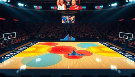
Bar charts are perfect for simple comparisons. They make it easy to see who has more or less of something. Use them to compare points per game or tackle counts. They answer, “Who has more or less of this stat?”
Line charts are great for showing trends over time. They plot a metric like team wellness scores or average possession time. This shows progress, decline, or cycles. The connecting line makes the trend clear. It answers, “How is this metric changing?”
Scatter plots with zones are powerful for player profiling. They plot athletes on two axes like speed vs. strength. Then, divide the plot into zones. This instantly categorizes players into groups. It’s perfect for combine analysis or tailoring training. It answers, “How do our athletes cluster based on these two traits?”
Choosing the right chart is a strategic decision. It ensures your data tells the story you need your team to see and understand.
Avoiding traps: cherry-picking, small n, dual axes, misleading color scales
Excel and Sheets make charts easy to create, but they can lead to traps. These traps can misrepresent athlete performance. A chart should show the truth, not hide it. This section guides you on how to create ethical and effective visualizations.
Great visualizations follow a core rule: show the data. Avoid charts that summarize too much, like “dynamite plots” with just averages and error bars. They hide the individual data points. Always ask if your chart lets the raw information speak.
Another critical practice is to display uncertainty. No metric is perfect. Showing confidence intervals or ranges builds trust. It tells your athletes and staff that you understand the limits of your analysis.
Let’s break down four specific traps that can compromise your message.
Cherry-Picking Data
This happens when you select only data that supports a pre-existing bias. For example, showing only games where a player shot well to argue they are in a “hot streak.” It ignores contradictory evidence.
To avoid this, set your analysis timeframe before looking at the data. Use consistent periods, like a full season or a defined training block. Transparency is your best defense.
The Small ‘n’ Problem
Drawing big conclusions from a tiny sample size is a classic error. Making rotation decisions based on three games of data is risky. The results are not stable and can change wildly with more information.
Always note your sample size on the chart. Be cautious with advice when ‘n’ is small. Wait for more data or use metrics that are reliable with fewer observations.
Dual Axes Distortion
Using two different Y-axes on one chart can suggest a relationship that isn’t real. Plotting player fatigue scores on one axis and scoring efficiency on another might make lines appear to move together. This can be an illusion created by the scale.
If you must use dual axes, make the relationship clear. Better yet, use two separate, aligned charts. This prevents the brain from making false connections.
Misleading Color Scales
Color should highlight what’s important. A default red-to-green scale might make small, meaningless differences look dramatic. This can misdirect attention away from the key insights.
Use color intentionally. Sequential scales (light to dark) are best for ordered data. Diverging scales (like blue-white-red) highlight deviation from a median. Avoid rainbow scales as they can imply false categories.
| Trap | What It Is | Common Example in Sports | How to Avoid It |
|---|---|---|---|
| Cherry-Picking | Selecting only data that confirms a belief. | Only showing a player’s top 10% of performances to argue for a starting spot. | Pre-define analysis windows. Show full context. |
| Small ‘n’ | Small sample size leading to unreliable conclusions. | Changing a drill because it “failed” in one practice session. | Annotate sample size. Seek larger datasets. |
| Dual Axes | Two different scales distorting perceived relationships. | Charting workload (high numbers) and wellness score (low numbers) together. | Use separate charts or a correlation scatter plot. |
| Misleading Color | Color scales exaggerating unimportant differences. | A heat map using a fiery red for a 51% success rate and calm blue for 49%. | Use perceptually uniform color palettes. Label clearly. |
Tools like Excel and Sheets often encourage these traps with their defaults. The standard dual-axis chart wizard, for instance, makes it a one-click option. The common color palettes may not be suitable for all data types.
Your job as a coach is to make conscious design choices. Override the defaults. Your goal is accuracy above all else. A truthful visual, even if simpler, is far more powerful than a flashy misleading one.
By avoiding these traps, you build a reputation for integrity. Your team will trust the numbers because they trust how you show them. This turns data into a tool for genuine decision-making, not just confirmation.
Tools: Excel/Sheets templates, Tableau/Power BI basics, Hudl data exports
The journey from data export to dashboard starts with a good tool. Coaches don’t need to be tech experts. They just need to know the basics.
This guide will show you where to start based on your program’s needs and your tech skills.

Excel and Google Sheets are great for many programs. They are easy to use and have templates for sports data. This makes creating charts and graphs simple.
These tools let you quickly turn practice logs and stats into visual reports. They’re perfect for team meetings or reports for parents.
Business intelligence platforms like Tableau and Power BI are better for big data. They connect to many data sources. This lets you make interactive dashboards that coaches can explore.
Imagine a dashboard where you can click on a player to see their stats. Or filter a heat map for second-half defense. This makes reports interactive and useful.
Connecting these tools to your sports data pipeline is key. Platforms like Hudl export detailed data. This data feeds into your visualization tools.
This makes the process smooth: from game capture to insights. No more typing numbers into spreadsheets. The system does the hard work, so you can focus on analysis.
Be platform agnostic. Choose tools that fit your current needs. Start with simple tools like Google Sheets. As you grow, you can move to more advanced tools.
Begin with what works now. Build confidence with one tool before adding more. The goal is clear communication, not mastering software.
Slide integration: one insight per visual; annotation rules; color legends and callouts
A powerful visualization loses its impact if it’s buried in a cluttered slide. The final step is integrating your chart into a coach-friendly report or pre-game presentation. This stage is about communication, not just creation.
Your goal is to ensure a coach can grasp the key takeaway in seconds during a busy meeting. Proper slide design applies core visualization principles directly to the coaching context.
The One Insight Per Visual Rule
Avoid cognitive overload. The most effective slides follow the one insight per visual rule. If a single chart is trying to show player efficiency, fatigue trends, and positional coverage, it will confuse more than inform.
Instead, create separate visuals for each major point. This focus forces clarity and makes your argument stronger. A coach reviewing a deck should instantly know what each slide is proving.
Maximize Data-to-Ink and Remove Clutter
Apply the principle of maximizing the data-to-ink ratio. Remove any element that doesn’t directly support the core insight. This includes unnecessary gridlines, redundant legends, and decorative backgrounds.
Increase whitespace around your chart. This gives the visual room to breathe and draws the eye directly to the data. A clean, uncluttered layout signals professionalism and confidence in your findings.
Don’t make your audience hunt for the story. Label key data points directly on the plot. If a bar is critically high, put the number on top of it. If a data point is an outlier, circle it.
Use callout boxes or arrows to highlight the main takeaway. A short, bolded sentence next to the chart can serve as the verbal punchline you’d deliver in a meeting. Effective annotation acts as a guide.
- Label Directly: Place text and values on the chart itself.
- Use Callouts: Highlight the “so what” with a text box.
- Integrate the Legend: Often, you can make the chart title your legend (e.g., “Player Sprint Distance: High = Red”).
Strategic Color and Accessibility
Use color legends strategically. If a color scale is essential, keep it simple and place it close to the data. Better yet, use intuitive colors that don’t require constant reference back to a legend.
Always consider accessibility. Use color-blind-friendly palettes (like viridis or plasma) to ensure your message is inclusive. Color should enhance understanding, not create a barrier.
Mastering slide integration turns data into decisions. It’s the bridge between your analysis and a coach’s actionable insight. A well-designed presentation earns trust and accelerates the path from stat to strategy.
Case studies: practice plan changed by GPS heat; rotation tweak from shot chart
A GPS heat map and a basketball shot chart are more than simple graphics. For two coaches, they were game-changers. They turned raw numbers into clear visuals that changed practice plans and game strategies.
A collegiate soccer coach looked at the team’s weekly load report. It showed total distances and high-speed runs, but the story was unclear. Then, she saw the GPS heat map of a recent training session.
The heat map showed a big problem. Drills were mostly on the right side of the pitch. Players on the left were doing less and at lower intensities. This made the uneven workload clear.
The coach quickly saw the issue. Some midfielders were always overloaded, while others on the left were underused. This put some players at risk of injury and others unprepared.
The coach made a simple but effective change. She made the drills more balanced across the field. She also changed where drills started to ensure everyone got a fair workout.
This change made the player load more even. The next week’s heat map showed even intensity. This change helped the team perform better and stay healthy.
Case Study 2: The Shot Chart That Changed the Rotation
A high school basketball assistant was looking at a recent loss. The team’s shooting was poor. He made a shot chart for the starting wing player.
The chart showed a clear problem. The player was taking too many contested long-twos from the left baseline. His makes were mostly in the right corner and on drives from the top of the key.
The chart made it clear where the player was good and where he wasn’t. The coach had a solid fact, not just a feeling, about shot selection.
The coach decided to make a small change. He proposed subbing the player out two minutes earlier in the first quarter. This way, the player would join the second unit, which ran sets that favored corner three-point attempts on the right side.
This change led to more shots from the player’s best zones. It improved his efficiency and the team’s offense. It turned a weakness into a strength.
| Scenario | Data Source & Visualization | Key Insight Revealed | Coaching Decision | Measurable Impact |
|---|---|---|---|---|
| Soccer Training Load | GPS Data; Heat Map Overlay | Uneven workout intensity across the field | Redesigned drill layouts for symmetry | Balanced player load; reduced injury risk |
| Basketball Shooting Efficiency | Play-by-Play Data; Shot Chart | Player’s shots clustered in low-percentage zones | Adjusted rotation and play calls | Increased shot quality from preferred areas |
These stories show how data can lead to winning decisions. In both cases, a coach moved from numbers or intuition to a visual. This led to clear insights and confident actions. The tools and principles discussed are practical and effective.
Downloadable dashboard starter
Data visualization turns numbers into stories and stats into plans. It changes raw GPS data into a new practice plan with the right tools.
We want to give you the power to make decisions with data. So, we’ve made a downloadable dashboard starter. It’s ready to use in Google Sheets or Excel.
This tool lets you see important metrics like player load and wellness scores. It’s your first step to interactive dashboards that engage everyone.
This template helps you tell data stories effectively. It helps you focus on what matters, like the strategies for memorable sports data. You can see trends and patterns easily.
Start using this template to apply your data insights. Turn your data into visuals that guide your decisions. Your next big idea is just a click away.