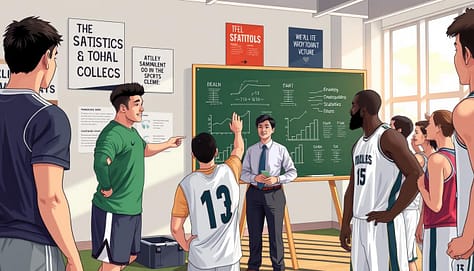
Welcome, coach! Let’s be honest for a second. You’ve seen the spreadsheets full of numbers and the reports packed with complex metrics. You know this information is valuable for your team’s success.
But when you try to share it, your player’s eyes glaze over. Terms like “points per possession” or “effective field goal percentage” just don’t connect. That’s the gap we’re here to bridge together.
Your most important job isn’t just collecting data. It’s translating it into a language your athletes instinctively understand. Every single metric must become a specific, on-court action paired with a simple cue word.
Think of it as decoding a foreign language into the mother tongue of movement and effort. This skill to simplify stats using non-technical language is now critical. The sports world is more data-driven than ever, just like the business world around it.
By mastering this translation, you turn confusing reports into powerful conversation starters. For more on making sports data memorable, we have great strategies to share.
Let’s begin this journey. We’ll show you how to make every number matter.
Pick 3 KPIs Per Game: Efficiency, Tempo, Shot Quality
The secret to winning with data is not more numbers, but fewer, sharper ones. In today’s sports, we get a lot of information from all sides. Without a clear plan, it just gets confusing for athletes.
Think of your team like any top company. Structure and governance are key. You wouldn’t run a business without clear goals, right? Your game plan needs the same focus.
That’s why we follow the “Rule of Three.” Before each game, you and your team pick just three Key Performance Indicators (KPIs). These are the top priorities for that game and strategy.
This focused approach helps cut through the noise. Instead of tracking many metrics, your team focuses on what really matters. It makes a simple, shared language for everyone.
So, what makes a great KPI? We often start with three powerful, sport-specific categories:
- Efficiency: Are we getting high-value outcomes from our possessions? In basketball, this could be points per possession. In soccer, it might be successful passes in the final third.
- Tempo: Are we controlling the game’s speed? A football team might track plays per minute. A tennis player could focus on time between points.
- Shot Quality (or Chance Quality): Are we taking the attempts we practice? For a shooter, it’s the percentage of shots taken within their preferred zones. For a baseball hitter, it’s the rate of hard-contact swings.
The exact game KPIs you pick must be sport-specific. A “shot quality” metric in volleyball looks completely different than in hockey! The magic is in the collaboration. When coaches and leaders choose these three indicators together, everyone from starters to staff understands the mission.
Here’s your simple framework for selection:
- Review your opponent’s key weakness.
- Identify your own team’s strength that can exploit it.
- Pick one KPI that measures the execution of that strength.
Do this three times, and you have your game plan’s backbone. You’ve now given your athletes a clear picture of success. They aren’t overwhelmed by data; they’re empowered by a clear goal. That’s how you turn analytics into action, one game at a time.
Visualize Simply: arrows, zones, stoplights; no decimals on walls
Visual coaching makes data easy to understand, like part of the game. No more taping up tiny numbers on walls. It’s confusing and ignored. Athletes’ brains work fast and love visuals during games.
Our goal is to make feedback clear and quick. When athletes see your feedback, they should know what to do right away. This is the power of visual coaching. We use simple symbols and colors that lead to action without thinking.

- Directional Arrows: A simple up arrow (↑) for “faster tempo” or a down arrow (↓) for “slower pace” is clearer than “0.92 possessions per minute.”
- Color-Coded Zones: Use green for high-quality shots and red for low-efficiency zones. This turns data into a spatial guide players can follow instinctively.
- The Stoplight System: Green means “on target,” yellow signals “needs work,” and red flashes an “alert.” It gives immediate feedback on any KPI.
Remember, no decimals on the walls. We’re choosing a big, green “GO” signal over “0.48 Points Per Play.” Which one motivates your team more?
This method works because it matches how athletes see the game. They read body language and react to colors and shapes quickly. Visual coaching gives them a clearer view of the sport they love.
Start small. Choose one KPI from your last game and think: “How can I show this as a color, shape, or symbol?” Your team will quickly connect with the numbers when they’re shown as a visual story.
Storytelling: before/after frames, cause→effect sequences
The most powerful coaching tool isn’t a spreadsheet; it’s a well-told story built from data. Players and unions connect with fans on social media by sharing stories, not spreadsheets. This shows the power of narrative in making analytics stick.
Data tells a story, and you’re the narrator. By framing stats as a compelling narrative using non-technical language, you turn dry numbers into lessons athletes feel. This connects the “what” of the stat to the “why” and “how” of real gameplay.
Our brains love visual stories. Use video clips to create instant “aha!” moments. Instead of saying, “Your defensive positioning efficiency was low,” show two frames side-by-side.
Point to the screen and say: “Look at your stance here, before the pass. Now, look here, after you reacted. See how your feet are planted in the ‘before’? In the ‘after,’ you’re already moving toward the open lane.”
This method makes feedback clear and undeniable. It’s not you criticizing; it’s the story the video tells. You’re using non-technical language to highlight a clear, visual difference.
Connect the Dots: Cause-and-Effect Sequences
Stories have plots: this happened, which led to that. Build these sequences from your data to show players the direct impact of their actions.
For example: “When we set this specific screen (the cause), it leads to an open lane for a drive (the effect) 80% of the time. Let’s watch the three plays where we did it right.”
This sequence does the heavy lifting. The player sees their action as the starting point of a chain reaction. They stop thinking about a “good” or “bad” stat and start understanding their role in the system’s outcome.
Here’s a quick comparison to see how shifting from technical jargon to storytelling changes everything:
| Aspect | Technical Data Presentation | Storytelling with Non-Technical Language |
|---|---|---|
| Language Used | “Your off-ball movement velocity decreased by 15%.” | “When you waited here, the defender caught up. When you exploded from the spot, you got open.” |
| Player Engagement | Eyes glaze over; feels like a critique. | Leans in; sees a puzzle being solved. |
| Lesson Retention | Forgotten by the next drill. | Remembered as a clear picture or story. |
| Primary Goal | Report a metric. | Explain a why and teach a how. |
By storytelling with data, you help athletes internalize lessons on an emotional and instinctive level. The desired behavior becomes part of their muscle memory because they understand the story behind it. They’re not just remembering a number; they’re remembering a moment they saw and felt.
Start your next film session with this question: “What’s the story this clip is telling us?” You’ll be amazed how quickly the conversation shifts from confusion to clarity.
Reinforcement: on-field tags, hand signals, post‑rep callouts
Data becomes instinct when we use it in practice. Your chalk talk ideas are clear, but they need constant reminders. Reinforcement turns theory into automatic action.
Now, let’s go from chalkboard to field. Start with simple, on-field verbal tags. These are one-word shouts that act as instant behavior cues. For example, “Tempo!” reminds a point guard to speed up. “Efficiency!” is called out after a smart pass.
These tags are quick and keep play moving. They help focus on your key performance indicators (KPIs).
But sometimes, shouting can disrupt the flow. That’s when silent, sideline hand signals come in. A coach might hold up three fingers for “focus on our third KPI.” A closed fist means “lock in on defensive efficiency.” This method is clear and doesn’t stop the game.
The most powerful tool is the immediate post-rep callout. Right after a play, you praise the specific behavior. “Great job finding the green zone on that shot, Sarah!” or “Perfect tempo on that fast break, team!” This links the action directly to your data framework in real-time. The feedback is instant. This makes the lesson stick.
Verbal tags, hand signals, and post-rep praise create a feedback loop. They turn abstract ideas into real experiences. Your athletes start to feel the data, not just think about it. This is how you build a culture where data-driven behavior cues are part of the game.
Micro-Assessments: 60-second quizzes, thumbs scales
Communication isn’t just about what you say. It’s about what others understand. Micro-assessments are your quick tools to check if they get it. Forget long exams or lectures. These fast checks tell you if your team is on board.
Imagine checking the room’s temperature. After a film on defensive transition, ask: “Show me with your hand—thumbs up, sideways, or down—how you think we did today.” In seconds, you see the whole group’s view. It’s instant feedback that needs no prep.

Another method is the 60-second quiz. Ask a focused question after a talk. “What was our top priority in the third quarter?” Give them a minute to think. This makes them recall the main idea you discussed.
Use a 1-5 confidence scale on a whiteboard too. Write a key play or stat and have players rate their confidence. It’s not about right or wrong. It’s about their gut feeling and understanding.
These tools do two important things. They give you insight right away. You see what they don’t get before the next practice. They also make players active in their learning. To rate or score, they must process and simplify stats into a personal judgment. It turns data review into a two-way conversation.
Here’s a quick comparison of common micro-assessment tools you can use today:
| Method | What It Measures | Time Needed | Best For |
|---|---|---|---|
| Thumbs Scale (Up/Side/Down) | Overall sentiment & gut feeling | 10-15 seconds | End-of-session pulse checks |
| 60-Second Verbal Quiz | Active recall of a single key point | 60 seconds | Reinforcing a major teaching point |
| Confidence Board (1-5 Scale) | Individual confidence in a specific skill or play | 2-3 minutes | Pre-practice readiness checks |
These checks are simple. There’s no grading, no pressure, and no complex setup. They fit easily into your routine. Regular use builds a habit of reflection. Players learn to simplify stats for themselves. This creates a culture where understanding is key.
So, after your next talk, don’t just walk away. Take the temperature. That quick show of hands or silent mark on the board is your most honest report card. It keeps communication flowing both ways and ensures your chalk talk translates into on-field action.
Closing the Loop: measure change on next report
The final step turns your data into a story of growth. You’ve shared your key game KPIs with clear visual coaching. Now, it’s time to close the loop.
Look at the next game report. Show your team how you’ve improved. “Last week, our paint touches were in the yellow zone. We worked on it in practice. Now, this game, we’re in green!” This shows your efforts pay off.
This proves their hard work is worth it. It turns analytics into a tool for getting better. Teams, like those in the NBA or NFL, must use new data to grow. Your review is that moment.
Celebrate the wins on the report. Talk honestly about areas that need work. Then, work together to set goals for the next cycle. This builds a culture of continuous learning.
Your visual coaching system drives progress. By always measuring change, you keep everyone motivated. The loop is closed, and the cycle of improvement starts again.