
Welcome! If you’re on a sports staff—a coach, athletic director, or marketing pro—you know clear communication is key. It can turn a good play into a championship-winning moment. Your presentations should be as sharp and effective as your game plans.
A well-crafted deck is like a perfectly executed playbook. It’s organized, easy to follow, and gets everyone on the same page fast. We’re here to explore the core principles that make slow, cluttered slideshows into dynamic, impactful tools your audience will enjoy.
These methods are used every day. Coaches break down complex strategies, organizations pitch to sponsors, and fitness trainers outline workout plans. Using a professional sports powerpoint template helps present data visually and supercharges your communication.
Let’s dive into the best practices that ensure your message isn’t just seen, but understood and remembered. We’ll guide you through structuring slides for maximum effect, using real-world examples you can apply immediately.
Audience and Context: coaches vs players vs admins
The most important choice for sports presentations isn’t about fonts or colors. It’s knowing your audience. If you get it right, your message hits home like a perfect pass. But if you don’t, you’ll see people zoning out faster than a blown coverage.
There are three main groups you’ll present to: coaches, players, and admins. Each group thinks, learns, and decides differently. Your task is to create a slide hierarchy that fits their way of thinking. This means putting the most important, actionable info right on every slide.
For coaching staff, focus on depth and detail. They love strategy, film analysis, and complex data. Your slides should help spark deep discussions. Think about tactical formations, opponent tendencies, and detailed practice plans.
When talking to players, change your approach completely. Clarity and motivation are key. Use big, bold visuals, short bullet points for drills, and highlight key takeaways. They need to see the “what” and “how” quickly, without getting lost in text.
For administrative staff like athletic directors or school officials, your deck should tell a story with data. Budgets, program growth, and eligibility timelines are the main players. Clean charts and clear summaries help them make quick, informed decisions.
The table below shows how focusing on your audience changes your deck’s content and structure:
| Audience | Primary Use Case | Content Focus | Slide Hierarchy Tip |
|---|---|---|---|
| Sports Coaches | Strategy Sessions, Training Planning | Tactical game plans, film analysis, practice schedules | Lead with the core strategic problem; support with film and data. |
| Athletes / Players | Motivation, Skill Installation | Actionable drill steps, motivational quotes, clear role definitions | Put the key action or takeaway in a large, bold headline at the top. |
| Athletic Directors / Admins | Budget Reviews, Program Reports | Financial summaries, participation metrics, compliance updates | Start with the executive summary or bottom-line number on each slide. |
| Sports Marketers & Event Planners | Promotion, Logistics | Timelines, sponsorship visuals, venue maps, ticket sales data | Highlight dates, deadlines, and call-to-actions visually. |
See the pattern? By defining your audience first, you naturally create a logical slide hierarchy. You’re not just dumping info; you’re telling a story that resonates. A coach feels ready, a player feels empowered, and an admin feels informed.
This audience-focused approach is what makes other design principles work. Now, let’s build on this foundation and make your deck look the part.
Brand the Deck: colors, logos, master slide setup, export presets
Think of your team’s colors and logo as your presentation’s uniform. This team branding boosts credibility and unity. When your team sees your deck, they know it’s official and trusted.
Start with your Sport Branding Guidelines, if you have them. This guide outlines logo use, colors, and fonts. If not, create a simple guide for your team. Use HEX or RGB codes for colors and decide on logo versions for backgrounds.
Next, create your master slides. This template controls your deck’s design. It saves time and ensures consistency.
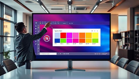
In your master slide view, set the background and logo position. Define title and content slide fonts and sizes. This creates a design rulebook for your deck.
Master slides are your single source of truth. They help everyone stay “on brand” without needing design skills. This keeps your team branding consistent, from meetings to reviews.
Don’t stop when designing is done. Prepare your deck for delivery. Export presets are key for different uses.
Save optimized export settings for ten minutes. Use high-resolution PNG or PDF for projectors. For digital use, choose compressed PDF or PowerPoint’s “Create a Video” feature.
By focusing on master slides and export settings, you create a system that works for you. Every message is delivered professionally and unified. It’s a small effort with big impact.
Layout Discipline: grids, white space, rule-of-thirds for film stil
Think of your slide deck as a playing field. Clear lines and markings help athletes play with precision. A disciplined layout does the same for your content, making it shine.
Without it, even the best stats and film clips can feel chaotic. This makes them hard to follow.
The secret to a clean structure is the layout grid. Turn on the invisible guides in your presentation software. Use them to align every text box, image, and data point.
This creates a subtle sense of order. It makes your content instantly easier to digest. A consistent grid signals professionalism and helps your audience focus on the message, not on trying to find it.
Now, let’s talk about what goes between those aligned elements: white space. This is not empty space! It’s a powerful design tool.
White space gives your key messages room to breathe. It reduces visual clutter and cognitive load. This allows the viewer’s eye to naturally rest on what’s important.
A common mistake is trying to fill every pixel. This leads to overcrowded slides that overwhelm your coaches or players. Strategic white space, guided by your grid, provides the clear structure and visual balance your data and film need.
It’s the difference between a calm, focused huddle and a noisy, confusing sideline.
Your layout discipline rests on three core principles:
- The Grid: Your invisible alignment system for a clean, organized look.
- White Space: Your strategic breathing room that highlights content and improves readability.
- The Rule-of-Thirds: Your compositional guide for dynamic visuals, including film stil
Speaking of film, the rule-of-thirds is a game-changer. Imagine dividing a film or photo with two equally spaced horizontal and two vertical lines. The points where these lines intersect are power positions.
Placing a key player, the ball, or a tactical formation on one of these points—instead of dead center—creates a more dynamic and engaging composition. This off-center placement adds visual tension and drama, which helps during film review.
It guides the viewer’s eye through the action more naturally. When you pair this thoughtful composition with a disciplined grid and ample white space, you create a seamless, professional flow. Your smart layout choices work hand-in-hand with clear typography to build presentations that are not just seen, but understood.
Type and Color: 2-font rule, readable sizes, contrast ratios
Let’s explore the power of type and color. Simple rules like the ‘two-font system’ and strict contrast ratios make your data stand out. Think of your presentation’s typography as its voice—it gives your message clarity and confidence. With the right color choices, your slideshow will grab attention from every corner.
The two-font rule is a simple yet effective strategy. Use a clean, bold font for headings like Arial or Helvetica. Then, pick a complementary font for body text, such as Calibri or Georgia. This combo adds interest without causing chaos and is a key to clear communication.
Choosing only two fonts helps avoid distractions. Coaches and players need to process information quickly. Your heading font should shout the main point, while your body font explains the details calmly.
Text size is critical. It must be easy to read in any lighting. Here are some guidelines:
- Headings: Never go below 36pt.
- Body text: Stick to 24pt or larger.
- Critical stats or calls-to-action: Make them bold and consider increasing their size!
If you can’t read it on your laptop, it’s too small for the big screen.
Color contrast is not just about looks; it’s about accessibility and impact. Players with color vision deficiencies and staff in bright rooms need clear instructions. That’s where contrast ratios come in.
A contrast ratio shows the light difference between your text and background. A higher ratio means better readability. Here’s a quick guide to the standards you should aim for:
| Contrast Ratio | Rating | Best Use Case |
|---|---|---|
| 7:1 or higher | Excellent | Any text, ideal for high-stakes data and viewers with low vision. |
| 4.5:1 to 6.9:1 | Good (Minimum) | Normal body text (WCAG AA standard). |
| 3:1 | Acceptable | Large text (over 24pt or bold 18.5pt). |
You can check these ratios for free using online contrast checkers—just plug in your color codes. A classic combo is dark gray text on white or bright white text on dark blue.

See how the bold heading stands out? That’s the two-font rule and strong contrast in action. The image shows clear, legible text against a background that doesn’t fight for attention.
Your goal is to make information easy to understand. By sticking to two fonts, large sizes, and checking color contrasts, you create slides that are inclusive and professional. This turns complex info into something everyone can quickly grasp—and that’s a winning strategy.
Visual Components: arrows, highlights, callouts, timers, score bugs
A slide full of random shapes and text boxes is like a chaotic play. It’s hard to know where to look or what to do. You need to guide your audience’s eyes like a play-caller.
Arrows, highlights, and callouts are your silent helpers. They guide attention and highlight what’s important. Using them wisely is key to motion discipline. Even on a static slide, you can lead the viewer’s eyes in a logical path.
- Arrows: These trace a player’s path, show play flow, or link a statistic to a moment. A well-placed arrow simplifies complex scenes.
- Highlights & Callouts: They’re like spotlights. Circle a key defender, add a text bubble to a key statistic, or enlarge a frame. They say, “Look here first!”
- Timers & Score Bugs: These graphics add context instantly. They answer “when” and “what’s the score” questions during game film review, making analysis feel immediate.
The magic is in combining these tools. You decide the order: does the eye see the highlighted player first, then follow the arrow, and then check the clock? This planned sequence is your visual choreography. It’s the practical use of motion discipline on every slide.
Mastering this makes complex sports data engaging. Your presentations become more dynamic, and your message hits hard. That’s the power of giving every visual element a clear, strategic role.
Motion and Media: 10–20 second clips, subtle transitions, compression
Motion and media are like the highlight reel of your presentation. They are short, powerful, and grab your attention. Your slides set the stage, but a good video clip adds emotion and clarity that text can’t.
When using film, choose quality over quantity. Aim for clips between 10 and 20 seconds. This length shows a complete action without losing focus.
Each clip should show one specific concept. For example:
- A defensive rotation that seals the lane.
- A perfect shooting form from release to follow-through.
- A single special teams alignment at the snap.
This focused approach avoids confusion and keeps your message clear. It’s a great way to improve team communication during film reviews or strategy sessions.
Just like a dynamic template for an “Extreme Sport: Skydiving” presentation, your motion elements should add energy. They should not distract from your message.
Transitions should be subtle and consistent. A simple fade is usually best. Avoid flashy transitions. Your goal is to smoothly guide the viewer’s eye, not to impress with special effects.
Compression is also key. A huge, uncompressed video file can slow down your presentation. Nothing is more frustrating than a presentation that freezes.
Always compress your media files before adding them. Most software has tools for this. Smaller files ensure your presentation runs smoothly on any computer.
By setting these rules, you can build them into your deck templates. This makes following best practices automatic.
Standardizing your motion and media approach ensures every presentation is smooth and professional. It makes your content creation process easier, saving you time and technical issues.
When your deck templates are set up for optimal media use, you can focus on finding the perfect clip. This is how you create presentations that are as effective as your game plan.
Data Pages: mini-charts, shot maps, pace bars; avoid clutter heatmaps
A cluttered data slide can lose your audience faster than a fumbled play. In sports, clarity is your MVP. We’ve all seen slides drowning in spreadsheets and tiny text. They make eyes glaze over, even for the most dedicated coach or player.
The solution isn’t less data—it’s smarter visualization. Your goal is to turn numbers into a story everyone can grasp in seconds.
Let’s start with trends. Instead of listing weekly stats, use a mini-chart. A simple line or bar chart embedded right on the slide shows performance over time instantly. Did shooting accuracy dip in mid-season? A mini-chart tells that story visually, without a single spoken word.
For spatial understanding, shot maps or pitch charts are game-changers. They show where attempts are coming from on the field or court. A cluster of dots in the paint? That’s a powerful visual argument for a defensive adjustment. These maps give immediate, intuitive insight.
Want to communicate effort or tempo? Enter the pace bar. This simple, horizontal bar can fill up to show intensity levels, sprint distances, or speed metrics. It’s a brilliant way to compare effort between players or across quarters.
Now, a critical warning: avoid the clutter of a traditional, dense heatmap. Unless it’s the absolute best tool, a complex heatmap often confuses more than it clarifies. A simpler, focused graphic is almost always more powerful. Remember, your slide is a spotlight, not a floodlight.
This is where slide hierarchy becomes your secret playbook. Never lead with the raw data. Always start with the big-picture conclusion. Use a bold headline like, “Shots Improved in the 4th Quarter” or “Defensive Pressure Increased After Timeout.” Then, and only then, use your mini-chart or map to prove that point. The visual supports the message, not the other way around.
To help you choose the right tool, here’s a quick guide:
| Visualization Type | What It Shows Best | Pro Tip |
|---|---|---|
| Mini-Chart | Trends over time (e.g., points per game, completion %) | Keep it to one clear metric. Two lines max! |
| Shot Map | Spatial patterns (e.g., shot locations, defensive coverage) | Use contrasting colors for makes vs. misses. |
| Pace Bar | Intensity or effort levels (e.g., player speed, hustle stats) | Combine with a key number (e.g., “Max Speed: 18 mph”). |
By mastering these tools and applying clear slide hierarchy, you transform data pages from a chore to read into a compelling part of your presentation. You’re not just showing numbers; you’re revealing the story behind the stats. And that’s how you drive real decisions and win the room.
Build Once, Use Often: duplicate decks for scouting, reviews, installs
Your time is precious. Spending hours redoing slides for each meeting takes away from film study and player development. The best approach is to create a master template library. It’s your digital playbook of tried-and-true slide designs.
Start with a well-organized set of master slides, icon packs, and data pages. These become your base. For scouting reports, season reviews, or play installations, just duplicate your core deck and update the content.
This method ensures your presentations look consistent across your program. It saves you hours of repetitive work. Just like the customizable sports program PPTs available, good deck templates can be tailored to your team’s colors and goals without starting from scratch every time.
We help every member of your sports team create clear, effective presentations. You can focus on coaching, analyzing, and leading. A solid set of deck templates turns complex data into quick, easy-to-understand slides for any audience.