
Explaining a complex playbook or quarterly data can be tough. You have important info, but if your team doesn’t get it, your plan fails.
Cognitive science has a solution. The Dual Coding Theory says people learn better with words and pictures. Studies show this method can improve understanding by up to 400%.
Also, people remember about 65% of information shown with visuals. This is way more than the 10% they remember without visuals. It’s not just about looks; it’s about making your message last.
For sports and business leaders, three tools are key: good slides, clear diagrams, and powerful video clips. They turn hard stats and complex systems into clear, memorable insights.
Learning to use these tools turns a basic briefing into a strong coaching moment. It’s how you make raw data into something your players or stakeholders can act on.
Design principles: contrast, alignment, repetition, proximity; sports color palettes and fonts
Good sports visual aids rely on clear contrast, smart alignment, consistent repetition, and logical proximity. These four core design principles, known as CRAP, make slides powerful coaching tools. They help athletes focus on what’s important.
Let’s explore each principle with examples from sports.
Contrast makes differences clear. It’s used to highlight a player’s route or a defensive gap. High contrast colors, like white on dark blue, are easy to read from afar. Always check contrast ratios for accessibility.
Alignment brings order. When player icons are on a grid, your diagram looks professional. Every element should connect visually. This prevents slides from looking messy.
Repetition creates consistency. Use your team’s colors, logos, and fonts in all presentations. This repetition strengthens your brand and makes materials easy to recognize.
Proximity groups related items. Place a statistic next to the player it describes. This rule makes your slide clear and easy to follow.
Choosing the right color palettes is next. Start with your team colors and build a palette for clarity. Use color theory: complementary colors make elements pop, while analogous colors create harmony.
About 8% of men have color vision deficiency. Avoid bad color combinations like red-green or blue-purple for important info. Use texture or labels as a backup. A consistent color scheme is key to making sports data memorable.
Font selection is about visibility and tone. Stick to one or two bold, sans-serif typefaces. Sans-serif fonts, like Arial or Helvetica, are easy to read on screens. Avoid thin, script, or overly decorative fonts.
Use font size to create hierarchy. Your main play title should be largest. Supporting points should be smaller. This visual guide directs attention smoothly.
| Design Principle | Primary Goal | Sports Application Example |
|---|---|---|
| Contrast | Create visual distinction and highlight importance | Using bright yellow to mark a receiver’s path on a dark green field template |
| Alignment | Establish order and a professional structure | Lining up all defensive player icons along a shared baseline on a court diagram |
| Repetition | Build consistency and reinforce branding | Using the same team logo, color strip, and font on every slide in a playbook |
| Proximity | Group related information logically | Placing a player’s season stats directly beneath their photo in a recruitment presentation |
Using these design principles as a system is essential. They work together. Good alignment enhances proximity. Strong contrast benefits from strategic repetition. Mastering these basics makes your sports presentations authoritative. Players and staff will trust the information because it looks clean and intentional.
Your visual aids should explain, not confuse. A solid design foundation ensures they do exactly that. Now you’re ready to build specific diagrams and clips with confidence.
Diagrams: court/field templates, spacing indicators, icon sets; when to animate vs static
Tactical diagrams are key in sports strategy, linking ideas to action. Studies show diagrams can boost understanding by 89% over text alone. For coaches, a clear play diagram is essential for teaching.
It turns complex ideas into simple, visual instructions players grasp right away. This section will guide you in creating better visual playbooks.
Begin with accurate court and field templates. These are the base for your tactical diagrams. You can find templates online or make your own in software like PowerPoint or Canva.
Make sure the proportions match your sport. A basketball court template should include the three-point line and key accurately. A football field needs correct hash marks.
Using a standard template helps everyone see the same strategy. It prevents confusion before you draw the first line.
Next, add spacing indicators and icon sets to show player positions and movement. Spacing indicators are lines, arrows, or shaded zones that highlight key distances between players.
For example, a dashed circle can show a defender’s needed distance. Icon sets use standardized symbols for players, balls, and equipment.
Consistency is key. Always use a triangle for a quarterback and a circle for a wide receiver. This creates a universal visual shorthand your team learns quickly.
Choosing between static and animated play diagrams is a big decision. Static diagrams are great for reference materials, like printed playbooks or pre-game handouts.
They are perfect for showing a final formation or a snapshot of a critical moment. Static diagrams are simple, quick to make, and easy to share.
Choose animation for showing timing, sequence, and flow. An animated diagram can illustrate a player’s cutting route, the pass progression, or a defensive rotation.
Tools like PowerPoint’s Morph transition can make a play diagram come alive with smooth movement. Animation is powerful for explaining dynamic plays where “when” is as important as “where.”
Use the following table as a guide to decide between static and animated visuals for your coaching needs.
| Factor | Static Diagram | Animated Diagram |
|---|---|---|
| Best Use Case | Reference sheets, printed playbooks, quick reminders | Demonstrating timing, sequence, and player movement flow |
| Creation Speed | Fast and simple to produce | Requires more time and technical skill |
| Player Comprehension | Excellent for memorizing formations and positions | Superior for understanding dynamic plays and reactions |
| Delivery Format | PDF, printed paper, static slide | Digital presentation, video file, interactive screen |
| Key Advantage | Clarity and simplicity for a single moment | Shows cause, effect, and progression over time |
Remember, the goal is always clear communication. A complex animated sequence can sometimes confuse more than it clarifies. If a static diagram with clear icons and spacing indicators does the job, use it.
For illustrating a multi-phase play where movement is everything, animation is your best tool. SmartArt and other diagram tools in presentation software help visualize complex concepts without overwhelming your audience.
Build your library of templates, icons, and indicators. Your play diagrams will become more effective and efficient to create. This saves you time and makes your team smarter.
Video: clip length, slow‑mo, telestration layers, captioning best practices
Mastering video analysis is more about using best practices than fancy equipment. Video is key for breaking down technique and connecting with your team. You need a clear plan for length, playback, annotation, and clarity.
Keep Clips Short and Purposeful
Attention spans are short, even during intense film sessions. Experts say keep instructional videos under 90 seconds. This keeps focus sharp and ensures your main point is clear.
Show only the necessary clip. For example, if analyzing a three-second decision, don’t play the whole 30 seconds. Tell your audience the video length and use it effectively in your talk. This saves time and makes your message stronger.
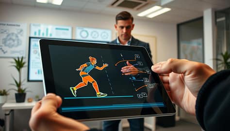
Slow-motion is great for technical analysis, but use it wisely. Use it for moments that are hard to see at full speed. Showing the play at full speed first helps set context, then slow-mo for the key moment.
Harness the Power of Telestration
Telestration makes video analysis interactive. It lets you draw on video frames to highlight important points. Modern software allows you to draw on a transparent layer, keeping your original footage safe.
You can use layers for different elements like highlighting defenders or offensive routes. This keeps the screen clear and lets you focus on what’s important. A good telestration tool is essential for real-time coaching.
Captioning for Universal Clarity
Never assume everyone will hear the audio clearly. Gyms are loud, and headphones aren’t always available. Clear captions ensure your analysis is understood everywhere. Use a large, legible font and keep captions short and accurate.
By using short clips, strategic slow-mo, dynamic telestration layers, and clear captions, you turn raw footage into a compelling coaching story. For coaches, exploring the latest broadcast tech innovations at IBC can reveal new tools to simplify the process.
Demo tools: PowerPoint morph, Keynote Magic Move, Canva brand kit, Google Slides; Hudl/KlipDraw/Coach Paint overlays
Let’s dive into the world of software, comparing everyday tools with special overlays used by top teams. Your toolkit has two main parts: general design tools for telling your story and sport-specific tools for deep analysis. Knowing both helps you smoothly move from studying film to discussing strategy with your team.
For making your main presentation, you’ll use tools like PowerPoint, Keynote, Canva, and Google Slides. They have advanced features that make showing play progressions easy. Microsoft PowerPoint’s Morph transition is a big help. It smoothly changes objects, text, and shapes between slides.
Apple Keynote has a similar feature called Magic Move. It automatically makes animations between slides where objects have the same name. This is great for showing how players move or a defensive shift changes. Canva’s Brand Kit is also key. It saves your team’s colors, logos, and fonts. Then, you can easily keep every slide and graphic consistent.
Remember, good design is key, no matter the platform. Use the 5-5-5 rule: no more than five words per line, five lines per slide, and five text-heavy slides in a row. Animations should reveal information or show motion, not just for fun. Always choose big, easy-to-read fonts so everyone can see.
| Platform | Standout Feature | Best For | Collaboration |
|---|---|---|---|
| Microsoft PowerPoint | Morph Transition | Detailed, stepwise play animation | Excellent (via 365) |
| Apple Keynote | Magic Move | Smooth object-based animations | Good (iCloud) |
| Canva | Brand Kit | Maintaining visual consistency quickly | Strong real-time editing |
| Google Slides | Simplicity & Access | Quick edits and universal sharing | Superior real-time collaboration |
The second part of your toolkit includes special software like Hudl, KlipDraw, and Coach Paint. These tools are for the film room. They let you draw on game footage. You can make dynamic overlays that show:
- Precise player pathways and spacing.
- Defensive coverage shells and rotations.
- Annotated frames with arrows, highlights, and text.
With KlipDraw or Coach Paint, you can create professional drill diagrams or add them to a video. Then, you can add this analysis to your main presentation. Export a clear, annotated video or a static diagram. Embed it in your PowerPoint or Keynote slide. This connects the tactical concept in your slideshow with real-game evidence from your film.
This mix—using Canva for branded slides, PowerPoint for animations, and Hudl for detailed annotation—makes a strong coaching presentation. It turns raw game footage into a compelling strategic story for your team.
Hardware: clickers, timers, laser vs on‑screen cursors; HDMI/USB‑C adapters checklist
Even the best visual aids can fail if the tools to show them don’t work. This part is about the physical tools needed to present your ideas. We’ll talk about the key equipment that helps you control your presentation.
Good hardware lets you focus on your message and your athletes. It keeps technical issues from ruining your session.

Handheld presentation clickers give you freedom. You can move around while advancing slides. This keeps your audience engaged more than being stuck to a laptop.
Built-in software timers are useful for explaining drills. But, a dedicated physical timer is often more reliable. It works on its own, not tied to your slides.
For sessions that need to be on time, use both. Have a backup timer on a separate device. This is a smart backup plan.
Highlighting Key Points: Pointer Options
Choosing how to highlight on-screen is important. You have two main options: the traditional laser pointer or your mouse’s on-screen cursor.
Each method has its own benefits for different coaching situations. The table below shows the pros and cons to help you decide.
| Feature | Laser Pointer | On-Screen Cursor |
|---|---|---|
| Precision & Visibility | Excellent for large screens and rooms. Creates a bright, visible dot. | Can be precise but may be hard to see from a distance. Requires a steady hand. |
| Presenter Mobility | Allows full room movement. You are not tied to the computer. | Typically requires you to stay near the laptop to use the touchpad or mouse. |
| Ease of Use | Simple point-and-click. No software setup needed. | Integrated into your computer. No extra device to carry or lose battery. |
| Best For | Large team meetings, gymnasiums, pointing at physical objects on a screen. | Smaller meetings, detailed software demonstrations (like drawing plays in Hudl). |
The Non-Negotiable Adapter Checklist
The most common presentation problem is a connection issue. You can’t assume the venue’s projector will match your laptop. Always carry your own adapter kit.
Practice connecting your own gear before the session. A quick test can prevent a major delay.
Pre-Presentation Connectivity Checklist:
- HDMI Adapter: The current standard for high-definition video and audio.
- USB-C to HDMI/VGA: Essential for modern MacBooks and many Windows laptops.
- Legacy VGA Adapter: Often found in older projectors and school facilities.
- Extension Cable: A 6-foot HDMI or VGA cable provides extra reach.
- Power Strip & Charger: Make sure your laptop and clicker are fully charged.
- Backup Plan: Have your presentation saved on a USB drive and accessible via cloud storage.
Go through this list before every meeting. When using video analysis tools like Hudl, check if your laptop can output the video feed smoothly through the adapter.
Great coaching communication needs smooth execution. Your hardware choices make this possible. Invest in reliable tools, check them before, and always have a backup plan.
Slide library setup and tagging
Your final step is building a legacy system. A well-organized slide library saves time. It also reinforces your coaching message every season.
Start by creating a centralized, cloud-accessible folder. This becomes your single source for every diagram, video clip, and statistic. Use a consistent naming convention for files.
Implement a logical tagging system. Tags like “4-3 Defense,” “Out-of-Bounds Plays,” or “2024 Season” let you find assets instantly. This is key for diagrams created in tools like Coach Paint.
Integrate all your visual assets into this system. Whether you use Coach Paint for detailed play diagrams or another tool, including the latest CAD design tools, store the final versions here. Consistent tagging ensures nothing gets lost.
This workflow guarantees version control. You always present the latest play design. It also maintains visual consistency across all team meetings and recruit presentations.
A disciplined library turns your hard work into a reusable asset. You stop recreating slides and start refining your game plan instead.