All posts by Marcus Reed

AI Safety Pact: Model Development Implications

The AI Safety Pact, signed on September 29, 2026, changed the presentation problem for model teams: safety is no longer a side slide near the end of a release review. It became a board-facing operating topic for frontier and “super intelligence” systems. The agreement was signed by President Trump and six AI companies: Meta, Google, OpenAI, Anthropic, Nvidia, and xAI, now part of SpaceX, according to Axios reporting. Because the pact was voluntary rather than statutory, its technical effect depends on how companies translate public commitments into training controls, evaluation gates, audit evidence, and deployment decisions.

For leaders explaining this to engineering, product, security, legal, or board audiences, the core issue is not whether the pact sounded ambitious. The useful question is narrower: which model-development practices became harder to skip, and which remain discretionary? That distinction matters in the same way it matters in a sports film room. A coach cannot improve performance by saying “defend better.” The staff needs the clips, the assignments, the measured breakdowns, and the limits of the evidence. AI safety briefings need the same discipline.

What The AI Safety Pact Changed

Voluntary Commitments, Not Binding Rules

The pact was described as a voluntary agreement. That means it did not create formal legal penalties, fixed statutory deadlines, or a standard public enforcement channel. Companies opted in. From a development-management perspective, this creates an uneven control environment: two organizations may both say they follow the pact while applying different thresholds for pausing training, escalating red-team results, or delaying deployment.

This should shape how teams present the pact internally. A slide that labels the agreement as “compliance achieved” is too strong unless the organization can show the control evidence behind that claim. A more accurate presentation frame is: voluntary commitments have created expectations for governance artifacts, but the depth of implementation still needs to be verified model by model.

Four Layers Of Oversight

The agreement committed signatories to four broad oversight layers for frontier or super intelligence models: internal controls and risk reviews during training and deployment; independent external audits; board-level governance review of internal and external audit results; and shared safety standards with regular reporting among companies. The technical shift is that model release discussions may need to connect engineering details to governance decisions more clearly than before.

For model developers, that connection is not just paperwork. Internal controls can affect dataset review, training run approval, system-card preparation, evaluation thresholds, access controls, deployment monitoring, and incident escalation paths. External audits can require reproducible evidence, stable documentation, versioned test results, and clear statements about what was not tested. Board review can force sharper summaries: what risk was tested, what failed, what was mitigated, and what residual uncertainty remains.

Technical Effects On Model Development

AI Safety Pact Controls In The Build Pipeline

For model groups, the AI Safety Pact is most likely to be felt as extra friction at existing decision points rather than as one new safety feature. Training plans may need earlier risk scoping. Evaluation teams may need defined test suites for cyber misuse, unauthorized system access, and biological or chemical misuse. Deployment teams may need monitoring that can flag policy-relevant model behavior after release. The U.S. Government Accountability Office has described generative AI training, development, and deployment considerations that include risk management, testing, monitoring, and governance practices in its GAO analysis.

The research record does not support a claim that these controls will produce uniform safety gains. The pact did not require public disclosure of audit findings, did not require firms to name auditors, and did not require open publication of model weights. Those omissions matter because outside observers may not be able to compare signatories’ safety work in a consistent way. Internally, though, the development effect can still be substantial if teams are required to produce audit-ready evidence before release.

Release Timing And Engineering Load

Because the AI Safety Pact emphasized audits and board oversight, release schedules may become more dependent on evidence packaging. A model might complete training but still face delays while teams resolve red-team findings, document mitigations, prepare board materials, or answer auditor questions. That is not necessarily waste. In a high-performance sports program, recovery checks, injury reviews, and video analysis slow the week down, yet they can reduce avoidable errors. The same logic applies cautiously here: review steps may reduce preventable failure modes, but their value depends on test quality and honest reporting.

The cost implications are also practical. Independent audits require staff time, technical access, documentation, and coordination. Board-level review requires summaries that are accurate enough for governance but plain enough for non-engineers. Monitoring infrastructure can add maintenance burden after deployment. None of these costs prove the pact is ineffective; they show that safety commitments become real only when they consume schedule, budget, and attention.

Presentation Risks For Technical Leaders

Avoiding Safety Theater In Briefings

The main presentation risk is “safety washing”: describing controls in a way that sounds complete without showing whether they worked. Because the agreement was voluntary and did not mandate full transparency, audiences should be told where evidence is strong, where evidence is internal only, and where uncertainty remains. This is especially relevant for cross-functional meetings where executives may hear a clean status label and miss the unresolved technical caveats.

A useful briefing format is to separate commitments, implemented controls, validation evidence, and open questions. For example, “external audit planned” is not the same as “audit completed with findings remediated.” “Red team performed” is not the same as “red-team results were mapped to release blockers.” The distinction is simple, but it changes team behavior. It turns a public pledge into a work queue.

Board Slides Need Operational Evidence

Board-level oversight only helps if the board receives decision-grade information. That means avoiding dense metric dumps and replacing them with a small set of traceable claims. In a sports review, I would not show every GPS datapoint from training. I would show the fatigue trend, the injury-risk signal, the coaching decision, and the uncertainty. Model governance decks should work the same way.

Technical leaders can use a compact structure: model scope, risk categories tested, control owners, evidence status, unresolved findings, deployment recommendation, and monitoring plan. If a team wants a related treatment of release gates and federal access issues, frontier model review provides a close companion topic. For a comprehensive look at security-related practices, Best Antivirus Pro offers insights into placing AI security efforts alongside familiar endpoint-security measures.

Limits And Unresolved Questions

Analysts comparing closed and open model release pathways on a whiteboard

Open-Weight And Closed-Weight Tension

The research notes indicate that the capability gap between leading closed-weight frontier systems and open-weight models has narrowed by many benchmarks, with some leading open-weight systems described as less than one year behind. That raises a governance question the pact did not fully settle. If powerful open-weight models are easier to distribute, modify, or host outside the original developer’s control, then internal controls at one signatory may not cover downstream use in the same way they cover a closed hosted system.

For presentations, this point should be stated with care. It does not mean open-weight systems are automatically unsafe, and it does not mean closed systems are automatically well governed. It means the control surface differs. A hosted model can be monitored through access logs, rate limits, and policy enforcement. An open-weight model may shift more responsibility to release decisions, documentation, downstream safeguards, and user competence. The pact’s voluntary framing leaves room for different interpretations.

Transparency Gaps

The absence of required public audit disclosure limits external evaluation. An organization may perform meaningful audits and still disclose little. Another may publicize its process without enough detail to evaluate results. That makes the phrase “independent audit” less informative unless a briefing explains auditor scope, access, test methodology, findings, remediation, and remaining limits.

Teams should avoid binary claims such as “safe” or “unsafe.” A better evidence-based phrasing is: “This model passed the defined release tests under the documented configuration, with the following unresolved risks.” That sentence is less dramatic, but it is much more useful for decision-makers.

AI Safety Pact And Model Development Practice

The AI Safety Pact should be presented as a governance signal with operational consequences, not as proof that frontier model risk has been solved. Its most concrete development effect is likely to be stronger demand for internal review evidence, external audit preparation, board-level reporting, and post-deployment monitoring. Its weakest point is the same feature that made it easier to adopt: it is voluntary and leaves key transparency choices to companies.

For model teams, the practical response is to treat safety claims like performance claims. Define the drill, run the test, record the result, and show the limitation. For presenters, the goal is not to make the pact sound larger than it is. The goal is to help the room see which commitments are backed by working controls, which are still process promises, and which decisions require caution before the next model release.


Claude Smart Reports for AI Cost Analysis

Claude Smart Reports give team leads a structured way to assess whether Claude usage is producing useful work, where costs appear, and where sessions stall. For managers responsible for motivation, especially in high-pressure team settings, the value is not just financial reporting. The stronger use case is creating a fairer post-match review of AI-assisted work: what helped the team move faster, what created rework, and what repeatable tasks should become shared skills.

As of early October 2026, the feature is still in beta. That matters. A beta reporting layer can improve visibility, but it should not be treated as a complete performance-management system or a precise return-on-investment model. The evidence supports a more cautious reading: the reports can show patterns in recent usage, but leaders still need context from delivery quality, employee feedback, and workflow outcomes.

What Claude Smart Reports Measure

Usage Windows And Product Coverage

According to Anthropic’s official help material, smart reports let team leads analyze Claude usage over a period of up to 28 days across Chat, Claude Code, and Claude Cowork. The same documentation says reports show what work is getting done, what it costs, where sessions hit friction, and where repeatable work may be packaged into shared skills through Anthropic’s smart reports guidance.

That 28-day window is useful for operational coaching. It resembles reviewing the last block of training sessions rather than judging a whole season. The time frame can expose recurring bottlenecks, such as a documentation workflow that keeps looping through revisions, or a coding task type that costs more than expected. It is less suited to long-cycle evaluation, such as whether AI use improved annual revenue, retention, or strategic delivery.

Claude Smart Reports And Friction Signals

The most practical feature for team motivation may be friction reporting. The research notes say the reports can break down cost per session by output type, identify expensive sessions, track task outcomes, and flag friction points such as connector failures or rework loops. These are not abstract dashboard metrics. They point to conditions that affect how people feel about a tool.

If a team keeps hitting connector failures, the problem may not be user adoption. It may be system setup, access design, or an integration path that needs maintenance. If sessions are expensive because people repeatedly ask the model to repair the same kind of output, the issue may be unclear prompts, missing reference material, or a workflow that should be redesigned. For team leads, that distinction is critical. Good measurement avoids blaming players for a bad playbook.

Report SignalWhat It Can SupportWhat It Does Not Prove
Cost by session or output typeBudget review and workflow comparisonBusiness value or work quality by itself
Most expensive sessionsReview of outlier tasks and repeated reworkThat the user acted inefficiently
Friction pointsTechnical fixes, training needs, or process redesignThat AI adoption is failing
Repeatable work patternsCandidate tasks for shared skillsThat automation should replace human review

Cost Visibility And Measurement Gaps

Why Cost Data Is Still Incomplete

Cost visibility is a documented weak spot in enterprise AI programs. KPMG reported on June 24, 2026 that only 26% of organizations had full, real-time visibility into what their AI systems cost to operate, even though 66% had monitoring dashboards and 61% had approval processes, according to its AI Quarterly Pulse Survey.

That finding is useful context for evaluating this beta feature. Dashboards and approval gates do not automatically produce cost understanding. A manager can know that AI use is approved and still not know which task categories consume the most spend, where staff time is being recovered, or which workflows are producing rework. Cost visibility has to connect usage data with the work people actually complete.

Claude Smart Reports appear designed to close part of that gap by tying usage to session cost, output type, and friction. Still, this is not the same as a full cost model. The report can show that a documentation session was expensive. It cannot, on its own, prove whether that session prevented a release delay, improved a customer handoff, or saved a senior engineer two hours of review. Those links require separate operational data.

Beta Limits And Eligibility Constraints

The beta terms create practical constraints. The research notes state that Claude Enterprise organizations can run up to 10 smart reports per calendar month for free during the beta, with the limit resetting on the first day of each month. The notes also state that the feature is available only for organizations not using CMEK or HIPAA setups, and that Claude Enterprise users with zero data retention are ineligible.

Those limits affect evaluation design. Ten monthly reports may be enough for a pilot across a few teams, but not enough for every department to run frequent custom analyses. The exclusions also mean teams with stricter data-control requirements may not be able to use the feature in its beta form. In a cautious rollout, that should be framed as a coverage limitation, not as a failure of the tool or the teams that cannot use it.

Claude Smart Reports For Team Motivation

Use Reports As Coaching Film, Not Surveillance

Claude Smart Reports are described as using aggregate and anonymized data for privacy guardrails. That matters for motivation. If employees believe AI analytics are mainly a surveillance mechanism, they are less likely to report friction honestly. If reports are framed as coaching film, the team can treat data as a shared resource: where did the workflow break down, where did the tool help, and where do we need a better routine?

This distinction is familiar in sports environments. A strong video review does not single out an athlete for every missed step; it studies spacing, timing, communication, and decision quality. AI reporting can work the same way. A rework loop may reflect unclear source documents. A high-cost coding session may reflect an underspecified acceptance test. A failed connector may reflect a technical dependency outside the user’s control.

Turning Repeatable Work Into Shared Skills

The research notes say smart reports can identify repeatable work that may be packaged into shared skills. This is a practical team-productivity angle. If multiple people use Claude for the same report draft, code explanation, onboarding note, or documentation update, leaders can standardize the pattern. That can reduce cognitive load and make good practice easier to repeat.

The motivation benefit comes from reducing avoidable friction. People tend to trust tools when the tool helps them complete real work with fewer dead ends. They lose trust when every task requires private trial and error. Shared skills can create a common baseline, though they still need review, maintenance, and quality checks. A reusable workflow that is never updated can become stale, just like an old playbook that no longer fits the opposition.

  • Review report scope first: confirm which products, teams, and dates are included before comparing results.
  • Separate cost from value: expensive sessions may still be useful if they support high-value work.
  • Track friction causes: distinguish user training needs from connector failures or missing source material.
  • Protect trust: explain the aggregate and anonymized nature of the reporting before using findings in team reviews.

Implementation Risks And Review Discipline

Analyst marking quality checks beside AI output metrics on a laptop

Quality Is Not Fully Captured By Usage

Usage data can be seductive because it is easy to count. Output quality is harder. A session that produces a draft quickly may still require heavy editing. A coding answer may look complete but need tests, security review, or integration checks. Reports that show task categories and costs should be paired with acceptance criteria, defect rates, review time, or delivery measures where those are available.

This is where the presentation strategy matters. Leaders should avoid turning a report into a scoreboard that rewards volume. A team can generate more AI-assisted output without improving outcomes. The better meeting format is a short review of three questions: what did the report show, what might explain it, and what experiment should the team run next? That keeps the discussion analytical rather than punitive.

Operational Ownership And Maintenance

Claude Smart Reports also raise an ownership question. Someone has to interpret the data, decide which friction points deserve action, and verify whether changes worked. In a sports staff, that would be the analyst, coach, and operations lead working from the same film. In an enterprise AI program, it may require coordination between team leads, IT, security, finance, and the people doing the work.

A related operational note: reporting should not live in isolation from infrastructure decisions. Connector failures, access issues, and usage cost patterns often sit close to system administration. For teams comparing tooling notes across related technical environments, HW Server is a related site in the same network providing valuable insights for infrastructure-oriented coverage.

Claude Smart Reports Review Criteria

Claude Smart Reports offer a useful beta mechanism for tracking recent AI tool efficacy and cost, provided leaders keep the evidence in proportion. The supported facts show a reporting feature focused on 28-day usage, cost by work type, friction, expensive sessions, outcomes, and repeatable workflows. The same facts show limits: beta status, monthly report caps, eligibility exclusions, and the need to interpret aggregate data carefully.

For team motivation, the strongest use is not policing AI activity. It is improving the conditions under which people use the tool. If a report reveals repeated rework, fix the prompt pattern, data access, or review process. If it reveals a repeatable task, consider whether a shared skill would reduce effort. If it reveals high cost, ask what value the task supported before cutting usage. That disciplined reading keeps the conversation technical, fair, and useful.

U.S. ransomware risks for Healthcare Teams

U.S. ransomware risks are no longer a background security issue that can be parked in a quarterly slide. For business services and healthcare teams, the evidence from 2026 points to a concentrated operational problem: the United States carried the largest visible victim share in one major ransomware study, while healthcare enforcement actions showed how a single incident can become a compliance, continuity, and trust problem at the same time.

That does not mean every organization faces the same probability of attack, or that public leak-site counts capture the full picture. Ransomware measurement is uneven. Some incidents are disclosed through regulatory channels, some appear on criminal leak sites, and some remain private. Still, the direction is hard to dismiss. Leaders need a briefing model that motivates action without panic. In sports terms, this is film review: not blame, not drama, just disciplined analysis of where the formation keeps breaking.

Measuring U.S. ransomware risks

What The Q2 2026 Victim Data Shows

In Q2 2026, Bridewell reported that the United States accounted for 34.0% of ransomware victims in a global sample of more than 2,200 victims, making it the most-targeted country in that period. The same report placed Business Services as the top sector, responsible for 19.3% of all victims, according to the Bridewell Q2 2026 study. Those two figures matter because they put U.S. exposure and service-sector exposure in the same frame.

There is a technical reason this pairing deserves attention, even though the report does not prove a single cause. Business services firms often sit between clients, finance systems, document platforms, managed workflows, support desks, and identity providers. A ransomware incident in that type of environment can interrupt more than one internal department. It can delay client delivery, damage shared data workflows, and force manual workarounds across teams that were not built for long periods of degraded service.

What The Data Does Not Prove

The same figures should not be stretched beyond their evidence. Victim counts do not automatically measure business impact, ransom payment, downtime, data sensitivity, recovery cost, or clinical harm. Public counts can also favor countries and sectors with stronger reporting, larger digital footprints, or greater media visibility. A careful executive presentation should make that limitation plain. A chart that shows victim share is useful; a chart that implies exact operational loss without evidence is not.

That distinction is motivational, not academic. Teams act better when the scoreboard is honest. If the metric is victim share, say victim share. If the metric is exposed records, say exposed records. If the metric is unknown, mark it as unknown and assign an owner to reduce uncertainty.

Business Services As The Front Line

Why Service Firms Create Broad Blast Radius

For business services, U.S. ransomware risks are tied to dependency chains. A payroll processor, billing contractor, legal support firm, staffing provider, consulting group, or outsourced operations team may hold data from many customers while relying on remote access, shared collaboration tools, ticketing systems, and third-party integrations. None of those technologies is inherently unsafe. The risk comes from weak control points, inconsistent monitoring, excessive permissions, and recovery plans that have not been exercised under realistic pressure.

From a presentation strategy view, the mistake is to show this as a generic cyber threat. A better team briefing maps the work. Which applications stop invoice processing? Which identity groups can reach client files? Which vendors can access production systems? Which manual process can keep the service moving for 48 hours if a core platform is unavailable? This turns a vague threat into a play diagram that operations, legal, finance, and security can all understand.

Control Gaps That Teams Can Actually Discuss

Technical response should stay defensive and verifiable. The useful discussion is not how attackers operate step by step. The useful discussion is whether the organization can resist, detect, contain, and recover. That means identity controls, multi-factor authentication coverage, endpoint visibility, backup isolation, restoration testing, network segmentation, logging retention, and vendor access governance.

These topics can become dry fast. The way to keep teams engaged is to connect each control to a business consequence. Backup testing is not a storage exercise; it is the difference between a recoverable service interruption and a prolonged outage. Vendor access review is not paperwork; it is how a team limits unnecessary pathways into client-facing systems. Logging is not noise; it is how responders reconstruct what happened without relying on guesswork.

Healthcare Exposure And Regulatory Pressure

HIPAA Enforcement Adds A Second Clock

Healthcare has a different pressure pattern. Continuity matters, but so do privacy obligations, patient trust, and regulatory timelines. In April 2026, the U.S. Department of Health and Human Services announced settlements of four HIPAA Security Rule ransomware investigations that together affected more than 427,000 individuals across four entities; HHS also described those matters as part of broader work involving 19 ransomware investigations under HIPAA, as stated in the HHS April 2026 settlement notice.

That fact should be handled with care in a team setting. It does not prove that every healthcare organization will face enforcement after ransomware. It does show that ransomware can trigger legal and compliance review in addition to technical recovery. For healthcare leaders, the incident clock and the regulatory clock may start at nearly the same time. Security teams, privacy officers, clinical operations, communications, and executive leadership need a shared briefing structure before an event, not after confusion has set in.

Why Healthcare Vendors Need The Same Attention

Healthcare risk is not limited to hospitals and clinics. Business-adjacent organizations can hold sensitive data, support billing, maintain devices, host records, or run workflow platforms. If the team only discusses ransomware as a server-room issue, it misses the operating model. The safer framing is service continuity plus data stewardship: what must keep working, what data must be protected, who must be notified, and which third parties must be contacted.

For team motivation, this is where leaders should avoid fear-heavy messaging. Staff already know healthcare downtime can be serious. Repeating worst-case language can cause fatigue. A stronger briefing gives each group a small set of actions: confirm contact trees, validate downtime procedures, test restoration steps, review access rights, and rehearse evidence preservation. Action reduces helplessness.

Briefing Teams Without Fear Fatigue

Team leader presenting a simple cybersecurity readiness scoreboard to staff

Use A Scoreboard, Not A Scare Deck

Security briefings often fail because they overload the room. Too many threat names, too many charts, and too many red icons can make even serious people tune out. The better method is a disciplined scoreboard. Show the external evidence first, then the organization’s own readiness indicators, then the next practice plan. Teams in sports respond to a clear score because it tells them where effort changes the result. Business and healthcare teams are no different.

A useful ransomware readiness slide can track a few defensible measures: percentage of privileged accounts reviewed, backup restore tests completed, key vendors assessed, high-value systems covered by monitoring, and downtime procedures rehearsed. These are not flashy numbers, but they are coachable. If a measure cannot be acted on, it probably should not lead the meeting.

Keep The Message Cross-Functional

U.S. ransomware risks cut across departments, so the briefing should not belong only to security. Operations owns workarounds. Legal and privacy teams own obligations. Communications owns internal and external clarity. Finance understands payment controls and business interruption. Human resources helps with staff coordination during high-pressure recovery. Technical teams still lead containment and restoration, but the wider organization has to know the playbook.

For organizations with partners outside the United States, regional context can also help teams avoid a narrow view of vendor and customer exposure. To gain broader business awareness, regional insights from Way Latino can be used effectively, ensuring that internal decisions remain grounded in verified incident data and official guidance.

  • Lead with evidence: state the date, source, metric, and limitation of each ransomware figure.
  • Translate risk into work: connect each control to a service, patient, client, or compliance outcome.
  • Assign owners: every gap discussed in a meeting should leave the room with a named owner and review date.
  • Rehearse recovery: tabletop exercises should include operations, privacy, communications, and vendors, not only security staff.

U.S. ransomware risks for Business Services and Healthcare

A Practical Motivation Model

The evidence from Q2 2026 and the April 2026 HHS action supports a sober message: the United States was heavily represented in ransomware victim data, Business Services ranked as the leading sector in one major quarterly study, and healthcare ransomware incidents can carry regulatory consequences after the technical event. That is enough to justify focused team action without exaggerating the data.

The presentation task is to make U.S. ransomware risks specific enough to change behavior. Replace abstract warnings with system maps. Replace blame with readiness measures. Replace one-time awareness sessions with short, repeated reviews that show whether backup tests, access reviews, vendor checks, and downtime rehearsals are improving. The strongest team culture is not the one that feels the most alarmed. It is the one that can look at the evidence, accept uncertainty, and still execute the next defensive step with discipline.

AI-powered hacks in Infrastructure Briefings

AI-powered hacks now change how infrastructure leaders should read threat reports, plan briefings, and motivate technical teams. The evidence does not support panic, but it does support a tighter presentation structure: shorter timelines, identity-heavy access paths, industrial control exposure, and higher pressure on response teams.

For a coach or operations lead, the mistake is to show every alarm bell at once. That creates the same problem as a bad halftime board: too many marks, no decision. A useful briefing separates what changed technically from what the team can verify, monitor, and rehearse. The research base available here points to faster adversary movement, more use of AI in reconnaissance and credential abuse, and more attention on systems close to essential services.

AI-powered hacks In Infrastructure Briefings

AI-powered hacks As A Timing Problem

The first technical change is speed. CrowdStrike reported in its 2026 Global Threat Report that AI-enabled adversary operations increased by 89% year over year in 2025, with AI used for reconnaissance, credential theft, and evasion in critical infrastructure-adjacent environments. The same report said the average eCrime breakout time fell to 29 minutes, with the fastest observed breakout at 27 seconds, according to the CrowdStrike report.

Those figures should change the cadence of a security presentation. A 60-slide status deck built around monthly trends may be useful for governance, but it does not prepare a plant, utility, or transport operations team for a fast-moving intrusion. Presenters should show time as the core variable: initial access, lateral movement, privilege abuse, attempted data removal, and containment. The point is not to dramatize the threat. The point is to help people see where a 29-minute window leaves almost no space for manual handoffs.

What The Numbers Do Not Prove

The same evidence has limits. A reported increase in AI-enabled operations does not mean every incident involved autonomous AI, nor does it prove that AI alone caused compromise. In a technical briefing, this distinction matters. If the team hears only that attackers “use AI,” they may assume the defense problem is entirely new. The research instead suggests acceleration of existing workflows: faster reconnaissance, sharper credential targeting, and more efficient evasion attempts.

Unit 42’s 2026 Global Incident Response Report stated that attackers using AI reduced time-to-exfiltration in some cases to 25 minutes, based on incident response observations in the Unit 42 report. “In some cases” is a key phrase for presenters. It tells leaders that the scenario is credible, but not universal. A good briefing should say where the evidence is strong, where it is case-dependent, and where local telemetry is needed before changing controls.

What Changed Technically In 2025 And 2026

Identity Became A Higher-Value Surface

The research notes point to identity as a primary access concern by mid-2026, including human accounts, API keys, AI agents, and service identities. For critical infrastructure, that matters because many environments depend on layered access: operators, vendors, remote maintenance tools, engineering workstations, and cloud dashboards. If credentials are abused, a technically ordinary login can become the opening move in a major incident.

In presentation terms, identity risk should not be hidden in an appendix. It belongs near the front, shown as a path diagram rather than a list of policy failures. A plant manager does not need every directory setting on one slide. They need to see which identities can touch operational data, which can reach engineering assets, and which have poor monitoring. That visual order keeps the briefing practical and lowers blame. It also helps teams agree on the next drill.

PLC Exposure Moved Into The Main Story

The July 22, 2026 joint advisory referenced in the research notes warned that Iran-affiliated cyber actors were actively exploiting and increasing targeting of programmable logic controllers across multiple U.S. critical infrastructure sectors. The same research set also referenced September 2026 warnings about AI-assisted attacks against PLC devices in industrial settings after Siemens-related advisories. These notes support a cautious point: PLC security is no longer a side topic for only engineering teams.

That does not mean every PLC is equally exposed, and it does not justify vague claims that AI can break any industrial system. Exposure depends on architecture, remote access, vendor maintenance paths, patch status, segmentation, and monitoring quality. In a briefing, the better question is: which PLC-connected assets can be reached from systems that also handle email, vendor access, or cloud credentials? That question keeps the discussion defensive and avoids operationally risky detail.

Identity, PLCs, And AI Supply Chains

Trusted Components Need Different Slides

Another technical shift in the research notes is pressure on software and AI supply chains. The 2026 CrowdStrike Threat Hunting Report, published on August 3, 2026, was described as showing adversaries exploiting critical vulnerabilities within 24 hours of public proof-of-concept release and poisoning 131 trusted AI framework packages. Even without treating those observations as universal, they point to a presentation problem: trusted components are often introduced as safe by default.

A better slide shows trust as conditional. Package repositories, model tools, scripts, vendor updates, and automation pipelines should be mapped by who approves them, where they run, and what access they inherit. For readers who track adjacent technical coverage, TechnCoins.net is a relevant reference point within the same network, highlighting broader technology trends. However, infrastructure teams still need their own asset-specific evidence.

The same caution applies to AI security tooling. AI can help summarize alerts, cluster logs, and support analyst workflow, but a slide deck should not imply that an AI assistant can replace asset inventory, network segmentation, access review, or rehearsed incident response. A presentation that oversells defensive AI risks lowering team confidence when the tool fails to explain an event clearly.

OpenAI Governance Is Relevant, But Not A Shortcut

The research notes said that on September 3, 2026, OpenAI committed US$1 billion to a “Daybreak for Frontline Defenders” initiative aimed at protecting critical infrastructure globally. The stated concern was that AI models may autonomously discover and chain vulnerabilities in public utilities and essential service systems. That is a relevant governance signal, not a local control plan.

For teams preparing board or command briefings, it can help to separate public AI safety initiatives from site-level readiness. A related internal analysis of OpenAI cybersecurity capabilities is useful for framing governance limits, access controls, and presentation risk. Still, local action depends on asset lists, detection coverage, response authority, and maintenance windows.

Presentation Structure For Technical Teams

Presenter showing four defensive briefing frames to an operations team

Use A Film-Room Sequence

Sports teams do not start film review with every play. They start with the pattern that changed the game. Security teams should do the same. For AI-powered hacks, the pattern is not “AI is dangerous.” The pattern is compression: less time between initial access and meaningful impact, more automation around finding weak identity paths, and more stress on systems that were not designed for rapid change.

A practical deck can use four frames:

  • Time: show observed breakout or exfiltration windows from cited reports, then compare them with local alert triage time.
  • Access: map human, service, vendor, API, and AI-agent identities by privilege and monitoring level.
  • Operational Link: show where IT systems connect to PLCs, engineering workstations, remote access tools, and historian platforms.
  • Decision Point: name the one response action the audience must approve, rehearse, or measure after the briefing.

This structure keeps motivation tied to execution. Teams are more likely to act when they can see the scoreboard, the clock, and the next play. Avoid turning the session into a fear briefing. Fear may create attention for five minutes; clarity creates repeatable behavior.

Measure Readiness Without Fake Precision

Presenters should resist invented maturity scores. If the evidence does not support a number, do not put a number on the slide. Use observable measures instead: mean time to triage, percentage of privileged identities reviewed, number of remote access paths validated, number of PLC-connected segments with known owners, and last tabletop exercise date. These are not perfect measures, but they are auditable.

For AI-powered hacks, the most useful question is often simple: can the organization make the right decision before the attacker’s observed timeline closes? If the answer is unknown, that is a valid finding. Unknowns are not failures; they are training markers. In sport, you do not punish a team for discovering a weakness in practice. You build the next drill around it.

Evaluating AI-powered hacks For Critical Infrastructure

Evaluating AI-powered hacks in critical infrastructure should be a disciplined exercise, not a slogan. The evidence in the research notes supports several technical changes: faster adversary timelines, identity-centered access, pressure on PLC-connected environments, and growing concern around AI supply chains. It does not support claims that all attacks are autonomous, all infrastructure is equally exposed, or every AI security product closes the gap.

The strongest presentation strategy is to make uncertainty visible without making the team passive. Show what is known from cited incident reports. Label what is inferred from sector advisories. Separate national-level trends from local evidence. Then convert the briefing into a small number of decisions: identity review, remote access validation, segmentation checks, backup and recovery rehearsal, or response-time testing.

That is how a technical briefing supports productivity and motivation. The room leaves with fewer myths, clearer assignments, and a shared sense of timing. In high-pressure environments, whether on a field or inside an operations center, the best plan is the one the team can understand under stress and repeat when the clock is moving fast.

Water Cyber Resilience After CISA Warning

Water Cyber Resilience became a sharper operational concern after CISA’s elevated threat warnings in 2026, especially for utilities running internet-exposed programmable logic controllers, older SCADA components, and thinly staffed operations teams. The warning did not prove that every water system faced the same level of risk. It did show that routine control-system weaknesses could move from a quiet backlog item to an active response problem for crews responsible for public service continuity.

For team leaders, the practical issue is not fear. It is attention. Water operators, IT staff, engineers, public works managers, and local officials need a shared picture of what changed technically, what did not change, and which actions can be turned into repeatable work. In sports terms, the alert was less like a surprise opponent and more like film review showing the same gap being attacked again: exposed control equipment, weak authentication, and uneven incident preparation.

CISA Warning And Water Cyber Resilience

Water Cyber Resilience As A Team Signal

The most useful reading of the CISA warning is as a team signal. Water Cyber Resilience is not a single appliance, dashboard, or annual checklist. It is the ability of the utility to detect a control-system issue, reduce damage, keep safe service running where possible, communicate clearly, and recover without improvising every step under pressure.

On April 7, 2026, EPA, CISA, FBI, and NSA issued a joint advisory warning U.S. water and wastewater systems about ongoing Iranian-affiliated cyber threats, including threats involving operational technology used in drinking water and wastewater treatment systems joint advisory. That date matters because it placed the issue in an operational context before the late-July events. The message was not limited to office IT. It named the equipment side of the plant, where process integrity, alarms, remote access, and operator trust intersect.

What Changed Technically

In late July 2026, after more than 30 municipal water systems in Minnesota were hit by cyberattacks, CISA alerts emphasized a “significant increase” in threats targeting PLCs in the water sector and urged utilities to disconnect PLCs from public internet access and change default passwords, according to a Washington Post report. That guidance is basic, but it is not trivial. In small utilities, basic controls can be delayed because the same staff may handle pumps, compliance reporting, billing systems, vendor calls, and emergency maintenance.

The technical shift was therefore not a new class of control-system defense. It was a reordering of priorities. Internet exposure that once looked like a convenience for remote monitoring became a board-level and city-manager issue. Default credentials that may have survived commissioning became an urgent defect. A PLC inventory that lived in one technician’s memory became a resilience gap.

Operational Gaps Exposed By PLC Targeting

Exposure Is A Management Problem

PLC exposure is often described as a technical fault, but the more accurate label is a management failure with technical symptoms. A controller connected too openly to the public internet may reflect vendor convenience, limited network design, shortage of in-house expertise, or years of deferred modernization. None of those causes excuse the exposure. They do explain why warnings alone rarely fix the problem.

A separate technical view of water systems cyberattack risk discusses how exposed PLCs and weak access controls affect monitoring, control, and incident planning. The same pattern fits the July 2026 warning: the immediate issue was not only whether an attacker touched a device, but whether responders could identify affected assets, isolate them, preserve safe operations, and brief decision-makers without confusion.

What The Warning Did Not Solve

The warning did not solve legacy equipment, workforce shortages, or budget limits. Research notes for the sector point to close to 170,000 water and wastewater systems in the United States, with widely varied cyber capability. That scale limits any one-size plan. A large municipal utility may have network segmentation projects, managed detection, procurement staff, and a formal incident command process. A rural system may have a small crew, part-time technical support, and equipment that predates many current security assumptions.

For Water Cyber Resilience, the evidence supports caution. Public reporting indicated that many targeted systems did not suffer lasting harm to water services, but some experienced disruption as incident responders intervened. That distinction matters. A utility can avoid public health damage and still lose operating time, staff confidence, and public trust if response procedures are unclear.

Operational AreaObserved Pressure After The WarningResilience Interpretation
Control AccessMore focus on PLC exposure and default passwordsBasic access control became a frontline reliability task
Incident ResponseResponders sometimes had to intervene during disruptionsTeams need rehearsed roles, not ad hoc escalation
Asset KnowledgeLegacy and mixed equipment complicated prioritizationInventories affect both security and maintenance planning
Leadership AttentionPublic warnings raised visibility beyond technical staffCyber work became easier to frame as service protection

Motivating Utility Teams Without Alarmism

Public works staff discussing response tasks around a conference table

Briefing The Crew Like A Match Review

As a presentation strategist, I would treat the CISA warning like a high-quality match review: clear evidence, limited drama, and direct assignment of next actions. Teams do not perform better when every alert is framed as catastrophe. They perform better when the threat is specific, the job is visible, and progress can be shown in short cycles.

The best internal briefing would avoid a long threat lecture. Start with the operational chain: an exposed controller can affect operator access, operator access affects plant confidence, and plant confidence affects public service. Then show the current state of the local environment: known PLCs, remote access paths, password status, vendor access arrangements, backup procedures, and manual operating options. The briefing should end with owners and dates, not a vague request to “improve security.”

  • Make the first win visible: show how many exposed devices were reviewed, removed from public access, or placed behind safer access controls.
  • Pair cyber tasks with maintenance language: crews already understand preventive maintenance; authentication and access review can be framed the same way.
  • Separate blame from accountability: older configurations often reflect past constraints, but current owners still need to reduce known risk.
  • Use short after-action reviews: each scan, vendor change, or drill should produce one lesson and one fix.

Turning Grants And Advisories Into Work Queues

Funding can improve morale because it turns a warning into work that teams can actually complete. The research record noted EPA grant activity in FY 2025 and a FY 2026 request for a competitive Water Sector Cybersecurity Grant Program. Yet funding does not automatically create resilience. Utilities still need scope control, procurement skill, vendor oversight, and staff time to convert money into safer operating practice.

Readers comparing infrastructure discussions across related sites may recognize HW Server, but the central lesson for utilities remains local execution and clear ownership. That is where leadership presentation matters. A good slide deck should not begin with a map of national attacks and end with panic. It should show a ranked local work queue: remove avoidable internet exposure, replace default or missing passwords, document remote access, test backups, define manual fallback steps, and schedule an incident drill.

What Water Cyber Resilience Requires After July 2026

The July 2026 warning left water utilities with a practical mandate: reduce obvious exposure first, then build habits that survive staff turnover, budget limits, and equipment age. Water Cyber Resilience requires technical controls, but it also requires team discipline. A utility that changes passwords once and forgets vendor access has not built a durable practice. A utility that documents assets, tests response steps, and briefs leadership in plain language has a stronger base, even if its equipment remains imperfect.

The supported evidence does not justify saying that every water system was compromised or that every utility faces the same threat level. It does justify a sharper standard for operational readiness. Exposed PLCs, weak credentials, and unclear response roles are known weaknesses. The CISA warning helped move those weaknesses from the background into the team meeting, where managers can assign work, track progress, and keep motivation tied to public service rather than fear.

Room Tech That Works: AV Setup and Reliability for Team Meetings

The way we work together has changed a lot. We don’t just sit around a table anymore.

Now, we need the right tools for meetings to go well. Good audio-visual equipment lets ideas flow without tech problems.

Hybrid work is here to stay. It means we need tech that connects everyone, in person or online. Everyone should be heard and seen well.

Good tech does more than fix audio and video issues. It builds trust and makes your team more efficient. Clear communication is key to success.

Bad tech can ruin a meeting. That’s why we made this guide. It’s your guide to a space where tech just works.

We’ll make complex tech easy to understand. From checking your room to recording presentations, we’ve got you covered.

Let’s create a space where your team can focus on ideas. Are you ready to start?

Room Audit: seating, sightlines, light control, sound checks

Before we dive into cables and settings, we need to become detectives of our own space. A proper room audit isn’t about complex tools. It’s about using your eyes, ears, and common sense to understand the environment where your technology has to perform. Getting this foundation right makes every single other decision—from display size to microphone choice—simpler and more effective.

The size of your room is your starting point. A small huddle room for 1-4 people needs compact, all-in-one solutions. A large conference room, on the other hand, demands a more strategic setup for video and audio that reaches everyone. Your audit helps you match the gear to the space.

Let’s break down the four key areas you’ll investigate:

  • Seating Arrangement: Where do people actually sit?
  • Sightlines: Can everyone see the screen comfortably?
  • Light Control: Does glare or darkness ruin the view?
  • Sound Checks: How does speech and sound behave in the room?

Start with seating and sightlines. Walk to the chair farthest from the screen. Can you read the smallest text on a test slide without squinting? If not, your display might be too small or too far away. Now, sit in a few different spots. Are there columns, plants, or other people blocking the view? Optimizing sightlines often means simply rearranging furniture or adjusting the screen height—it’s a free fix with a huge payoff.

Next, tackle light control. Turn on your main display and observe. Is there a bright window creating a blinding glare on the screen? Do overhead lights wash out the image? This is a common meeting killer. The fix can be as easy as closing blinds, tilting the screen slightly, or turning off specific light banks. Your goal is balanced, comfortable light where faces are visible and content is crisp.

Now, for the truly fun part: the sound check. Your room’s acoustics are key, and basic sound checks are your first line of defense for good audio. First, clap your hands once, sharply. Listen. Do you hear a quick, flat “pop” or a slight ringing “tail” afterwards? That tail is echo (or reverb), and it makes speech sound muddy. This tells you a lot about the room’s basic audio character.

Second, have a conversation. One person stands near the display, another sits at the far end. Talk at a normal meeting volume. Can you hear each other clearly? Hard surfaces like glass, whiteboards, and bare tables bounce sound around, causing echo and making distant speech hard to understand. Optimizing room acoustics with soft materials—carpets, curtains, or acoustic panels—can dramatically reduce this problem. For larger spaces, achieving clear room-wide audio coverage is a must.

By spending this time on your room audit, you’re not just checking boxes. You’re learning the personality of your space. You’ll know its quirks and strengths, which allows you to choose technology that complements it. This proactive step is the hallmark of a reliable, professional-grade meeting environment.

Display Choices: projector vs TV wall; lumens and size guide

Choosing the right display for your meeting room is like picking the centerpiece for a stage. It sets the tone for everything that follows. Your content comes to life here, so let’s choose wisely. We’ll break down the classic debate and give you a clear guide based on your room’s unique needs.

Think of your display as the window into your team’s ideas. For years, the go-to choice was a projector. It’s like a movie theater experience, casting a large image onto a screen. Modern commercial TVs and video walls, on the other hand, offer a different kind of brilliance. They are like ultra-sharp digital canvases built for bright, everyday spaces.

So, which one is right for you? Let’s compare the two main contenders.

Projectors: The Big Picture Specialists

Projectors excel at creating massive images. They are ideal for large auditoriums or rooms you can reliably darken. The key specification here is projector brightness, measured in lumens. More lumens mean a brighter image that can fight ambient light.

For a typical conference room with some windows, aim for at least 3,000 to 4,000 lumens. A completely dark home theater might need less. Remember, a projector needs a screen and careful placement, but it delivers that classic, immersive feel.

TVs and Video Walls: The Clarity Champions

Today’s commercial displays, like new LG UHD signage with BrightSignOS, offer future-proof visuals with stunning brightness and clarity. A large TV or a video wall (multiple screens tiled together) is perfect for well-lit boardrooms and lobbies.

They turn on instantly, have incredible color accuracy, and don’t require a dark room. For a small huddle room, a 55-inch touchscreen might be perfect. A formal boardroom often needs a 75-inch display or larger to ensure everyone has a clear view.

Your Simple Size and Brightness Guide

Your room’s dimensions and lighting decide the winner. Use this simple framework:

  • Small Huddle Room (4-6 people): A 55-inch to 65-inch commercial TV is often ideal. It’s bright enough for lights-on collaboration.
  • Mid-Size Conference Room (8-12 people): Choose a 75-inch to 85-inch display or a projector with 4,000+ lumens if you have light control.
  • Large Boardroom or Auditorium (15+ people): A projector with 5,000+ lumens or a large-format video wall ensures visibility from the back row.

Don’t forget about connections! While we’ll dive deeper into cables later, know that a high-quality HDMI cable is the superstar for carrying a crisp digital signal from your laptop to either a projector or a TV. It’s the reliable standard you can count on.

The goal is to pick a display that feels just right—impressive without being overwhelming. Whether it’s the expansive glow of a projector or the pixel-perfect detail of a video wall, your team’s work deserves to be seen in the best possible light.

Connections: wired priority, casting alternatives, adapters kit

Dealing with cables and wireless options can be overwhelming. This section guides you to perfect connectivity. We’ll cover how to prioritize wired links, find easy casting alternatives, and create a universal adapter kit for any device.

Your connection is like a bridge between your ideas and your audience. A weak bridge causes delays and frustration. A strong one ensures your message flows smoothly.

The Wired First Philosophy

For critical presentations, we recommend a “wired first” approach. A physical HDMI or USB-C cable offers the most reliable, high-quality signal with zero lag. It’s like a dedicated highway for your video and audio.

Wired connections are often preferred for stable, high-quality video calls. They eliminate Wi-Fi congestion or signal interference. Simply plug in and present with confidence.

Your primary setup should always include a high-quality cable directly connected from your main presentation laptop to the display. This is your non-negotiable baseline for reliability.

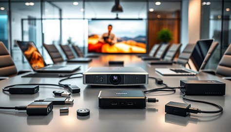
A professional wireless casting and adapter kit laid out on a sleek conference room table, surrounded by modern tech elements like laptops and projectors. In the foreground, detailed close-ups of various adapters, dongles, and a wireless receiver, highlighting their sleek designs and vibrant colors. In the middle ground, a high-quality projector casting a sharp image onto a large screen, while a stylish laptop displays a presentation seamlessly connecting via wireless technology. The background features glass walls and soft ambient lighting, creating a polished, corporate atmosphere. The image captures a sense of efficiency and innovation, ideal for enhancing team meetings. The scene is well-lit with natural light illuminating the workspace, evoking a mood of professionalism and collaboration.

Embracing Wireless Casting Alternatives

We live in a world where everyone uses different devices. Team members will want to share from tablets, phones, or secondary laptops in seconds. This is where wireless screen casting shines.

Tools like the ClickShare Hub allow participants to share with a single tap, simplifying hybrid meetings. Built-in standards like Miracast (for Windows/Android) and AirPlay (for Apple devices) also offer convenient, cable-free options.

The key is to choose a system that is intuitive for your users. A good wireless system reduces friction and keeps the meeting’s momentum going. It’s perfect for brainstorming sessions or quick reviews.

Feature Wired Connection (HDMI/USB-C) Wireless Casting (ClickShare/AirPlay)
Reliability Excellent – No signal drop Good – Depends on network health
Setup Speed Fast (once plugged in) Very Fast (often one-tap)
Video/Audio Quality Consistent, high-fidelity Very good, but can compress
Best For Keynote speeches, final client presentations Collaborative brainstorming, impromptu shares
Device Compatibility Requires correct port/adapter Works with many modern devices wirelessly

Building Your Universal Adapters Kit

“Prepare for everyone” is our mantra. The moment someone can’t connect is the moment your meeting stalls. Avoid this by assembling a small, powerful adapters kit.

This kit is your connectivity safety net. It should live permanently in your meeting room. Here’s what to include:

  • USB-C to HDMI: The modern essential for most new laptops.
  • USB-A to HDMI: For older laptops and peripherals.
  • Mini DisplayPort to HDMI: Covering specific business laptops.
  • VGA to HDMI (active adapter): The ultimate legacy lifesaver.
  • A multi-port USB-C hub: A powerhouse that adds HDMI, USB-A, and Ethernet.

With this kit, you’re not just supporting technology—you’re supporting people. It empowers every team member to contribute seamlessly, which is one of the key skills every coach needs for leading successful sessions, whether in sports or business.

By mastering both wired and wireless connections and being prepared with adapters, you ensure that your team’s focus stays on the content, not the cable. That’s how you build a truly reliable and inclusive meeting environment.

Audio: mic options, echo control, volume baselines

Ever been on a call where someone sounds like they’re in a tin can? Or you can’t tell who’s speaking? That’s the sound of a meeting breaking down. Perfect audio is the glue that holds a remote collaboration together. Let’s make sure everyone is heard crystal clearly.

Choosing the Right Microphone for Your Space

Your microphone choice depends on your room’s size and layout. For a small huddle room, a simple all-in-one soundbar is often perfect. It combines speakers and mics in one neat package.

In larger spaces, you need smarter technology. Beamforming microphone arrays, like the Yealink CM20, are game-changers. They act like a spotlight for sound, automatically focusing on the person who is talking. This cuts out background noise and makes every word sharp.

For boardrooms where a clean table is a must, ceiling microphones like the Yealink CM50 are ideal. They’re installed overhead, keeping cables and hardware out of sight while picking up voices from all seating positions.

Many modern devices also feature AI-powered noise cancellation. A product like the Yealink DeskVision A24 can distinguish between a human voice and other sounds—keyboard clacks, paper shuffles, air conditioning—and remove the distractions in real-time.

Echo makes conversations exhausting. It happens when sound from the speakers is picked up again by the microphones. The fix is part technology, part placement.

First, follow the one-foot rule: keep microphones at least a foot away from speakers. Second, consider your room’s surfaces. Hard walls, floors, and tables bounce sound around. Adding soft materials like carpets, curtains, or even acoustic panels can absorb those reflections dramatically.

Smart microphone placement is your secret weapon. Point directional mics towards people, not at blank walls or speaker outputs. For more advice on how room dimensions and furniture affect sound, check the official room planning guidance.

Setting a Smart Volume Baseline

You need a standard, comfortable volume level. It should be loud enough for remote participants to hear easily, but not so loud it blasts people in the room or causes distortion.

Here’s a simple way to set it: Have someone sit in the farthest seat from the speakers. Play a standard test tone or a familiar music track at a moderate volume on your conferencing system. Adjust the level until it’s clear and comfortable for that person. That’s your baseline. Mark that setting and try to keep all meetings there.

Remember, great audio is invisible. When it’s done right, no one compliments it—they just have a productive, frustration-free meeting. That’s the goal we’re helping you achieve.

Latency and Sync: clip testing, playback devices, codecs

Latency is that slight delay between audio and video. It can turn a professional presentation into a confusing mess. But, with a few simple checks, you can sync everything up and ensure your hybrid collaboration flows naturally.

Imagine watching a badly dubbed movie. When the words don’t match the mouth movements, your brain works overtime. In a business meeting, this distraction wastes time and reduces clarity. Let’s eliminate that problem together.

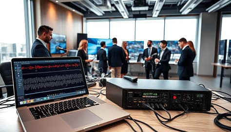
A professional workspace featuring a modern AV setup for latency and sync testing. In the foreground, an array of high-tech playback devices, including a laptop and a digital signal processor, prominently displaying waveforms and codec settings on their screens. The middle ground showcases a group of diverse individuals, dressed in smart business attire, engaged in meticulous testing, adjusting devices, and reviewing results. They are surrounded by an array of cables, microphones, and video screens displaying synchronized clips. In the background, a bright, tech-inspired office space with large windows allowing natural light to flood in, enhancing the atmosphere of focused collaboration. The image should evoke a sense of precision and reliability, emphasizing the importance of thorough testing in maintaining AV setup integrity.

Your Simple Clip Test for Perfect Sync

You don’t need expensive gear to check for latency. We recommend a quick “clip test.” Find a short video online with a sharp audio cue—like a hand clap, a drum hit, or a speaker clearly saying “pop.” Play this clip on your meeting room’s primary display through the usual system.

Watch and listen closely. Does the sound happen at the exact moment the visual action occurs? If you see the hands meet before you hear the clap, you have detectable latency. This test gives you a real-world benchmark for your system’s performance.

Playback Devices and Software Settings

Where you play the video from matters. A laptop connected via HDMI might perform differently than wireless casting from a tablet. Test using the same devices your team actually uses for presentations.

Check the audio output settings on your computer and conferencing software. Sometimes, the software selects a different audio device than your room’s sound system, creating a delay. Ensuring everything is routed through one primary system is a key step for sync.

Understanding Codecs: The Behind-the-Scenes Translators

Codecs are the essential software that compress and decompress video and audio signals. They’re like translators for your media. Different codecs (like H.264, VP9, or AV1) handle data at different speeds, which can affect latency.

For video conferencing, systems often use specialized codecs designed for low latency. If you’re experiencing consistent sync issues, check what codec your conferencing platform prefers. A reliable system will prioritize codecs that support seamless, real-time communication.

Modern conference room technology is built to support hybrid collaboration seamlessly. High-quality video conferencing relies on these proper codecs and a well-tuned system. A quick check here prevents the audio drops and visual delays that can derail an entire meeting.

By running this simple clip test and understanding your playback chain, you take control. You ensure your meetings feel natural, professional, and engaging. A little proactive testing saves everyone from a lot of distraction later.

Redundancy: offline copies, spare cables, printed boards

True meeting room mastery is not just about things working. It’s about being ready when they don’t. This is what redundancy is all about. It’s your tech safety net, always ready to keep your meeting smooth.

We’ll show you how to build a simple habit that makes you a tech master. Start with a small “oh-no” kit for your room. It’s not about fancy gear. It’s about simple backups that give you confidence.

  • Offline Copies: Keep a USB drive in the room with your important files. If the network goes down, you’re ready in seconds.
  • Spare Cables: Carry a pouch with must-have cables like HDMI and USB-C. Having spares means you can solve problems quickly.
  • Printed Boards: Have printed copies of agendas and diagrams. It’s old-school, but it helps if screens fail.

This approach matches the key criteria for choosing room tech: reliability. Regular checks and spares prevent small problems from becoming big ones. A well-run room means systems and backups work every time.

Creating this kit is like carrying an umbrella. You might not use it every day, but when you do, you’re really glad. This mindset means you’re always in charge of your meeting’s success. Let’s build that confidence together.

Run of Show: preflight checklist and roles

All your AV gear is set up and tested. Now, it’s time to coordinate the human element. Think of this as your meeting’s “Run of Show”. It’s the backstage work that makes everything run smoothly from start to finish.

This isn’t just about checking boxes. It’s about turning your room into a dynamic space. Here, technology and teamwork come together perfectly.

The Five-Minute Preflight Checklist

Every pilot does a preflight check before flying. Your meeting needs the same attention. We suggest a quick, five-minute check that anyone can do.

Here’s what to check:

  • Lights On: Make sure the room is well-lit for screens and comfort. Check for glare on displays.
  • System Booted: Confirm all AV equipment is on and showing the right input sources.
  • Mics Live: Do a quick sound check. Tap each microphone and listen for clear audio through the speakers.
  • Presentation Loaded: Open the main deck on the presentation computer. Check the first few slides to make sure they display right.
  • Connections Stable: Verify all wired connections are secure. Also, check that any wireless devices are paired and ready.

Tools like YAROOMS help with room booking and scheduling. But this hands-on checklist catches any last-minute issues.

Assign Clear Roles, Even in Small Teams

Who does what during the meeting? Confusion can cause awkward pauses and technical problems. Even with a small team, assigning clear roles helps everything run smoothly.

Consider these key positions:

Role Primary Responsibility Key Action
Presenter Deliver content and guide discussion Focus on engaging the audience, not operating slides
Tech Manager Handle all AV controls and troubleshooting Advance slides, adjust volume, manage shared screens
Chat Monitor Bridge communication with remote attendees Voice questions from the chat and share key points

You don’t need three people for these roles! One person can often handle both tech and chat duties. The key is that everyone knows their role before the meeting starts.

The Power of the Pre-Meeting Huddle

Gather your key players for a two-minute huddle before starting. This is your final sync-up.

Use this time to confirm the agenda order and highlight any special tech needs (like a video clip). Also, remind everyone of their roles. This brief huddle aligns your team’s mindset and answers any last-second questions.

Automating meeting controls, like setting presentation timers or pre-configuring screen layouts, adds to the seamless experience. But the human huddle ensures everyone is ready to adapt if needed.

When you combine a detailed preflight checklist with clear roles, your meeting becomes more than just a discussion. Your AV setup becomes a well-oiled machine, driving your team toward better collaboration and results.

Post‑Meeting: save annotations, version name, upload rules

The meeting ends, but your tech workflow shouldn’t! A proper post-meeting routine locks in the value of your collaboration. This final step turns a great discussion into actionable, lasting results.

First, save all important data. Did your team use a digital whiteboard like Miro or FigJam? Export those annotations. Capture chat logs from Slack or Microsoft Teams. Tools like Microsoft Teams Rooms offer live transcription you can save for reference. This step protects every idea shared.

Next, give your files a clear version name. A simple system like “ProjectAlpha_Review_2025-10-27” works wonders. This file management practice makes it easy for anyone to find the right document later. No more searching through “final_v2_new_reallyfinal” chaos!

Lastly, follow consistent upload rules. Move the saved files to a shared team folder on Google Drive, SharePoint, or your company’s cloud drive. Set a rule that everyone does this right after the meeting. It ensures information is accessible for future reference.

This post-meeting habit builds your team’s institutional memory. Brilliant ideas discussed won’t get lost. By closing the loop, you ensure your reliable AV setup contributes to lasting productivity long after everyone leaves the room.

Enhancing Sports Presentations with Video & Multimedia to Engage Every Athlete

Remember the last team meeting where you could hear a pin drop? Or worse, the frantic scrolling of phones as you detailed the next big play?

The classic chalk-talk or bullet-point slideshow is as exciting as a stale trophy case. We’ve all been there.

But the game has changed. Today’s athlete isn’t just a passive viewer. They’re an immersed participant and a content creator by nature. They expect a seamless, unified digital experience.

This isn’t about replacing your coaching genius. It’s about amplifying it. Think of this as moving your playbook from the static page to the IMAX screen.

We’re going to explore why dynamic content is essential. It’s the core tool for building culture, clarifying complex strategy, and forging emotional connections. These connections turn a group of players into a legacy.

It starts with a simple shift in understanding. Your athletes don’t just want the data. They need to be shown, immersed, and involved. Your presentation platform is now your most dynamic assistant coach.

Why Use Video in Team Meetings?

Video can bridge the gap between what you say and what your athletes understand. You can describe a defensive rotation until you’re blue in the face. Or, you can show a 10-second clip where it works perfectly. Which one sticks?

Traditional methods like printed playbooks and chalkboard diagrams have big limitations. They take up space, offer shallow information, and are expensive to maintain. It’s like trying to stream a 4K game through a dial-up modem. It just doesn’t work.

Digital storytelling changes the game. It has unlimited capacity and multimedia richness. It’s not just about watching film. It’s about creating a mental blueprint. A study on football training found that video-based practice improves play selection accuracy because it replicates in-game scenarios—something static diagrams fail miserably at.

This is cognitive priming in action. Showing a clip of a perfect pick-and-roll isn’t just instruction; it’s installing software in your players’ minds before game day.

Video analysis offers immediate feedback and helps teams identify and correct flaws quickly. More importantly, training with video “offers a play view close to that seen in a game scenario.” This directly improves decision-making perception. You’re not just talking about the game; you’re simulating the chaos and speed of the real thing.

This approach transforms criticism from a personal critique into a tactical discussion. Instead of saying, “You missed the assignment,” you can show the exact moment the coverage broke down, then immediately cut to a clip of it working. The focus shifts from the player to the play.

Aspect Traditional Recognition (Chalkboard, Print) Digital Video Storytelling
Information Depth Shallow, static, abstract. Limited by physical space. Deep, dynamic, concrete. Unlimited multimedia capacity.
Feedback Speed Slow. Corrections require redrawing or re-printing. Immediate. Pause, rewind, and annotate on the spot.
Cost & Maintenance High. Physical materials, printing, storage, updates. Low. Digital files are easily edited, duplicated, and shared.
Engagement & Retention Low. Relies on imagination and note-taking. High. Creates visceral, memorable mental blueprints.
Scenario Realism Poor. Cannot replicate game speed or perception. Excellent. Mirrors in-game visuals for better decision training.

So, isn’t the old film session enough? Not really. A standalone film review is passive. Integrating video directly into your presentation narrative—creating what we can call sports video slides—makes it active and central. It evolves from being a mere illustration to becoming the core argument of your meeting. It’s the difference between describing a symphony and letting your team hear it.

Types of Effective Multimedia Content (Highlights, Tutorials, Motivational Clips)

Think of your multimedia tools as special weapons, each for a specific goal. The lazy coach just plays a full game tape. But the smart one picks and chooses. Your multimedia presentations should be precise, not a random attack.

A dynamic multimedia presentation scene set in a modern conference room. In the foreground, a large screen displays a vibrant video montage featuring sports highlights, engaging tutorials, and motivational clips, showcasing athletes in action. In the middle, a diverse group of professional-looking individuals in business attire are attentively watching while taking notes; their expressions reflect enthusiasm and engagement. The background features sleek, contemporary decor with soft overhead lighting that casts a warm glow, enhancing the inviting atmosphere. The angle captures both the audience's reactions and the impressive visuals on the screen, conveying a sense of inspiration and collaboration in sports presentations. The overall mood is energetic and focused, urging the viewer to embrace multimedia in enhancing athletic performance.

Let’s look at the lineup. First, Highlights show what’s good and inspiring. It’s not just the winning shot. It’s also the perfect defensive move or the pass that led to a score.

Next, Tutorials are like detailed textbooks. Use software to highlight and explain the film. This turns watching into learning.

Then, Motivational Clips fuel your team’s spirit. Forget the cheesy speeches. Show a montage of hard work or a scene from Miracle that matches your team’s story. This touches hearts.

The secret is Behind-the-Scenes & Culture Clips. Show how a rookie is welcomed or a fun drill that went wrong. These moments show who you are, better than words. They can also highlight the small details that strengthen team identity, from rituals and locker-room moments to custom branded promotional merchandise that reinforces pride, unity, and a shared sense of belonging.

Don’t overlook photos. Photography Best Practices capture action and friendship. A single photo can be as powerful as a video.

Lastly, use Statistical Displays for the data lovers. Interactive boards or graphs make numbers tell a story. This convinces those who need to see it to believe.

Content Type Primary Purpose Key Features Real-World Example
Highlights Provide evidence & model excellence Short, focused on technique/hustle Clip of a perfect pick-and-roll from practice
Tutorials Build tactical IQ Annotated footage, direct coaching voiceover Screen recording breaking down defensive rotations
Motivational Clips Fuel emotional buy-in High-energy editing, powerful music/speech Montage of offseason grind set to a pump-up song
Behind-the-Scenes Build team culture & identity Candid, authentic, often unpolished Phone video of a team meal or inside joke
Data Visualization Persuade through analytics Clean graphs, interactive elements Chart showing shooting percentage improvement

Mixing these types makes your team meetings engaging. You’re not just showing videos; you’re creating multimedia presentations that hit home on many levels.

Embedding and Playing Videos in Common Software

The best highlight reel is useless if your software can’t handle it. In a dynamic coach meeting, nothing kills the vibe like buffering or “file not found” errors. Your software must let you play videos smoothly. Anything else is just amateur.

PowerPoint & Google Slides: The Old Guard Gets an Upgrade

PowerPoint and Google Slides are the veterans. They’ve been around for years and have learned a lot. The key is to avoid shaky web links during your presentation.

For PowerPoint, embed the video in the presentation itself. This makes it work on any device. Go to the Playback tab to set how the video plays. You can even make it loop. For more info, check out this guide on how to embed a video in.

Google Slides is cloud-based. Host your video on Google Drive and add it from there. It’s more reliable than a YouTube link. The goal is to make the video a key part of the slide.

Keynote: The Design-Conscious Choice

Keynote is like a sleek electric car. It’s all about design. Use its tools to make video a natural part of your slide, not a clunky rectangle. Its animations and transitions are smooth, making your content feel intentional.

Canva: The Disruptive Rookie

Canva is like the surprise star. It’s great for creating beautiful presentations. Embedding video is easy, and it blends well with text and graphics. It’s perfect for those who value looks and ease.

There’s a universal rule: test everything on the actual display system before the team walks in. Your tech check is essential. It keeps your meeting smooth and focused.

Tech Tips for Seamless Presentation

Your playbook is ready, and your sports video slides are set. But, a technical glitch can ruin everything. The right tech can make your presentation shine. Let’s get your tech ready for the big game.

First, check your hardware. A weak laptop can mess up your presentation. Make sure it can handle HD videos smoothly. Think of it as your quarterback.

Sound is also key. Don’t use weak laptop speakers for your videos. A portable Bluetooth speaker can make a big difference.

Next, choose the right file format. MP4 is the best for all platforms. Avoid formats like .MOV or .AVI. They might not work on presentation day.

Internet access is important. For videos you’ve downloaded, you’re good to go. But for live streams, you need a strong connection. Always have a backup plan for when Wi-Fi fails.

Control is essential. A wireless presentation clicker lets you move freely. It keeps your presentation smooth and engaging.

This is more than just avoiding problems. It’s about making your presentation run smoothly. A smooth show keeps everyone focused on your message.

Component The MVP (Most Valuable Player) The Benchwarmer (To Avoid)
Hardware Laptop with dedicated graphics; External Bluetooth speaker. 5-year-old budget laptop; Built-in laptop speakers for a large room.
File Format MP4 (H.264 codec) – Universally compatible. .MOV, .AVI, or rare codecs that require special players.
Connection Wired Ethernet for streaming; Downloaded local files as backup. Relying on public or overloaded Wi-Fi with no Plan B.
Control Wireless presentation clicker with laser pointer. Mousing over the laptop or using the arrow keys.

Mastering these tech tips ensures your presentation runs smoothly. It’s ready for any setting, from the team room to online. Now, it’s time to run your tech rehearsal.

Best Free Video Resources

Smart coaches and presenters don’t need a big budget. They know where to find free, high-quality resources. A great multimedia presentation shows you’re smart, not rich.

You need tools for editing, screen recording, finding b-roll and audio, and adding graphics. Learn these skills and your videos will look amazing without costing anything.

First, editing and clipping. Forget about iMovie. For top-notch editing, DaVinci Resolve is the best. It’s like finding a Ferrari ready to go.

For quick edits, use Kapwing or Clideo. They’re easy to use and don’t require downloads.

To record your screen, try OBS Studio. It’s free and used by pros. Or, use your computer’s built-in tools for a simple fix.

For mood and story, use stock footage and music. Pexels and Pixabay have lots of free videos and music. They help make your presentations feel like movies.

For graphics and text, Canva’s free version is great. It helps you make animated titles and more. It makes your presentations look professional.

The key is to use these tools well. They add polish and story to your videos. Your audience will notice, even if you spent nothing.

FAQ

The path to dynamic coach meetings is filled with good intentions and excuses. It’s time for a reality check. Let’s look at the four main mental blocks coaches face.

The Old Excuse The New Reality The Core Principle
“This takes too much time to prepare.” Strategic clipping saves more time than it costs. One key play is a start. Efficiency through precision.
“My athletes won’t pay attention.” A 2-minute targeted video replaces 10 minutes of lecture. Potency beats duration. Earned engagement.
“The tech is too complicated.” Complexity is a choice. Start with embedding in Slides, not editing a masterpiece. Progress over perfection.
“They’ll just tune out and watch.” Video is a discussion catalyst, not a movie. Pause it. Ask “What did you see?” Active analysis.

A modern office setting showcasing a dynamic coach meeting in a sports context. In the foreground, a diverse group of three professional coaches, dressed in athletic wear, engaged in an interactive discussion over a digital tablet displaying multimedia presentations. In the middle ground, a whiteboard filled with colorful diagrams and notes about athlete engagement strategies. The background features large windows letting in natural light, illuminating the space with a bright, motivational atmosphere. The use of a wide-angle lens captures an inviting and collaborative mood, making the scene feel lively and professional. The overall color palette includes energetic blues and greens, reflecting the vibrancy of the sports world.

“This takes too much time to prepare.” Does winning take time? The answer is simple. Start small. Clip one key play from practice. Let a tech-savvy assistant or captain help. The 10 minutes you spend preparing now saves an hour of confusion later.

“My athletes won’t pay attention to a longer presentation.” But you’re not making it longer. You’re making it sharper. A two-minute highlight of a mistake is more effective than a long talk. You earn their attention with relevance and multimedia.

“The tech is too complicated for me.” This is the 21st century. Your phone is more powerful than the computer that sent Apollo 11 to the moon. Start simple. Master embedding a YouTube clip in Google Slides before you dive into complex editing. The goal is to communicate better, not to make a film.

“Won’t they just tune out and watch the video?” Only if you let them. The video is just the start. Pause it and ask questions. “What was the spacing here?” “Why did this pass work?” Make them the analysts. This turns passive viewing into active learning, the heart of a dynamic coach meeting.

Conclusion

Let’s cut through the pixelated noise. This was never about hitting ‘play.’ It’s about pressing ‘record’ on a legacy.

Those highlight reels you stitch together are your team’s living memoir. They’re the proof of sweat turning into story. Your mission is to create experiences that inspire and preserve athletic legacy.

Think of yourself as a director, not just a coach. Your film set is the locker room. Your audience is a squad waiting to see their hero’s journey. This is how you build loyalty and set new standards.

So, are you a distributor of information or a curator of culture? The right highlight reels answer that question before it’s even asked. They provide the storytelling that builds emotional connection.

The final buzzer on boring presentations has sounded. Your clicker is your new whistle. Command the room.

The Ultimate Resource Library: Icons, Graphs, and Backgrounds for Presentations

Let’s be honest. Most presentations are as exciting as a spreadsheet read aloud. They’re like watching paint dry in the business world.

But what if you had a secret weapon? Imagine having a collection of graphics that makes your data shine and your ideas stand out. It’s not about old clip art. It’s about top-notch visuals that grab your audience’s attention.

Think of it as a Swiss Army knife for today’s communicators. Need to explain a complex strategy? Sports visuals for coaches can make it exciting. Want to impress clients? A set of sports icon packs can boost your credibility.

The power of good visuals is undeniable. Sites like the Noun Project have nearly 10 million icons and photos. Adobe and Canva use them. SlideTeam even offers PowerPoint templates that cut through jargon.

This is your guide to finding the perfect image. The right picture can make all the difference. Let’s find the one that will make you stand out.

The Impact of Quality Visuals

Our brains love visuals. It’s not just a preference; it’s how our brains work. We understand images 60,000 times faster than text. This makes a good graph a quick and strong argument. Research in cognitive science also explains why our brains love visuals — visual information is processed rapidly and helps people absorb complex ideas more efficiently than text-heavy content.

Think about this when you’re talking to a skeptical person. Dozens of bullet points on a slide? That’s overwhelming. But one clear, insightful presentation graph? That’s a strong point.

It’s not just theory. Sites like SlideTeam show how icons can make complex charts easy to understand. Sales teams use them to show pipeline forecasts clearly. HR managers use them to make onboarding simple.

Quality visuals don’t just add to information; they are the information. They are quick ways to understand complex ideas.

Also, authentic visuals matter. Have you seen presentations with generic stock photos? Noun Project offers real, diverse visuals. This makes your message more believable and relatable.

In short, a great visual does three things. It builds instant credibility. A well-made chart shows you’re prepared and know your stuff. It supercharges engagement. It keeps people interested and not checking their phones. And it bridges communication gaps, making data easy for everyone to get.

So, when making a presentation, ask yourself: am I just showing data, or am I telling a story? The right presentation graphs and icons are your best helpers. They add the visual impact that makes your message unforgettable.

Having a strong library of icons, graphs, and backgrounds is powerful, but knowing how to apply them strategically is what truly elevates a presentation. Learning how to use impactful visuals in coach presentations ensures your design choices reinforce clarity rather than distract from your message.

Overview: What’s in a Good Resource Library?

What makes a top-notch library stand out? It’s the difference between a messy drawer and a well-organized toolkit. A good library is all about quality, not just how many things it has.

Imagine a chef with only one knife. Or a graphic designer with no good clipart. A great library helps you tell your story better. It turns random data into a compelling narrative.

A vibrant and dynamic sports-themed background, showcasing a seamless blend of various sports elements like a basketball, soccer ball, football, and tennis rackets arranged artistically. The foreground features a subtle gradient that hints at the energetic spirit of sports. In the middle ground, abstract shapes and patterns inspired by sports movements and fields create a sense of motion, while evoking excitement and engagement. The background fades into a lighter hue, providing a bright and welcoming atmosphere. Soft, diffused lighting enhances the colors, creating a lively yet professional look, suitable for resource library illustrations. The scene captures the essence of teamwork and competition, contributing to an inspiring ambiance ideal for presentations.

  • Volume and Variety: Having a huge collection, like Noun Project’s 10-million icons, means you’ll never run out of ideas. Need a soccer ball icon for a kids’ presentation? Got it. Or abstract backgrounds for a corporate event? You’re covered. This variety includes free sports backgrounds that look professional.
  • Relevance and Representation: Does your library show the real world or just idealized images? Good resources have visuals that match your audience. They show diverse athletes and various sports. It makes your story feel real and relatable.
  • Design Consistency: Can you find icons that match perfectly? A mismatched slide deck looks amateur. Libraries with consistent icon families ensure your presentation looks polished from start to finish.
  • Legal Clarity: Are the rights clear and free from worries? This isn’t just about the fine print; it’s about avoiding legal trouble. Trusted libraries offer easy-to-understand usage rights, so you can focus on your message.
  • Ethical Foundation: Who benefits from your library? A library that supports its artists, like Noun Project, is a good choice. It’s a fair model that rewards creativity, not just exploitation. Your choice supports quality and fairness.

With these five pillars, your library becomes a valuable asset. It’s not just a cost; it’s an investment in every presentation you make. You’re not just downloading files; you’re building a visual language.

Icon Sets for Different Sports

Using generic sports icons in presentations is like showing up to the Super Bowl in sweatpants. It might get the point across, but you’ve lost all authority before the first whistle. For coaches, league administrators, or brands, your visual language needs to be as precise and professional as the play you’re calling.

A youth soccer coordinator mapping out field layouts needs more than a clip-art ball. A brand sponsoring a marathon requires icons that capture motion and energy. Using a one-size-fits-all graphic is a strategic blunder. It tells your audience you didn’t do the homework.

The secret weapon? Curated sports icon packs. We’re talking about dedicated visual rosters where every icon shares the same stylistic DNA—the same line weight, color palette, and perspective. This cohesion turns a scattered group of images into a unified team.

This is where modern resource libraries change the game. Platforms like Noun Project use AI-enhanced search to sift through thousands of styles. You can find a matched set for pickleball, parkour, or Paralympic sports faster than a fastbreak. The best part? You download them as ready-to-use PNGs or, as editable SVG files.

Why does the SVG format matter? It means every icon is a scalable vector. You can recolor that football helmet to match your team’s branding. You can isolate the swimmer’s stroke to highlight a specific technique. This level of customization transforms generic assets into a bespoke visual playbook.

Having a full suite of these editable assets is a legitimate game-changer. It turns complex explanations into intuitive diagrams. It elevates a simple schedule into a compelling narrative. Don’t just tell your audience about the strategy. Show them.

Editable Graphs and Stats Slides

Let’s face it: dumping a spreadsheet into a slide is not a good idea. It’s like holding your audience hostage. Numbers alone are hard to understand. A bad chart can even mislead people.

Your goal is to tell a story with your data. To do that, you need the right tools.

Enter the world of fully editable presentation graphs and stats slides. These are not just images from old reports. Sites like SlideTeam offer professional templates. You add your numbers and brand.

This makes a big difference. Instead of just showing sales figures, you can present a clear growth story with a bar chart.

The magic lies in being able to edit everything. Want to show your team’s performance over time? Don’t struggle with Excel. Use a customizable graph instead.

Change the colors to fit your team’s style. Add your data. These tools are flexible, in formats like PPTx, PNG, and EPS.

This turns a static image into a dynamic tool. It makes complex data easy to understand. You’re not just sharing facts; you’re telling a story.

Think of it as having a graphic design partner for your data. You focus on the insights and story. The template handles the visuals and polish.

The result? Presentation graphs that engage and persuade. They don’t just sit on a slide; they work to convince and impress.

Customizable Backgrounds

A presentation background is like a movie score. It should be noticed only when it’s perfect. A good background is like a silent partner, setting the stage for your data.

But, a bad background can ruin everything. Imagine a corporate meeting in a neon-lit arcade. It’s a total mismatch that distracts from your message.

On the other hand, a great background creates an environment. For sports presentations, it’s about building a world that feels real. Think of a subtle gym flooring texture or a blurred action shot from a game.

Even a simple gradient in your team’s colors can reinforce your brand. The goal is to set the mood, not just decorate.

Customizable assets are where the magic happens. A static image is limited. But a customizable background is a starting point.

The best free sports backgrounds from quality libraries give you a solid base. You can adjust the opacity, add a logo, or crop images to highlight key stats. You’re in control.

Resources like Noun Project offer high-resolution, royalty-free photos. They provide the visual texture you need. SlideTeam offers professionally designed templates with backgrounds already integrated.

Why use these free sports backgrounds? They make good design accessible to everyone. You’re not just filling space; you’re curating an experience.

A well-chosen background guides the audience’s eye and communicates your brand’s energy. It ties your deck together, making your content shine like a lead actor.

So, don’t settle for default templates. Use these resources to create a stunning stage for your content. Your content is the star. Give it a set that deserves applause.

Where to Find the Best Free/Paid Resources

Finding sports visuals for coaches online can be tricky. It’s like avoiding a minefield. The wrong click can ruin your presentation with too much clipart. The internet is full of bad stock images and old collections. Let me help you find your way.

The Noun Project is a top choice for icons and photos. It’s like a treasure trove of images. You can get free images with a small credit, or pay for commercial use. It’s perfect for those who want quality and variety. These visuals can also be adapted for branding materials beyond presentations, including custom branded promotional merchandise, helping teams and organizations maintain a consistent visual identity across slides, marketing materials, and fan engagement campaigns.

A dynamic sports coaching scene showcasing a diverse group of coaches analyzing game statistics on digital devices. In the foreground, there are two coaches, one in a blue polo and khaki pants, the other in a black jacket and grey slacks, deeply focused on their tablets displaying graphs and icons. The middle layers feature a large digital screen on a wall with vibrant sports visuals, including charts and player statistics. The background has a well-lit gym environment with basketball hoops and a whiteboard filled with strategic play diagrams. The atmosphere is energized and collaborative, with soft overhead lighting highlighting the activity. Capture the scene from a slightly elevated angle, emphasizing the teamwork and intensity in the coaches’ expressions.

Need more than just images? SlideTeam is your go-to. It’s like having a custom-made presentation. They offer templates for sports coaches and managers. People love how it saves them time.

Choosing between free and paid resources depends on your needs. Free stuff is great for ideas and quick tests. But always check the license. That “free” image might have hidden costs.

Paid resources are worth it for important presentations. Use free resources for ideas, then buy professional templates for your final presentation. This way, you get the best of both worlds.

Your resource library should help you, not the other way around. It’s not about spending money. It’s about saving your time and focus.

Tips for Mixing and Matching Visuals

Mixing different visuals in a presentation is like trying to put together a fantasy sports team. It’s chaotic if the players don’t work together. The goal is to communicate clearly, not just look good.

A design playbook can help. It’s about creating a visual strategy that makes your data and points clear.

Start with colors and style. Choose two or three main colors and some neutrals like gray or white. Use these colors for all your visuals. This makes things easier for your viewers.

Next, pick a style for your visuals. Are you going for modern, realistic, or playful? Using a single sports icon pack helps a lot. Sites like Noun Project offer sets that match, so your visuals speak the same language.

Here’s a five-point checklist for visual harmony:

  • Color Command: Choose your colors early and use them everywhere.
  • Stylistic Fidelity: Stick to one style, like flat or realistic. A sports icon pack helps a lot here.
  • Hierarchy is Everything: Make your main point big and bold. Use icons for secondary points. Guide the viewer’s eye.
  • Embrace the Breather: Use whitespace to make things clear. Don’t fill every pixel. Let important visuals stand out.
  • The Five-Second Test: If someone can’t get your slide in five seconds, change it. Clarity is key.

Companies like SlideTeam focus on cohesion. Their slides work because everything is designed together. You can do the same.

Think of it as dressing your presentation for success. You wouldn’t wear cleats to a meeting. Choose your visuals carefully to avoid clashes. A unified set of resources makes your presentation smooth. Your audience will appreciate it.

FAQ

Got questions after this deep dive? Let’s clear up the ones that stick like a bad transition.

What exactly are “Resources Icons”? They’re like a visual language for abstract ideas. They turn concepts like strategy into sleek symbols—gears, globes, flowcharts. They tell your story silently.

Can I really customize them? Yes, in quality, editable templates. Every detail can be changed. A good template is like clay, not concrete.

What’s the most common visual mistake? Using too many styles that clash. It’s like wearing plaid with stripes. Keeping your visuals consistent is key.

Are free resources safe for my company’s deck? Always check the license. Some are only for personal use. Sites like Noun Project are clear about commercial use. Always verify.

Where’s the best place to start building this system? Begin with a key presentation. Choose a template that fits its main goal—a SlideTeam sports management deck, for example. Use it as a guide. The aim is to build a library of visuals you can reuse.

Visual Aids that Work: Slides, Diagrams, and Clips for Coaches and Managers

Explaining a complex playbook or quarterly data can be tough. You have important info, but if your team doesn’t get it, your plan fails.

Cognitive science has a solution. The Dual Coding Theory says people learn better with words and pictures. Studies show this method can improve understanding by up to 400%.

Also, people remember about 65% of information shown with visuals. This is way more than the 10% they remember without visuals. It’s not just about looks; it’s about making your message last.

For sports and business leaders, three tools are key: good slides, clear diagrams, and powerful video clips. They turn hard stats and complex systems into clear, memorable insights.

Learning to use these tools turns a basic briefing into a strong coaching moment. It’s how you make raw data into something your players or stakeholders can act on.

Design principles: contrast, alignment, repetition, proximity; sports color palettes and fonts

Good sports visual aids rely on clear contrast, smart alignment, consistent repetition, and logical proximity. These four core design principles, known as CRAP, make slides powerful coaching tools. They help athletes focus on what’s important.

Let’s explore each principle with examples from sports.

Contrast makes differences clear. It’s used to highlight a player’s route or a defensive gap. High contrast colors, like white on dark blue, are easy to read from afar. Always check contrast ratios for accessibility.

Alignment brings order. When player icons are on a grid, your diagram looks professional. Every element should connect visually. This prevents slides from looking messy.

Repetition creates consistency. Use your team’s colors, logos, and fonts in all presentations. This repetition strengthens your brand and makes materials easy to recognize.

Proximity groups related items. Place a statistic next to the player it describes. This rule makes your slide clear and easy to follow.

Choosing the right color palettes is next. Start with your team colors and build a palette for clarity. Use color theory: complementary colors make elements pop, while analogous colors create harmony.

About 8% of men have color vision deficiency. Avoid bad color combinations like red-green or blue-purple for important info. Use texture or labels as a backup. A consistent color scheme is key to making sports data memorable.

Font selection is about visibility and tone. Stick to one or two bold, sans-serif typefaces. Sans-serif fonts, like Arial or Helvetica, are easy to read on screens. Avoid thin, script, or overly decorative fonts.

Use font size to create hierarchy. Your main play title should be largest. Supporting points should be smaller. This visual guide directs attention smoothly.

Design Principle Primary Goal Sports Application Example
Contrast Create visual distinction and highlight importance Using bright yellow to mark a receiver’s path on a dark green field template
Alignment Establish order and a professional structure Lining up all defensive player icons along a shared baseline on a court diagram
Repetition Build consistency and reinforce branding Using the same team logo, color strip, and font on every slide in a playbook
Proximity Group related information logically Placing a player’s season stats directly beneath their photo in a recruitment presentation

Using these design principles as a system is essential. They work together. Good alignment enhances proximity. Strong contrast benefits from strategic repetition. Mastering these basics makes your sports presentations authoritative. Players and staff will trust the information because it looks clean and intentional.

Your visual aids should explain, not confuse. A solid design foundation ensures they do exactly that. Now you’re ready to build specific diagrams and clips with confidence.

Diagrams: court/field templates, spacing indicators, icon sets; when to animate vs static

Tactical diagrams are key in sports strategy, linking ideas to action. Studies show diagrams can boost understanding by 89% over text alone. For coaches, a clear play diagram is essential for teaching.

It turns complex ideas into simple, visual instructions players grasp right away. This section will guide you in creating better visual playbooks.

Begin with accurate court and field templates. These are the base for your tactical diagrams. You can find templates online or make your own in software like PowerPoint or Canva.

Make sure the proportions match your sport. A basketball court template should include the three-point line and key accurately. A football field needs correct hash marks.

Using a standard template helps everyone see the same strategy. It prevents confusion before you draw the first line.

Next, add spacing indicators and icon sets to show player positions and movement. Spacing indicators are lines, arrows, or shaded zones that highlight key distances between players.

For example, a dashed circle can show a defender’s needed distance. Icon sets use standardized symbols for players, balls, and equipment.

Consistency is key. Always use a triangle for a quarterback and a circle for a wide receiver. This creates a universal visual shorthand your team learns quickly.

Choosing between static and animated play diagrams is a big decision. Static diagrams are great for reference materials, like printed playbooks or pre-game handouts.

They are perfect for showing a final formation or a snapshot of a critical moment. Static diagrams are simple, quick to make, and easy to share.

Choose animation for showing timing, sequence, and flow. An animated diagram can illustrate a player’s cutting route, the pass progression, or a defensive rotation.

Tools like PowerPoint’s Morph transition can make a play diagram come alive with smooth movement. Animation is powerful for explaining dynamic plays where “when” is as important as “where.”

Use the following table as a guide to decide between static and animated visuals for your coaching needs.

Factor Static Diagram Animated Diagram
Best Use Case Reference sheets, printed playbooks, quick reminders Demonstrating timing, sequence, and player movement flow
Creation Speed Fast and simple to produce Requires more time and technical skill
Player Comprehension Excellent for memorizing formations and positions Superior for understanding dynamic plays and reactions
Delivery Format PDF, printed paper, static slide Digital presentation, video file, interactive screen
Key Advantage Clarity and simplicity for a single moment Shows cause, effect, and progression over time

Remember, the goal is always clear communication. A complex animated sequence can sometimes confuse more than it clarifies. If a static diagram with clear icons and spacing indicators does the job, use it.

For illustrating a multi-phase play where movement is everything, animation is your best tool. SmartArt and other diagram tools in presentation software help visualize complex concepts without overwhelming your audience.

Build your library of templates, icons, and indicators. Your play diagrams will become more effective and efficient to create. This saves you time and makes your team smarter.

Video: clip length, slow‑mo, telestration layers, captioning best practices

Mastering video analysis is more about using best practices than fancy equipment. Video is key for breaking down technique and connecting with your team. You need a clear plan for length, playback, annotation, and clarity.

Keep Clips Short and Purposeful

Attention spans are short, even during intense film sessions. Experts say keep instructional videos under 90 seconds. This keeps focus sharp and ensures your main point is clear.

Show only the necessary clip. For example, if analyzing a three-second decision, don’t play the whole 30 seconds. Tell your audience the video length and use it effectively in your talk. This saves time and makes your message stronger.

A dynamic scene depicting a digital telestration in action. In the foreground, a sleek tablet screen shows layered annotations illustrating the movement of a sports player in slow motion, highlighted by vibrant colors that contrast with the dark screen. In the middle ground, a professional coach stands intently analyzing the screen, wearing smart casual attire, surrounded by detailed charts and diagrams on a large monitor behind them. The background features a well-lit office space, subtly decorated and conveying a productive atmosphere. The lighting is bright yet soft, creating a focused ambiance. The perspective is slightly angled, enhancing the sense of engagement and interaction with the digital tools at hand while maintaining a clean and professional look without any text or distractions.

Slow-motion is great for technical analysis, but use it wisely. Use it for moments that are hard to see at full speed. Showing the play at full speed first helps set context, then slow-mo for the key moment.

Harness the Power of Telestration

Telestration makes video analysis interactive. It lets you draw on video frames to highlight important points. Modern software allows you to draw on a transparent layer, keeping your original footage safe.

You can use layers for different elements like highlighting defenders or offensive routes. This keeps the screen clear and lets you focus on what’s important. A good telestration tool is essential for real-time coaching.

Captioning for Universal Clarity

Never assume everyone will hear the audio clearly. Gyms are loud, and headphones aren’t always available. Clear captions ensure your analysis is understood everywhere. Use a large, legible font and keep captions short and accurate.

By using short clips, strategic slow-mo, dynamic telestration layers, and clear captions, you turn raw footage into a compelling coaching story. For coaches, exploring the latest broadcast tech innovations at IBC can reveal new tools to simplify the process.

Demo tools: PowerPoint morph, Keynote Magic Move, Canva brand kit, Google Slides; Hudl/KlipDraw/Coach Paint overlays

Let’s dive into the world of software, comparing everyday tools with special overlays used by top teams. Your toolkit has two main parts: general design tools for telling your story and sport-specific tools for deep analysis. Knowing both helps you smoothly move from studying film to discussing strategy with your team.

For making your main presentation, you’ll use tools like PowerPoint, Keynote, Canva, and Google Slides. They have advanced features that make showing play progressions easy. Microsoft PowerPoint’s Morph transition is a big help. It smoothly changes objects, text, and shapes between slides.

Apple Keynote has a similar feature called Magic Move. It automatically makes animations between slides where objects have the same name. This is great for showing how players move or a defensive shift changes. Canva’s Brand Kit is also key. It saves your team’s colors, logos, and fonts. Then, you can easily keep every slide and graphic consistent.

Remember, good design is key, no matter the platform. Use the 5-5-5 rule: no more than five words per line, five lines per slide, and five text-heavy slides in a row. Animations should reveal information or show motion, not just for fun. Always choose big, easy-to-read fonts so everyone can see.

Platform Standout Feature Best For Collaboration
Microsoft PowerPoint Morph Transition Detailed, stepwise play animation Excellent (via 365)
Apple Keynote Magic Move Smooth object-based animations Good (iCloud)
Canva Brand Kit Maintaining visual consistency quickly Strong real-time editing
Google Slides Simplicity & Access Quick edits and universal sharing Superior real-time collaboration

The second part of your toolkit includes special software like Hudl, KlipDraw, and Coach Paint. These tools are for the film room. They let you draw on game footage. You can make dynamic overlays that show:

  • Precise player pathways and spacing.
  • Defensive coverage shells and rotations.
  • Annotated frames with arrows, highlights, and text.

With KlipDraw or Coach Paint, you can create professional drill diagrams or add them to a video. Then, you can add this analysis to your main presentation. Export a clear, annotated video or a static diagram. Embed it in your PowerPoint or Keynote slide. This connects the tactical concept in your slideshow with real-game evidence from your film.

This mix—using Canva for branded slides, PowerPoint for animations, and Hudl for detailed annotation—makes a strong coaching presentation. It turns raw game footage into a compelling strategic story for your team.

Hardware: clickers, timers, laser vs on‑screen cursors; HDMI/USB‑C adapters checklist

Even the best visual aids can fail if the tools to show them don’t work. This part is about the physical tools needed to present your ideas. We’ll talk about the key equipment that helps you control your presentation.

Good hardware lets you focus on your message and your athletes. It keeps technical issues from ruining your session.

A well-organized coaching presentation hardware checklist displayed on a modern conference table. In the foreground, neatly arranged items include a wireless clicker, digital timer, HDMI and USB-C adapters, and a sleek laser pointer. The middle section features an open laptop with a presentation slide visible, surrounded by color-coded sticky notes and a cup of coffee to create a productive atmosphere. In the background, soft-focus elements like a whiteboard with inspirational diagrams and a bright window streaming natural light enhance the setting. The lighting is warm and inviting, with an emphasis on clarity to highlight each item. The overall mood is professional and focused, perfect for a coaching or managerial context.

Handheld presentation clickers give you freedom. You can move around while advancing slides. This keeps your audience engaged more than being stuck to a laptop.

Built-in software timers are useful for explaining drills. But, a dedicated physical timer is often more reliable. It works on its own, not tied to your slides.

For sessions that need to be on time, use both. Have a backup timer on a separate device. This is a smart backup plan.

Highlighting Key Points: Pointer Options

Choosing how to highlight on-screen is important. You have two main options: the traditional laser pointer or your mouse’s on-screen cursor.

Each method has its own benefits for different coaching situations. The table below shows the pros and cons to help you decide.

Feature Laser Pointer On-Screen Cursor
Precision & Visibility Excellent for large screens and rooms. Creates a bright, visible dot. Can be precise but may be hard to see from a distance. Requires a steady hand.
Presenter Mobility Allows full room movement. You are not tied to the computer. Typically requires you to stay near the laptop to use the touchpad or mouse.
Ease of Use Simple point-and-click. No software setup needed. Integrated into your computer. No extra device to carry or lose battery.
Best For Large team meetings, gymnasiums, pointing at physical objects on a screen. Smaller meetings, detailed software demonstrations (like drawing plays in Hudl).

The Non-Negotiable Adapter Checklist

The most common presentation problem is a connection issue. You can’t assume the venue’s projector will match your laptop. Always carry your own adapter kit.

Practice connecting your own gear before the session. A quick test can prevent a major delay.

Pre-Presentation Connectivity Checklist:

  • HDMI Adapter: The current standard for high-definition video and audio.
  • USB-C to HDMI/VGA: Essential for modern MacBooks and many Windows laptops.
  • Legacy VGA Adapter: Often found in older projectors and school facilities.
  • Extension Cable: A 6-foot HDMI or VGA cable provides extra reach.
  • Power Strip & Charger: Make sure your laptop and clicker are fully charged.
  • Backup Plan: Have your presentation saved on a USB drive and accessible via cloud storage.

Go through this list before every meeting. When using video analysis tools like Hudl, check if your laptop can output the video feed smoothly through the adapter.

Great coaching communication needs smooth execution. Your hardware choices make this possible. Invest in reliable tools, check them before, and always have a backup plan.

Slide library setup and tagging

Your final step is building a legacy system. A well-organized slide library saves time. It also reinforces your coaching message every season.

Start by creating a centralized, cloud-accessible folder. This becomes your single source for every diagram, video clip, and statistic. Use a consistent naming convention for files.

Implement a logical tagging system. Tags like “4-3 Defense,” “Out-of-Bounds Plays,” or “2024 Season” let you find assets instantly. This is key for diagrams created in tools like Coach Paint.

Integrate all your visual assets into this system. Whether you use Coach Paint for detailed play diagrams or another tool, including the latest CAD design tools, store the final versions here. Consistent tagging ensures nothing gets lost.

This workflow guarantees version control. You always present the latest play design. It also maintains visual consistency across all team meetings and recruit presentations.

A disciplined library turns your hard work into a reusable asset. You stop recreating slides and start refining your game plan instead.

Know Your Room: Players, Parents, and Stakeholders—Different Decks, Same Goal

Every successful communication strategy has one key rule. You must know who you’re talking to. Treating everyone the same is a big mistake, even in complex places like youth sports.

Picture a critical business meeting. Unexpected stakeholders show up late. This could mean they’re ready to support, oppose, or negotiate. The smart thing to do? Don’t just stick to your plan.

Instead, reach out to them first. Learn about their views and influence before you start. This is true for working with players, parents, and board members.

Good audience analysis is more than just a formality. It’s a constant effort to gather information. Your aim is to make sure your message hits home and moves everyone towards a shared goal.

Personas: Player (18–25), Youth Parent, Athletic Director/Board, Sponsor/Booster

Understanding the four main groups in youth sports is key. Just like the educator’s card game, your meeting works best when you know each group’s needs. Each brings their own views, problems, and goals.

Creating these personas is your first step. It makes sure your message hits home and everyone works together.

The Player (Aged 18-25)

This group lives two lives. They focus on sports and also grow as young adults. They deal with school, work, and personal growth.

They want to be seen by scouts and improve their game. They also care about being part of a good team. Their main worries are playing time, coaching, and how sports affect their future.

Talking to players should be clear, lively, and respect their time. They want to know the program’s direction and their role in it.

The Youth Parent

For youth parents, the game is about their child’s safety and happiness. They worry about safety, cost, and value.

They look for a well-rounded experience for their child. They want character growth, fun, and support. They manage schedules and finances.

Their biggest fears are bad coaching, injuries, and money issues. Talking to parents should be reassuring, informative, and focus on the child.

The Athletic Director or Board Member

This group faces a lot of pressure. They manage budgets, facilities, and the school’s image. They see the big picture, focusing on keeping the program going and managing risks.

They aim for financial health, success in sports, and good community standing. They balance resources with results. Their main concerns are avoiding lawsuits, keeping students enrolled, and keeping sponsors.

When talking to ADs and board members, use facts and figures. Emphasize the benefits, like saving money and building a strong reputation.

The Sponsor or Booster

Sponsors look for a good deal. They invest and expect something in return. It’s a partnership, not just charity.

They want their brand to be seen in a positive light. They seek networking chances and marketing benefits. They want their logo seen by families.

They ask, “What’s in it for me?” Talk about how their support helps their business, like reaching new customers and building goodwill.

Persona Primary Goal Key Concern Communication Priority
Player (18-25) Athletic development & future opportunity Playing time, coaching quality, visibility Direct, transparent, and empowering
Youth Parent Child’s safety, growth, and enjoyment Cost, safety, and positive environment Reassuring, informative, and child-focused
Athletic Director/Board Program sustainability and institutional success Budget, liability, and reputation Data-driven, strategic, and risk-aware
Sponsor/Booster ROI and community brand alignment Exposure, network access, clear value Benefit-oriented, professional, and partnership-focused

Knowing these four personas is not just for fun. It’s the key to making messages stick, building trust, and working together. When you talk to what each group values, you turn different people into a united team.

Information needs and fears per group; language and tone shifts

A player, a parent, a board member, and a sponsor meet. Your success depends on speaking their language. Everyone wants the program to thrive, but their questions and fears differ greatly. You must understand these needs and fears and adjust your tone.

Imagine a CFO, an operations VP, and a procurement officer. They all have different needs. So do your athletic stakeholders. By understanding their views, you can connect with them. For more on this, check out our guide on understanding your audience and connecting with players, parents, and.

The Player (18-25): Aspiration and Anxiety

Young athletes dream of growth and opportunities. They want clear feedback on their performance and a path to success. They’re interested in drills, schedules, and how to get more playing time.

But they also fear stagnation, injury, or not being good enough. This fear can make it hard for them to listen to anything else.

Language & Tone Shift: Speak to their dreams and ambitions. Use direct and motivational language. Avoid jargon and focus on gaining a competitive edge. Your tone should be energetic and supportive, seeing challenges as chances to grow.

The Youth Parent: Transparency and Trust

At a parent meeting, parents want honesty above all. They need details on costs, safety, and fair play. They’re investing in your program with their time, money, and child’s well-being.

They fear hidden fees, unfair coaching, or their child being overlooked or hurt. They need to know the program is safe and caring.

Language & Tone Shift: Be reassuring, detailed, and empathetic. Give specifics and avoid legal terms. Talk about security and value. Saying “here is our safety plan” builds trust better than vague promises.

The Athletic Director or Board Member: Compliance and Metrics

Administrators focus on strategy. They need data on enrollment, budget, liability, and outcomes. They must justify the program to superiors or a board.

They fear budget cuts, legal issues, poor performance, or community backlash. A mistake could cost funding or their job.

Language & Tone Shift: Use a strategic, data-driven, and formal tone. Lead with KPIs. Talk about ROI, risk, and compliance. Show the numbers behind your passion.

The Sponsor or Booster: Engagement and Value

Sponsors seek a return on their investment. They want metrics on audience engagement, brand visibility, and goodwill. They want to see how their money brings value.

They fear being linked to controversy or ignored. They worry about their brand being damaged by scandal or neglect.

Language & Tone Shift: Focus on partnership and value. Highlight demographics, social media, and success stories. Emphasize co-branding and community impact. Your tone should be professional and enthusiastic, highlighting mutual benefits.

Your program’s message remains the same. But how you present it must change. By addressing each group’s needs and fears, you create meaningful conversations. This is the art of understanding your audience before you speak.

Pre‑work: RSVP forms, pulse polls, knowledge baselines

Before you meet, you’ve already started to understand your audience. This early work turns a generic talk into a meaningful conversation. It’s about getting key information to make your message hit home.

Think of pre-work as showing respect. It means you value people’s time and thoughts. It also helps you tackle real issues, not just guesswork.

RSVP Forms: Your First Intelligence Tool

Don’t just see RSVP forms as a headcount tool. View them as a way to listen strategically. A good form asks not just if someone will come, but why.

Add fields like:

  • “What one question do you hope this meeting answers?”
  • “What is your primary role related to this topic?”
  • “What outcome would make this session a success for you?”

This change gives you a sneak peek of what’s on people’s minds. You can spot common themes and plan your talk to address them directly.

A well-organized, professional workspace featuring an athletic director's pre-work survey setup. In the foreground, a sleek wooden table is adorned with neatly arranged RSVP forms, pulse polls, and knowledge baseline documents, all in muted colors for a sophisticated look. In the middle ground, a large digital tablet displays a colorful data visualization summarizing feedback trends, while a laptop is open, showcasing a spreadsheet of survey results. The background reveals a conference room with soft natural light filtering through large windows, casting gentle shadows. The atmosphere is focused and collaborative, inviting a sense of preparation and engagement among stakeholders. The space is free from distractions, reflecting a professional ambiance suitable for strategic planning.

Some topics, like new safety rules or fee hikes, can stir strong feelings. A quick, anonymous poll via email or app helps gauge the mood.

Ask one or two direct questions:

  • “On a scale of 1-5, how comfortable are you with the proposed new practice schedule?”
  • “What is your biggest concern regarding the updated travel policy?”

Knowledge Baselines: Leveling the Information Field

Experts and newcomers are in the same room. Starting from scratch bores the veterans. A knowledge baseline helps.

This is a quick, non-judgmental test sent before the meeting. For example, before discussing new concussion rules, ask three questions on basic terms.

The results show how familiar everyone is with the topic. You know if you need to explain basics or dive into details. This ensures everyone understands and shows the athletic director board’s commitment to clear communication.

Using these three pre-work tools greatly improves meetings. They start with shared understanding, not confusion. Discussions are focused, and attendees feel heard from the start. This proactive approach is key for a leader who understands the room before anyone speaks.

Room read tactics: cold-open questions, show-of-hands, QR polls

Effective facilitators don’t just present; they engage in real-time audience analysis. They watch who actually runs the room once the meeting starts. This live “room reading” is the core of a dynamic communication plan. It lets you adjust your flow on the fly and ensure every voice is heard.

These tactics give your group time to process information. They are like effective teams sorting and re-sorting cards to think through complex issues. Let’s explore three powerful techniques.

Cold-Open Questions: Bypass the Small Talk

Start with a question that cuts straight to the heart of the matter. A cold-open question immediately taps into the group’s primary concern or hope.

For example, ask a player, “What’s the one word that describes your goal for this season?” Ask a parent, “What is your biggest hope for your athlete’s experience this year?” This tactic bypasses awkward introductions. It gathers critical emotional data from the very first minute.

You instantly see who is eager, who is hesitant, and what themes are bubbling under the surface. It sets a tone of direct, meaningful dialogue.

Show-of-Hands: Create Visual Consensus

This low-tech method has high impact. Frame a question that requires a simple raised hand. It creates a powerful visual of group opinion.

You might ask, “How many feel our communication last season was timely and clear?” Or, “Show of hands if you’ve reviewed the new safety protocol document.”

This technique is excellent for revealing divides or confirming alignment. It makes abstract opinions concrete. A room half-raised tells a different story than a room fully raised. It encourages participation from those less likely to speak up first.

QR Code-Linked Live Polls: Capture Honest Feedback

For anonymous and inclusive input, use a live digital poll. Participants scan a QR code to answer questions in real-time on their phones.

This is perfect for sensitive topics or gauging true sentiment. You could poll stakeholders on budget priorities or ask players to rate their understanding of a new rule anonymously.

Integrating this tool into your communication plan ensures you capture honest opinions from quieter personas. It democratizes the conversation. The instant results allow you to address concerns immediately, much like the dynamic adjustments noted in research on inclusive facilitation.

Together, these room read tactics transform a one-way presentation into a responsive dialogue. They are not just activities. They are essential sensors for your live communication plan. Use them to listen, adapt, and lead your mixed audience toward a shared goal.

Accessibility: captions, contrast, jargon busters, multilingual handouts

True audience-first communication builds bridges, not barriers. This starts with making things accessible. These steps are not just for checking boxes. They are key strategies that help you reach more people and help them understand better.

Inclusive practices show respect and value diverse views. This supports the “Appreciation for Diversity” principle. It turns your audience analysis into real action.

A diverse group of professionals engaged in an inclusive meeting setting, showcasing accessibility features in presentation handouts. In the foreground, a well-organized table with colorful, clearly labeled handouts displaying large captions and multilingual options. The middle area includes a projector screen displaying accessible visuals with high contrast imagery. In the background, a bright, modern meeting room filled with natural light, large windows, and greenery, evoking a welcoming atmosphere. Professionals of various backgrounds are wearing smart business attire, focusing intently on the materials. The scene captures a sense of collaboration and empowerment, emphasizing the importance of accessibility in communication. Soft, even lighting enhances the details without harsh shadows, creating an inviting environment.

Don’t Mute the Message: The Power of Live Captions

Live captions are key for virtual meetings and videos. They meet ADA rules but do more.

Captions help in loud places, like a busy home. They help those who learn better by reading. They also help those who speak English as a second language.

Using a good auto-caption service or a professional captioner makes sure your main points are clear. This includes team philosophy or season schedules.

Design for the Eyes: High-Contrast Visuals

Readability is key. Slides with low contrast, like gray text on a light background, hurt eyes and lose focus.

Choose high-contrast colors. Dark text on white or bright white on deep blue makes data clear. This is true for fundraising goals or performance metrics.

Apply this to handouts and digital documents too. A clean, high-contrast design is professional and easy to read.

Speak Everyone’s Language: Busting Jargon

Every field has its own jargon. “NTDP” or “load management” might be familiar to an athletic director board member. But to a new parent at a parent meeting, it’s confusing.

Jargon busters help bridge this gap. A simple glossary in your pre-meeting packet helps. Explain key terms when you first use them.

Say, “For those new to our program, ‘ELO rating’ is a system we use to…” This makes complex ideas easy to understand. It welcomes newcomers.

Welcome Every Family: Multilingual Handouts

Multilingual materials show respect to families where English is not the main language. They make sure your communication plan reaches everyone.

Providing key handouts in multiple languages shows you care. It helps non-native speakers follow along and engage fully.

This practice meets the needs of your personas. It builds a more supportive and united community around your program.

Accessibility Tool Primary Purpose Key Action Benefits Key Persona
Live Captions Ensure auditory information is accessible visually. Enable auto-captions on your video platform. Parents in noisy homes, visual processors.
High-Contrast Design Maximize readability and reduce eye strain. Use dark text on light backgrounds for all slides. All attendees, including those with visual impairments.
Jargon Busters Demystify insider terminology for clarity. Create a one-page glossary for complex terms. New parents, sponsors new to the sport.
Multilingual Handouts Provide equal access to critical information. Translate core documents into top 2-3 languages in your community. Families with English as a second language.

Using these tools is the practical result of a detailed audience analysis. By removing barriers, your message reaches and engages everyone. It moves everyone toward your shared goal.

Templates: 3 Variants of the Same Slide (Player/Parent/Stakeholder)

Creating three different visual templates for one message is key to effective communication. It’s like a card game where everyone works together but uses their own cards. Each card is designed to be clear and relevant to the player.

This approach makes sure your message is understood by teachers or outside stakeholders. The goal is the same, but the way it’s presented is tailored. Let’s create something you can use right away.

We’ll make three versions for a single important message: starting an Off-Season Training Program. A main slide deck has all the content. You can quickly make the right version for your audience without starting over, supported by communication strategy principles on tailoring messages for different stakeholders from audience segmentation.

Player Variant Slide

This slide talks to the athlete’s goals and everyday life. It aims to have a strong impact and personal benefits.

  • Imagery: Pictures of athletes training, not logos or text-heavy charts.
  • Core Message: “Get stronger, gain an edge, and own your next season.”
  • Key Details: A clear, simple weekly schedule and locations.
  • Call-to-Action: A clear link for sign-up.

The language is motivational and to the point. It answers the player’s main question: “What’s in it for me, and how do I start?”

Parent Variant Slide

This version is for a parent meeting. It covers logistics, costs, and safety. It aims to build trust and ease worries.

  • Imagery: Photos of certified coaches, safe places, and friends.
  • Core Message: “A safe, structured, and valuable investment in your athlete’s growth.”
  • Key Details: Show coach certifications, a clear cost/value breakdown, and how to get there.
  • Call-to-Action: A QR code for more info.

This slide gets ahead of questions. It shows the program as a wise choice.

Stakeholder Variant Slide

This slide is for the athletic director board, sponsors, and school leaders. It looks at the program’s benefits for the school.

  • Imagery: Clean infographics and data.
  • Core Message: “Improving athlete safety, keeping them, and boosting program reputation.”
  • Key Details: Show injury rate drops and better retention. Align with school goals.
  • Call-to-Action: Sponsorship and partnership options.

The tone is professional and based on facts. It shows how the program helps the school’s goals.

Having a master content deck is a big advantage. You never start from scratch again. You just use approved content for your slides. This keeps your message consistent and saves a lot of time.

Your messages become scalable, professional, and precise. You meet every audience exactly where they are.

Follow‑up cadences and feedback forms

The game may end, but your communication doesn’t. A smart follow-up turns a single presentation into a lasting conversation. Success relies on a clear plan that outlines who gets what and when.

Stakeholders have different needs. Send a personalized thank-you within 24 hours, mentioning a specific comment. Athletic directors and sponsors get a detailed summary with next steps in 48 hours. Players, on the other hand, prefer a motivational update on a team app.

Announcing your timeline for reporting back builds trust. It shows you value their input.

Effective feedback forms are key. Don’t just ask if they were satisfied. Ask specific questions like “What should we start doing?” or “What’s unclear?” Make sure your forms work well on phones, as 96% of people use them during events.

This approach is a core part of proven strategies for engaging sports stakeholders.

The data you collect drives improvement. Feedback is the main source for analyzing your next audience. Use it to refine messages, adjust follow-ups, and track ROI through dashboards or scores.

This cycle of listening, acting, and reporting back strengthens every relationship. It solidifies your long-term communication plan.