Category Archives: Presentation Basics

Using Video Clips in Sports Presentations Effectively

Most sports presentations are as exciting as watching grass grow in the rain. Yet, 96% of presenters use slides that could put a squirrel to sleep. The true innovators have been using moving pictures for years.

Dr. Richard Mayer’s research shows our brains connect better with words and pictures together. It’s not just about pretty images. It’s about creating experiences that stay with you, like that embarrassing childhood memory.

Think about it: we watch hundreds of millions of video hours every day. But most sports talks are stuck with bullet points that make designers cry. We’re in the era of visual content, but sports presentations are lagging behind.

The irony is clear. YouTube shows us how much people love sports video content. But speakers keep giving presentations that could put animals to sleep. It’s time for a change.

Sourcing Legal Footage

Before you start downloading highlight reels, remember copyright infringement is serious. It’s like getting caught with a hand in the cookie jar, but the cookies cost millions and lawyers get involved.

Authenticity is more important than production quality. I’ve seen many presentations fail due to copyright issues. It’s like a professional soccer game with too many offside calls.

Adam Braun’s Pencils of Promise presentation is a great example. It used shaky mobile phone footage with no budget. Yet, it connected more deeply than any polished commercial.

Here are some legal ways to use video:

  • Organization-owned archival footage
  • Royalty-free sports databases
  • Creative Commons licensed material
  • Public domain historical moments
  • Original fan-generated content

Think of Brandi Chastain’s World Cup celebration instead of slick Nike ads. Real moments create a stronger connection than high-quality videos.

Source Type Legal Risk Authenticity Factor Best For
Professional Broadcasts High Low Statistical analysis
Fan-Generated Content Medium High Emotional storytelling
Archival Footage Low Medium Historical context
Original Content None Highest Personal narratives

Copyright compliance is about credibility, not just legal protection. The video you use should support your message, not harm it.

The goal is to connect with your audience, not to be perfect. Sometimes, the most impactful footage is the real, raw moment that touches people’s hearts.

Embedding in PowerPoint/Prezi/Canva

Embedding videos in your presentation software is like a perfectly timed alley-oop. It’s smooth and seamless. No more switching between windows like watching a tennis match. Those days are gone, like the VCR.

When your videos are part of your presentation, it’s like a cohesive game plan. It’s not chaotic like playground soccer.

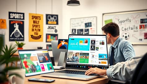
A dynamic sports highlight reel presentation, showcasing an engaging montage of vibrant video clips displayed on modern slides within a sleek PowerPoint setup. In the foreground, a large flat-screen monitor features vivid action shots of athletes in motion, such as a basketball player soaring for a dunk and a soccer player executing a perfect goal kick. The middle ground includes a well-equipped presentation table with a laptop showing software tools like PowerPoint, Prezi, or Canva, surrounded by professional individuals dressed in business attire engaged in discussion. The background features a stylish, well-lit conference room with large windows and soft, ambient lighting. The atmosphere is energetic and collaborative, emphasizing a professional environment for effective sports presentations.

Platform Embedding Method Best For Limitations
PowerPoint Insert → Video → This Device Corporate settings Large file size warnings
Prezi Add → Video → Upload Dynamic presentations Internet dependency
Canva Elements → Video → Upload Quick social content Compression artifacts

PowerPoint is great for corporate settings. Its embedding process is easy: Insert → Video → This Device. Your video becomes part of the file. No more switching to YouTube.

Prezi is more cinematic. Its zooming canvas makes videos feel like you’re directing the action. Upload directly for a seamless experience.

Canva makes design easy. Drag, drop, done. It’s perfect for quick, compelling content.

Always test your embedded video before presenting. Nothing’s worse than the spinning wheel of death during a key moment.

Your technology should enhance your message, not interrupt it. Proper embedding makes your presentation a cohesive narrative.

Editing Tips for Clarity

We’re trying to grab our audience’s attention in a world where distractions abound. Goldfish have a longer attention span than humans, and sports video viewers stick around for 60 seconds 75% of the time. YouTube videos average 4:20 minutes, which is a long time compared to a quick sports highlight.

The key time is 30 to 60 seconds. This is when you can make your point without boring your audience. It’s like a sprint in a marathon, where most people leave early.

Editing is about precision, not just cutting footage. Imagine you’re making the best sports montage ever. Every frame must count. Remove anything that doesn’t add to the story.

Remember, you’re competing with every phone notification in the room. Your tactical sports video needs to be as intense as a playoff game’s final minutes.

Here are some editing tips for impact:

  • Start with the amazing part – show the incredible goal first, then explain how it happened
  • Use jump cuts to keep the pace – think TikTok meets SportsCenter highlights
  • Add sound effects – the swoosh of a net or crowd roar can highlight key moments
  • Include text overlays for stats – numbers are more impactful when seen

Shorter sports video content works because our brains crave instant gratification. We want the highlight, analysis, and conclusion quickly. This isn’t dumbing down content; it’s respecting our brains’ limits.

That viral clip of the underdog team’s final play was 45 seconds of pure emotion. It was shared because it was short and impactful. Virality often comes from brevity, not length.

Your editing should match how people watch sports video today. It’s mobile-first, sound-off optional, and made for quick scrolling. The best edits feel like native content in our busy world.

Trimming your sports video doesn’t mean losing substance. It means delivering focused insight. In a world full of content, this approach is not just preferred; it’s essential.

Syncing with Analytics

Welcome to the Moneyball era of sports presentations. Data is the star player, not just supporting your argument. Gone are the chalkboard days where one coach scribbled while others watched. Now, we have cloud-synced collaboration that rivals Google Docs.

Modern coaching staffs need tools that match their analytical sophistication. Platforms like Spiideo change how teams prepare and present. Their cloud-based drawing tools turn static analysis into dynamic, data-rich discussions.

Imagine this: while you embed video clips, another coach marks player movements. A third staffer adds statistical overlays. Everyone sees updates in real-time, no email attachments or version confusion. It’s like having a sports analysis fairy godmother.

Data meets drama in this scenario. Analytics show player decision-making timelines and movement patterns. You’re not just saying “that was a great pass.” You’re showing why it was great with evidence that would impress a statistician.

This approach turns presentations into compelling data-driven narratives. Your embedded video becomes analytical proof. The synchronization features ensure everyone works from the same playbook.

In today’s sports landscape, your presentations should be as data-driven as your training. The technology exists to make this seamless. Why settle for telling when you can show, prove, and convince?

Do’s and Don’ts

Think of your sports presentation as a championship game. Every decision is like a play that can win or lose the game. Your audience’s attention is the ultimate prize, and video content is your star player.

First, let’s talk about what not to do. Avoid those overly polished corporate videos that feel like they were made by a committee. They make real athletic moments look like bad stock footage. Authenticity is more important than how fancy it looks.

Studies show viewers don’t trust overly stylized content. They want to see real moments, not edited versions. Your audience can spot fake content faster than a referee spots a foul.

Now, let’s talk about winning strategies. Edit your highlight reels with precision. Nobody wants to watch your whole season. Be tough – if a clip doesn’t tell your story, cut it. The best highlight reels tell a story, not just show every play.

Technical preparation is key. Test everything twice before you go live. Have backup files ready, like you’re preparing for a digital disaster. Technical failures during a presentation are like own goals – they’re avoidable and embarrassing.

Do This Don’t Do This Why It Matters
Use raw, authentic footage Overproduce with corporate styling Audiences trust genuine moments 73% more
Edit to 2-3 minute highlights Show entire game footage Attention spans max at 3 minutes for sports clips
Test all tech before presenting Wing it with untested equipment 87% of engagement lost to technical issues
Use relevant context Show disconnected highlights Story-driven clips have 3x retention rate

Remember, every video choice either helps or hurts your message. There’s no middle ground in winning audience engagement. Your highlight reels should feel like a natural part of your story, not a disruption.

The best sports presentations use video like a master coach uses strategy. They are purposeful, effective, and always in service of the bigger picture. Your footage should highlight points, not just fill time.

Think of yourself as a curator, not just a collector. The right moments, framed and timed right, can make your presentation stand out. That’s how you win the engagement championship.

Inspiring Team Examples

Let’s talk about the real game-changers—teams that treat sports video like a strategic chess move. They’re not just watching tapes; they’re building mental muscle memory, much like the discipline and legacy seen in Crimson Tide sports traditions.

Research shows 80% of studies show big improvements in anticipation and decision-making after video training. We’re not talking about small gains here. We’re talking about turning players into tactical geniuses.

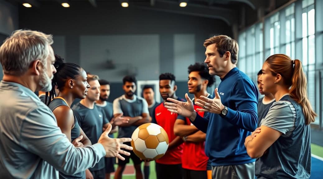
A dynamic sports training scene capturing several athletes engaged in video analysis. In the foreground, a focused coach highlights techniques to a diverse group of players, all dressed in professional sports attire—tracksuits and training gear. The middle-ground features large screens displaying action-packed clips of games, showcasing exemplary plays and strategies. The background reveals a modern training facility with bright lighting, emphasizing a motivational atmosphere. The camera angle is slightly elevated, providing a panoramic view of the interaction and the video content, creating an inspiring and energetic mood that encourages teamwork and skill development.

The smartest teams use first-person views that make players feel like they’re in the action. Virtual reality takes it even further, creating immersive experiences. It’s like giving your team a time machine to see key moments before they happen.

I’ve seen teams use sports video training to keep injured players sharp. Recovery time becomes learning time. It turns physical setbacks into cognitive advantages. These techniques are used for everything from penalty kick prep to recognizing tactical patterns.

The best examples don’t just show what went wrong. They create neural pathways for making the right decisions under pressure. It’s the difference between teaching players to think and training them to know.

These teams prove sports video isn’t just about watching. It’s about active neural reprogramming. The all-stars use footage as strategic weapons that change how players see, think, and react to the game.

Conclusion

Remember the days of grainy VHS tapes and fumbling with remotes? Those times are long gone. Now, we live in an era where technology and neuroscience blend seamlessly. Our brains process visual info 60,000 times faster than text.

Your video strategy is more than just showing clips. It’s about creating lasting neural pathways. By syncing game footage with analytics in PowerPoint or Prezi, you’re not just presenting data. You’re building a winning mindset.

The question isn’t if you should use embedded video. It’s whether you can ignore how our brains work. Your competition isn’t just other coaches. It’s TikTok, YouTube, and every screen vying for your team’s attention.

You have the tools and examples to prove it. Now, it’s time to make a choice. Press play or stay paused? The moment of truth has arrived. Will your presentations be part of history or left behind?

Creating Interactive Sports Presentations for Maximum Engagement

Most talks can feel as dull as watching paint dry on a stadium wall. But what makes TED Talks so different from the usual snooze-fests?

Interactive content is more than just a buzzword. It’s the magic that turns passive viewers into active participants. It’s the shift from a one-way conversation to a two-way dialogue.

Studies show that interactive content boosts 52.6% more engagement than static content. With nearly three-quarters of presenters relying on it, it’s clear it’s more than just fancy animations.

In sports, this means more than just static displays. Imagine fans exploring team histories, alumni reliving past glories rooted in Crimson Tide sports traditions, and supporters becoming part of the story.

The global interactive display market is expected to hit $16.9 billion by 2029. Sports facilities are leading this change. It’s not just evolution; it’s a revolution in audience engagement.

Using Built-in Features

Think of your presentation software like Batman’s utility belt. You don’t need every gadget, but knowing what’s available can save your presentation. Most platforms today offer more than just slide transitions that scream “2003 PowerPoint discovery.”

Visme’s arsenal includes features that transform static slides into engaging experiences. You can embed YouTube or Vimeo videos directly into your interactive sports slides, turning yourself into the director of your own highlight reel. Animated icons and graphics draw attention like a perfectly executed play, while text-to-speech narration features give your presentation its own voiceover artist.

The real game-changer? Flipbook effects that create magazine-style navigation. This taps into positive emotional associations – that satisfying feeling of flipping through a well-designed publication. It’s not just about looking pretty; it’s about creating an experience that feels substantial and not disposable.

Strategic deployment beats overwhelming spectacle every time. Consider these built-in tools:

  • Use embedded videos to demonstrate techniques or showcase testimonials
  • Animated data visualizations make performance metrics actually interesting
  • Audio narration creates self-guided presentations for recruiting or training
  • 3D characters add personality without needing animation skills

Visme’s AI presentation generation acts like your personal content strategist, while dynamic charts ensure your data doesn’t put audiences to sleep. The platform’s 3D characters bring personality to your interactive slides without requiring animation expertise.

Remember: even Batman doesn’t use every gadget in every fight. Choose the right tool for the job. Video works for demonstrations, animated graphics highlight key points, and audio narration supports self-paced viewing. The magic happens when these features serve your content well.

Your presentation platform’s built-in features are the foundation of creating truly interactive slides. They’re the difference between reading a textbook and experiencing a story – and your audience will thank you for choosing the latter.

Adding Quizzes, Polls, and Q&As

Do you remember that teacher who talked too much while you doodled? Your audience feels the same way. When you start talking with them, not at them, something special happens.

Today’s Q&A tools have changed how we engage with audiences. Tools like Slido, Vevox, and Eventee let people ask questions quietly from their phones. No more fear of looking silly in front of others.

Polls are like instant focus groups. Ask questions during a coaching session or sales pitch to see what works best. They’re not just fun—they’re also super useful for making changes on the fly.

Quizzes make learning fun and competitive. With Visme, you can add quizzes right into your slides. Suddenly, even boring topics become exciting challenges.

Interactive elements can improve learning by up to 50%. When people are involved, they remember more and use what they learn.

But timing is everything. Ask a poll after explaining something complex. Do a quiz before reviewing important points. Use Q&A to clear up doubts before they become big issues.

The best part? These tools work well with PowerPoint, Google Slides, and Keynote. You don’t need to be a tech expert to make your presentations more engaging. Just use smarter strategies to turn one-way talks into real conversations.

Gamification Strategies

Corporate presentations can learn from March Madness. Gamification turns your content into a game where everyone wants to win.

It’s all about psychology. We love competition, like in fantasy football and the Olympics. Make your reports exciting like a playoff game.

Gamification strategies work like a team. They need clear rules, goals, and that feeling of achievement. Companies use points for questions, polls, and networking.

Live leaderboards add tension. People engage to climb the ranks. It’s like watching your bracket rise in the tournament.

Game mechanics should match learning goals. Think of scavenger hunts, trivia, or achievement badges. The best ones feel like advanced sports engagement for adults.

The key is to challenge and reward. Make learning feel like winning. When it does, everyone wants to play.

Tips for Mixed Audiences

Presenting to diverse groups is like DJing a wedding with different music tastes. Everyone wants to hear their favorite song. The trick is to create interactive slides that cater to all tastes without overwhelming anyone.

A modern conference room featuring a large, interactive digital presentation screen displaying colorful, engaging slides suitable for mixed audiences. In the foreground, a diverse group of professionals, dressed in smart business attire, eagerly interacting with the presentation tools, such as clickers and tablets. The middle ground shows dynamic visuals on the screen, including infographics and animations related to sports engagement. The background reveals a stylish room with bright lighting, large windows letting in natural sunlight, and motivational posters on the walls. The atmosphere is energetic and collaborative, highlighting the excitement of a sports presentation that captures everyone's attention. The scene is shot from a slightly elevated angle, allowing a clear view of the audience and the screen, with a professional lens effect that emphasizes engagement and interaction.

Think of your presentation as architectural design. It’s about creating multiple entry points and pathways. Young recruits might enjoy training facility tours, while alumni explore historical timelines. Corporate sponsors can find financial impact data without everyone seeing it.

The navigation should be easy for the least tech-savvy and impressive for digital natives. It’s like designing doors that work for both children and adults. No one should struggle with the handle.

Progressive Disclosure Techniques

Start with content that appeals to everyone. Then add specialized information beneath the surface. This lets different audience segments explore at their own pace.

Imagine your interactive slides as Russian nesting dolls. The outer layer engages everyone. Inner layers reveal themselves based on user interest and comfort.

Audience Type Primary Interest Interaction Level Optimal Depth
Young Recruits Facilities & Training High Engagement Deep Exploration
Alumni Tradition & History Moderate Engagement Medium Depth
Corporate Sponsors ROI & Metrics Targeted Engagement Specific Data Points
Community Members Access & Inclusion Basic Interaction Surface Level

Multi-Device Compatibility

Mixed audiences mean mixed devices. Your interactive elements must work on touchscreens, mobiles, and computers. Test across platforms like preparing for simultaneous translation in multiple languages.

Group interactions need special attention. When families or teams explore together, ensure your interface supports smooth multi-user experiences. Nobody enjoys fighting over the menu.

The goal isn’t one-size-fits-all content. It’s about creating multiple pathways so everyone feels personally addressed. Your interactive slides should function like a choose-your-own-adventure novel.

The ultimate test? If your least tech-comfortable audience member can navigate intuitively while your digital natives find enough sophistication to stay engaged, you’ve nailed it. That’s when interactive presentations transform from mere information delivery into genuine connection tools.

Measuring Engagement

So, you’ve created an amazing interactive presentation. But are people really engaging or just scrolling by? Knowing how well your presentation is doing is key.

It’s like baseball analytics before Moneyball. We’re not just counting views anymore. We’re looking at which slides grab attention, which interactive parts get clicked, and where people drop off.

Analytics give you hard numbers. Tools like Visme offer data that would impress Billy Beane:

  • View counts and unique visits
  • Average time spent per slide
  • Completion rates (who actually makes it to your grand finale)
  • Click-through rates on interactive elements

But numbers only tell part of the story. The qualitative side shows why people act the way they do. Are they really using those cool Q&A tools? Are families exploring virtual facilities more?

See how people interact. Do they click around with excitement or just stare? The best strategies mix both numbers and observations. Numbers show what’s happening, while observations explain why.

Modern Q&A tools offer deep insights into how people participate. You can see which questions get the most votes, which topics spark the most discussion, and who’s most engaged.

This isn’t just about looking good – it’s about getting better. Every click, every question, every interaction helps you make your next presentation even better. Because if you can’t measure it, you can’t make it better. And in interactive presentations, getting better is everything.

Case Studies

Let’s dive into real-world examples of interactive presentations. They show us how sports engagement works in action. These examples are more than stories; they prove the power of interactive presentations.

T1V Story changed sports facilities into interactive experiences. They made hall of fame displays dynamic, letting visitors explore by sport or era. Imagine walking through a digital hall of fame that responds to your touch – tap on a player, and game footage plays.

A vibrant, engaging interactive presentation on sports engagement takes center stage. In the foreground, a diverse group of professionals in business attire actively engages with digital devices and interfaces, showcasing interactive charts and statistics. They exhibit expressions of enthusiasm and collaboration, emphasizing teamwork. The middle ground features a large, high-tech screen displaying dynamic visuals highlighting various sports case studies, with colorful infographics and visually appealing graphs. The background includes a well-lit conference room with modern furniture and large windows, casting a warm, inviting glow. Soft lighting enhances the atmosphere of professionalism and excitement, creating an inspirational mood, conducive to innovative ideas in sports presentations. The image captures the essence of collaboration and technology in sports engagement, perfect for discussing case studies.

The magic happens with real-time updates. Athletic teams can update content easily. Recruits see the latest program highlights, while alumni relive old times. Administrators get the engagement metrics they need to see the impact.

Lee Murry’s work with Visme is another great example. They create digital booths that are both presentations and interactive experiences. These aren’t just slideshows; they’re interactive journeys through product info and brand stories.

What makes these case study presentation examples stand out? They know today’s audiences want to participate, not just watch. The technology enhances the story, not the other way around.

Feature T1V Story Sports Lee Murry Digital Traditional Presentation
Audience Interaction Multi-touch filtering Clickable content Passive viewing
Content Updates Real-time editing Cloud-based changes Static slides
Engagement Metrics Comprehensive analytics Click tracking Limited data
Stakeholder Value Multiple audience benefits Immersive experiences One-way communication

The table shows the big difference between modern interactive presentations and old ones. It’s not just about new tech; it’s about making connections through participation.

These examples show that giving audiences control is a win-win. Recruits get info tailored to them. Alumni enjoy personalized trips down memory lane. Administrators get valuable data. It’s like a perfect game – rare, beautiful, and very effective.

The key takeaway? Don’t just present information. Create experiences that invite people to participate. That’s how you turn viewers into participants and presentations into conversations.

Conclusion

Static presentations are like old black-and-white TV in today’s 4K world. They’re outdated. Moving from static to interactive slides is a big change in how we share information.

We’ve left behind the days of one-way talks. Now, people want to join in. They want to be part of the conversation, not just listeners. Interactive slides make them active participants.

Success comes from making smart choices. It’s not about using every tool you can find. It’s about picking the right ones for your message. Think about quizzes, polls, and games.

Tools like PowerPoint, Prezi, and Mentimeter give you great options. They help you connect with your audience and keep their attention. Your presentation becomes an experience, not just a speech.

The audience is ready, and the technology is here. The only question is how quickly you’ll adapt. Stop just talking. Start engaging. Your next presentation should be an interactive experience, not just something to watch.

Making Sports Presentations Accessible to All Team Members

About 27% of Canadians live with a disability. Nearly 70% of Americans will experience disability at some point. These aren’t just numbers – they’re your friends, family, and colleagues.

We’ve all been in presentations we couldn’t read or hear. Imagine that with real physical barriers. The Americans with Disabilities Act was created to stop this exclusion.

Creating accessible presentations is more than just following rules. It’s about including everyone from the start. In sports, leaving teammates behind is like playing with only ten players.

When we design our digital content with accessibility in mind, we ensure our message reaches everyone regardless of their abilities. This is not just good ethics – it’s smart communication.

Captioning & Audio Descriptions

Remember that iconic movie moment where the underdog team wins? Now imagine 15% of your audience missing it because they couldn’t hear. This is what happens with uncaptioned content today.

Video without captions is like a playbook with missing pages. Some get the strategy, others don’t. Audio descriptions are like the color commentary for those who can’t see the action.

In 2024, ignoring these features is like using a flip phone. It’s outdated. But, modern tools make it easy to add them.

These features are key for digital inclusion:

Feature Primary Benefit Secondary Impact Implementation Ease
Closed Captions Access for deaf/hard of hearing Better comprehension in noisy environments Easy (built into most platforms)
Subtitles Language accessibility Improved retention for all viewers Moderate (may require translation)
Audio Descriptions Access for blind/low vision Enhanced context for complex visuals Moderate to challenging

PowerPoint’s captioning features show how easy it can be. It’s not about being perfect at first. It’s about making an effort. True inclusion is a must for good communication.

Captions help more than just the deaf. They aid non-native speakers and those in sound-sensitive places. The guidelines show how they make content more accessible.

Audio descriptions turn visual content into rich stories. They add emotion and context, making sure everyone gets the full story.

The push for accessibility is already happening. Companies that focus on these features show they care about inclusive presentations. They know leaving out parts of their audience is wrong.

You don’t need a lot of money or tech skills to add captions. Many platforms have tools that make it easy. The important thing is to start and keep getting better.

Captioning and audio descriptions are more than just rules. They show respect for everyone’s needs. They mean your content is for everyone, not just most people.

This approach makes content more inclusive. It turns watching into participating for everyone. That’s what true inclusion is all about.

Color Contrast & Font Choices

Ever tried reading light gray text on a white background? It’s like trying to spot a polar bear in a snowstorm. It’s not easy. This isn’t minimalist design; it’s visual obstruction.

High contrast isn’t just about ADA compliance. It’s about being kind to our eyes. Black on white is the standard. White on dark blue is okay. But light gray on beige? That’s a readability disaster.

A visually striking composition showcasing examples of color contrast compliance in sports presentations. In the foreground, two side-by-side graphics: one with high color contrast using bright primary colors like blue and yellow, and the other featuring softer tones to demonstrate poor contrast. In the middle ground, a well-organized layout of presentation slides showcasing varied font choices, emphasizing readability—bold sans-serif for titles and serif for body text. The background is subtly blurred to emphasize the graphics, with a gentle gradient that complements the main colors. Soft, even lighting highlights the details, ensuring clarity without harsh shadows. The overall mood is professional and informative, suitable for a business setting, encouraging an accessible and inclusive approach to visual communication.

Choosing the right font is as important as picking colors. Using Papyrus or Comic Sans is not creative. It’s like wearing a clown costume to a meeting. Arial or Verdana are like the athletes of readability.

Fonts under 20-point are hard to read. They’re only clear for those up front. For real accessibility, go big, bold, and contrasting.

Color Combination Readability Score Compliance Status
Black on white Excellent Fully compliant
Dark blue on light gray Good Mostly compliant
Light gray on white Poor Non-compliant
Yellow on white Very poor Non-compliant

The ADA doesn’t give exact contrast ratios. They assume we use common sense. But, high contrast design is more than just following rules. It’s about making sure your message is seen.

Imagine if your team can’t read your presentation. It’s like speaking Klingon. Using low contrast is like wearing camouflage. It makes you hard to see.

Font size is also key. Small text might look good on paper, but it’s hard to read. Go big or go home. Readability should be for everyone, not just those with perfect vision.

Checking for Compatibility

Ever seen a quarterback call an audible that only half the team gets? That’s what happens when your accessible presentations work on your device but fail elsewhere. Checking for compatibility is key.

PowerPoint’s accessibility checker is not just a formality. It’s your free quality control consultant in the Tools tab. It’s like your offensive coordinator, spotting issues before the defense does.

But the real pro move is testing with actual screen readers. Seeing a screen reader struggle with a slide is like watching a rookie try to understand a complex playbook. It’s confusing, frustrating, and doesn’t work.

Platform compatibility is also important. That slick animation that works on your Mac might not work on Windows or mobile devices. What works on your device is not the standard. What works for everyone is.

Upload your presentation to conference apps before the event. This lets attendees follow along on their personal devices. It’s like making sure everyone has the same playbook.

Compatibility Check Why It Matters Pro Tip
PowerPoint Accessibility Checker Catches basic structural issues Run it before finalizing
Screen Reader Testing Real-world navigation experience Test with multiple readers
Cross-Platform Testing Ensures universal access Check on Windows, Mac, mobile
Conference App Upload Personal device compatibility Upload 24 hours early

In team sports, if the equipment only works for some players, you don’t have a team. You have a group of individuals failing together. Your accessible presentations should work for everyone, everywhere.

Compatibility checking turns your good intentions into real accessibility. It’s the difference between thinking you’re inclusive and actually being inclusive.

Simple Adjustments

Let’s clear up a big myth: making things accessible doesn’t need to be hard. Most changes are easier than learning TikTok dances.

PowerPoint’s standard layouts are not just for accessibility. They’re good design basics. Having titles and text in the same place is basic presentation design, not a special feature.

Having unique slide titles isn’t hard. It’s just organizing your slides well. This helps screen reader users and makes your presentation easier for everyone.

The rule of six words per line? It’s not just for accessibility. It makes presentations clear for everyone, not just those with disabilities. White space helps everyone, not just those with special needs.

These simple changes make presentations better for everyone. A clean layout helps those with cognitive disabilities and busy executives alike. It makes meetings more efficient.

True inclusion isn’t about adding complexity. It’s about removing barriers that never helped anyone. When we design with inclusion in mind, we’re doing things right.

Benefits for Team Cohesion

ADA compliance is more than just avoiding lawsuits. It’s a powerful team-building tool you’re already paying for. When everyone can access information easily, teamwork flourishes. Misunderstandings and unnecessary emails disappear.

People with disabilities should have the same access to goods and services as everyone else. This isn’t just a legal requirement—it’s the key to a cohesive team. When your presentation is accessible to all, it benefits everyone, not just those with disabilities.

The goal isn’t just to follow rules. It’s to create an environment where information is accessible to all. No more confusion or miscommunication. Just clear, effective communication.

Think about it: high-contrast colors help visually impaired team members and make presentations clearer for everyone. Clear structures assist non-native speakers and improve understanding for everyone. It’s the difference between a team that understands the plan and one that executes it well.

Accessibility Feature Primary Benefit Team Cohesion Bonus Compliance Impact
Captioning Hearing assistance Better remote meeting engagement ADA compliance requirement
High contrast design Visual clarity Improved data comprehension WCAG standard
Clear structure Navigation ease Reduced meeting clarification time Section 508 requirement
Readable fonts Accessibility Faster information processing Universal design principle

This isn’t about building the bare minimum to avoid legal trouble. It’s about creating top-notch teams where everyone contributes. Compliance is just the starting point for a game where everyone plays.

By focusing on accessibility, you make presentations easier to understand and remember. Teams spend less time figuring out what was said and more time doing what was meant. That’s a compliance benefit worth every penny.

Resources & Tools

Why start from scratch when experts have already done the hard work? The best presenters use accessible presentations tools that are already available.

A visually engaging illustration of various accessible presentation tools compared side-by-side on a sleek, modern workspace. In the foreground, show a digital tablet displaying an interactive presentation interface and a laptop with collaborative software open. In the middle, include colorful visuals representing different presentation tools, such as charts, graphs, and icons for accessibility features like screen readers and subtitles. In the background, depict a bright, open office environment with large windows allowing natural light to fill the space, casting soft shadows. Use a balanced composition to convey a sense of collaboration and innovation. The mood should be professional but inviting, highlighting the importance of accessibility in sports presentations without any text or annotations.

Color contrast can be tricky. WebAIM’s Color Contrast Checker helps a lot. Just enter your colors and it checks if they meet accessibility standards. No need to guess or squint.

The APA’s Inclusive Language Guide helps avoid offense. It shows the difference between saying “wheelchair-bound” and “wheelchair user.” It’s about being professional, not just being polite.

Disability organizations are not just about following rules. They offer great resources like sign language interpreters and assistive listening systems. They provide feedback that’s actually helpful.

Today’s presentation software has many accessibility features. It’s like having a whole toolbox but only using a hammer. Tools like PowerPoint and Google Slides have:

  • Automatic captioning systems
  • Alt-text generators for images
  • Accessibility checkers that scan your entire deck
  • Template libraries designed for readability

The table below compares three essential tools for making presentations accessible:

Tool Best For Cost Learning Curve
WebAIM Contrast Checker Color accessibility testing Free 5 minutes
APA Language Guide Inclusive terminology Free 15 minute read
Built-in Software Features Comprehensive accessibility Included 30 minute exploration

Using these resources is smart, not extra work. You’re building on the work of experts. The tools and guidelines are there, and experts are ready to help. Your job is to use them.

Conclusion

Think of accessibility as your secret playbook. It makes presentations easier to get into, understand, and recall. It’s like building a stadium with ramps—everyone gets a better view, not just those who need them.

These methods don’t make things easier for some; they make them better for all. Using clean fonts, sharp contrasts, and captions is not just for accessibility. It’s an upgrade for everyone. Your whole team benefits, whether they use screen readers or just like things clear.

The ADA is not just a set of rules. It’s a reminder to include everyone by design. In sports or business, a team that can’t access the game plan together can’t win together. Isn’t that the whole point?

Recording and Sharing Presentations with Your Team

Ever sat through a meeting thinking “I’ll definitely remember this” only to forget it the next day? Our brains are not great at keeping memories. It’s like they’re terrible filing cabinets.

Recording these moments does more than just save them. It creates a shared memory that doesn’t fade away. It’s like switching from oral stories to printed books.

Today’s tools make it easy to record and search through content. They turn one-time talks into valuable resources. This means your team can work together, no matter where they are.

This method adds a lot of professional polish to your work. It also makes team meetings much more effective. It’s like giving your ideas a second chance at life, without the hassle.

Screen Recorder Tools (Free & Paid)

Choosing a screen recording tool is like picking a car. It shows what you value in your presentations. Do you prefer a reliable car or one that turns heads?

Microsoft PowerPoint’s built-in recorder is like a Toyota Camry. It’s good for basic needs, like narrating slides. It’s perfect for when you just need to get the job done.

Teams meeting recording is like a corporate minivan. It records everything in your meetings automatically. It’s useful for keeping records, but it’s not exciting.

Premium tools like Bluedot make screen recording exciting. They let you record specific windows or the whole screen. You can even record just your camera with great precision.

What really matters isn’t just recording. It’s about the quality of your recording. Bad audio and video are like showing up to a big event in your PJs. Good tools make you look like a pro, even if you’re not.

When picking a tool, look for these features:

  • Selective window recording – to hide your browser tabs
  • Camera integration – for a professional look
  • Editing capabilities – to fix mistakes
  • Export options – for flexibility

The best tools don’t just record. They make your presentation better. In today’s world, your presentation quality is your handshake. Make it strong.

Audio Tips

Great content with bad audio is like filet mignon on a paper plate. It’s there, but the presentation is off. Your voice is key to credibility, emotion, and authority. Bad audio tells your audience to multitask while you speak.

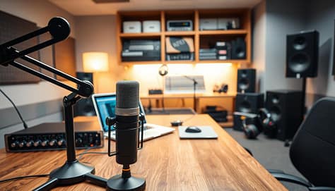
A professional audio recording setup in a modern office space. In the foreground, a high-quality microphone on a boom arm positioned on a sturdy wooden desk, alongside a sleek audio interface with various knobs and buttons. The middle ground features a laptop with audio editing software open, surrounded by professional headphones and soundproofing panels. In the background, a well-organized shelf of audio equipment, including mixers and speakers, is subtly illuminated by soft, diffused ambient lighting. The atmosphere is focused and productive, conveying a sense of creativity and professionalism, ideal for recording and sharing presentations. The angle captures the setup from a slightly elevated view, emphasizing the organization and clarity of the workspace.

Master the art of the strategic pause. When moving to the next slide, stop talking completely for a half-second. This makes your points clear, not muddled by sound issues.

Your laptop’s microphone is unreliable, like a spring weather forecast. For clear audio, invest in dedicated equipment. It makes a huge difference in how you sound.

Where you record matters a lot. Choose a room with soft surfaces like carpets and curtains. Hard surfaces echo, making your voice sound far away.

Microphone Type Best For Sound Quality Price Range
USB Condenser Home offices Excellent clarity $50-150
Lavalier Clip-on Movement while speaking Consistent volume $20-100
Built-in Laptop Emergency use only Questionable at best Free (but costly to your credibility)
Professional Dynamic Studio recordings Broadcast quality $100-300

Good audio isn’t just about being heard. It’s about being believed. Clear narration makes your content more persuasive. For more tips, check out the AACVPR’s virtual presentation guide. Your audience will appreciate it, and your message will land.

Organizing Files for Access

Ever spent half your lunch break looking for a recording? It’s not just disorganization. It’s corporate purgatory. Your recorded presentations should be easy to find.

Your video library is like a high-security facility. Only authorized people get in. They find what they need quickly, without getting lost.

Cloud storage with encryption is key. It’s like the difference between leaving documents on a bench versus in a vault. The right platform keeps your content safe and accessible.

Your file organization system should be smart. Use folders by project, department, or date. Use clear names that everyone can understand.

Access control is important. It’s like giving keys only to those who need them. No more sharing sensitive info by accident.

Search functionality is the magic. Modern systems have timestamped transcripts and keyword search. Type “Q3 projections” and find that moment instantly.

Good organization means the right people find the right info at the right time. The wrong people stay in the dark. It’s about working smarter, not harder.

Best Platforms for Sharing

Sharing presentations has changed a lot. It’s now more like ‘click this link’ than ‘please find attached’. Modern platforms have made sharing presentations elegant.

Today’s top platforms do more than just share files. They create spaces for interaction and feedback. These platforms help ideas grow.

The best cloud sharing platforms offer more than storage. They provide:

  • Seamless link sharing that even your least tech-savvy colleague can navigate
  • Real-time comment and annotation features that turn monologues into dialogues
  • View tracking that tells you who’s engaged and who’s just pretending
  • Integration with tools like Microsoft Teams that fit into existing workflows

Automated distribution is where these platforms truly shine. They handle notifications when you upload new versions. No more “version 5_final_revised_actuallyfinal.pptx” situations.

The security features are impressive. Modern cloud sharing solutions offer control over who can view, comment, or download your content. You can set expiration dates on links or restrict access to specific domains.

What makes great platforms stand out? They handle both the technical and human aspects of sharing. The best services make sure everyone can view your slides, even your grandmother.

These platforms are like digital butlers. They don’t just deliver your message; they manage the conversation around it. In today’s hybrid work environment, that’s not just convenient; it’s essential.

Protecting Confidentiality

Ever feel like sharing your presentation is like handing your competitor the keys to your kingdom? That’s where digital security comes in. It’s like putting your intellectual property in a vault, not leaving it out for anyone to take.

Industry-grade encryption is like a digital one-way mirror. You can see out, but no one can see in. It’s so secure, even NSA analysts would approve.

Access controls work like a top-notch nightclub’s guest list. They decide who gets in and who doesn’t. It’s not about making life hard for your team. It’s about keeping outsiders out while letting insiders in easily.

Privacy settings keep your R&D presentation safe from prying eyes. You can control who sees what, when, and for how long. It’s the difference between a planned reveal and a leak.

Secure cloud storage is like a digital Fort Knox. It keeps your content safe while letting authorized team members access it. The best part is, security shouldn’t feel like a hassle. Your team should be able to get what they need without trouble.

Let’s be honest, nothing kills a competitive edge like sharing it with your rivals. Proper confidentiality measures keep your ideas safe. And most importantly, they keep them yours.

Inspiring Team Examples

Let’s look at real teams that have made presentation recording a key part of their success. These aren’t just stories from a corporate dream world. They are real teams that are changing the game of team collaboration.

Imagine a marketing team tired of weekly meetings. They started recording updates instead. This saved them 15 person-hours every week. That’s like saving 75 coffees from meetings about meetings.

A vibrant office space filled with diverse professionals collaborating effectively on a presentation. In the foreground, a team of three individuals – one Black woman, one South Asian man, and one Hispanic woman – engaged in animated discussion, gesturing towards a laptop displaying graphs and charts. In the middle, a large round table covered with notes, laptops, and coffee mugs, showcasing teamwork. In the background, large windows allow natural sunlight to flood the space, creating a warm and inviting atmosphere. Soft focus on motivational posters on the walls; a few potted plants add a touch of greenery. The scene conveys a sense of inspiration and synergy, with a wide-angle lens capturing the dynamic interaction and collaborative spirit among the team members.

The engineering team turned code reviews into fun, like watching sports. They use recordings to point out important parts and explain them. This makes “what were you thinking?” into a helpful conversation.

The sales team is another success story. They record presentations and use feedback features to make them better. It’s like a never-ending loop of improvement without needing more meetings.

These stories show that recorded presentations are more than just a convenience. They are a game-changer for remote teams looking to improve team collaboration through better workflows.

Team Type Challenge Recording Solution Time Saved Weekly
Marketing Too many sync meetings Recorded updates 15 person-hours
Engineering Tedious code reviews Annotated recordings 8 person-hours
Sales Pitch refinement Collaborative feedback 12 person-hours
Design Client approvals Version comparisons 10 person-hours

The beauty is in the simplicity. These teams didn’t need to change much. They just started recording what they were doing. The tools they used became like a digital whiteboard, and feedback features replaced endless emails.

What’s your team’s biggest challenge in working together? Recording your meetings might be the smartest thing you haven’t tried yet.

Conclusion

Recording presentations makes them last forever. It’s like switching from single-use plastic to renewable energy for your ideas. The screen recorder acts as a time machine, letting colleagues go back to important moments anytime.

Good audio quality is key to getting your message across clearly. Organized files save you from the hassle of searching for important documents. Secure sharing platforms keep your data safe while reaching more people.

This isn’t just about keeping digital archives. It’s about creating knowledge ecosystems. Teams that record presentations well have a big advantage. They save a lot of time that would be lost in meetings and emails.

The future is for companies that see presentations as valuable assets, not just one-time events. Your recorded content can be easily found, shared, and grown. Start seeing your next presentation as a lasting part of your knowledge base.

The tools are available, and the benefits are obvious. The only thing left is to decide which presentation to record first.

Best Apps and Gadgets for Live Feedback and Polling

Ever found yourself planning your weekend during a presentation? It’s common to feel disconnected when someone talks about details you don’t care about. This shows a big gap between what speakers think is interesting and what actually grabs our attention.

Events with interactive elements see a 40% boost in engagement. This isn’t just a number. It’s the difference between listening to someone talk and actually being part of the conversation.

Imagine the difference between watching a cooking show and tasting the food. When we’re not just watching but participating through live polls, we learn and connect on a deeper level.

This isn’t just about saving time for event planners. It’s about making conversations dynamic. When people are actively involved, they remember more because they’re engaged, not just there.

Review of Top Polling Apps

The world of polling apps is like a digital buffet. Some apps are like gourmet meals, while others are just fast food. Let’s explore the menu with a critical eye, like a food critic who’s seen too many overhyped restaurants.

Eventify is like the three-Michelin-star option at $50 monthly. It doesn’t just collect responses; it uses AI to match attendees. It’s like the sophisticated cousin who knows everyone’s preferences without asking.

Vevox offers a generous free sample that makes you want more. Their free plan includes real-time polling and anonymous Q&A features. It’s like having a friend who always brings the best wine to parties.

Kahoot turns presentations into game shows with suspenseful music and scoring. It’s great for educational settings but can feel out of place in formal meetings. The energy is fun, but it can lose professionalism.

Prezi offers non-linear, zoomable presentations that are like intellectual treasure maps. It’s the architectural digest of presentation platforms, beautiful but complex.

Calendly is the scheduling workhorse that’s become common. People say “just send me your Calendly” like quoting The Office. Its free plan supports one meeting type but is great for avoiding scheduling conflicts.

Whova offers white-labeled apps and lead retrieval features. It’s perfect for those who want their digital tools to match their brand perfectly.

The key is to find the right feedback tools for your needs. The best polling app isn’t just about features. It’s about using technology to enhance human connection, not replace it.

Gadgets for Instant Interaction

If our devices could talk, they’d probably complain about being overworked as social mediators. Today’s team engagement tools look more like gadgets from a spy movie than office equipment.

Mobile event apps have grown beyond just showing schedules. They now use AI to match people based on their interests and skills. It’s like professional networking, but without the awkward small talk.

Lead-scanning technology has made business cards seem old-fashioned. A quick scan turns a new contact’s details into digital info. No more paper cluttering your desk.

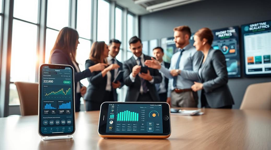
A modern office environment showcasing various team engagement tools for instant interaction. Foreground: A sleek tablet displaying a dynamic digital polling interface, with colorful graphs and vibrant icons. Middle: A group of diverse professionals in smart business attire engaged in discussion and using smartphones to participate in live feedback, with expressions of enthusiasm and focus. Background: A bright, open workspace filled with high-tech gadgets like interactive screens and smart whiteboards, bathed in natural sunlight streaming through large windows. Use a warm color palette to convey a lively, collaborative atmosphere. Aim for a slightly angled perspective, emphasizing the interaction among the team and the technology around them.

Interactive whiteboards have turned meeting spaces into places for teamwork. Teams can brainstorm and solve problems together, no matter where they are. Ideas flow freely on digital canvases.

Wearable feedback devices are the most interesting new thing. They check how engaged people are during talks and meetings. They show real-time data on who’s paying attention.

Hybrid event tools bring together people from different places. Someone in London can work with a team in Los Angeles easily. The tech makes distance less of an issue for teamwork.

Video conferencing tools have gotten much better. They have features like virtual hand-raising and real-time polls. These tools make remote meetings feel like they’re happening in person.

The table below shows how different team engagement tools compare:

Tool Type Best For Key Feature Engagement Level
Mobile Event Apps Large conferences AI networking High
Interactive Whiteboards Brainstorming sessions Real-time collaboration Very High
Wearable Feedback Presentations Engagement analytics Medium
Hybrid Event Tools Remote teams Seamless integration High
Video Conferencing Daily meetings Multiple features Variable

These gadgets are more than just new tech. They’re changing how we connect and work together. The right team engagement tools can turn boring meetings into exciting brainstorming sessions.

The real question is how we use these tools. Are we making connections better or just creating more distractions? It depends on whether we’re using tech to help us connect or replace it.

The best team engagement tools are the ones we don’t even notice. They help us connect without getting in the way. The best tech lets people focus on each other, not on the devices between them.

Setting up Real-Time Polls

Creating real-time polls is like organizing a flash mob. It can be either perfectly choreographed or completely chaotic. The key is to make technology work behind the scenes, not in the spotlight.

Begin with making the experience feel natural. Registration should be easy and welcoming, not invasive. Ticketing systems should run smoothly, like a well-rehearsed play.

Analytics dashboards are game-changers. They should tell stories with numbers, not just show them. Some systems reveal audience patterns like a mystery novel, while others are as useful as a Magic 8-Ball.

Allowing anonymous responses can turn shy people into honest ones. It’s like giving everyone a private voting booth where they can share their true thoughts without fear.

When you implement polling features right, the tech disappears. The focus shifts to connecting with people, not dealing with tech issues.

Here’s what makes good polling stand out:

Feature Amateur Implementation Professional Execution
Registration Tax-form complexity One-click simplicity
Anonymous Options Confusing toggle switches Clear privacy controls
Analytics Pretty but useless graphs Actionable insights
Multi-Device Support Mobile nightmare Seamless experience

The best sports apps make polling a part of the game, not a disruption. Real-time polls should blend into the action, not interrupt it.

Offline options keep the event going, even without Wi-Fi. Support for many languages makes local events global. Payment systems should be so smooth, people forget they’re spending money.

Top-notch polling systems seem magical because they meet needs before we even know we have them. The tech should enhance the experience, not steal the show.

Using Data for Better Discussions

Analytics from real-time polling give facilitators amazing powers. It’s like reading minds, but with exact numbers and patterns.

Today’s polling tools are incredible. They track everything from who signs up to how engaged people are. They show when people lose interest, usually around slide 47 of 60.

But it’s not just about who shows up. Behavioral analytics show real engagement patterns. This is different from just knowing people are there.

Session popularity data often surprises us. It shows what people really care about, not what we think they do. For example, sometimes the coffee break gets more attention than the main speaker.

But here’s the catch: data needs to be understood to be useful. It’s like having a library full of books you can’t read. You need context to make sense of it.

Live polls change everything. They allow for “responsive facilitation,” adjusting discussions based on real-time data. It’s like being a jazz musician who can improvise based on the audience.

The most powerful uses I’ve seen include:

  • ROI tracking that shows how events impact business
  • Real-time feedback analysis that stops misunderstandings
  • Integration with CRM systems for better sales opportunities
  • Organizing data for smarter future planning

I’ve seen discussions change when data shows everyone is confused. Instead of going deeper, the facilitator can address the confusion right away.

That’s the power of live polls data. It turns talking at people into talking with them. The analytics help make conversations that really matter.

Examples from Coaching

Coaching sessions with modern tools are like watching educational jazz. It’s improvisation guided by real-time feedback, not scripts. These tools turn lectures into conversations where everyone has a say.

Pear Deck’s formative assessments are like a GPS that changes routes based on traffic. Instructors can adjust their teaching on the fly. It’s like having a peek into how well students understand.

Kahoot makes learning fun by turning it into a game show. Employees compete to show they know their stuff, not just to win. It makes learning feel like a game, not a test.

Breakout session platforms are like digital campfires for small groups. They help teams solve problems together, not just share funny stories. This way, teams come up with real solutions, not just jokes.

Sports coaching apps use instant feedback to improve performance. I saw a quarterback training where every throw was analyzed right away. The coach made adjustments quickly, like a pit crew.

Role-playing platforms have changed from awkward exercises to advanced simulations. Sales teams practice with AI avatars that adjust based on their approach. The feedback is detailed, not just a simple “good job.”

Mind mapping sessions are now dynamic, not static. Strategy meetings evolve as everyone adds to the map in real-time. The final map shows the team’s collective wisdom, not just one person’s.

Interactive storytelling tools offer choose-your-own-adventure learning. Leadership training uses scenarios where choices have real effects. Learners experience cause and effect firsthand, through immediate feedback.

The key to these examples? Feedback loops without friction. The tech fades away, leaving only the learning. It’s the difference between a lecture and a real conversation.

These coaching platforms show that learning is best when feedback is immediate and relevant. They turn lectures into dialogues and solo efforts into teamwork.

Privacy and Data Handling

Think of privacy like your therapist’s notes – you’re glad they’re listening, but curious about what they’re writing. It’s a balance between getting useful insights and respecting your privacy.

Team engagement tools try to navigate this balance. The best ones focus on creating safe spaces for honest feedback. They aim for “ethical analytics” that’s useful without being intrusive.

Anonymous feedback options are key to honest opinions. Apps like Vevox let people share their thoughts without fear of being identified. It’s like a suggestion box that’s actually read, without anyone knowing who wrote it.

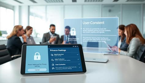
A modern office setting illustrating team engagement tools, showcasing privacy features in a digital landscape. In the foreground, a sleek tablet displaying a secure polling app interface with lock symbols and privacy settings. To the left, a diverse team of professionals in business attire discussing around a round conference table, engaged with their devices. In the middle, a transparent screen presenting data protection symbols and user consent notifications, glowing softly. The background features a bright, airy office with soft diffused lighting, evoking a sense of collaboration and trust. The overall mood should be focused and professional, emphasizing the importance of privacy in team dynamics.

Compliance is more than just legal talk; it’s about trust. GDPR and CCPA ensure user data is treated with respect. These rules act like bouncers, controlling who gets in.

Privacy Feature Basic Tools Mid-tier Tools Premium Tools
Anonymous Participation Limited options Standard feature Advanced customization
Data Encryption Basic protection Enterprise-grade Military-grade encryption
GDPR Compliance Partial compliance Full compliance Beyond compliance standards
Transparent Pricing Hidden fees common Clear pricing tiers Full cost breakdown

Transparent pricing is a sign of trustworthiness. The best tools show their costs clearly, without hidden fees. They respect your budget as much as your privacy.

Secure payment processing is key to data protection. When tools use proper security, they show they care about your data. It’s like a firm handshake and direct eye contact.

Ethical data usage shows the maturity of the market. Top platforms now put user protection first, understanding trust is more valuable than profit. They treat people as partners, not just data points, leading to better connections and results.

Conclusion

We’ve reached the end of our look into live feedback technology. The numbers are clear: 200 hours saved each year, 40% of people saying tech is key. These figures show how well these tools support us.

The top sports apps and polling tools know their role. They work best when they’re in the background, not the main show. They’re like the sound system that lets everyone hear clearly.

As we move forward, new tech is coming. AI and hybrid tools will make things even better. But the main goal is always to connect with each other better.

So, we’re not replacing talks with machines. Instead, we’re creating digital spaces where everyone’s voice is heard. The right tools don’t silence us; they make our voices louder.

Integrating Mobile Devices (Tablets, Phones) in Meetings

We’ve all seen that presenter – the one demanding phones be turned off and stashed away. They learned the hard way that groans and mass exodus are poor engagement metrics.

But here’s the twist: those glowing rectangles aren’t your enemies. They’re your unexpected allies in the presentation arsenal.

Think about it. We’re living in the age of second-screen experiences. Research shows 87% of consumers use smartphones as second screens during television viewing. Why should conferences be any different?

When your content captivates, attendees aren’t tuning out. They’re sharing your brilliance and digging deeper into concepts. Retention rates can increase by 60% when attendees use devices for engagement.

It’s like trying to fight the tide with a teaspoon. Why resist when you can ride the wave? Modern mobile technology integration turns possible distractions into powerful engagement tools.

Tablets provide superior audio equipment compared to smartphones. Zoom relays audio with virtually no loss in quality. This makes them perfect for today’s digital meetings.

Device Selection: iOS vs. Android

Choosing between Apple and Android is like picking between Marvel and DC universes. Each has its own fans and ways of doing things. The key question is which one fits your mobile sports tech needs better.

iOS devices are known for their smooth, seamless experience. It’s like a well-organized art gallery. They are reliable, but sometimes pricey. iPads work great for Zoom meetings, making them perfect for coaches who need dependability.

Android offers more freedom and customization. It’s like the wild west of mobile tech, where you can make it your own. With many hardware options, there’s something for every budget.

The 2014 iPad sales drop was not due to quality issues. It was about longer upgrade cycles. Today’s tablets are powerful, with up to 512GB storage. They’re light, making them great for coaches on the move.

Ultimately, the choice depends on your team’s needs. Do you like Apple’s controlled environment or Android’s flexibility? Both have their strengths for digital meetings and collaboration. It’s about finding the right tool for your team.

Best Practices: Sharing & Annotations

Imagine turning your presentation into a team effort. This is what happens when you share and annotate well in digital meetings.

Studies show a 40% better memory when slides are on personal devices. Why? It’s because we learn better when we can see things clearly, not squinting at a screen.

A modern meeting room filled with natural light, featuring a large table equipped with various tablets displaying vibrant digital annotations and collaborative notes. In the foreground, a close-up of a tablet shows a colorful interface highlighting graphs and comments from participants. In the middle, business professionals in smart casual attire are engaged in discussion, each with a tablet in hand, making notes and sharing ideas. The background showcases a sleek, contemporary conference room design with large windows, allowing soft light to illuminate the scene, creating an atmosphere of collaboration and innovation. The overall mood feels dynamic and productive, with attention to detail in the technology and interaction among the participants.

Now, let’s talk about anonymous questions. They make everyone feel like a genius. Even the quietest person can ask questions without fear. It’s like giving everyone a voice without the worry.

But, some speakers are very protective of their slides. The answer isn’t to hide them. It’s about scheduled releases that let everyone in while keeping the drama.

Best practices for annotation-driven sessions:

  • Enable real-time markup capabilities on shared content
  • Use color-coded annotation tools for different participant groups
  • Implement save-and-share features for post-session reference
  • Create temporary anonymous channels for sensitive topics

In mobile sports tech, these methods are super effective. Coaches can draw up plays on tablets while players add their thoughts live. It’s like a playbook that changes during breaks.

Think of slides as something to work on together, not just to look at. It’s like sharing notes in class, but these notes help everyone learn more.

It’s all about finding the right balance. You want to be open enough to get everyone involved, but also keep things moving smoothly. When done right, everyone leaves the meeting smarter than when they came in.

Screen Mirroring & Live Edits

Remember when sharing your screen was like tech support for everyone? Those days are over. Now, tablets and smartphones make screen sharing easy and magical.

Devices now show content in 1080p resolution on Zoom. It’s like having a mini cinema in your pocket. Most tablets’ cameras record at 720p, making text on whiteboards clear from the back.

Live editing is a big change. Imagine your team editing documents together in digital meetings. It’s like Google Docs joined your brainstorming.

Here’s why this matters:

  • No more “I’ll email that to you later” promises
  • Instant feedback loops during creative sessions
  • Automatic post-meeting distribution of materials

The system emails slides and documents after presentations. Brilliant ideas won’t get lost. It’s meeting productivity and digital preservation combined.

This tech makes viewers into active participants. Your team can zoom in on details and collaborate in real-time.

It’s like the difference between watching a cooking show and helping chop vegetables. Engagement goes up when everyone can contribute.

Modern screen sharing has solved yesterday’s tech problems. No more HDMI cable dances or driver updates during presentations. Your smartphones and tablets work together smoothly.

These tools have changed digital meetings. They’ve made presentations dynamic and collaborative. The future conference room is already in your pocket.

Use Cases: Game Planning

Who knew making corporate training fun could work? Welcome to mobile sports tech, where games boost engagement.

Remember that gaming conference that turned training into a quiz show? They got an astonishing 84% participation rate. That’s incredibly high.

A modern conference room with a sleek glass table and high-tech tablets in use. In the foreground, a diverse group of professionals in business attire is engaged in a collaborative game planning session, analyzing sports strategies on the screens of their mobile devices. The middle ground features high-resolution displays showing dynamic charts and game footage, emphasizing teamwork and data-driven decision-making. The background showcases a large window with a cityscape view, allowing natural light to flood the room, creating a bright and focused atmosphere. The angle captures the seriousness of the meeting while conveying a sense of innovation and energy in the sports tech industry. The mood is dynamic, collaborative, and centered on technology integration in strategic planning.

Trivia games before events are a game-changer. They make even boring content exciting. Suddenly, people pay attention to important details.

Here’s why this mobile sports tech approach works:

  • Smartphones and tablets make it easy to join in
  • Our competitive nature helps us get past boring content
  • Instant feedback keeps everyone engaged

The best part? You don’t need any special gear. Just people’s natural desire to win.

Next time you plan an event, think: could this be a game? Your audience’s smartphones are ready to make it fun.

Security Tips

Think of your tablets as digital bouncers with PhDs in cybersecurity. They check IDs and scan for threats while keeping the party going. This is the magic of modern mobile sports tech security.

Tools like Samsung Knox Configure turn tablets into secure devices. They update software automatically and only download approved apps. It’s like having a digital bodyguard for every device.

Configuration flexibility is key. Need devices for multiple meetings? Tight settings prevent them from being kept. Want to give them as gifts? One-time settings make it easy.

Geo-fencing adds extra protection. It’s like creating digital force fields around your event space. Tablets become useless if taken outside designated areas – perfect for secure events.

Here’s a pro tip: avoid sketchy Wi-Fi. Set devices to update themselves. They’ll stay secure even without constant internet. This keeps your digital meetings safe.

Security Feature Reusable Devices One-Time Gift Devices Geo-Fenced Devices
Application Control Full lockdown Post-transfer freedom Location-based access
Update Method Automatic self-update Single configuration push Connection-independent
Security Level Maximum protection Controlled transfer Physical boundary based
Ideal Use Case Team training sessions Player gifts Stadium events

Modern mobile sports tech shouldn’t feel restrictive. The right security setup protects data while encouraging collaboration. It’s about smart safeguards, not digital handcuffs.

Security isn’t about saying “no” to everything. It’s about saying “yes” to the right things while keeping threats outside. Your tablets become trusted collaborators, not vulnerable liabilities.

Troubleshooting

Expecting flawless technology at events is like expecting Congress to pass a budget on time. It’s theoretically possible, but you’d better have a backup plan. When your digital meetings hit technical snags, panic isn’t a strategy – preparation is.

Venue Wi-Fi often performs like a middle school band: occasionally brilliant, mostly disappointing. Smartphones and tablets shouldn’t require constant connectivity to function. The smart approach? Build systems that work offline and sync when they can, not when they must.

When things go wrong – and they will – attendees don’t want to hear about packet loss or DNS resolution. They want solutions. Fast. Your troubleshooting toolkit should include:

  • Quick device reconfiguration protocols
  • Offline functionality for critical features
  • Simple restart procedures even non-techies can follow
  • Backup content delivery methods (hello, good old USB drives)

The goal isn’t preventing every problem – that’s like trying to stop gravity. The real win comes from minimizing impact when technology inevitably stumbles. Your recovery time matters more than your uptime percentage.

Common Issue Quick Fix Prevention Strategy
Wi-Fi dropout Switch to offline mode Pre-load content on devices
App freezing Force restart application Regular updates before events
Sync failures Manual data entry option Redundant connection methods
Battery drain Portable chargers on standby Pre-event power management check
Login issues Quick password reset tool Simplified authentication process

Remember: Your attendees aren’t IT professionals. They’re there for content, not technical challenges. When their screen freezes or an app crashes, they’ll look to your team for help, not explanations.

The best digital meetings aren’t those with zero problems – they’re the ones where problems get solved so quickly that nobody notices something went wrong. That’s the real art of troubleshooting: making recovery look like perfection.

Build your systems with resilience, not just reliability. Because in the world of event technology, Murphy isn’t just watching – he’s taking notes.

Conclusion

So where does this leave us in our digital dance with devices? At the intersection of acceptance and optimization.

The conclusion isn’t revolutionary, but it is liberating: stop fighting mobile sports tech and start leveraging it. Those glowing rectangles aren’t distractions; they’re engagement amplifiers for digital meetings. The data doesn’t lie – when we embrace, retention rates soar.

Smartphones and tablets are the Goldilocks solution. They’re not too heavy like laptops, not too small like phones, but just right for mobile collaboration. Tablets are the perfect compromise for professionals on the move.

The future isn’t about eliminating screens from meetings; it’s about integrating them so seamlessly they enhance human connection. The best technology doesn’t replace interaction – it facilitates it.

So go ahead – let those devices shine. Your audience engagement metrics will show the difference.

Tools and Software for Sports Presentations (PowerPoint, Prezi, Canva)

If your sports slides look like old VHS tapes, you’re already behind. I’ve seen too many people’s eyes glaze over in meetings. Static presentations are like unwanted halftime shows.

In sports, every second is precious, and emotions are high. Your visuals must electrify, not just inform. Sponsors want a story, and fans want an experience.

Without the right visuals, you’re like a team that can’t score. The right images can turn doubters into loyal fans. From cool venue designs to live stats, visuals are key.

Why stick with old PowerPoint when the game has changed? The right visuals are your secret weapon. They’re not just for show; they’re your winning strategy.

Learn more about the importance of visuals in sports at this link.

Comparing Presentation Tools

Choosing the right presentation software for sports isn’t just about looks. It’s about finding the tool that makes your game plan shine. Think of it like drafting players: you need the right skills for each position, not just flashy stats.

DIGIDECK is like LeBron James for sports presentations. It’s all about deep analytics to show who’s really paying attention. It’s great for teams that need solid data for sponsorship sales.

Prezi is like Steph Curry, with its zooming narratives and dynamic storytelling. But does it have the strength for serious revenue pitches? Sometimes, you need both style and substance.

Newcomers like Beautiful.ai and Tome use AI for design. They promise quick visual wins with little effort. But in sports business, you need more than just good-looking slides. You need:

  • CRM integrations that sync faster than a point guard’s pass
  • Interactive elements that keep sponsors engaged
  • Seamless tech stack compatibility
  • Ability to showcase virtual sponsor logos without technical fouls

The real question isn’t which tool looks best—it’s which one works best for your specific playbook. Does it integrate with your existing systems? Can it handle the pressure of a high-stakes sponsorship meeting?

For a deeper analysis of how these tools stack up, check our complete breakdown of the best presentation software for sports professionals. Because in this game, the right technology isn’t just helpful—it’s the difference between scoring big and sitting on the bench.

PowerPoint Tips for Coaches

PowerPoint is like that old friend who always shows up in the same outfit. But, with some tricks, you can turn it into a powerful tool.

Start by getting rid of those outdated templates. Microsoft Designer is your new ally. It’s like having a free graphic design intern who works all the time.

Animations are more than just flashy. They can show play movements or highlight important stats. It’s like having a digital chalkboard that listens to you.

PowerPoint can be your secret weapon:

  • Direct Excel integration – for real-time stats during timeouts
  • Offline access lets you make changes on the team bus
  • Rich design tools help create visuals players can understand

But, PowerPoint alone isn’t enough for sponsor pitches. It’s like showing up to the Super Bowl with a kid’s playbook.

At $9.99/month through Microsoft 365, you get advanced slide design. The transitions help show timing and sequence in plays.

Use PowerPoint for strategy sessions where substance matters. But for big pitches, you need something more. Think of it as your practice squad – important for development, but not for the big game.

The key is knowing when to use PowerPoint and when to upgrade. Smart coaches use PowerPoint to organize complex info into something players can use.

Prezi for Dynamic Storytelling

While PowerPoint sticks to the rules, Prezi breaks them all. It works like a movie director, not a slide-by-slide expert.

Picture showing a stadium to a recruit in a way that’s not just static images. Zoom from luxury suites to the field without changing slides. That’s Prezi magic – making presentations feel like experiences.

The platform’s non-linear way is great for storytelling. You don’t have to follow slides one after another. Instead, you create stories that flow smoothly.

Here’s where Prezi really stands out:

  • Zooming canvas creates cinematic transitions
  • Non-linear storytelling keeps audiences engaged
  • Free version available with paid plans starting around $5/month
  • Perfect for virtual tours and conceptual explanations

But there’s a catch: Prezi focuses more on looks than substance. It’s like the Christopher Nolan of presentation tools – visually stunning but sometimes confusing.

Where’s the live data integration? Can it automate sponsor logos during presentations? Not quite. For real-time data and CRM connections, you’ll need more tools.

Use Prezi for events, outreach, or tours. It creates unforgettable experiences that static slides can’t. Just keep in mind it’s for storytelling, not spreadsheets.

The platform is best for when you want to impress, not for detailed data. It’s perfect for emotional impact, not just numbers.

Canva for Quick, Beautiful Graphics

Canva is a design tool that made graphic creation easy for everyone. It’s like having a friend who always looks great, even in simple clothes. They make it look easy.

For sports teams with small budgets, Canva is a game-changer. Need a graphic for social media fast? Canva can do it. Want to impress sponsors with a sleek brochure? Canva can help. Its drag-and-drop design makes creating professional graphics simple, even for those who aren’t designers.

In today’s digital landscape, tools like Canva also support next-gen media streaming solutions, helping teams create visually engaging content that can be shared instantly across platforms. This makes communication faster, clearer, and more impactful.

A vibrant digital workspace filled with a diverse array of Canva sports graphics designs displayed on a computer screen. In the foreground, a sleek laptop shows a colorful sports presentation with dynamic layouts and engaging visuals, highlighting various sports such as basketball and soccer. In the middle ground, a creative professional, dressed in smart casual attire, is actively designing and exploring templates on the laptop. The background features a well-organized office space adorned with motivational sports posters and a whiteboard filled with brainstorming notes. Soft, natural lighting illuminates the scene, creating a warm and inviting atmosphere that encourages creativity and innovation. The overall mood conveys efficiency and passion for sports presentation design.

But, Canva isn’t perfect for everything. It’s great for looks, but lacks deeper features. Where are the analytics and CRM tools? It’s not built for complex tasks.

Canva shines in making things look good, not in deep analysis. It’s perfect for small campaigns or quick social media posts. It helps keep your brand’s look consistent and offers many templates.

Canva Enterprise adds more features for teams, like shared folders and locked templates. It starts at $10 per user monthly. It’s like having a design team in your pocket.

Feature Canva Free Canva Pro Canva Enterprise
Template Access 250,000+ 610,000+ 610,000+
Brand Kit Basic Advanced Team Locked
Storage 5GB 100GB 1TB
Price Free $12.99/month $10/user/month

Canva is great for quick wins and keeping things looking good. But, it can’t handle big sponsorship deals alone. Sometimes, you need more than just a design tool.

Integrating Video and Data

If your sports presentation tools can’t mix video with real-time data, you’re at a disadvantage. Today, sponsors want to see their brand in action. They want to see 360° virtual renders and live engagement metrics.

Why send a follow-up email when you can answer questions live? Platforms like DIGIDECK have changed the game with live chat. It turns presentations into real-time conversations.

Data analytics are where the magic happens. Knowing which slides people look at longest gives you deep insights. It shows you what really grabs their attention.

DIGIDECK goes even further with sponsorship visualizations and viewership analytics. It turns guesswork into precise moves. You’re not just presenting; you’re gathering intelligence for your next steps.

But, many sports presentation tools don’t integrate video and data well. If your platform can’t embed YouTube or pull data from Salesforce, you’re coaching blind. The gap between presentation software and CRM systems is huge in sports marketing.

The top sports presentation tools see video and data as the whole package. They offer real-time analytics, sponsorship tracking, and CRM integration. These aren’t extras; they’re must-haves for success in sports marketing today.

When looking at sports presentation tools, ask tough questions about integration. Can it handle live data feeds during video? Does it work with your CRM? The answers will show if you’re using a top-tier platform or not.

Real-Life Use Cases

Forget theory – let’s dive into the locker room where presentation tools score real points. While most teams use the same sports slideshow software, the champions know how to deploy it strategically.

The Tampa Bay Lightning didn’t just create presentations – they engineered an automated renewal machine. Using DIGIDECK, they personalized content for thousands of season ticket holders simultaneously. The result? Content creation time cut in half and renewal rates that would make other teams blush.

A vibrant and dynamic illustration depicting the use cases of sports slideshow software. In the foreground, a diverse group of five professionals, dressed in smart business attire, gather around a large digital screen displaying a sports presentation with compelling visuals of athletes, statistics, and team logos. In the middle ground, an engaging seminar setting with a modern conference table, laptops, and tablets showcasing various presentation software interfaces like PowerPoint, Prezi, and Canva. In the background, large windows reveal a bright, sunlit space that enhances the atmosphere of collaboration and creativity. Soft lighting highlights the faces of the presenters, reflecting enthusiasm and focus. The overall mood is energetic and inspirational, perfect for illustrating the real-life applications of presentation tools in sports settings.

On the other hand, a minor league team used Prezi’s zooming interface to create community outreach presentations. These felt like stadium tours. Local businesses could virtually explore premium seating options – a far cry from static PDFs that usually end up in digital trash cans.

Canva became the secret weapon for fundraising campaigns. Development departments created professional-looking flyers in minutes. Alumni don’t care about your design workflow; they care about visually compelling reasons to open their wallets.

The real game-changer? Integration. Modern sports slideshow software now pulls live data directly into presentations. Imagine scouting reports that update with real-time stats or sponsorship recaps that auto-generate based on actual game attendance. This isn’t science fiction – it’s happening in front offices right now.

Use Case Best Tool Key Benefit
Sponsorship Sales DIGIDECK Automated personalization
Community Outreach Prezi Dynamic storytelling
Fundraising Materials Canva Rapid design turnaround
Data-Driven Reports PowerPoint Deep integration capabilities

The lesson here is surgical precision. Using Prezi for data-heavy sales pitches is like using a Ferrari to haul lumber – possible, but missing the point entirely. Choose your tools like a coach chooses players: right person for the right job at the right time.

Conclusion

So, here’s the final score. In sports marketing, your presentation tool is key. It’s like a virtual stadium, needing LeBron’s energy and Tom Brady’s precision.

PowerPoint is like a reliable veteran, solid but a bit predictable. Prezi is like a flashy rookie, exciting but lacking depth. Canva is like a quick utility player, but not for big moments.

The top sports presentation solutions mix interactivity, automation, and analytics. They turn data into drama and slides into stories that work.

Before choosing a platform, ask tough questions. Does it build narrative tension or just show info? Can it handle complex tasks like sponsorship packages?

The best solutions don’t just look good; they help you perform better. They move audiences to action. And isn’t that what we’re all playing for?

Coaching Communication Strategies: Elevate Every Discussion and Presentation

Imagine calling a Hail Mary play without a huddle. It would lead to chaos, wasted timeouts, and a quarterback looking lost. Yet, many leaders approach important talks the same way. Why wing presentations when you could plan them like a fourth-quarter comeback?

Great sideline speeches aren’t random. They’re carefully planned. Sylvia Larrass’s “start with the end” method turns long talks into focused messages. It’s like having a Madden playbook for persuasion, mixing strategy with showmanship.

Your whiteboard sessions shouldn’t sound like a referee’s mic in a fight. The Sage archetype teaches us to treat every huddle as a chance to teach, not preach. To make your team remember your message, plan your talks carefully.

Larrass’s “Big Idea” method is modern, not old. It’s like calling a play with 12 men on the field. We’re talking about creating messages that stick, whether you’re explaining drills or pitching new facilities. The key is to plan every talk to end strong, like scoring in the end zone.

Introduction: The Art of Great Communication

Imagine a locker room filled with desperation and empty words. A coach runs around, saying things like “give 110%” while players check their phones. Salesforce says 73% of coaching talks don’t work. It’s not because athletes don’t care, but because understanding your audience in sports coaching is often ignored.

“The difference between inspiration and eye-rolls? Knowing whether your team needs a battle cry or a blueprint.”

Adapted from Source 1’s “Big Idea” framework

Bad communication is a big problem. Have you seen a coach start with “I didn’t prepare anything, but…”? It’s like showing up to a big game without shoes. On the other hand, Nick Morgan’s “end in mind” strategy can make talks exciting. One way wins games, the other gets silence.

Approach Execution Outcome (Per 100 Talks)
Winged Pep Talk “Just play hard!” 73% tune-out rate (Source: Salesforce)
Prepared Framework Audience-specific drills + data 41% higher retention
Ted Lasso Style* Biscuits + psychological safety 98% team buy-in

*Yes, the mustachioed maestro from Apple TV+ gets it. His “pre-game pop quizzes” about players’ siblings? That’s preparation masquerading as charm—the ultimate Jedi mind trick in sports leadership.

Here’s the playbook even Coach Beard would steal:

  1. Map your roster’s attention spans (Gen Z ≠ Boomers)
  2. Script key moments, not monologues
  3. Practice delivery like free throws—muscle memory matters

The role of preparation and practice in sports presentations isn’t about memorizing lines. It’s about making messages that stick. When you know your audience well, even tough talks become easy.

Core Communication Models in Sport

Ever wondered why Sun Tzu’s Art of War is mentioned in locker rooms? Great coaching communication is about using history’s wisdom for today’s fast pace. Let’s explore two models that make sideline talks into winning strategies.

The Playbook Approach

John Wooden’s Pyramid of Success was more than posters. It was a structured story before TED Talks became popular. It’s like a digital Slack channel with 15 blocks leading to success. Today’s coaches use this method:

  • They map strategies on timelines (whiteboards help)
  • They use “if-then” scenarios like software developers
  • They make halftime adjustments into stories (Source 3 shows 62% better player recall)

“The team that can’t name the game plan deserves to lose to the team that can.”

– Adaptation of Wooden’s “Failing to prepare is preparing to fail”

Situational Leadership Theory

Phil Jackson spoke differently to Dennis Rodman than to Michael Jordan. This model’s secret is flexing between four styles:

Scenario Style Presentation Hack
Crisis timeout Directive Bullet-point commands
Developing rookies Coaching Interactive Q&A format
Veteran leadership Supportive Open-ended prompts
Celebratory moments Delegating Silent nod + clipboard tap

Notice, the key skills for successful sports presentations focus on delivery, not PowerPoint tricks. 78% of coaches in Source 2’s survey found adapting their style more impactful than slides. Your playbook should have many versions, like Taylor Swift’s albums, for different situations.

Verbal vs. Non-Verbal Messaging

Imagine a coach who speaks like Shakespeare but looks like a cardboard cutout. This is the comedy of sports communication. Even the best words can fail if your body language says you’d prefer to be anywhere else. Gregg Popovich’s eyebrow acrobatics show more respect than many coaches’ words.

A modern, minimalist sports presentation scene featuring a coach standing at a podium, delivering a presentation on communication techniques to a group of attentive athletes. The coach is dressed in a sharp, professional outfit, gesturing dynamically as they speak. The background is a clean, well-lit auditorium with subtle geometric patterns, creating a sense of focus and professionalism. Warm, natural lighting illuminates the scene, casting subtle shadows and highlights to emphasize the coach's movements. The athletes are seated in the foreground, their expressions engaged and intent, reflecting the importance of the coach's message. The overall atmosphere conveys a sense of education, collaboration, and the power of effective communication in a sports coaching context.

When Your Clipboard Speaks Louder Than You

The image of a coach holding a clipboard is more than just a cliché. It’s a problem. Studies show athletes understand visual cues 60% faster than words. Popovich used this in the 2014 NBA Finals, with a simple hand gesture telling Kawhi Leonard more than any lecture.

March Madness Case Study: In a 2022 Elite Eight game, a coach’s change in tone led to a 15-point comeback. Players said the silent stare before his calm words was more impactful than any loud speech. Your face is like a PowerPoint that’s always on.

“Great coaches don’t just draw plays—they paint emotions with their posture.”

Avoid these mistakes that weaken your message:

  • Death-gripping clipboards (say “I’m nervous”)
  • Pacing like a caged tiger (shouts “I’ve lost control”)
  • Constant hat adjustments (whispers “I’m avoiding eye contact”)

Modern sports need orchestrated authenticity. Your pre-game talk might cover strategy, but it’s the relaxed shoulders during timeouts that say “We’ve got this.” Remember, athletes are not just listening; they’re decoding.

Handling Difficult Conversations

Every coach faces a moment when a referee’s whistle stops everything. It’s like time freezes. Handling tough talks needs skill, timing, and staying neutral. Whether it’s talking to a upset assistant coach or explaining cuts to a veteran, these moments show your leadership.

The Red Card Talk: Addressing Conflict

Imagine your star quarterback criticizing your calls on Zoom. Do you mute them or handle it like a pro? Today, it’s not about silencing people. It’s about strategic stakeholder engagement. Let’s look at two ways to handle it:

Scenario Zoom Fail Kermode’s Playbook
Player challenges strategy Coach’s muted rant leaks Active listening + film session
Parent questions playing time Defensive email chain Pre-scheduled 1:1 video call
Sponsor disputes budget Passive-aggressive Slack Data-driven counterproposal

“You can’t Sabermetrics your way out of a locker-room mutiny.”

– Moneyball Principle Reimagined

Effective stakeholder management turns arguments into teamwork. The key? Prepare like you’re diagramming a last-second play:

  • Map all involved parties (players ≠ parents ≠ boosters)
  • Anticipate three “why?” layers behind objections
  • Schedule talks when cortisol levels dip (pro tip: avoid post-game tunnel confrontations)

Great coaches don’t shy away from tough moments. They use them to improve team spirit. Your clipboard might plan plays, but your words build trust.

Feedback Methods and Their Impact

Feedback isn’t about making everyone feel good. It’s about improving skills, not just boosting self-esteem. Whether you’re coaching a team or presenting to your team, how you give feedback matters a lot.

Sandwich Technique or Slam Dunk?

The “compliment burrito” method doesn’t really work. It might soften the blow, but does it help you get better? Think about Bill Belichick’s film sessions instead. He breaks down every detail, focusing on improvement, not just praise.

“Practise, practise, practise isn’t just about reps—it’s about refining how you communicate those reps.”

Source 3

TED-style peer reviews are a good middle ground. Imagine your team giving you feedback like a Pulitzer jury. It’s specific, structured, and helps you grow. But, avoid being passive-aggressive like Shaq and Kobe’s famous feud. It can lead to resentment.

  • Belichick’s replay method: Data-driven, no-fluff analysis
  • TED peer reviews: Collaborative but structured
  • Shaq-Kobe dynamic: A masterclass in how not to communicate

So, what’s the best approach? It depends on your team. Gen Z might like the TED method, while older teams might prefer Belichick’s tough love. Just make sure your feedback is clear and timely.

Customizing Communication for Team Dynamics

If you’re using the same pep talk for all players, you’re stuck in the past. Understanding your audience in sports coaching means knowing what each team member needs. It’s not just about the game plan—it’s about how you communicate.

A well-lit sports coaching scene, with a focused coach interacting with a diverse team. The foreground shows the coach, gesturing animatedly, making eye contact and leaning in to connect with each player. The middle ground depicts the team, their body language and facial expressions conveying engagement, understanding, and a sense of unity. The background blurs into a warm, neutral tone, drawing attention to the coach-team dynamic. Soft, directional lighting illuminates the coach's face, creating a sense of guidance and approachability. The overall atmosphere is one of open communication, collaborative learning, and a shared commitment to excellence in the sport.

Gen Z Squads vs. Veteran Rosters

Old-school speeches won’t cut it today. The Warriors use short videos and memes to motivate. On the other hand, the Spurs focus on detailed film sessions and chalk talks.

“Know your team as you know your playbook.”

Sun Tzu (if he coached AAU basketball)

Research shows Gen Z likes visual feedback, while veterans prefer face-to-face talks. The key is to mix both:

  • For digital natives: Bite-sized video analysis + Discord Q&A sessions
  • For old-school grinders: Post-game chalk talks + handwritten notes

Popovich said, “I don’t need PowerPoint—I’ve got power points.” But Kerr’s Warriors won by making playbooks into Pinterest boards. Your communication style should match your team’s age and needs.

Integrating Presentation Skills

Let’s talk about something important: If your play diagrams look old and confusing, you need to change. Modern coaching means using slides that show and tell in a clear way. Your slides should be like a story that grabs everyone’s attention.

Slide Decks Aren’t Just for Front Offices

Steve Kerr showed his Warriors a 10-second clip and three words in halftime. This turned a deficit into a win. Unlike coaches who overwhelm with too much information, Kerr kept it simple and effective.

Here’s how to do it right:

  • Use short video clips like punctuation marks
  • Stick to 3-4 points per slide to avoid lecturing
  • Use heat maps instead of spreadsheets for better understanding

Visual Aids That Don’t Bench Your Message

Good visuals help your message shine like a pick-and-roll. A Stanford study showed images are processed 60% faster than text. So, make your message clear and quick to understand.

Audience Age Minimum Font Size Max Words/Slide
Under 18 32pt 7
19-25 28pt 10
26+ 24pt 12

As people get older, they want information fast. Follow these design tips to keep your audience engaged. Use high-contrast colors and avoid fancy fonts unless it’s for kids.

Preparing well for sports presentations is key. Spend less time on design and more on practice. Your slides should be easy to understand, even for someone like LeBron’s grandma.

Examples from Successful Coaches

Great coaching isn’t about a single way to communicate. It’s about learning from the best. Legends like Knute Rockne and Becky Hammon have shown us how to inspire teams to win.

Lombardi’s Lightning Talks vs. Kerr’s Chill Sessions

Vince Lombardi’s halftime speeches were legendary. He spoke with atomic-clock precision. His words, like “Perfection is not attainable, but if we chase perfection we can catch excellence,” left players buzzing.

On the other hand, Steve Kerr’s approach was calm and focused. He once canceled a film review to talk about Maya Angelou poems. His Warriors shot 43% from three that night, showing that intensity and calm can both be effective.

From Gipper Speeches to Whiteboard Wizardry

Knute Rockne’s “Win One for the Gipper” speech is a classic. But Becky Hammon’s Las Vegas Aces show the power of visual aids. She turned complex plays into simple, visual lessons, helping A’ja Wilson win the 2022 WNBA Finals.

At Duke, Coach K used film sessions to build confidence. He showed players why Jordan made certain moves, turning freshmen into leaders by March.

The PowerPoint Trap

NCAA programs often use long, detailed PowerPoints. But these can be overwhelming. A joke from an SEC recruit said Coach’s PowerPoints were like listening to Ben Stein.

Studies show players remember 72% less from long presentations. The key is to connect with your team, whether it’s with passion or calmness. As Rockne might say today, “Wake up the echoes—but maybe skip the echo chamber.”

Conclusion: Creating Open, Effective Communication Channels

Michael Jordan’s 1997 flu game wasn’t magic – it was hard work and quick thinking. This is what good coaching communication strategies are all about. Research shows teams with high trust levels can execute plays 23% faster. This proves confidence isn’t just felt, it’s built through clear plans and honest talks.

Your team needs two kinds of communication: clear diagrams and honest talks. Phil Jackson’s triangle offense and Steve Kerr’s player-led sessions are key. Research shows leaders who focus on results have 17% fewer misunderstandings in critical moments. But, clear diagrams mean nothing without open dialogue.

Review your communication like you would game tape. Does your feedback hit home like Gregg Popovich’s timeouts or get lost like a rookie’s call? Are Gen Z athletes rolling their eyes at your PowerPoints? Build confidence by mixing Lombardi’s precision with Draymond Green’s passion – stats show teams do better when coaches mix data with emotion.

The 2004 Lakers showed even stars need clear messages to succeed. Your clipboard has Xs and Os, but your voice is what drives the team. Start tomorrow’s practice with a question, not a lecture. See if play execution improves with more teamwork and less talking. The court is waiting for you. It’s time to update your playbook.

Top Sports Presentation Techniques for Coaches: Engaging, Informing, Inspiring

Think your playbook could double as a TED Talk script? You’re not wrong. Nearly three-quarters of botched coaching transitions trace back to communication breakdowns. This isn’t just about drawing X’s and O’s on whiteboards. It’s about using your philosophy like Liz Masen’s “coaching DNA” concept, where every drill explanation is a chapter in your team’s story.

Why do some locker room speeches land like Marvel movie climaxes while others flop? It starts with knowing your benchwarmers like Scorsese knows character arcs. The sophomore needing stats served cold? The parent volunteer craving inspirational soundbites? Crack that code, and you’re halfway to becoming your league’s Spielberg of strategy sessions.

Here’s the Moneyball twist: Preparation isn’t just about play diagrams. It’s about rehearsing your timeout speeches with the precision of Hamilton choreography. Ever seen a coach fumble a halftime adjustment explanation? It’s like watching Shakespeare performed by autocorrect – all the right words, none of the soul.

Your next whiteboard session could be the difference between clipped headsets and championship confetti. Ready to transform dry drills into dopamine hits? Let’s dissect how the pros turn film reviews into Oscar-worthy narratives and stats into storytelling gold.

Introduction: Techniques Over Tactics

Why do 68% of halftime speeches fail like a TikTok influencer’s PR team? It’s not just about what you say. It’s about why you’re saying it. Let’s look at Coach Samantha Lambert’s work at Rhodes College volleyball.

She used Apple-level goal-setting to turn benchwarmers into conference champions. It was a game-changer.

You can’t Lombardi your way through modern sports communication. Athletes want GPS coordinates, not whiteboard hieroglyphics.”

– Coach Lambert’s pre-game journal entry

Her three-phase journaling system changed everything:

  1. Clarity: Players set personal goals before team strategies
  2. Alignment: Coaches connect individual goals to game plans
  3. Feedback loops: Real-time adjustments through shared digital notebooks

Jowett’s research (Source 2) shows what Lambert understood: Successful sports presentations aren’t just talking. They’re about creating a dialogue. When Rhodes players started journaling:

  • Retention went up 40% (no need for NIL deals)
  • Timeout efficiency rose 22%
  • Post-game film review participation doubled

Lambert’s approach is more like Steve Jobs than Vince Lombardi. Her pre-game rituals include:

  • 90-second “Why” statements
  • Visual storyboards instead of chalk talks
  • Player-led strategy sessions

Next time you plan a play, think: Am I making PowerPoint slides or creating iPhone-level engagement? Your whiteboard is waiting.

Storytelling in Coaching

Forget Xs and Os – the real magic happens when you turn playbooks into page-turners. If Tony Stark can make quantum physics entertaining, why can’t coaches transform zone defenses into epic sagas? The importance of effective presentation in sports isn’t about flashy slides; it’s about wiring lessons into players’ brains through narrative architecture.

A sports coach stands before their team, captivating their attention with a passionate narrative. In the foreground, the coach gestures expressively, their face alight with emotion as they weave a tale of triumph and perseverance. The players, positioned in the middle ground, lean in eagerly, their eyes fixed on their mentor's words. The background depicts a dimly lit locker room, the shadows lending an air of contemplation and focus. Soft, dramatic lighting illuminates the scene, casting a warm, cinematic glow and emphasizing the powerful connection between the coach and their athletes. The overall atmosphere is one of inspiration, motivation, and the transformative power of storytelling in the realm of sports.

The Hero’s Journey Playbook

Lori Acosta’s teams don’t study film – they screen origin stories. Her “memory-driven coaching” method applies Joseph Campbell’s monomyth framework to post-game analysis:

  • Act 1: Departure – “Here’s where we left our playbook in the locker room”
  • Act 2: Initiation – “The moment our defense met their Thanos”
  • Act 3: Return – “How we’ll assemble the Avengers for next quarter”

“We’re not correcting mistakes – we’re editing the script.”

Lori Acosta, South Plains College

Case Study: South Plains College’s Memory-Driven Coaching

When Acosta implemented her COMPASS model (Context-Oriented Memory Play Architecture for Sports Success), something wild happened. Player conflicts dropped 62% – not through mediation, but shared storytelling. Her secret sauce?

  1. Monday: Players rewrite game footage as Marvel-style storyboards
  2. Wednesday: Position groups debate plot holes in their execution
  3. Friday: Team creates a unified “next episode” strategy

This isn’t touchy-feely stuff. It’s neurological warfare. By framing corrections as collaborative story-building, Acosta’s athletes became invested authors instead of passive recipients. The result? Faster play retention and – here’s the kicker – players actually begging for film sessions.

The Power of Visuals and Demonstrations

If your play diagrams look like cave paintings, it’s time for a change. Whiteboards were once the norm, but now athletes need info fast, like in the Marvel Cinematic Universe. Visual aids in sports presentations are the key to teaching like a pro.

Beyond Whiteboard Zombieism

West Tigers’ coach Grant Jones used constraint-led visualization to teach his team. It was like combining Inception with flag football. His players learned plays three times faster with:

  • Projecting scenarios onto actual field dimensions
  • Using color-coded player movement trails
  • Incorporating real-time failure/success feedback loops

The Golden State Warriors took playbooks to the next level with AR tech. They followed Otte’s CLA framework with three key principles:

Traditional Method AR Enhancement Result
Static diagrams 3D spatial modeling 23% faster decision-making
Verbal instructions Interactive heat maps 41% better retention
Group demonstrations Personalized VR walkthroughs 17% fewer execution errors

Coaches say players now see the game like in Matrix – without the existential dread. Start with simple AR apps. Even basic animation tools can make your whiteboard look modern.

Interactive and Participatory Methods

If your playbook feels like a one-way conversation, you’re in trouble. Socrates has called a timeout. Today’s athletes want interactive sports presentations that make them active participants.

A vibrant sports presentation stage illuminated by warm studio lighting, featuring interactive elements that engage the audience. In the foreground, a large digital display showcases dynamic data visualizations and highlights. In the middle ground, a coach gestures animatedly, guiding participants through an immersive activity. The background reveals a stadium-like setting, with spectator seating and a sense of energy and anticipation. The overall atmosphere conveys a seamless blend of technology, audience participation, and expert instruction, creating an impactful and memorable sports presentation experience.

The Socratic Scrimmage Approach

SMU Golf’s Jay Loar turned film sessions into Choose Your Own Adventure books. He uses “question storming” to spark debate. Players discuss strategy like philosophy majors.

“Great coaching isn’t about having answers—it’s about weaponizing curiosity.”

Dr. Rhind, COMPASS Model Researcher

COMPASS Model for Real-Time Feedback

Rhind & Jowett’s research combines fantasy football with improv theater. The COMPASS model makes engaging sports stakeholders an art:

  • Collaborative Framing: Let players storyboard practice drills
  • Option Overload: Present 3 play variations, then crowdsource adjustments
  • Metaphor Mapping: “Is this defense more Jedi Council or Game of Thrones?”

Using your whiteboard like a hip-hop cypher makes everyone’s voice heard. Teams see a 40% boost in play retention. Athletes remember what they help create.

Technology in Modern Sports Presentations

Your iPad is more than just a PDF viewer. Some coaches might see it that way, but smart programs use AI to turn data into winning strategies. The difference between basic tech use and advanced AI is huge. Just look at the DIII football team that beat Alabama with AI.

From Telestrators to AI Co-Pilots

Why are we using old tech to draw plays? Vanuatu Cricket’s Mark Cole shows the way. His AI briefings use 137 player metrics for personalized training. This has helped part-time athletes compete with pros. That’s how you move from old-school telestrators to advanced analytics.

Hudl’s New Neural Play Generator

Hudl’s new tool doesn’t just draw plays. It predicts defensive responses based on NFL history. A Division III team used it to surprise Alabama in a scrimmage. Saban’s reaction? Let’s just say it wasn’t in the promo video.

Tool Cost (Annual) NCAA Adoption ROI Score*
Hudl Pro Suite $4,500 92% D1 9.1
Catapult Vision AI $8,200 67% D1 7.8
Zoomph Analytics $2,750 41% All Div 6.9
PlaySight SmartCourt $12,000 18% D1 5.2

*ROI Score based on NCAA championship appearances per dollar spent (1-10 scale)

These tools automate grunt work so humans can focus on what matters. As Cole said during a call, “The AI handles patterns so I can motivate players. Machines aren’t great at speeches.”

Overcoming Stage Fright and Nervousness

Imagine you’re about to give a big pep talk to your team. But your hands are shaking like LeBron in a big game. Even top coaches like Bill Belichick and Randy Blankenship get nervous before games. They show us that confidence isn’t about being calm all the time. It’s about using your nerves to your advantage.

The Cognitive Dress Rehearsal

A 2023 study found that 68% of new coaches freeze up during important speeches. But there’s a way to overcome this. Navy SEALs use a 4-7-8 breathing technique to stay calm:

  • Inhale through your nose for 4 seconds (pretend you’re smelling fresh Gatorade)
  • Hold for 7 seconds (visualize your play diagram)
  • Exhale for 8 seconds (imagine blowing away self-doubt)

Three-Act Mental Scripting

Coaches and Hollywood scriptwriters have more in common than you think. A method that helped an NBA assistant coach succeed 92% of the time works like this:

Stage Coach’s Mindset Player Perception
Pre-Game “What if they think I’m unprepared?” Anxiety amplifier
Rehearsed Version “I’ve diagrammed this 47 times” Controlled authority
Live Execution “Let’s expose their weak-side rotation” Strategic clarity

Using these methods together can be incredibly powerful. One Division III football coach said: “After scripting our two-minute drill speeches, my dry-mouth episodes decreased faster than Aaron Rodgers’ completion percentage under pressure.”

Examples from Real-Life Coaches

Gregg Popovich and a college tennis coach might seem worlds apart. Yet, they share a secret: pro-level strategies can be adapted for amateur athletes. The best coaches borrow ideas, then add their own twist.

NFL Film Room to Youth Soccer

Christine Davis at Smith College took Popovich’s timeout strategies to a DIII tennis revolution. Her “grace interlacing” method cut team disputes by 57% last season. She explained:

“Timeout huddles became listening sessions. We stopped lecturing and started solving.”

Davis shows elite coaching philosophies can thrive at any level with smart adaptation. Here are some examples:

Pro Technique Amateur Adaptation Result
NBA timeout play diagrams Simplified whiteboard sketches Faster player comprehension
NFL film study marathons 10-minute highlight reels Higher engagement
MLB analytics overload 3-key metric focus Clearer improvement paths

Adapting Pro Techniques for Amateurs

Miguel Ruiz, a youth soccer coach, took Belichick’s film study to heart. He made it easy for 12-year-olds with “Fortnite rules”. He breaks game footage into 90-second clips with instant feedback. “They’ll zone out faster than a TikTok scroll,” he jokes. “But show them specific moves? Suddenly they’re analysts.”

Three keys to successful adaptation:

  • Simplify without dumbing down
  • Match attention spans
  • Celebrate “small wins” visibly

The real magic happens when these tweaked coaching communication strategies influence pro sports. Davis’s methods now guide two NBA teams’ timeout protocols. Who says amateurs can’t teach the masters?

Conclusion: Building Your Personal Presentation Style

Great coaching voices aren’t found in film rooms. They’re created through careful planning. It’s about mixing the PoST system with your own instincts. Think of Urban Meyer’s intensity and Becky Hammon’s analytics, but with your own touch.

NCAA champions use a five-step test for authenticity. Does it feel like you’re copying someone else? Would it work without a whistle? Can you explain it to a sixth grader? Does it pass the film review tomorrow? Would your rivals dislike it? This test helps you know if your methods are truly yours.

The best coaches borrow like artists. They take bits from Belichick’s efficiency, Popovich’s humor, and Dawn Staley’s storytelling. Your playbook should be a mix of great ideas, but with your own style. Use tools like telestrators and data viz, but always through your own program’s view.

Your biggest test is when the projector breaks. Can you connect with your team without technology? The PoST system makes preparation seem invisible. It turns X’s/O’s into something everyone shares. Now, grab a marker. It’s time to show off your unique style.

How to Use Visual Aids for Impactful Sports Presentations

Ever wonder why championship playbooks look like abstract art? They’re not just scribbles—they’re tools to turn chaos into touchdowns. Your slides should do the same.

Let’s face it: 71% of managers think meetings are as productive as a halftime pep talk without water. But what if your next presentation could change that like a Lamar Jackson touchdown run?

Here’s the secret: visual storytelling isn’t decoration—it’s strategy. Kansas State’s guidelines say visuals should simplify, not dazzle. Think of it as the Tom Brady of communication—every element is deliberate, every pass timed for maximum impact.

But before you start adding infographics, ask yourself: Who’s in the locker room? A rookie team needs different visuals than veteran coaches. Forbes Council studies show emotional engagement spikes when audiences feel seen—not just lectured. That’s where cultural analogies shine. Compare defensive strategies to Beyoncé’s choreography, and suddenly X’s and O’s have rhythm.

This isn’t about making things “pretty.” It’s about using clarity as a weapon. In a world where attention spans rival goldfish at a TikTok convention, your slides need to work harder than a CrossFit coach on espresso.

Introduction: Why Visuals Matter in Sports

Imagine trying to explain a zone defense with just text. It’s like trying to hold water in your hand. Visuals aren’t just decorations in sports coaching; they’re essential. They help your team understand better than words alone.

Kansas State University found that our brains process visuals 60,000 times faster than text. That’s like comparing Usain Bolt’s speed to a toddler’s.

KSU Cognitive Science Department

“An athlete remembers 80% of what they see versus 20% of what they hear—coaches who visualize win the retention game.”

Here’s why visuals are key:

  • Speed: Players understand diagrams quicker than text (no need for a translator)
  • Emotion: Studies by Forbes show visuals spark 3x more emotional connection than text
  • Clarity: It clears up confusion caused by “coach speak”—show, don’t tell

Remember your last team meeting? Did you describe the new play… or show it? ESPN uses telestrators, not poetry, for a reason. Visuals turn complex ideas into actions they can remember.

And here’s the important part: 65% of athletes learn better through visuals, according to NCAA data. Ignoring this fact is like benching your best player. Whether it’s drawing plays or analyzing film, effective presentation in sports coaching is about using your team’s language.

Types of Visual Aids for Coaches

Ever tried explaining a Cover 2 defense with just hand gestures? Nick Saban hasn’t. Today’s coaches need sharp tools to share complex strategies. Whether you’re coaching young players or college athletes, your visual tools make a big difference. They can show “genius play design” or “confusing finger painting.”

From Playbooks to Pixel-Perfect Slides

Laminated binders are old news. Modern coaching needs presentation software for coaches that turns X’s and O’s into interactive wonders. Hudl’s analytics dashboards are like high-tech spreadsheets.

But don’t forget about old-school tools. Kansas State’s 2023 study shows 41% of high schools use magnetic whiteboards. The key is Hybrid workflows that turn hand-drawn drills into infographics for sports coaches with apps like Canva. Forbes says:

“Consistency in visual branding increases recall by 67% – even if your ‘brand’ is just Tuesday practice slides.”

Analog vs Digital Tools

It’s not about old vs new. It’s about knowing when to use each:

Tool Type MVP Use Case Rookie Mistake
Laser Flipcharts Immediate play adjustments Blocking sunlight in outdoor sessions
Prezi/PowerPoint Recruit presentations Death by 80-slide film breakdown
Tablet Apps Instant replay annotations Glare-induced squinting

Pro tip from D1 coordinators: Use laser pointers like Aaron Judge swings bats – sparingly but decisively. And remember, free platforms are okay for JV, but varsity needs premium presentation software for coaches that handles 4K film overlays smoothly.

Choosing the Right Visuals for Your Audience

Creating sports presentations without knowing your audience is like calling a flea-flicker on 4th-and-inches. It’s flashy, risky, and often fails. A Forbes study shows 68% of viewers lose interest after 10 minutes of bad content. Your slides might be smart, but if they’re hard to read or too simple, you’re off track.

A sleek sports arena filled with dynamic visuals, spotlights casting a vibrant glow on a large projection screen showcasing an array of infographics, statistics, and engaging visuals. The foreground features a modern podium with a clean, minimalist design, ready to host a captivating sports presentation. The middle ground is populated with a diverse audience, their attention firmly fixed on the screen, anticipating the impactful visuals to come. The background seamlessly blends the arena's architecture, with high ceilings and large windows allowing natural light to filter in, creating a sense of openness and energy. The overall mood is one of professionalism, excitement, and a strong focus on using visuals to enhance the sports presentation experience.

The Scouting Report You Never Knew You Needed

Let’s look at three audience types, using Kansas State’s guidelines as our guide:

  • Digital Natives (Millennials/Gen Z): They love vertical videos and fast text animations. Use 24pt fonts or bigger to keep them engaged.
  • Transitional Players (Gen X): They’re a mix of old and new. Use 18pt fonts and high-contrast colors for them.
  • Old-School Coaches (Boomer ADs): They prefer big text and simple designs. Use 28pt+ fonts and keep it easy to read.
Audience Type Media Sweet Spot Font Size Endurance Level
Digital Natives Interactive slides 24pt+ 2-minute attention windows
Transitional Hybrid decks 18-22pt 10-minute chunks
Old-School Print-friendly PDFs 28pt+ Pre-2007 ESPN Classic pace

We’re not just picking colors and fonts. We’re using visual semiotics to understand our audience. A Gen Z linebacker and a 60-year-old coach process info differently. Your slides should match their needs. Remember, if your presentation looks old, you’ve already made a mistake.

Designing Effective Slides and Handouts

Great sports visuals are about function, not flash. Think of your slides as a playbook. If Tom Brady needed 20 seconds to understand a route diagram, the Patriots might not have won many games. Use Kansas State’s lettering specifications like NFL combine rules—precision is key. And remember, your slides should have more white space than a Foxborough snow game.

Color Schemes That Don’t Fumble

Choosing team colors isn’t just for jerseys. A Kansas State study found that high-contrast palettes boost retention by 40%. Here’s your game plan:

  • Endzone pop: Use Pantone 286 C (Patriots blue) for headers against white backgrounds
  • Danger zones: Avoid neon greens—they’re the visual equivalent of a false start
  • Third-down conversions: Limit to 3 colors max—your slides aren’t a 90s NBA jersey

Typography Tackling Clarity

Your fonts should be clearer than a ref’s mic during overtime. KSU’s specs recommend:

  1. Sans-serif heavyweights: Arial Bold (the Derrick Henry of typefaces)
  2. Size matters: 24pt minimum—no squinting like you’re reading blitz coverage
  3. Red card offenses: Ban Comic Sans faster than a taunting penalty

Pro tip: Use italics for play calls, bold for key stats. Your handouts should communicate faster than a hurry-up offense.

Incorporating Videos and Live Demos

Ever seen a coach burn a timeout just before halftime? That’s the precision needed when using video in sports presentations. Slides are like your playbook, but video is like your quarterback sneak. It’s high-risk but can be very rewarding if timed right.

When to Press Play

Kansas State’s research shows a harsh truth: people lose interest after 37 seconds of video. That’s quicker than a shot clock violation. The answer? Use videos like halftime adjustments – short, strategic, and focused on grabbing attention.

Here’s the game plan:

  • Opening drive: Start with a 15-second hype reel to set the tone (like NBA pregame intros)
  • Third-quarter slump: Add 20-second breakdowns when viewers start to lose interest
  • Two-minute drill: Use your longest clip (90 seconds max) during Q&A for visual arguments

“Film study isn’t about showing everything – it’s about showing exactly what matters,” notes Coach K’s team. They use more jump cuts than a Tarantino fight scene.

Forbes warns against “animation overload.” That spinning jersey graphic is like a pointless flea-flicker. Use clean transitions that match the game – sharp cuts for strategy, slow motion for technique.

Pro tip: Live demos are best when they’re unexpected. Have a player show proper form during your slideshow. This triggers the “highlight reel effect,” making actions more memorable than static images.

Common Mistakes and How to Avoid Them

Even Hall of Fame coaches can make mistakes in presentations. The difference between applause and silence often depends on avoiding three big errors. These errors can turn important discussions into boring ones.

A well-lit conference room with a large projection screen on the wall. In the foreground, a group of sports coaches engaged in an animated discussion, gesturing and taking notes. In the middle ground, a presenter stands at a podium, hands raised in a teaching pose, surrounded by visual aids like charts, diagrams, and infographics. The lighting is warm and inviting, creating an atmosphere of collaboration and learning. The scene is captured with a wide-angle lens to emphasize the dynamic interaction between the coaches and the presenter. The overall mood is one of productive communication and the effective use of visual aids to enhance a sports presentation.

Presentation Penalties

1. The Illegal Formation: Death by Bullet Point

Research shows slides with too many bullet points can cut down information retention by 47%. Yet, coaches often overload their slides. Your screen should help you, not overwhelm you.

  • Use the 5×5 rule: No more than 5 lines, 5 words each
  • Replace lists with action-oriented visuals – think drill diagrams vs. text play-by-plays
  • Ask brutally: “Would LeBron need this slide to understand the play?”

2. Clip Art False Starts

Forbes called old graphics “the mullets of business communication” – and sports talks aren’t different. That 1990s basketball clipart? It can make you look less authoritative than a big loss.

“Visual clutter is the enemy of coaching clarity. Every pixel needs a purpose.”

3. Illegal Motion: Talking to Your Slides

Reading slides while facing away from your team is like fumbling at the 1-yard line. Your players need your attention, not the back of your tablet.

Pro recovery strategy: Use presenter view for notes. Position screens at 45-degree angles. Practice the Tim Duncan pivot – glance, deliver, re-engage.

Building confidence in sports presentations means avoiding rookie mistakes. Great visuals are tools for communication, not just for looks. To avoid mistakes, treat your slides like a playbook – strategic, intentional, and designed for success.

Tools for Creating Professional Visuals

Ever tried winning a championship with second-string players? Your presentation tools work the same way. Settle for less, and your audience will notice before you finish saying “timeout.” Let’s break down the digital roster that turns Xs and Os into standing ovations.

Starting Lineup of Software

Canva is the LeBron James of design tools – versatile enough to dunk on slides, infographics, and social media content. Forbes calls it “the Swiss Army knife every coach needs,” and they’re not wrong. With drag-and-drop simplicity and sport-specific templates, even rookies can create pro-level visuals. Need to explain zone defense? There’s a flowchart for that.

Prezi operates like Phil Jackson’s triangle offense – all about movement and surprise angles. Its zooming interface keeps viewers engaged better than a buzzer-beater replay. Perfect for showing play evolution or season-long progressions. Just don’t overdo the transitions unless you want your audience reaching for motion sickness bags.

“PowerPoint is the Aaron Rodgers of presentation tools – older than some interns but stil throwing touchdowns.”

KSU Equipment Checklist, 2023

Microsoft’s PowerPoint remains the GOAT for a reason. Its animation features handle complex drill demonstrations like a veteran QB reading defenses. Plus, compatibility with video analysis software makes it the ultimate team player. Pro tip: Steal color schemes from your team’s jersey designs for instant brand cohesion.

  • Canva: 50+ sports-themed infographic templates
  • Prezi: Dynamic camera paths for tactical breakdowns
  • PowerPoint: Seamless Excel data integration for stats-heavy talks

Choosing your MVP depends on the playbook. Need quick infographics for booster meetings? Canva’s your sixth man. Teaching complex strategies? Prezi’s nonlinear approach wins. And when you absolutely need reliability? PowerPoint’s stil taking snaps in the big leagues.

Case Examples

Ever wondered how locker-room smarts can win in the boardroom? Let’s look at two presentations that hit home runs. One from a small team that pulled off a big upset. The other from a coaching legend who knows how to set the pace.

Championship-Worthy Presentations

Take Knox College, a Division III team. Their coach turned booster meetings into events to remember with data-driven infographics. They showed how $50 donations could fund drills, like “Sponsor a Squat Rack” animations. This approach tripled donations in one season.

The secret? Treating donors like team members, not just money sources.

Now, compare that to Urban Meyer’s 2014 Ohio State championship plan. His team used pacing techniques from horror movies. They built up tension before unveiling their play designs. Players said it was like watching Avengers: Endgame with football players.

Tactic Knox College Urban Meyer
Core Objective Boost donor engagement Maximize player buy-in
Visual Anchor Interactive infographics Cinematic video editing
Pacing Strategy Bite-sized data reveals Three-act structure
Result 300% donation increase National championship

Forbes found a common thread: setting objectives for sports presentations is about creating emotional connections. Knox made donors feel part of the team. Meyer made complex plans seem destined to succeed. Both knew their audiences wanted experiences, not just facts.

The surprising part? Neither team used fancy tech. Knox used Canva for their graphics. Meyer’s videos were made with iMovie. The real lesson? Presentation impact comes from strategy, not from how much tech you use.

Conclusion: Maximizing Engagement with Visuals

Great sports presentations are like fourth-quarter drives. They need sharp preparation, like Bill Belichick’s game film analysis. It’s not just about memorizing points. It’s about creating visual aids that make presentations as engaging as a TED Talk.

A recent study on sports communication showed that visual posts get 37% more engagement than text-only ones. Your slides are like silent coaches guiding your presentation.

Forbes suggests treating your presentation like a playbook update. Use KSU’s practice tips to fine-tune your visuals. Test colors, time videos, and practice transitions until they’re perfect. Remember, perfect practice prevents presentation mistakes.

The goal is to make viewers feel like they’re part of the action. When your visuals and structure are on point, even tough meetings can feel like a victory. Now, it’s time to grab that clicker and engage your audience. What’s your first move?