All posts by Eric Matthews

From Analytics to Chalk Talk: Communicating Numbers Athletes Understand

Welcome, coach! Let’s be honest for a second. You’ve seen the spreadsheets full of numbers and the reports packed with complex metrics. You know this information is valuable for your team’s success.

But when you try to share it, your player’s eyes glaze over. Terms like “points per possession” or “effective field goal percentage” just don’t connect. That’s the gap we’re here to bridge together.

Your most important job isn’t just collecting data. It’s translating it into a language your athletes instinctively understand. Every single metric must become a specific, on-court action paired with a simple cue word.

Think of it as decoding a foreign language into the mother tongue of movement and effort. This skill to simplify stats using non-technical language is now critical. The sports world is more data-driven than ever, just like the business world around it.

By mastering this translation, you turn confusing reports into powerful conversation starters. For more on making sports data memorable, we have great strategies to share.

Let’s begin this journey. We’ll show you how to make every number matter.

Pick 3 KPIs Per Game: Efficiency, Tempo, Shot Quality

The secret to winning with data is not more numbers, but fewer, sharper ones. In today’s sports, we get a lot of information from all sides. Without a clear plan, it just gets confusing for athletes.

Think of your team like any top company. Structure and governance are key. You wouldn’t run a business without clear goals, right? Your game plan needs the same focus.

That’s why we follow the “Rule of Three.” Before each game, you and your team pick just three Key Performance Indicators (KPIs). These are the top priorities for that game and strategy.

This focused approach helps cut through the noise. Instead of tracking many metrics, your team focuses on what really matters. It makes a simple, shared language for everyone.

So, what makes a great KPI? We often start with three powerful, sport-specific categories:

  • Efficiency: Are we getting high-value outcomes from our possessions? In basketball, this could be points per possession. In soccer, it might be successful passes in the final third.
  • Tempo: Are we controlling the game’s speed? A football team might track plays per minute. A tennis player could focus on time between points.
  • Shot Quality (or Chance Quality): Are we taking the attempts we practice? For a shooter, it’s the percentage of shots taken within their preferred zones. For a baseball hitter, it’s the rate of hard-contact swings.

The exact game KPIs you pick must be sport-specific. A “shot quality” metric in volleyball looks completely different than in hockey! The magic is in the collaboration. When coaches and leaders choose these three indicators together, everyone from starters to staff understands the mission.

Here’s your simple framework for selection:

  1. Review your opponent’s key weakness.
  2. Identify your own team’s strength that can exploit it.
  3. Pick one KPI that measures the execution of that strength.

Do this three times, and you have your game plan’s backbone. You’ve now given your athletes a clear picture of success. They aren’t overwhelmed by data; they’re empowered by a clear goal. That’s how you turn analytics into action, one game at a time.

Visualize Simply: arrows, zones, stoplights; no decimals on walls

Visual coaching makes data easy to understand, like part of the game. No more taping up tiny numbers on walls. It’s confusing and ignored. Athletes’ brains work fast and love visuals during games.

Our goal is to make feedback clear and quick. When athletes see your feedback, they should know what to do right away. This is the power of visual coaching. We use simple symbols and colors that lead to action without thinking.

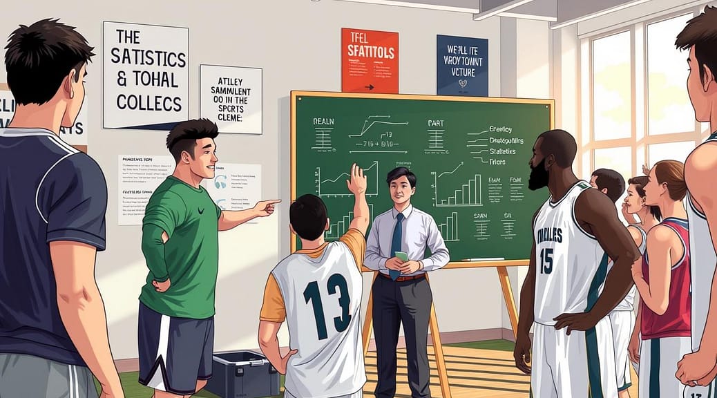
A dynamic sports coaching environment showcasing visual coaching techniques. In the foreground, a coach in professional business attire stands, pointing at a large, translucent board filled with simple, vibrant visuals: arrows indicating movement patterns, colored zones representing different areas of focus, and stoplight symbols denoting decision-making statuses. In the middle, a diverse group of athletes attentively observes, wearing modest casual clothing, with expressions of concentration and curiosity. The background features a well-lit gymnasium with high ceilings, equipped with training equipment and motivational posters. Soft natural lighting creates an inviting atmosphere, emphasizing clarity and simplicity in communication. The composition conveys a sense of teamwork and engagement in understanding complex analytics through visual aids.

  • Directional Arrows: A simple up arrow (↑) for “faster tempo” or a down arrow (↓) for “slower pace” is clearer than “0.92 possessions per minute.”
  • Color-Coded Zones: Use green for high-quality shots and red for low-efficiency zones. This turns data into a spatial guide players can follow instinctively.
  • The Stoplight System: Green means “on target,” yellow signals “needs work,” and red flashes an “alert.” It gives immediate feedback on any KPI.

Remember, no decimals on the walls. We’re choosing a big, green “GO” signal over “0.48 Points Per Play.” Which one motivates your team more?

This method works because it matches how athletes see the game. They read body language and react to colors and shapes quickly. Visual coaching gives them a clearer view of the sport they love.

Start small. Choose one KPI from your last game and think: “How can I show this as a color, shape, or symbol?” Your team will quickly connect with the numbers when they’re shown as a visual story.

Storytelling: before/after frames, cause→effect sequences

The most powerful coaching tool isn’t a spreadsheet; it’s a well-told story built from data. Players and unions connect with fans on social media by sharing stories, not spreadsheets. This shows the power of narrative in making analytics stick.

Data tells a story, and you’re the narrator. By framing stats as a compelling narrative using non-technical language, you turn dry numbers into lessons athletes feel. This connects the “what” of the stat to the “why” and “how” of real gameplay.

Our brains love visual stories. Use video clips to create instant “aha!” moments. Instead of saying, “Your defensive positioning efficiency was low,” show two frames side-by-side.

Point to the screen and say: “Look at your stance here, before the pass. Now, look here, after you reacted. See how your feet are planted in the ‘before’? In the ‘after,’ you’re already moving toward the open lane.”

This method makes feedback clear and undeniable. It’s not you criticizing; it’s the story the video tells. You’re using non-technical language to highlight a clear, visual difference.

Connect the Dots: Cause-and-Effect Sequences

Stories have plots: this happened, which led to that. Build these sequences from your data to show players the direct impact of their actions.

For example: “When we set this specific screen (the cause), it leads to an open lane for a drive (the effect) 80% of the time. Let’s watch the three plays where we did it right.”

This sequence does the heavy lifting. The player sees their action as the starting point of a chain reaction. They stop thinking about a “good” or “bad” stat and start understanding their role in the system’s outcome.

Here’s a quick comparison to see how shifting from technical jargon to storytelling changes everything:

Aspect Technical Data Presentation Storytelling with Non-Technical Language
Language Used “Your off-ball movement velocity decreased by 15%.” “When you waited here, the defender caught up. When you exploded from the spot, you got open.”
Player Engagement Eyes glaze over; feels like a critique. Leans in; sees a puzzle being solved.
Lesson Retention Forgotten by the next drill. Remembered as a clear picture or story.
Primary Goal Report a metric. Explain a why and teach a how.

By storytelling with data, you help athletes internalize lessons on an emotional and instinctive level. The desired behavior becomes part of their muscle memory because they understand the story behind it. They’re not just remembering a number; they’re remembering a moment they saw and felt.

Start your next film session with this question: “What’s the story this clip is telling us?” You’ll be amazed how quickly the conversation shifts from confusion to clarity.

Reinforcement: on-field tags, hand signals, post‑rep callouts

Data becomes instinct when we use it in practice. Your chalk talk ideas are clear, but they need constant reminders. Reinforcement turns theory into automatic action.

Now, let’s go from chalkboard to field. Start with simple, on-field verbal tags. These are one-word shouts that act as instant behavior cues. For example, “Tempo!” reminds a point guard to speed up. “Efficiency!” is called out after a smart pass.

These tags are quick and keep play moving. They help focus on your key performance indicators (KPIs).

But sometimes, shouting can disrupt the flow. That’s when silent, sideline hand signals come in. A coach might hold up three fingers for “focus on our third KPI.” A closed fist means “lock in on defensive efficiency.” This method is clear and doesn’t stop the game.

The most powerful tool is the immediate post-rep callout. Right after a play, you praise the specific behavior. “Great job finding the green zone on that shot, Sarah!” or “Perfect tempo on that fast break, team!” This links the action directly to your data framework in real-time. The feedback is instant. This makes the lesson stick.

Verbal tags, hand signals, and post-rep praise create a feedback loop. They turn abstract ideas into real experiences. Your athletes start to feel the data, not just think about it. This is how you build a culture where data-driven behavior cues are part of the game.

Micro-Assessments: 60-second quizzes, thumbs scales

Communication isn’t just about what you say. It’s about what others understand. Micro-assessments are your quick tools to check if they get it. Forget long exams or lectures. These fast checks tell you if your team is on board.

Imagine checking the room’s temperature. After a film on defensive transition, ask: “Show me with your hand—thumbs up, sideways, or down—how you think we did today.” In seconds, you see the whole group’s view. It’s instant feedback that needs no prep.

A dynamic, engaging scene illustrating the concept of micro-assessments in sports analytics. In the foreground, diverse athletes, dressed in professional athletic gear, are interacting with digital devices displaying colorful, simplified stats visualizations. Some athletes are giving thumbs-up or thumbs-down gestures, while others are engaged in a fast-paced 60-second quiz. In the middle ground, a well-designed sports training facility with bright LED lighting casts a motivational glow, enhancing the atmosphere of urgency and focus. The background features motivational banners with abstract representations of data analytics, emphasizing sports performance. The overall mood is energetic and collaborative, suggesting an environment where quick feedback translates into improvement, showcasing athletes understanding their stats in real-time. Use a wide-angle lens for depth and clarity.

Another method is the 60-second quiz. Ask a focused question after a talk. “What was our top priority in the third quarter?” Give them a minute to think. This makes them recall the main idea you discussed.

Use a 1-5 confidence scale on a whiteboard too. Write a key play or stat and have players rate their confidence. It’s not about right or wrong. It’s about their gut feeling and understanding.

These tools do two important things. They give you insight right away. You see what they don’t get before the next practice. They also make players active in their learning. To rate or score, they must process and simplify stats into a personal judgment. It turns data review into a two-way conversation.

Here’s a quick comparison of common micro-assessment tools you can use today:

Method What It Measures Time Needed Best For
Thumbs Scale (Up/Side/Down) Overall sentiment & gut feeling 10-15 seconds End-of-session pulse checks
60-Second Verbal Quiz Active recall of a single key point 60 seconds Reinforcing a major teaching point
Confidence Board (1-5 Scale) Individual confidence in a specific skill or play 2-3 minutes Pre-practice readiness checks

These checks are simple. There’s no grading, no pressure, and no complex setup. They fit easily into your routine. Regular use builds a habit of reflection. Players learn to simplify stats for themselves. This creates a culture where understanding is key.

So, after your next talk, don’t just walk away. Take the temperature. That quick show of hands or silent mark on the board is your most honest report card. It keeps communication flowing both ways and ensures your chalk talk translates into on-field action.

Closing the Loop: measure change on next report

The final step turns your data into a story of growth. You’ve shared your key game KPIs with clear visual coaching. Now, it’s time to close the loop.

Look at the next game report. Show your team how you’ve improved. “Last week, our paint touches were in the yellow zone. We worked on it in practice. Now, this game, we’re in green!” This shows your efforts pay off.

This proves their hard work is worth it. It turns analytics into a tool for getting better. Teams, like those in the NBA or NFL, must use new data to grow. Your review is that moment.

Celebrate the wins on the report. Talk honestly about areas that need work. Then, work together to set goals for the next cycle. This builds a culture of continuous learning.

Your visual coaching system drives progress. By always measuring change, you keep everyone motivated. The loop is closed, and the cycle of improvement starts again.

Scouting Reports That Stick: Visual Templates for Opponent Prep

Welcome, coach! Before we dive into drawing X’s and O’s, let’s talk about building a rock-solid foundation. Every great game plan starts with understanding your opponent, not just collecting random notes.

Think of your three non-negotiables as the immovable pillars of your strategy. These are the core strategic truths you simply won’t compromise on, no matter what.

What can’t we allow the other team to do? Is it giving up corner threes? Letting their star point guard get into the paint at will? Professional templates, like those used in the NBA, help you pinpoint these critical tactical keys by organizing team info, offense, defense, and player tendencies.

By starting with your non-negotiables, you build a focused, actionable filter for all the information you gather. This step transforms an overwhelming pile of data into a clear path to a winning strategy.

You’re not just doing opponent analysis; you’re unlocking essential insights into their playcalling and habits. Let’s turn those insights into your next victory!

Visual Tiles: lineup map, top 5 actions, pressure/press zones, and late-game habits

Imagine having a dashboard that shows everything you need to know about your opponent at a single glance. That’s the power of visual tiles. Our brains are wired for pictures, processing images thousands of times faster than text. By translating your scouting notes into clear, at-a-glance visuals, you give your team an instant, shared understanding of the challenge ahead.

Think of these tiles as the building blocks of your game plan. Each one covers a critical aspect of opponent prep. When combined on one page, they create a complete picture of the other team’s identity. Let’s break down the four essential tiles you need to build.

The Lineup Map: Start with who’s on the floor. A simple court diagram with player numbers and positions replaces a confusing paragraph of text. Using a printable Basketball Court Diagram, you can sketch their common lineups. Is their point guard always in the left corner? Does their center float to the high post? This map makes spatial relationships obvious to every player.

Top 5 Actions: Next, list their bread-and-butter plays. Don’t overload your team with twenty options. Boil it down to the five actions they run most often. This could be “Spain Pick-and-Roll,” “Horns Flare Screen,” or “Baseline Out-of-Bounds Lob.” Write them as short, actionable bullet points. This tile answers the question: “What are we going to see over and over again?”

Pressure/Press Zones: This is where pressure maps become your best friend. Where do they trap? Do they full-court press after made baskets? Use a shot chart template or a blank court diagram to shade the areas where their defensive pressure is highest. A visual pressure map is clearer than any verbal description. It instantly shows your guards where the double-teams come from and tells your posts where passing lanes might be open.

These tools, like those found in a comprehensive template pack, revolutionize how you track defensive tendencies. They provide a visual representation of your game plan on a single page. Creating these pressure maps forces you to identify patterns. You’ll see if they always trap the sideline or if their press has a weak side you can exploit.

Late-Game Habits: Lastly, how do they behave when the clock is winding down? Do they isolate their star for a last shot? Do they foul immediately when down by three? Note their crunch-time tendencies in a separate tile. This prepares your team for the moment when the game is on the line. There’s no need for a frantic timeout explanation if everyone already knows what’s coming.

Together, these four visual tiles form a powerful one-page scout. They turn abstract data into concrete pictures. Your players won’t just hear the plan; they’ll see it. This shared visual language ensures everyone is on the same page—literally. Start with a lineup map, add their top actions, layer in the pressure maps, and finish with their late-game personality. You’ll have a scouting report that sticks.

Player Cards: photo, role, hand/footedness, 2 strengths, 1 exploit

Player Cards turn unknown jersey numbers into known opponents. They are like strategic baseball cards. They help you win player matchups.

Instead of just guarding “jersey #5,” you now know “the left-handed shooter who hates driving right.” This change is powerful. It makes your defense more personal.

We create these cards from data on player skills. You track shooting and ballhandling. Then, we make a one-sheet profile. Our goal is actionable intelligence, not just info.

Every Player Card has five key parts. Here’s what they mean and why they’re important:

Card Component What It Tells You Why It Matters for Matchups
Photo Quick visual identification during play. No confusion on switches; defenders lock in instantly.
Role Primary scorer, facilitator, defensive stopper, etc. Reveals their job on the court and where your attention should be.
Hand/Footedness Dominant hand (right/left) for shooting and driving. You can force them to use their weak side, disrupting their rhythm.
Top 2 Strengths Their go-to moves and most reliable skills. You know what to take away, making them uncomfortable.
1 Exploitable Weakness A single, targetable flaw (e.g., poor right-hand dribble, slow in transition). Provides a clear, simple instruction for your defender: “Force him right every time.”

You give these cards to the defender facing that opponent. It gives them a clear game plan. They know exactly what to force and what to prevent.

This turns scouting data into action on the court. Your team feels more confident. They have a plan for every key player matchup.

Set Pieces: Stills → Arrows → Assignments → Counters

Imagine having a flashcard for every key play your opponent runs. These cards break down their movements into simple steps for your defense. This is the power of focusing on set pieces.

Set pieces include baseline out-of-bounds (BOB), sideline out-of-bounds (SOB), after-timeout (ATO) sets, and half-court initiations. They are rehearsed, making them predictable. For a prepared defense, this predictability is a gold mine for steals and stops.

We break down these complex plays into a clear, four-step visual progression. This method turns any play diagram into a story every player can understand and remember.

Step 1: Stills

Start with a static image of the play’s initial setup. Use a blank court template to draw where all five offensive players begin. This is your baseline. It answers the question: “What does it look like when the referee hands them the ball?”

Step 2: Arrows

Next, add movement. Use arrows to show where each player is designed to go. Does the point guard flare to the corner? Does the big man set a screen and roll? The arrows reveal the play’s intended path.

Step 3: Assignments

Now, assign your defensive responsibilities. Mark which of your players is responsible for denying the first pass, who helps on the roll, and who stays home on shooters. This step turns observation into a specific job for each defender.

Step 4: Counters

Lastly, diagram your planned counter. If they run this specific BOB play, will you jump the passing lane? Will you switch all screens? This is your rehearsed response, turning their organized attack into your defensive opportunity.

By following these four steps, you create a set-piece card. It’s a single, visual reference for one specific opponent play. The best part? You can build a whole library of them using the blank playbook templates from professional scouting resources.

These templates give you ready-made courts for drawing full-court plays, offensive sets, and all out-of-bounds situations. You’re not starting from scratch; you’re filling in the blanks with your opponent’s tendencies.

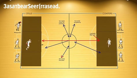
A detailed diagram of a basketball set-piece card, showcasing a four-step progression: stills, arrows, assignments, and counters. The foreground features clear, labeled diagrams illustrating players in action poses, arranged methodically to depict the sequence of movements. In the middle layer, arrows connect various player positions, highlighting their intended paths and tactical roles, with distinct color coding for easy interpretation. The background includes a basketball court outline for context, with a subtle gradient to avoid distraction from the main elements. The lighting is bright and focused, enhancing the clarity of the diagrams. The overall mood is analytical and professional, conveying a sense of strategy and preparation, ideal for a scouting report visual.

With a set of these set-piece cards, your team learns to “read” plays as they happen. Instead of reacting in confusion, players recognize the initial setup (the stills), anticipate the movement (the arrows), and execute their job (the assignments and counters).

This preparation turns game-time stress into confidence. When the other team calls a timeout to draw up a special play, your team already has a flashcard for it. You’ve changed the script, making their most organized moments your best chance to get a stop.

Start building your library of set-piece cards today. You’ll give your players a visual playbook that turns complex scouting into clear, winning actions.

Game Plan One-Pager: “if/then” boxes and clock management notes

We turn pages of notes into a one-page guide. It uses “if/then” logic and clock management. This is your final, master document. It combines all the great work from your visual tiles, player cards, and set pieces into one powerful sheet.

Think of it as your team’s game-day cheat sheet. It’s not a long book to read; it’s a quick guide for action. Just like a well-structured practice plan streamlines your drills, this one-pager makes your in-game decisions quicker and more informed.

Feature Complex Scouting Report Game Plan One-Pager
Primary Goal Information gathering & analysis Instant communication & execution
Format Multiple pages, detailed text One page, visual & bullet-pointed
Best For Coach preparation during the week Player review on the bus & during timeouts
Core Content Raw data, tendencies, full video notes Distilled “if/then” rules & clock management notes

The “if/then” boxes are key. They prepare your team for anything. For example: “IF they double-team our star guard, THEN our forward cuts to the open space for an easy pass.” Or, “IF they press after a made basket, THEN we inbound to our primary ball-handler immediately.”

You list the most likely scenarios you scouted. Then, you provide the clear, rehearsed response. This turns panic into quick action.

Clock management notes are also key. These are reminders for end-of-quarter or end-of-game situations. If the opponent presses with 30 seconds left, note it here. If they foul when down by three, write the plan. This ensures everyone knows the script when it matters most.

Let’s build your one-pager. You’ll create two main sections:

  • The “If/Then” Battle Plan: List 3-5 of the opponent’s most predictable actions. Next to each, write your team’s counter-move in simple language.
  • Clock & Situation Rules: Bullet points for last 2 minutes of each half, overtime procedures, and special inbound plays.

When you’re done, you can hand this sheet to any player. They will know exactly what the team’s priorities are. It prevents confusion and keeps everyone aligned to the game’s flow. This document turns your week of preparation into focused, on-court action.

Distribution Plan: captains’ packets, position group boards, bus review

It’s time to share your hard work with your team. A great scouting report is useless if it’s only in your hands. We need to make sure it reaches every player!

Your plan is like the game day logistics for your scouting report. It’s about giving the right info to the right people at the right time. A Basketball Template Bundle for Coaches can help make this process smooth and easy.

Your plan should have three key delivery channels:

  • Captains’ Packets: Give your team leaders more than just the basics. Include deeper insights and plans for different situations. This helps them coach on the court and keep the game plan alive.
  • Position Group Boards: Don’t overwhelm your players with too much info. Create boards for each group. Guards learn about other guards, and posts learn about the paint. This makes learning faster and more relevant.
  • Bus Review: Use the bus ride to review the game plan one last time. Focus on the top three team concepts and key opponent tendencies. This keeps the plan fresh in everyone’s mind.

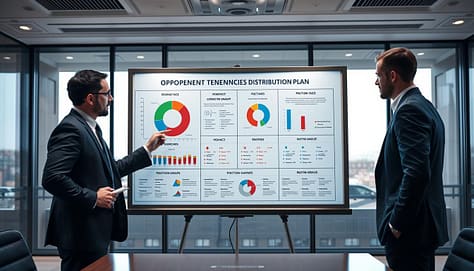
A detailed visual representation of an "opponent tendencies distribution plan" displayed on a sleek presentation board. In the foreground, include three professional individuals in business attire, analyzing the board; one is pointing at a colorful pie chart, another taking notes, and the third observing thoughtfully. The middle layer features the board itself, adorned with graphs, statistics, and strategic notes about opposing team tendencies, with labeled sections for different position groups. The background showcases a modern conference room with large windows letting in natural light, highlighting a subtle, focused atmosphere. The mood should be serious and strategic, emphasizing teamwork and preparation. Use a wide-angle lens to capture the entire scene with sharp detail and professional lighting to enhance clarity.

This approach works because it respects each player’s role. A point guard doesn’t need to know about center footwork. By filtering the info, you make sure everyone learns what’s important for their job.

Using a template system makes this easy. Just fill in the slots for captains, guards, and posts. This consistent format helps players know where to find the info every game. It builds a routine of focused readiness.

The goal is for everyone to feel like they own the game plan. When players know their role against the other team’s habits, they play with confidence. Your scouting work helps the whole team execute better. That’s how you win the preparation battle before the game starts.

Postgame Update: what matched the scout vs what changed

Sharp coaches learn a lot after the game ends. It’s not just about watching game footage. It’s about checking if your prep was right.

Take out your pre-game visual tiles and pressure maps. Compare them with your game notes. We’ll look at key questions to close the loop.

  • What Matched? Celebrate your scouting wins! Did their defense match your lineup map? Did their star player use the foot you predicted for that shot?
  • What Changed? This is the key insight. Did they press in a different zone than your pressure maps showed? Did they use a new set-piece trigger we hadn’t seen?

This honest audit uses the data you tracked. Your Shot Chart Template is for more than live analysis. Use it post-game to check patterns. Did their shots go where you thought? Or did your defense force them into a tough spot?

This process isn’t about being “right.” It’s about getting better. Every difference between your scout and the game is a lesson. It sharpens your eye and makes your next plan stronger.

Make this a regular habit with your team. It turns every game into a lesson for the next one. For more on how to do this, check out these best practices for coaches and trainers. This reflective practice is what sets good teams apart from the best.

Template Pack: printable and mobile formats

You’ve built a visual playbook piece by piece. Now it’s time to bring it all together with a professional template pack. Imagine having every tool we discussed ready to use.

The Basketball Template Bundle for Coaches gives you that complete system. It includes the Scouting Report Template, NBA Scouting Report, Player Evaluation Form, Shot Chart Sheet, and Practice Plan Template.

These resources are designed to connect. Your player cards feed into your scouting report. Your shot charts inform your practice plans. Critical set-piece cards for offense and defense are part of the package, giving you ready-made visual anchors.

Created by coaches at Hoop Mentality, these templates turn complex prep into a straightforward process. You save hours that would be spent designing documents from scratch, including custom set-piece cards.

Access the pack in both printable PDF and editable digital formats. Print binders for your staff or share files directly to tablets. Your entire process becomes mobile and immediate.

This toolkit democratizes high-level preparation. You step into an organized workflow used by winning programs. Streamline your opponent analysis, empower your players, and make your game plan stick.

Get the template pack today. Elevate your coaching with visual tools that work.

Data Visualization for Coaches: Turn Stats into Decisions

Today’s coach is surrounded by numbers. They deal with everything from player load metrics to game performance stats. The real challenge isn’t just collecting this data—it’s understanding it.

Powerful visuals help clear the confusion. They turn complex spreadsheets into clear, compelling stories. A well-designed chart does more than show numbers. It grabs attention, shows you’ve put in the effort, and builds trust with your team.

This is about strategic communication. You might want to show an athlete their progress or explain a tactical change to your staff. The right visual, chosen with purpose, turns raw statistics into useful insights. It shapes training plans, game strategies, and development paths.

Being good at this skill makes you a great leader. This guide will teach you to use visuals to make decisions. For a detailed look, check out our 10-step data viz guide.

Data to Decisions

In sports analytics, the most powerful visual is useless if it doesn’t answer a specific question for a specific person. Coaches swim in data, but making a game-changing decision requires a deliberate process. It starts with two foundational questions.

What decision does this information support? And who needs to understand it? Answering these questions shapes everything that follows.

This “know your purpose” step is critical. Are you visualizing to prove a player’s improved efficiency to them? Or to show a tactical weakness to your staff? The goal dictates the design. A chart for an athlete focuses on personal progress. A report for the front office might compare value across the entire league.

Your audience is just as important. A head coach needs high-level, strategic takeaways. An assistant might need drill-specific details. The athlete themself benefits from clear, personal feedback. Great sports analytics visuals are tailored for their viewer.

Raw numbers lack meaning. Their power comes from context. This is the “compared to what?” principle. A player’s scoring average is just a number. But compared to the team average, it shows contribution. Compared to their own last season, it shows growth. Compared to the league’s top performers, it reveals a gap.

Embedding data within the right context transforms reporting into insight. It moves from “what happened” to “why it matters and what we should do.” The table below outlines this decision-driven framework.

Primary Purpose Intended Audience Key Context Question Sample Insight
Show Individual Performance Athlete Compared to their own past performance? Player’s sprint speed has increased 5% from pre-season.
Demonstrate Team Trend Coaching Staff Compared to league average or key rivals? Our defensive efficiency ranks 3rd in the conference.
Evaluate Training Load Sports Scientist & Coach Compared to planned vs. actual workload? Week 3 load spiked 20% above plan, risking fatigue.
Plan Strategy for Next Opponent Entire Staff Compared to opponent’s historical weaknesses? Opponent allows 40% more shots from the left wing.

This structured approach turns data into a decision-making engine. Visualizations become tools for examining performance, planning strategies, and pinpointing improvement areas. They stop being just reports and start being conversations.

The right sports analytics visuals act as the perfect vehicle for these comparisons. They make complex relationships clear and immediate. This mindset shift—from data delivery to insight generation—is what separates reactive coaches from proactive ones.

Once your purpose and audience are set, you can choose the right chart type with confidence. The next step is learning how to present your insights clearly to drive action. Effective visuals lead directly to adjusted practice plans, new rotations, and smarter in-game choices.

What to Visualize: KPIs by Sport (Efficiency, xG, Load, Wellness)

Before starting, coaches must decide which metrics are most important. The right data visualization focuses on the right KPIs for the sport and athletes.

Choosing the wrong data leads to confusion. The right KPIs turn numbers into clear, actionable insights. This choice is the first and most important step.

We can group essential KPIs into two broad categories. The first is for measuring in-game performance and tactics. The second is for monitoring athlete health and readiness.

Team Sport Performance KPIs

For sports like basketball, soccer, and hockey, efficiency metrics are key. These numbers show how well a player or team converts opportunities into results, much like how mindfulness and meditation resources help individuals improve focus and performance over time.

Simple percentages, like shooting accuracy or pass completion rate, offer a solid foundation. They answer basic questions about skill execution.

Advanced metrics like Expected Goals (xG) provide deeper tactical insight. xG evaluates the quality of a scoring chance. It helps coaches understand if a player’s goal tally is sustainable or lucky.

Visualizing these efficiency KPIs highlights strengths and exposes weaknesses. It guides decisions on player selection, tactical adjustments, and practice focus.

Athlete Monitoring and Load KPIs

The second category is vital for athlete health and long-term development. It involves tracking both external and internal load.

External load measures the physical work done. This is where GPS tracking excels. Wearable devices capture data like total distance, sprint speed, and high-intensity efforts.

Coaches use this GPS tracking data to quantify training intensity. They can ensure athletes are not under-prepared or pushed toward injury.

Internal load measures how an athlete feels. This is captured through RPE dashboards and wellness questionnaires.

Players rate their perceived exertion (RPE) after a session. They also log sleep quality, muscle soreness, and mood. This subjective data is critical.

When combined, external and internal load create a complete picture. A sudden spike in GPS metrics paired with poor wellness scores is a major red flag. This holistic view is essential for modern athlete management.

Sport Context Key Performance Indicators (KPIs) Primary Purpose Common Data Sources
Team Sports
(Soccer, Basketball)
Shooting Percentage, Expected Goals (xG), Pass Completion Rate, Turnover Ratio Evaluate tactical effectiveness and player efficiency in competition. Game footage, play-by-play statistics, sport-specific tracking software.
Individual Performance
(Track, Swimming, Gymnastics)
Speed, Endurance Capacity, Technique Consistency, Power Output Optimize individual athlete output, refine technique, and track progress. Timing systems, video analysis, force plates, coach observations.
Athlete Monitoring & Load Management Training Load (GPS data), Internal Load (RPE dashboards), Wellness Scores (Sleep, Soreness) Balance workload with recovery, prevent overtraining, and reduce injury risk. Wearable GPS devices, athlete self-reporting apps, heart rate monitors.

The table above provides a clear starting point. Your sport will dictate which column is most relevant. Often, you will need to visualize KPIs from multiple categories.

For example, a soccer coach might look at a player’s xG alongside their high-speed running distance from GPS tracking. A fatigued player may start making poor tactical decisions.

Remember, good visualization practice means being selective. Do not show every metric you collect. Choose KPIs that directly relate to the specific decision you need to make. This focus turns a dashboard from a data dump into a decision-making tool.

Chart choices: when to use shot charts, heat maps, bar/line, scatter with zones

Choosing the right chart is key to good data visualization. The wrong chart can confuse your message. The right one makes your insight clear.

Think of these charts as tools in your coaching toolbox. Each one is designed for a specific job.

  • Shot Charts and Heat Maps answer “where” questions about spatial patterns.
  • Bar Charts and Line Charts help compare values and track changes.
  • Scatter Plots with Zones categorize players based on two key metrics.

Shot charts are great for analyzing scoring attempts. They show where every shot is taken. This reveals a player’s best and worst shooting spots. It answers, “Where are we most and least effective offensively?”

Heat maps show density and intensity. They use colors to highlight where players spend most time or where action is intense. A soccer heat map can show if a midfielder is in the right spots. A football heat map can highlight collision areas. They answer, “Where is the action concentrated?”

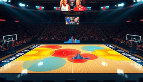
A visually striking and informative shot chart heat map visualization serves as the centerpiece of the image, showcasing a basketball court layout with colorful, overlapping zones indicating player shot locations and frequencies. The foreground features heat maps in vibrant reds and blues, highlighting areas of high and low shooting efficiency. In the middle ground, blended bar and line graphs illustrate comparative shooting statistics, seamlessly integrated into the court design. The background displays a soft-focus arena ambiance, with blurred crowds, enhancing the perception of an active game environment. Dramatic lighting casts shadows across the court, emphasizing the importance of data visualization in coaching strategies. The overall mood is insightful and professional, designed to inspire coaches and analysts in interpreting performance metrics effectively.

Bar charts are perfect for simple comparisons. They make it easy to see who has more or less of something. Use them to compare points per game or tackle counts. They answer, “Who has more or less of this stat?”

Line charts are great for showing trends over time. They plot a metric like team wellness scores or average possession time. This shows progress, decline, or cycles. The connecting line makes the trend clear. It answers, “How is this metric changing?”

Scatter plots with zones are powerful for player profiling. They plot athletes on two axes like speed vs. strength. Then, divide the plot into zones. This instantly categorizes players into groups. It’s perfect for combine analysis or tailoring training. It answers, “How do our athletes cluster based on these two traits?”

Choosing the right chart is a strategic decision. It ensures your data tells the story you need your team to see and understand.

Avoiding traps: cherry-picking, small n, dual axes, misleading color scales

Excel and Sheets make charts easy to create, but they can lead to traps. These traps can misrepresent athlete performance. A chart should show the truth, not hide it. This section guides you on how to create ethical and effective visualizations.

Great visualizations follow a core rule: show the data. Avoid charts that summarize too much, like “dynamite plots” with just averages and error bars. They hide the individual data points. Always ask if your chart lets the raw information speak.

Another critical practice is to display uncertainty. No metric is perfect. Showing confidence intervals or ranges builds trust. It tells your athletes and staff that you understand the limits of your analysis.

Let’s break down four specific traps that can compromise your message.

Cherry-Picking Data

This happens when you select only data that supports a pre-existing bias. For example, showing only games where a player shot well to argue they are in a “hot streak.” It ignores contradictory evidence.

To avoid this, set your analysis timeframe before looking at the data. Use consistent periods, like a full season or a defined training block. Transparency is your best defense.

The Small ‘n’ Problem

Drawing big conclusions from a tiny sample size is a classic error. Making rotation decisions based on three games of data is risky. The results are not stable and can change wildly with more information.

Always note your sample size on the chart. Be cautious with advice when ‘n’ is small. Wait for more data or use metrics that are reliable with fewer observations.

Dual Axes Distortion

Using two different Y-axes on one chart can suggest a relationship that isn’t real. Plotting player fatigue scores on one axis and scoring efficiency on another might make lines appear to move together. This can be an illusion created by the scale.

If you must use dual axes, make the relationship clear. Better yet, use two separate, aligned charts. This prevents the brain from making false connections.

Misleading Color Scales

Color should highlight what’s important. A default red-to-green scale might make small, meaningless differences look dramatic. This can misdirect attention away from the key insights.

Use color intentionally. Sequential scales (light to dark) are best for ordered data. Diverging scales (like blue-white-red) highlight deviation from a median. Avoid rainbow scales as they can imply false categories.

Trap What It Is Common Example in Sports How to Avoid It
Cherry-Picking Selecting only data that confirms a belief. Only showing a player’s top 10% of performances to argue for a starting spot. Pre-define analysis windows. Show full context.
Small ‘n’ Small sample size leading to unreliable conclusions. Changing a drill because it “failed” in one practice session. Annotate sample size. Seek larger datasets.
Dual Axes Two different scales distorting perceived relationships. Charting workload (high numbers) and wellness score (low numbers) together. Use separate charts or a correlation scatter plot.
Misleading Color Color scales exaggerating unimportant differences. A heat map using a fiery red for a 51% success rate and calm blue for 49%. Use perceptually uniform color palettes. Label clearly.

Tools like Excel and Sheets often encourage these traps with their defaults. The standard dual-axis chart wizard, for instance, makes it a one-click option. The common color palettes may not be suitable for all data types.

Your job as a coach is to make conscious design choices. Override the defaults. Your goal is accuracy above all else. A truthful visual, even if simpler, is far more powerful than a flashy misleading one.

By avoiding these traps, you build a reputation for integrity. Your team will trust the numbers because they trust how you show them. This turns data into a tool for genuine decision-making, not just confirmation.

Tools: Excel/Sheets templates, Tableau/Power BI basics, Hudl data exports

The journey from data export to dashboard starts with a good tool. Coaches don’t need to be tech experts. They just need to know the basics.

This guide will show you where to start based on your program’s needs and your tech skills.

A sleek, modern workspace showcasing various data visualization tools specifically designed for coaches. In the foreground, an open laptop displays a colorful, interactive dashboard made with Tableau featuring sports analytics and player stats. Beside it, a printed Excel template with vivid charts and graphs for tracking player performance. In the middle, an elegant tablet shows a Hudl data export with intuitive visualizations. The background features a blurred office setting with soft natural light filtering through a window, enhancing a professional atmosphere. The overall mood is one of focus and insight, ideal for empowering coaches to make data-driven decisions. The image should be captured with a slight tilt angle to emphasize the tools and their potential impact on coaching strategies.

Excel and Google Sheets are great for many programs. They are easy to use and have templates for sports data. This makes creating charts and graphs simple.

These tools let you quickly turn practice logs and stats into visual reports. They’re perfect for team meetings or reports for parents.

Business intelligence platforms like Tableau and Power BI are better for big data. They connect to many data sources. This lets you make interactive dashboards that coaches can explore.

Imagine a dashboard where you can click on a player to see their stats. Or filter a heat map for second-half defense. This makes reports interactive and useful.

Connecting these tools to your sports data pipeline is key. Platforms like Hudl export detailed data. This data feeds into your visualization tools.

This makes the process smooth: from game capture to insights. No more typing numbers into spreadsheets. The system does the hard work, so you can focus on analysis.

Be platform agnostic. Choose tools that fit your current needs. Start with simple tools like Google Sheets. As you grow, you can move to more advanced tools.

Begin with what works now. Build confidence with one tool before adding more. The goal is clear communication, not mastering software.

Slide integration: one insight per visual; annotation rules; color legends and callouts

A powerful visualization loses its impact if it’s buried in a cluttered slide. The final step is integrating your chart into a coach-friendly report or pre-game presentation. This stage is about communication, not just creation.

Your goal is to ensure a coach can grasp the key takeaway in seconds during a busy meeting. Proper slide design applies core visualization principles directly to the coaching context.

The One Insight Per Visual Rule

Avoid cognitive overload. The most effective slides follow the one insight per visual rule. If a single chart is trying to show player efficiency, fatigue trends, and positional coverage, it will confuse more than inform.

Instead, create separate visuals for each major point. This focus forces clarity and makes your argument stronger. A coach reviewing a deck should instantly know what each slide is proving.

Maximize Data-to-Ink and Remove Clutter

Apply the principle of maximizing the data-to-ink ratio. Remove any element that doesn’t directly support the core insight. This includes unnecessary gridlines, redundant legends, and decorative backgrounds.

Increase whitespace around your chart. This gives the visual room to breathe and draws the eye directly to the data. A clean, uncluttered layout signals professionalism and confidence in your findings.

Don’t make your audience hunt for the story. Label key data points directly on the plot. If a bar is critically high, put the number on top of it. If a data point is an outlier, circle it.

Use callout boxes or arrows to highlight the main takeaway. A short, bolded sentence next to the chart can serve as the verbal punchline you’d deliver in a meeting. Effective annotation acts as a guide.

  • Label Directly: Place text and values on the chart itself.
  • Use Callouts: Highlight the “so what” with a text box.
  • Integrate the Legend: Often, you can make the chart title your legend (e.g., “Player Sprint Distance: High = Red”).

Strategic Color and Accessibility

Use color legends strategically. If a color scale is essential, keep it simple and place it close to the data. Better yet, use intuitive colors that don’t require constant reference back to a legend.

Always consider accessibility. Use color-blind-friendly palettes (like viridis or plasma) to ensure your message is inclusive. Color should enhance understanding, not create a barrier.

Mastering slide integration turns data into decisions. It’s the bridge between your analysis and a coach’s actionable insight. A well-designed presentation earns trust and accelerates the path from stat to strategy.

Case studies: practice plan changed by GPS heat; rotation tweak from shot chart

A GPS heat map and a basketball shot chart are more than simple graphics. For two coaches, they were game-changers. They turned raw numbers into clear visuals that changed practice plans and game strategies.

A collegiate soccer coach looked at the team’s weekly load report. It showed total distances and high-speed runs, but the story was unclear. Then, she saw the GPS heat map of a recent training session.

The heat map showed a big problem. Drills were mostly on the right side of the pitch. Players on the left were doing less and at lower intensities. This made the uneven workload clear.

The coach quickly saw the issue. Some midfielders were always overloaded, while others on the left were underused. This put some players at risk of injury and others unprepared.

The coach made a simple but effective change. She made the drills more balanced across the field. She also changed where drills started to ensure everyone got a fair workout.

This change made the player load more even. The next week’s heat map showed even intensity. This change helped the team perform better and stay healthy.

Case Study 2: The Shot Chart That Changed the Rotation

A high school basketball assistant was looking at a recent loss. The team’s shooting was poor. He made a shot chart for the starting wing player.

The chart showed a clear problem. The player was taking too many contested long-twos from the left baseline. His makes were mostly in the right corner and on drives from the top of the key.

The chart made it clear where the player was good and where he wasn’t. The coach had a solid fact, not just a feeling, about shot selection.

The coach decided to make a small change. He proposed subbing the player out two minutes earlier in the first quarter. This way, the player would join the second unit, which ran sets that favored corner three-point attempts on the right side.

This change led to more shots from the player’s best zones. It improved his efficiency and the team’s offense. It turned a weakness into a strength.

Case Study Impact Summary
Scenario Data Source & Visualization Key Insight Revealed Coaching Decision Measurable Impact
Soccer Training Load GPS Data; Heat Map Overlay Uneven workout intensity across the field Redesigned drill layouts for symmetry Balanced player load; reduced injury risk
Basketball Shooting Efficiency Play-by-Play Data; Shot Chart Player’s shots clustered in low-percentage zones Adjusted rotation and play calls Increased shot quality from preferred areas

These stories show how data can lead to winning decisions. In both cases, a coach moved from numbers or intuition to a visual. This led to clear insights and confident actions. The tools and principles discussed are practical and effective.

Downloadable dashboard starter

Data visualization turns numbers into stories and stats into plans. It changes raw GPS data into a new practice plan with the right tools.

We want to give you the power to make decisions with data. So, we’ve made a downloadable dashboard starter. It’s ready to use in Google Sheets or Excel.

This tool lets you see important metrics like player load and wellness scores. It’s your first step to interactive dashboards that engage everyone.

This template helps you tell data stories effectively. It helps you focus on what matters, like the strategies for memorable sports data. You can see trends and patterns easily.

Start using this template to apply your data insights. Turn your data into visuals that guide your decisions. Your next big idea is just a click away.

Complete Checklists for Pre-Season, In-Season, and Post-Season Presentations

Starting a season without a plan is like going to a chess match blind. It’s a recipe for disaster.

Derek Sheridan, after 27 years coaching, learned this the hard way. He saw the chaos firsthand. His solution was a system for team preparation that 11 of his former assistants now use.

This isn’t just about filling out forms. It’s about building a strategy. Think of your coach meeting checklist as the blueprint for your season.

Coaches like Matt Brighton and Jim Rucki have seen the difference. They’ve moved from chaos to respected leaders. They plan their season like a play: pre-production, live show, and review.

Seasonal checklists provide structure, but they become even more powerful when aligned with clearly defined long-term development plans that guide athletes, staff, and stakeholders toward measurable progress year after year.

The difference is huge. It’s like the difference between a focused TED Talk and a long, aimless speech. Which one do you want to give this year?

Why Use a Presentation Checklist?

Ever watched a master conductor lead an orchestra without a score? Neither have I, and for the same reason you need a checklist: structure enables brilliance.

This isn’t about stifling creativity. It’s about giving your creative instincts room to shine. Think of it as clearing your mental RAM. A solid coach meeting checklist helps you focus on the game.

Coach Sheridan said organized coaches are seen as better by everyone. That’s a big advantage. Your checklist boosts your credibility before you even start.

Think about the pre-season parent meeting or the “Face-off Dinner” for hockey. A well-organized session can avoid a lot of drama. You’re not just handing out schedules. You’re managing the story, your time, and your sanity.

It’s about diplomacy, logistics, and psychology, all in a to-do list. Coach Mike McBride called these materials “incredibly detailed & a tremendous asset.” That’s smart coaching.

Let’s look at how people see organized coaches versus those who wing it.

Stakeholder View of Organized Coach (With Checklist) View of Disorganized Coach (Without Checklist)
Administration Sees a professional, trustworthy leader. Budget requests are more credible. Sees a possible problem. Questions if you’re competent.
Players Feel confident, secure, and focused. Trust the process. Feel anxious, uncertain. Off-field chaos distracts them.
Parents Appreciate clear communication. Become allies, not opponents. Become nervous, fill information gaps with rumors. Can cause problems.
Assistant Coaches Empowered with clear roles. Morale and efficiency are high. Confused about roles. Constant firefighting lowers morale.

This table shows the real benefits of a checklist. It shapes how people see you, making things smoother.

A checklist is your guide for team preparation. It ensures you don’t miss any important steps in your sports season planning. From equipment checks to eligibility forms, it’s all covered. This approach lets you focus on being the best coach you can be.

So, why use one? Because winning starts long before the game. It starts with a solid plan.

Pre-Season: Key Slides and Prep Steps

The pre-season is like your war room. The 119-question framework is your guide for the season. It’s not just about picking a motto. It’s a deep dive into how your season could go wrong before it starts.

The 119-question list is tough but effective. It helps you move past simple answers. Let’s look at a few examples.

When you ask “How we need to play,” you’re not just wondering if you’ll run. You’re figuring out the best number of possessions for your team. It’s a strategic move, not just a cheer.

The “Individual player development” section is more than just “get better.” You need to define one key skill each player must master by October. This could be a point guard’s left-hand finish or a libero’s serve-receive.

In “Defining roles,” you identify your team’s dynamics. You need to know who tells the tough truths and who motivates. This balance is as important as your starting lineup.

This framework turns vague goals into a clear plan. It’s the brain behind your presentation plan template. Much like leveraging optimized B2B business directories to structure outreach and visibility, it brings clarity and direction to every step of the process.

Coach Sheridan’s checklist is key to turning theory into action. It covers everything from media forms to a summer workout packet. This packet is full of drills, reading, and fitness logs.

For Matt Brighton, this packet was a game-changer. It gave him structure, making summer workouts productive. The lesson? Your checklist should be a living guide, not just a list.

Pre-Season Element Superficial Prep Deep-Dive Audit (Your Goal)
Philosophical Foundation “We will play hard.” “Our defensive identity is built on no middle penetration; here are the three drills to install it.”
Role Clarity Listing starters and subs. Defining “Energy Bringer,” “Defensive Stopper,” and “Clutch Scorer” roles with specific, measurable benchmarks for each.
Staff Dynamics Assigning coaching duties. Mapping communication styles: who delivers tough feedback, who builds confidence, and how they synergize.
Player Development “Get in the gym.” Individualized 8-week summer plan with video review milestones for two key skills.

A detailed sports season planning checklist displayed prominently on a sleek modern desk, with a notepad, pen, and a laptop open to a calendar application. The foreground features the checklist with items like "Team Roster Update," "Schedule Key Matches," and "Secure Sponsorships" neatly organized in bullet points. In the middle, a whiteboard stands with color-coded markers, displaying timelines and important dates highlighted. The background reveals a large window with a view of a sports field under natural daylight, casting a warm glow across the scene. The atmosphere is focused and dynamic, evoking a sense of preparation and strategy, designed to inspire productivity and organization in a professional sports environment.

The last slide in your pre-season deck is the “Known Unknowns.” List your biggest questions, injury recoveries, or schedule challenges. Naming them helps you prepare for anything.

This level of detail prepares you for anything. When a key player gets hurt, you’re ready. You’ve thought through the adjustments. That’s the power of a detailed presentation plan template.

Your pre-season work is now a strategic plan, not just a to-do list. You’ve moved from “getting ready” to being ready. The season is waiting.

In-Season: Updates, Tracking Progress, and Adjustments

The preseason was your plan, but the in-season is where things get real. You face unexpected challenges like a player’s slump or a new defensive strategy. Your team preparation moves from theory to action, needing quick changes.

Coach Mike Taylor’s three-act season model is a smart guide. It divides the season into preseason, midseason, and the final push. Midseason is for checking what’s working and what’s not. This approach makes the season feel more manageable.

Now, you track more than just wins and losses. You watch how players grow and how the team works together. It’s like a detailed report card. You see who’s leading and who’s improving. This data helps you make smart changes.

Deciding when to change a strategy is key. It can’t be just based on emotions after a loss. Your coach meeting checklist should help you make informed decisions.

To keep everyone on the same page, use simple tools. Short forms or “cheat sheets” are great. They list important stats and ideas for the next game. This makes your team preparation quick and effective.

The in-season is about adapting wisely. You’re not changing your plan with every problem. You’re making it better as you go. This ongoing process is what makes a team strong and flexible. The best plans evolve with the season.

Post-Season: Review and Celebrate

Think of the post-season as a chance to look back and plan ahead. The game is over, but don’t rush off. This is a critical time for your team’s growth.

It’s important to review what happened, not just to feel good. Your post-season checklist is like a detailed report. It helps you see what worked and what didn’t.

Look at the data to find out what really mattered. Who stepped up when it counted, and what strategies didn’t work? This isn’t about blaming anyone. It’s about learning from what happened.

A well-organized coach meeting checklist laid out on a polished wooden table, with stationery like colorful pens and notepads scattered neatly around it. The foreground features a close-up of the checklist, clearly detailed, showcasing categories such as "Key Performance Reviews," "Team Rewards," and "Lessons Learned." In the middle, a blurred background reveals a warm and inviting conference room decorated with team memorabilia and motivational posters. Soft, natural lighting filters in through large windows, creating a welcoming atmosphere. The mood is celebratory yet professional, emphasizing teamwork and reflection. A group of four diverse individuals in professional business attire, engaged in discussion, can be seen in the background, ensuring inclusivity and collaboration in their expressions.

But analysis alone isn’t enough. You also need to celebrate your team’s achievements. This is how you build a strong team culture.

Recognize the efforts of everyone, from the manager who filmed games to the seniors who made sacrifices. These moments are what hold your team together.

This phase is all about finding ways to improve. Was your defense strategy effective, or was it just a stubborn choice? The answers will help shape your presentation plan template for the off-season. This checklist ensures you don’t forget any important insights.

In the end, this process turns the end of one season into the start of the next. Your data and celebrations become the foundation for future success. They make your next pre-season coach meeting checklist even stronger.

Downloadable Example Checklists

We’re moving from the philosopher’s cafe to the coach’s clipboard. Here, strategy meets ink and paper. This is the archive. The playbook for the playbook-makers.

I’ve curated a gallery of checklist components. These are real, functioning programs. They are the administrative engine—the intellectual property that turns chaos into a repeatable process.

Consider these three field-tested documents your foundational toolkit. Each solves a specific, nagging problem in team preparation.

  • The Pre and Post Season Master Checklist: This is your program’s spine. It moves you from facility walk-throughs to final banquet logistics with military precision. Why does it work? It externalizes memory. You’re not trying to recall if you ordered the championship patches; you’re following a trail of checked boxes. It transforms anxiety into action.
  • The Scrimmage Evaluation Template: Most coaches scribble notes on a legal pad. This template forces structured observation. Columns for individual technique, unit cohesion, and conditioning notes turn a chaotic scrimmage into raw, actionable data. It saves the cognitive tax of deciding what to look for in the moment.
  • The Media Info Form: This is a secret weapon for sanity. You fill out team roster, key storylines, and coach bios once. Then you simply attach the PDF to every email inquiry from reporters, bloggers, or TV producers. It eliminates redundant typing and ensures message consistency. It’s a brilliant, simple presentation plan template for your public face.

The architectural logic is clear. These documents standardize the repeatable and free your mind for the singular. They handle the “what” so you can focus on the “how.”

Think of them as open-sourced code for program management. They provide the proven framework. Your job is to customize the variables for your sport, your culture, your dynasty. This is where true team preparation begins: not with a blank page, but with a battle-tested presentation plan template.

Customizing for Your Sport

Let’s be honest: a mover-blocker offense slide deck won’t save a youth hockey coach from a scheduling apocalypse. The true test of any system is its adaptability. Here, we embrace our inner intellectual tinkerer.

Take Coach Troy Opperman. He started with a basketball-focused coach meeting checklist. Then he morphed it. He translated the core logic for soccer and track. The slides changed, but the skeleton remained. His story proves a point. A powerful framework isn’t a straitjacket. It’s a blueprint you can remodel.

The magic lies in universal principles. Every sport, from chess boxing to water polo, must answer three core questions during sports season planning.

  • Philosophy: What is our team’s identity? Are we a run-and-gun offense or a defensive wall?
  • Roles: Who does what, both on the field and off? This includes captains, assistants, and parent volunteers.
  • Operations: How do we communicate? What are the rules for tryouts, playing time, and parent concerns?

Your job is to translate these principles into your sport’s native tongue. The table below shows how the same universal idea plays out in wildly different arenas.

Universal Principle Hockey Application Football Application Tennis Application
Pre-Season Parent Communication Mandate the “24-hour rule” for game feedback. Schedule a dedicated “Equipment & Safety” night. Ice time politics are real. Focus on massive roster logistics. Clear medical clearance protocols are non-negotiable. Define playing time philosophy for 50+ players. Shift to individual athlete development plans. Set expectations for solo practice. Coordinate shared court costs and tournament travel.
Defining Team Roles Special teams are king. Clearly identify power-play units and penalty killers. The backup goalie’s role is uniquely mental. Position groups become sub-teams. The long snapper is as vital as the quarterback. Manage the emotional dynamics of a large scout team. It’s individual and team. Define what “team point” contribution means. The #1 player has a different leadership role than a doubles specialist.
In-Season Progress Tracking Track shots against, not just goals. Use video review for line chemistry. Adjust shifts based on penalty kill performance. Measure red-zone efficiency. Track offensive line protection grades. Manage weekly health reports for a physically battered roster. Chart first-serve percentage and unforced errors. Monitor an athlete’s mental stamina across a three-set match. Progress is highly personal.

See the pattern? The hockey coach, like Mike Taylor advises, builds a fortress around parent communication. The football coach is a CEO of human resources. The tennis coach is a hybrid psychologist and logistics manager.

Your customization starts by asking the right questions. Don’t just copy a checklist. Interrogate it. “How does ‘Philosophy’ manifest in my sport?” For a swim team, it’s about individual time drops versus relay wins. For a volleyball team, it’s about offensive system choice.

Use a generic sports activities presentations deck as your starting canvas. Then, paint over it with the specific colors of your league, your athletes, and your coaching soul. That’s how a template becomes a true tool for sports season planning.

Common Mistakes to Avoid

Let’s explore the world of coaching mistakes, where not having a checklist leads to chaos. It’s not just forgetting a slide. It’s about big failures that hurt trust and ruin seasons. These mistakes teach us the value of a presentation plan template.

The first mistake is the Philosophical Ghost. You have a vague idea of how to play but no clear system. Your team preparation feels like a series of random drills. Players feel lost, like they’re on a ship without a rudder.

Then, there’s the Lobby Ambush. This happens when you ignore the rule of clear parent communication. Without a 24-hour rule for feedback, you get emotional, off-the-cuff talks. These talks never go well and create resentment.

Next, we have the Assumption Trap. This is when you judge a player based on past performance or a single growth spurt. You decide their role before they even start. This is not evaluation but bias. It misses raw talent and ruins your team choices from the start.

All these mistakes come from a lack of structure. They make assistants feel resentful and parents upset. The solution is a proactive plan. For more on avoiding mistakes, check out 10 things you should never do during a presentation. The key to clear communication is universal.

Below is a list of these common mistakes. It shows how a checklist can bring order to chaos.

Common Mistake The Consequence How a Checklist Solves It
The Philosophical Ghost No defined playing system; confused players; reactive coaching. Mandates a “System of Play” slide, forcing clarity of philosophy from the first meeting.
The Lobby Ambush Emotional parent confrontations; eroded coach-parent trust. Includes a “Communication Protocol” rule, formalizing feedback methods and timing.
The Assumption Trap Biased tryout evaluations; missed talent; unfair roster decisions. Provides a standardized tryout evaluation sheet, focusing on objective metrics over reputation.
Unclear Assistant Roles Overlap or gaps in duties; frustration; inefficient practices. Features a “Staff Responsibilities” matrix, defining roles for every phase of the season.
Unorganized Tryouts Chaotic station flow; inconsistent player assessment; poor first impression. Lays out a timed tryout itinerary, ensuring a smooth, professional, and fair process.

See the pattern? Each mistake is a place where process should be. A strong presentation plan template doesn’t just suggest action. It requires it. It turns hopes into plans. Your team preparation becomes a clear guide, not just dreams.

So, when you want to skip planning, remember this. The cost is your sanity. The better option is a single document that helps you.

Conclusion

So, what’s the real score? A collection of sports presentation checklists is more than just paperwork. It’s the heart of your program’s success. It turns chaos into a clear plan.

Your coach meeting checklist is like a playbook for your mind. It makes sure every talk has a goal. This way of planning saves time and builds a team of experts.

The pre, in, and post-season work isn’t just about paperwork. It’s about leading with knowledge. Coaches like Lance Fritz plan seasons, not just games. Your presentation plan template keeps your team’s history alive.

This approach makes your program look better. It changes from being reactive to being proactive. You move from being a fan to being a leader with a plan.

The end result is more than a neat folder. It’s a lasting impact of thoughtful coaching. Now, it’s time to put your plan into action. The next season is ready for your best strategy.

How to Use Data Visualization in Sports Presentations

Remember the clipboard? That leather-bound relic of gut feelings and hundunder-the-hood calls? Moneyball wasn’t just a movie. It was a declaration of war on tradition.

We’re now living in the sequel. AI tools dissect a fast break with the cold precision of a Vegas oddsmaker. Every dribble, every pass, every shot is a data point. Our playbooks are drowning in spreadsheets.

But here’s the rub: a player’s brain, in a high-stakes moment, is wired for pictures. Trying to parse raw metrics with 30 seconds on the clock is like trying to understand James Joyce’s Ulysses while down by three. It’s a losing game.

We’re not just moving numbers around anymore. The real mission is transforming cold statistics into a gripping narrative. This is the heart of data storytelling. It’s about turning sports hieroglyphics into a graphic novel where every chapter is a cliffhanger.

Why Visualizing Data Boosts Impact

If a picture is worth a thousand words, then a sports graphic is worth a whole playbook. Our brains process images 60,000 times faster than text. Let that sink in for a moment.

This isn’t just about making slides look good. It’s about making data easy to understand. When Erik Spoelstra’s Miami Heat team shows defensive heatmaps, they’re not showing art. They’re showing maps of opponent weaknesses.

Think of Liverpool FC’s transformation. They didn’t just add analysts; they used color-coded maps for shot probabilities. Their expected goals (xG) dashboards made complex data easy to see. This led to a Premier League race between instinct and data.

Why does this visual approach work so well? There are three main reasons.

First, cognitive speed. A player can quickly understand a heatmap. Trying to do that with a 40-page stats packet is hard. Visuals make data easy to grasp.

Second, pattern recognition. Our brains are great at spotting patterns. Visuals like clusters of red in a defensive zone show tendencies that might be missed in spreadsheets.

Third, decision confidence. A good dashboard turns “maybe” into “execute.” Visuals don’t just share information; they remove doubt. They make complex data clear and real.

The best sports graphics are like a universal language. They connect the data scientist’s work to the athlete’s quick decisions. They make complex data simple and obvious.

Visualizing statistics is only effective if players and staff actually remember what they see. Focusing on strategies for making sports data memorable helps transform raw numbers into insights that athletes can understand, retain, and apply during training and competition.

Choosing Relevant Data Points

Data visualization starts with a tough choice, not a chart. Today’s sports analysts have more data than ever but less clarity. The key is not to add more metrics but to cut the wrong ones.

This is called the “KPI Salami-Slicer” syndrome. It’s the urge to track everything, even the useless. Imagine tracking left shoelace tension or linking three-point percentage to avocado toast. This is not analysis; it’s a mistake.

The magic happens when you ask, “What story is this data trying to tell?” Every metric tells a story. Your task is to listen and pick the right way to show it.

A dynamic workspace scene showcasing the visual analytics selection process in a modern office setting. In the foreground, a diverse group of three professionals in business attire actively discussing data visualizations on a digital screen displaying colorful graphs and charts. In the middle, a large touchscreen table with interactive data points and vivid icons, representing various sports statistics, captures their attention. In the background, large windows let in natural light, creating an inviting atmosphere, with cityscape views hinting at an urban environment. The composition emphasizes collaboration and focus, conveying a sense of innovation and engagement in data-driven decision-making. The lighting is bright yet soft, enhancing the vibrant colors of the visualizations without overwhelming the scene.

There are three main data stories in sports, each needing a different way to show:

  • Temporal Patterns: This is about change over time. Like Michael Jordan’s scoring growth or a team’s defense in playoffs. A line graph shows this story well.
  • Spatial Analysis: This is about where things happen. Like where Megan Rapinoe confuses defenders or a pitcher misses strikes. Heatmaps show this story.
  • Multivariate Comparison: This is about complex relationships. Like how a quarterback does in different areas. An interactive dashboard is best for this.

Choosing the wrong way to show data leads to confusion. A spatial story in a line graph is like using a road map for stock prices. Here’s a guide to match metrics with the right way to show them:

Visualization Type Best For (Metrics/Story) Common Pitfalls
Line Graph Temporal patterns: scoring trends, fitness metrics over a season, win/loss progression Overcrowding with too many lines; ignoring meaningful scale breaks
Heatmap Spatial analysis: shot locations, defensive coverage zones, player movement density Using misleading color gradients; failing to account for court/field dimensions
Bar/Column Chart Direct comparisons: player stats head-to-head, team rankings across categories Alphabetical instead of value-based ordering; inconsistent bar widths
Scatter Plot Relationship correlation: speed vs. injury rate, training load vs. performance Forcing correlation where none exists; ignoring outlier context
Interactive Dashboard Multivariate visual analytics: combining multiple data streams for holistic player/team assessment Dashboard paralysis—too many widgets without narrative flow

Let the story choose the visual. A temporal metric in a pie chart is a story not told. This approach turns numbers into stories that coaches and players get.

For a detailed guide on choosing the right way to show data, check out our 10-step data visualization guide. Remember, in data, relevance beats volume.

Types of Sports Visualizations (Charts, Heatmaps, Dashboards)

The type of visualization you choose can turn raw stats into the highlight of your presentation. It’s like directing a movie with numbers. A bar chart is like the wide shot. A heatmap is the close-up. An animated dashboard is like the continuous shot that follows the action.

Each type has its own role. Using the wrong one can make your presentation feel like a playbook instead of a highlight reel. Let’s explore the main types of sports data visualization.

Dashboards: The Coach’s Command Center

A modern sports dashboard is not like a static spreadsheet. It’s more like Mission Control. It combines biometrics, player tracking, and performance metrics into one interface. Imagine a Formula 1 pit crew’s dashboard, but for a hockey goalie.

Live-update dashboards show important stats in real time. They track heart rate and shot attempts together. They show player positioning and fatigue. This is more than just displaying data—it’s like having real-time awareness.

The best dashboards answer questions before they’re asked. They show why the defense broke down in the 78th minute. They reveal which batter is most vulnerable to a high fastball. A good dashboard turns coaches into tactical experts, making decisions with data-backed confidence.

Heatmaps: Where Legends Leave Footprints

Heatmaps show where athletes excel. That bright red zone on a soccer pitch isn’t just data. It’s where a winger consistently beats defenders.

These visualizations reveal patterns that are hard to see with the naked eye. They show where a tennis player’s backhand lands under pressure. They expose the “hot hand” zones on a basketball court. Heatmaps turn scatter plots into tactical maps.

Great heatmaps tell spatial stories. They show where a player’s influence is strong. They reveal concentration, dominance, vulnerability, and opportunity in color. When you need to prove a player’s influence, heatmaps are your go-to.

Shot Charts & Animations: From Crime Scenes to Choreography

If heatmaps show territory, shot charts do forensic analysis. A basketball shot chart is like a crime scene investigation. Each mark tells a story, like a successful corner three or a missed layup.

These charts show shooting efficiency by zone. They expose offensive tendencies and defensive weaknesses. But when animated, they become like ballet.

Animated shot charts show a player’s range over a season. They trace the migration of shooting hotspots as defenses adjust. Pair this with player movement animations, and you’re not analyzing a game—you’re watching athletic poetry.

Bar chart races turn league standings into drama. Animated line charts make injury comebacks visual journeys. This is data with narrative momentum.

The Supporting Cast: Races, Brackets, and Gamified Charts

Not every visualization needs to be the star. Sometimes, you need the reliable special teams. Tournament brackets map Cinderella stories from first round to championship glory. They visualize upset chances and path difficulty simply.

Sports race templates turn medal counts into thrilling competitions. The “Draw The Line” quiz format turns viewers into active participants guessing where the trendline will go next.

Consider these versatile options:

  • Fixture tables that show schedule density and rest advantages
  • Timeline templates that plot championship droughts and dynasty runs
  • Progress trackers that make individual stat milestones feel communal
  • Gamified prediction charts that turn analytics into friendly competition

These supporting visualizations build suspense. They create engagement. They make complex tournament structures or lengthy seasons easy to understand. They’re the utility players of your presentation roster—always valuable, often indispensable.

The visualization toolkit for sports is now richer than ever. Your choice determines whether your audience sees a confusing spreadsheet or understands the beautiful game at a deeper level. Pick wisely, and you won’t just show data—you’ll show destiny.

Avoiding Common Pitfalls

The path to sports presentation disaster is filled with good intentions and bad charts. You’ve picked the right data and the best way to show it. Now, let’s avoid turning your hard work into a mess.

Even the best software can’t save you from these mistakes. They’re like fumbling on the one-yard line—completely avoidable yet devastating.

First, there’s the “Rainbow Puke” Chart. It happens when a heatmap looks like a unicorn threw up on your team colors. Too many colors fight for attention, making the data hard to see.

Accessibility is key in sports analytics. Can your colorblind point guard tell the difference between those seven shades of green and red? If not, you’ve made a barrier, not a bridge.

Next, we have the “Mute Button” Axes. These are graphs and charts with scales that aren’t labeled. They make players guess what they’re seeing, like mumbling a play call in a noisy stadium.

Imagine showing a linebacker a diagram of coverage zones without labels. You’re asking him to solve a puzzle instead of getting critical info. In a fast game, hesitation is deadly.

Lastly, watch out for “Fossilized Data”. These are charts that don’t update often. If your chart doesn’t change as fast as a Twitter feed during the playoffs, it’s outdated.

Player performance changes weekly. Opponent strategies evolve. A chart that doesn’t update is useless, like last season’s playbook.

The solution to these problems comes from Edward Tufte. His idea of the “data-ink ratio” is key for sports presentations. Every pixel, line, and color should have a purpose.

Remove the extra stuff. Use every pixel to show information. It’s like coaching philosophy in design: cut out the unnecessary.

Our rule is simple: if your left tackle can’t get your pass-rush metrics in three seconds, you’ve lost. Test your charts with Giannis Antetokounmpo, not just data experts. Does the diagram help him block 7-foot centers? That’s the only review that matters.

Pitfall What Goes Wrong The Fix
Rainbow Puke Charts Too many colors create noise and barriers, hurting colorblind athletes. Use a few, clear colors with high contrast. Test for colorblind visibility.
Mute Button Axes Unlabeled graphs slow down players, making them guess metrics and context. Always label axes clearly with units. Add concise titles that state the purpose.
Fossilized Data Static charts become outdated quickly, failing to show current performance or strategy. Build live dashboards that update automatically. Design for real-time or frequent updates.

The goal isn’t to make art for a gallery. It’s to make clear information for the locker room. Your visualization should be like a crisp pass—easy to handle and leading to action.

Avoiding these pitfalls turns your data into a compelling story. It’s the difference between showing numbers and telling the story behind them.

Making Data Approachable for Any Audience

Sean McVay and Bill Belichick have a secret: analytics must look like nothing. McVay uses emotional word clouds for feedback, while Belichick uses holographic animations. They prove that the medium is the message.

Your task is not just collecting data. It’s about making it understandable. Forget the long PDF reports. Instead, use a simple dashboard that shows everything at once. This turns your sports stat slides into something meaningful.

Imagine traffic lights for your data. Use red, orange, and green to show urgency. This way, a coach sees a problem instantly, without needing a spreadsheet.

Belichick’s 3D animations help players understand plays better. They see routes and timing like in video games. This makes complex data easy to grasp.

The New Zealand rugby team used comic book panels for lineout strategies. This made learning plays 43% faster. It also gave the media something fun to share.

Here are some ways to make your data easy to understand:

  • The Emotion Map: Show team sentiment with performance metrics. See if wins match certain emotions.
  • The Animated Sequence: Break down plays step by step. Use simple graphics, not technical terms.
  • The Comparison Dashboard: Show current stats next to season averages or opponent data. Use colors to highlight differences.

Making data easy to understand is not about simplifying. It’s about making it smart. A good sports stat slides deck translates numbers into a story. It speaks to analysts and coaches alike.

The best test is if someone gets the main point in under ten seconds. If they need a guide, you’re not doing it right. The goal is to make complex data feel natural and memorable.

Showcasing Example Slides

The best sports presentations are like detective stories. They reveal clues, like a glowing red blob on a court. Let’s explore four real-world example slides that didn’t just explain data. They decided games, shaped franchises, and rewrote strategies.

A modern office setting showcasing a large digital projector displaying various colorful sports data visualization example slides. The foreground features a sleek, minimalist conference table with an open laptop, sports equipment like a basketball and soccer ball, suggesting engagement with the data. In the middle, the projector beam illuminates vibrant charts and graphs, depicting statistics such as player performance, game outcomes, and audience engagement metrics, all designed with a cohesive color palette. The background features floor-to-ceiling windows allowing natural light to flood the room, with a view of a city skyline. The mood is professional and dynamic, emphasizing collaboration and innovation in sports presentation. The composition should be captured from a slightly elevated angle, providing a comprehensive view of the entire setup. No text or watermarks are present.

The 2023 Denver Nuggets took down the Golden State Warriors with a clever move. The data presentation wasn’t about Nikola Jokić’s points. It was a passing heatmap that showed a weak spot in their defense.

This heatmap asked a simple question: “What if we force the switch here?”

The answer was an NBA championship. This visualization turned a complex defensive scheme into a single, targetable flaw.

Then, we see two different philosophies at the plate. The Savannah Bananas use VR to map a batter’s eye movement. Their sports visualization shows when a hitter picks up spin against a lefty. This led to a .312 average in those matchups.

The New York Yankees, on the other hand, rely on classic spray charts. These charts show where the ball went. But they don’t explain why. This gap between understanding and action is measured in wins.

Lille OSC’s player valuation is a masterpiece. Their dashboard didn’t just list Jonathan David’s goals. It showed his defensive pressures per euro of his salary. This made his €80 million transfer into a story of quantifiable, relentless efficiency.

From the sublime to the surreal, Texas high school football has a story. A coach tracked sleep data and found his right tackle was 40% less likely to jump offsides after 7.2 hours of rest. The example slide was simple: a line graph of sleep hours plotted against penalty flags. The mandate was simpler: be in bed by 10 PM.

This wasn’t just analytics. It was “Napgate”—a sleep schedule that paved the way to a state title. It proved the most powerful visualization is one that changes behavior.

Team / Scenario Visualization Type Key Insight Revealed Competitive Outcome The “So What?” Factor
2023 Denver Nuggets vs. Warriors Passing Heatmap (Jokić) Chronic defensive vulnerability in the weak-side corner during specific switches. Exploited flaw to win NBA Finals. Turned spatial analysis into a championship blueprint.
Savannah Bananas Hitting Analysis VR Eye-Tracking Visualization Batters identified left-handed pitch spin 0.05 seconds faster with tailored drills. .312 batting average against lefties. Measured the process (eye movement) to improve the result (hits).
Lille OSC Player Scouting Integrated Financial & Performance Dashboard Jonathan David’s defensive work rate per salary euro was elite. Justified an €80M+ transfer as a value purchase. Quantified “intangible” effort in concrete financial terms.
Texas HS Football Program Sleep Schedule vs. Penalty Tracking Graph 7.2+ hours of sleep reduced offsides penalties by 40% for linemen. Improved discipline, contributing to a state championship. Made lifestyle data as critical as playbook data.

What do all these case studies share? The slide wasn’t the end of the conversation. It was the beginning. Each one took a complex, hidden truth and made it obvious and actionable. That’s the power of a great data presentation. It doesn’t just show you the numbers. It shows you the path to victory.

Software & Tool Recommendations

Choosing your visualization software is like picking a playbook. It sets your strategic ceiling and creative floor. The tools you use can turn basic ideas into interactive dashboards that win games. Let’s look at the options, from simple to advanced.

First, there are the no-code tools like Flourish. They’re like Swiss Army knives for analysts. You can create bar charts, tournament brackets, and more without coding. They’re great for making sports stats slides easily.

Then, there are the code-powered tools like Python libraries Matplotlib and Plotly. These are for those who want custom, high-quality visuals. You can create detailed shot charts and animate play sequences. These tools are like digital chalkboards, but more powerful.

AI-powered analytics platforms are the game-changers. They don’t just make pretty graphs. They can analyze data like Manchester City’s system, which maps counterattack gaps in real-time. This software combines biometric data with tracking to predict player performance.

The shift is huge. The table below shows how we’ve moved from just telling what happened to predicting what will happen next.

Tool Category Primary Function Data Input Output & Insight
Traditional No-Code/Code Tools (e.g., Flourish, Tableau, Python) Visualization & Static Reporting Historical stats, play-by-play data, manual inputs Beautiful dashboards showing past performance, trends, and “what was.”
AI-Powered Analytics Platforms Predictive Analysis & Real-Time Decision Support Live sensor data, wearable biometrics, real-time video feeds, historical big data Predictive models, fatigue alerts, optimal substitution times, and “what will be.”
Integrated Systems (The Frontier) Holistic Performance Ecosystem Combines all of the above + financial, scouting, and health data A single command-center dashboard for coaching, medical, and front-office strategy.

The right tool today does more than show data. It combines it and predicts outcomes. Your choice isn’t just about making slides. It’s about gaining a sixth sense for the sport.

Conclusion

So where does this leave us? Visualizing sports metrics isn’t just about making spreadsheets look good. It’s about finding clarity in a sea of numbers. That winning team didn’t succeed because they had more data.

They won because their visual data, like shot charts and heatmaps, guided their strategy.

Imagine Michael Jordan’s fadeaway jumper as art. The shot charts showing its success across the court were the real masterpiece. They revealed the secret behind his magic.

The future is already here. Artificial intelligence doesn’t just look at past games. It predicts how defenses will move and when players will get tired. It’s time to upgrade your clipboard and playbook to keep up with the game.

The main goal is simple. Turn your stats into stories. Let your data tell the tale that the numbers hint at. The whiteboard is waiting for your next move. And the championship is waiting for the team that listens.

Public Speaking Skills for Sports Coaches: Build Confidence and Connection

Here’s a truth that might make you uncomfortable. You can lead a weight room with just a look, but speaking in front of the school board makes you nervous. Why is that?

Coaching athletes and public speaking are two different things. One is about trust in action, the other is about convincing with words.

But here’s something interesting. Your words can be as powerful as your actions. Studies show that a good coach-athlete relationship boosts confidence. This happens because the athlete feels supported.

When you speak, you’re doing more than just sharing facts. You’re showing your leadership skills. You’re either building trust or losing it.

That fear is not just personal. It’s a problem for your job. It’s not about becoming a famous speaker. It’s about understanding that communication is key to your coaching.

Your ability to communicate affects the confidence you build with your athletes. Want to turn that weakness into a strength? Learn how leadership communication changes the game.

Overcoming Nerves

Overcoming nerves isn’t about getting rid of butterflies. It’s about learning to fly in formation. That nervous energy is raw fuel. First, we need to see nerves as a sign of passion, not weakness.

Mark Twain once said there are two kinds of speakers: the nervous and the liars. Embrace your jitters as a sign of honesty. Now, let’s use that energy wisely.

The Preparation Paradox

Think of Michael Jordan practicing free throws. He shot them after wind sprints, feeling tired. Your speech prep should be just as realistic.

Just reading your slides in your head isn’t enough. Practice speaking out loud, from start to finish. This helps you find and fix awkward parts before you’re in front of people.

Good prep builds a mental path. It turns unknowns into familiar ground. The table below shows the difference between just knowing your stuff and being truly ready.

Ineffective Prep Effective Prep The Result
Silently reviewing notes Delivering the full speech aloud, timed Familiarity breeds calm, not contempt
Memorizing a script word-for-word Internalizing key points and stories Flexibility under pressure; you sound human
Practicing only when feeling fresh Practicing when tired or distracted Builds resilience for real-world conditions

The Physical Override: Breathe and Release

When your heart starts racing, your body takes over. You need a way to calm down. Here’s a trick: the “Breathe and Release” method.

Inhale deeply. Imagine pulling that nervous energy up into your chest. Then, exhale slowly. Release tension from your hands, jaw, and shoulders. Do this three times. It’s not just breathing; it’s resetting your nerves.

Directing the Movie of Your Success

Now, let’s talk about visualization. Don’t just hope for success. Direct it.

Close your eyes. Imagine yourself confidently walking to the front of the room. Hear your voice, steady and clear. See your audience nodding in understanding. Feel the joy of success.

This isn’t just wishful thinking. It’s mental rehearsal. You’re creating a detailed plan for success. When the time comes, your brain will know exactly what to do.

Combine tough prep, smart breathing, and clear visualization. You won’t eliminate butterflies. But you’ll make them work for you.

Structuring an Effective Speech

Military strategists use a secret tool for clear communication. It’s not a secret document, but BLUF. Bottom Line Up Front makes sports presentations clear and focused. It’s like calling the play before the team huddles.

Most coaches talk like they’re writing a research paper. They build a case slowly with evidence. But your audience wants the winning play, not a thesis. BLUF changes this. Start with your main point.

Here’s the magic: “This offseason, we’re adding mindfulness because data shows it cuts mental errors by 18%.” This grabs their attention. Every fact that follows has a purpose. It’s not about making things simple. It’s about making them clear.

The key is knowing what to say, not just what you know. Knowing your topic makes you an expert. Knowing how to say it makes you a communicator. Your knowledge is the fuel. Structure is the engine.

A good talk has three parts. The start (BLUF) is like announcing a touchdown. The middle has your strategies. The end wraps it all up. It’s like a final spike in the end zone.

For tips on making your talks stand out, check out this guide on how to structure speech. It offers award-winning techniques.

Let’s look at two ways to structure your next team talk:

Approach Structure Audience Experience Best For
Scholarly Essay Format Linear build-up: background, data, analysis, conclusion Mental marathon; attention fades by minute three Academic conferences, written reports
BLUF Playbook Format Inverted pyramid: conclusion, supporting plays, reinforced ending Immediate engagement; each point connects to the “why” Team talks, halftime adjustments, parent meetings
Conversational Story Format Narrative arc: hook, challenge, struggle, resolution Emotional journey; feels personal and memorable Pep talks, culture-building sessions, recruitment
Data-Driven Dashboard Modular blocks: key metric, interpretation, action item (repeated) Cognitive clarity; easily digestible chunks Performance reviews, season analysis, tech implementation

BLUF and conversational formats focus on the audience’s experience. They make your message clear and engaging. It’s like teaching a play and showing where it leads on the field.

The table shows that the right structure depends on the context. A data dashboard is great for analysis. A story inspires before a game. BLUF is perfect for making quick decisions.

When planning your talk, first ask: What should my audience think, feel, or do when I finish? That’s your BLUF. Everything else supports it. It’s about making an impact, not just sharing information.

Your players remember the highlights, not the whole game. Your speeches should be the same. Structure creates those memorable moments. It turns your knowledge into something your audience can understand and remember.

Next time, plan your sports presentations with a clear structure. Where’s your BLUF? What plays support it? How will you end with a bang? This approach makes your talks unforgettable.

Storytelling and Relatability

Forget the weight room metrics for a moment—what sells a program isn’t the squat rack, it’s the story. This is your pivot from coach-as-technician to coach-as-communicator. Data might win arguments, but storytelling builds alliances.

Think about the classic recruiting visit. You’re sitting across from a recruit’s parents. The easy route? Show them weight room specs and squat max percentages. It’s factual but not relatable.

The smarter play? Tell a story. “Last year, a freshman walked in here. He was shy and unsure. Six months later, he’d gained 15 pounds of muscle.” You pause. “He called his mom, saying he’d never felt more capable.”

A sports coach, dressed in modest casual attire, animatedly storytelling to a group of attentive athletes. The foreground features the coach, a middle-aged Black woman, using hand gestures to emphasize her narrative, her expression lively and engaging. The middle ground shows a diverse group of young athletes, seated in a semi-circle, focused and inspired, with varied expressions of curiosity and enthusiasm. The background consists of a well-lit indoor training facility, with motivational posters and sports equipment subtly displayed. Soft natural lighting highlights the connection between the coach and her athletes, creating an intimate and uplifting atmosphere, evoking a sense of camaraderie and growth in the realm of sports.

See the shift? You’re not just selling a program. You’re sharing a narrative of transformation they can imagine for their child. This is relatability. It’s the emotional bridge before asking for a commitment.

Think of it this way: your philosophy is abstract. Your playbook is complex. But a human story is universal. Storytelling turns your core principles into real-life experiences.

Whether you’re asking for budget or explaining a new drill, use the classic three-act structure:

  • The Challenge: “We were getting pushed around on the line every fourth quarter.”
  • The Process: “So we committed to this specific, grueling conditioning protocol.”
  • The Outcome: “By season’s end, we were the ones pushing in the final minutes.”

This structure provides context and shows cause and effect. It creates emotional resonance. You stop being just a source of instructions. You become a guide in a shared saga.

That’s how you move from being heard to being felt. It’s the difference between a parent nodding politely and seeing their kid’s future in your words. It’s the gap between an athlete memorizing a play and believing in a system.

Master this, and you’re not just coaching a sport. You’re curating an experience. The stats will be forgotten. The feeling of being part of a story? That lasts.

Body Language and Nonverbal Cues

Forget your carefully crafted speech for a moment—your audience is already reading the subtitles written in your posture. While you’re articulating strategy, they’re decoding your stance. As you emphasize a key point, they’re auditing your eye contact. Your body language is the unspoken testimony that either corroborates or contradicts every word you say.

Jenny Rearick hits the nail on the head with a brutally honest assessment: “If people are going to see my body language and hear my voice in the way I’m delivering this information, that’s going to impact how they perceive that information.” Think about that for a second. It’s not just what you say, but how your entire being says it. If your words claim “this play is critical” but your slouched shoulders whisper “I’m not convinced,” which message do you think the team believes?

The quote continues with the real payoff: “…if they perceive me as being grounded and competent and confident… they’re more likely to buy into the information I’m sharing.” This isn’t psychology jargon—it’s human nature 101. We trust congruent messengers. This is where body language becomes your most credible character witness in the courtroom of team communication.

In coach-athlete relationship theory, this aligns with “complementarity”—that synchronized, cooperative interaction where both parties are in sync. Your physical presence is your nonverbal complementarity with the room. Grounded feet signal stability. Open shoulders broadcast accessibility. Deliberate gestures emphasize conviction. Each element works together like players executing a practiced drill.

Let’s break down specific elements of effective body language for coaches:

  • Stance as Foundation: Plant your feet shoulder-width apart. This isn’t about military rigidity—it’s about communicating that you’re not going anywhere. You’re present, invested, and rooted in this moment.
  • Eye Contact as Connection: Scan the room like you’re checking in with each player during a timeout. Make it a firm handshake of the eyes, not a laser beam stare-down. Distribute your attention democratically.
  • Gestures as Punctuation: Use your hands to emphasize key points like an orchestra conductor highlighting a crescendo. Keep gestures at chest level—too high looks frantic, too low looks uncertain.

Now consider the flip side. Pacing signals anxiety—it’s the physical manifestation of “I want to be anywhere but here.” Crossed arms build a literal barrier between you and your team. Downcast eyes communicate submission or evasion. Your body language either amplifies or undermines your authority with every minute you speak.

Think of it as the nonverbal scouting report your team compiles in real-time. Are you a reliable leader or a shaky prospect? Your physical presence files the evidence continuously. Before you polish that perfect metaphor, practice standing and making eye contact. Practice your body language with the same diligence you’d apply to designing a game-winning play.

Confidence on stage doesn’t come only from preparation—it also depends on how effectively a coach communicates verbally. Learning the principles of mastering your coaching voice helps ensure that your message carries authority, clarity, and motivation when addressing the team

Handling Q&A

The Q&A session is like a jazz improvisation after a ballet. It’s where most coaches find they can’t dance. This is when your presentation turns into an unscripted reality show. The ice breaks, and the script ends.

This is where you show you’re not just reading lines. You actually know your stuff.

Don’t treat your talk like a monologue to memorize. A scripted speaker is like someone reading a movie description without letting friends ask questions. When a question comes, it feels like a hostile interruption.

The solution isn’t more memorization. It’s the opposite. Be “conversant.” This means being deeply familiar with your material. You can discuss it freely.

Think of it as the difference between an actor and an expert being interviewed. One is rigid, the other is responsive.

This conversant approach turns Q&A into your greatest opportunity. It’s like an athlete adapting in real time. You’re not defending your script. You’re engaging with curious minds.

A question isn’t an attack on your narrative. It’s an invitation to explore a new angle of your topic.

Your goal changes from delivering information to managing a conversation. This requires active listening. You can pivot and connect a question to your central message.

What happens when you don’t know the answer? This is the true test. The bluffer panics and invents something shaky. The sage understands that “I don’t know” can be powerful.

Try saying: “That’s an excellent question, and it’s one I need to look into more deeply.” Or: “My expertise is in X, but for Y, I’d recommend consulting Z.” This honesty builds trust.

The Q&A is where you prove command of your topic and respect for your audience. It’s where the lecturer becomes a genuine communicator. It’s where you show you can think, not just recite.

For a sports coach, this dialogue is where strategy meets personality. It’s where philosophy gets tested by practical curiosity.

Remember: The audience isn’t judging you on perfection. They’re evaluating your engagement. A messy but authentic conversation often beats a flawless but robotic speech.

The Q&A is your chance to transform from a talking head into a thinking partner. That’s where real coaching connections are made.

Workshop Exercises

The film room teaches theory, but the field demands execution. Turn your speaking tips into muscle memory. You can diagram a perfect play all day, but if your team can’t run it, what’s the point? Communication skills work the same way.

Let’s get off the whiteboard and onto the practice field. Here’s your workout plan for building vocal endurance and precision.

Start with “low-risk scrimmages.” Source 2 hits the nail on the head: start where the stakes feel minor. Volunteer for that five-minute equipment update in the next staff meeting. Explain the new hydration protocol to a small group of freshmen.

This isn’t about delivering a TED Talk; it’s about getting comfortable with your voice. The audience is friendly, the topic is straightforward, but the neurological reps are absolutely real.

Second, institutionalize the practice. If you lead a staff, create a “Presentation Rotation.” Each coach, GA, or intern presents on a relevant topic once a month. You’re not just building individual skill; you’re constructing a culture of communication.

A vibrant workshop setting focused on public speaking exercises for sports coaches. In the foreground, a diverse group of three coaches, dressed in professional business attire, are engaged in an interactive speaking exercise, practicing gestures and expressions. One coach stands confidently, demonstrating a technique, while the others observe attentively, taking notes. In the middle ground, a large whiteboard features organized notes with points on effective communication and body language, enhancing the educational atmosphere. The background includes sports equipment and motivational posters related to coaching and teamwork, creating an inspiring environment. The lighting is bright and warm, casting a welcoming glow throughout the room, evoking a mood of enthusiasm and collaboration. The scene is captured from a slightly elevated angle to encompass the entire workshop dynamic.

Third, and this is non-negotiable: practice out loud. Source 3 emphasizes this for good reason. Your office, your car, walking the dog—these are your private training grounds. Hearing the awkward phrase, feeling the stumble, timing the flow… this is your skill-specific conditioning.

Reading silently in your head is like visualizing a jump shot without ever touching a ball. The muscle memory forms in the vocal cords, the diaphragm, the pacing of your breath.

Customize your practice. This is where generic advice fails. If your primary fear is forgetting your points, practice with minimal notes. If it’s the judgmental gaze, practice first for one trusted colleague. If you rush, use a metronome app.

Tailor your drills to your specific weaknesses, just as you would design a conditioning program for a player returning from injury.

These exercises bridge the gap between knowing and doing. They move you from conscious incompetence—”I know what I should do”—to unconscious competence, where the right words and cadence simply flow. Stop waiting for the “big speech” to test your skills. Create the practice, demand the reps, and watch your confidence solidify with every low-risk scrimmage you conquer.

Success Stories

Let’s get real. You want proof, not just words. You want to see the real change from being nervous to being confident.

The NSCA is a great example. A graduate assistant starts with a small talk in a side room. But after years of practice, they’re speaking to a huge crowd. It’s not magic; it’s hard work and skill.

This shows us how it works: start small, seek brutal feedback, iterate relentlessly, and scale deliberately. Maybe your success story is about getting funding for new equipment. Or maybe it’s about getting more recruits because of better storytelling.

These stories are not just nice to hear. They show real results. Investing in public speaking makes you a better leader and team player.

To understand success, let’s look at what makes a coach great.

Coach Profile Starting Point Key Skill Developed Tangible Outcome Time to Result
Graduate Assistant (Strength & Conditioning) Nervous presenter at regional clinic Structuring concise, data-driven talks Promoted to lead presenter at national Coaches Conference 3 seasons
Head Soccer Coach Struggled to connect with recruits during home visits Authentic storytelling & relatability Increased top-tier recruit commitments by 22% 1 recruiting cycle
Program Director Failed to secure admin funding for new facilities Persuasive pitching & handling tough Q&A Secured $250,000 equipment grant after revised presentation 6 months
Assistant Basketball Coach Team tuning out during halftime talks Commanding body language & vocal projection Measurable improvement in 3rd-quarter team performance metrics 1 season

The table shows a pattern. Success isn’t about being a superstar right away. It’s about finding one area to improve and working on it. The strength coach focused on structure, and the soccer coach worked on storytelling.

These stories build trust in your program. When one coach does well, it makes others’ training seem smart. You’re not just making a better speaker. You’re making a better leader and a more persuasive advocate.

The real proof is in the pipeline. The NSCA promotes people to main stages because they deliver. Your success story is waiting in your next meeting or conversation. Start collecting your data points.

Confidence Boosting Routines

Confidence isn’t something you’re born with. It’s something you build through routines, like stretching before a workout. The difference between a shaky presentation and a strong one often comes down to the rituals you perform before speaking.

Think of it like athletes warming up before a game. They do specific routines to get ready. Your mind needs similar cues. This is where confidence building starts.

Let’s talk about what happens in your mind. Researchers call it “Cognitive Restructuring,” or arguing with your own negative thoughts. You know that voice saying, “I’m going to bomb this” or “They won’t listen”? That’s the opponent you need to outsmart.

Replace “I’m not ready” with “I am prepared to share valuable information.” Swap “They’ll think I’m a fraud” for “I have expertise worth hearing.” This isn’t just positive thinking. It’s mental technique practice. You’re rewiring your brain through repetition.

Now, let’s add physical rituals. Create a pre-speech routine as deliberate as your pre-lift mobility work. Here’s a simple framework that works:

  • 5-minute visualization: Close your eyes and mentally run through your talk. See yourself speaking clearly, making eye contact, handling questions smoothly.
  • Breathe and Release sequence: Three deep diaphragmatic breaths, holding for four counts, exhaling for six. Shake out your hands and shoulders.
  • Vocal warm-up: Hum scales softly, articulate tongue twisters, or simply read your first paragraph aloud at conversational volume.

This ritual signals to your nervous system that it’s “go time” in a controlled, familiar way. It transforms anxiety into anticipatory energy. The consistency is what builds real, reliable confidence over time.

Now for the meta part. When you execute these rituals and present with grounded confidence, you’re providing what psychologists call “perceived support” to your audience. Whether they’re athletes or executives, they perceive you as competent and reliable. That perception becomes a direct conduit to their confidence—in you, in your message, in the team’s direction.

Your confidence building routine, is never just about you. It’s the first rep in a chain of trust-building. You model poise, which gives others permission to feel secure. The research is clear: a coach’s confident communication directly mediates athlete self-confidence. The same principle applies to any leadership context.

Technique What It Is Best For Time Required
Cognitive Restructuring Identifying and replacing negative self-talk with evidence-based affirmations Overcoming pre-speech anxiety and self-doubt 3-5 minutes daily
Guided Visualization Mentally rehearsing successful performance from start to finish Building familiarity with material and reducing surprise anxiety 5-10 minutes before speaking
Physiological Anchoring Creating a consistent physical routine (breathing, movement) that triggers calm focus Managing adrenaline spikes and grounding yourself in the moment 2-3 minutes pre-event
Power Posture Practice Adopting expansive, open body positions to boost testosterone and reduce cortisol Projecting authority and actually feeling more confident chemically 2 minutes before entering the room
Verbal Priming Speaking key phrases or your opening lines aloud to activate language centers Reducing verbal stumbling and creating fluency from the first word 1-2 minutes before starting

The table above isn’t a menu where you pick one. It’s a circuit. Do them in sequence. The cumulative effect is what transforms nervous energy into commanding presence. Each technique addresses a different aspect of the confidence building puzzle—mental, physical, chemical, verbal.

Remember the golden rule of rituals: they must be personal but consistent. Your pre-game playlist, your lucky socks, your specific breathing pattern—these aren’t superstitions. They’re neurological triggers that tell your brain, “We’ve done this before. We know how this goes.”

Start small. Pick one technique from the table and practice it before your next team talk or meeting. Notice the shift. Then add another. Within weeks, you’ll have a personalized confidence building arsenal that works whether you’re addressing five people or five hundred. The routine becomes the foundation. The confident delivery follows naturally.

Conclusion

Your playbook is complete. We started with nerves and ended with routines. Moving from the tactical to the strategic, we’ve covered a lot. Public speaking for coaches isn’t about becoming Tony Robbins.

It’s about becoming a more potent version of yourself. This is important on the court, in the locker room, and during presentations. You’re not just teaching plays. You’re architecting belief.

Every speech, every team talk, every media interview is an exercise in perceived support. It’s how you translate drills into dreams. This shift from just getting by to genuinely getting ahead is the real career game-changer.

The microphone is your new whistle. The podium is your new sideline. Your voice, now understood as your most critical coaching tool, awaits its next drill. Go make the call.

Master Difficult Conversations with Visual Support: A Coach’s Toolkit for Navigating Conflict and Tension

Let’s face it. The term “difficult conversation” isn’t exactly a warm welcome. Our minds are hardwired for peace, making these talks feel like a no-win situation.

But what if we changed how we view these talks? It’s not about winning or losing. It’s about navigating through the challenge. The secret lies in how we see the problem.

Conflict resolution expert Leslie Nydick says, “Conflict happens because we see things differently.” That’s the heart of it. We’re looking at different pictures.

Another truth is that change requires tension. Good leaders don’t shy away from this tension. They aim to move it from emotional chaos to a logical, shared understanding.

Here’s where a strong conflict resolution coaching toolkit comes in. Visual tools help our stressed-out brains relax. They create a path of understanding, bridging the gap of awkwardness.

Ready to move from a tightrope to a blueprint? Let’s see how visual support can turn tense talks into chances for clarity.

Psychology of Difficult Conversations

Ever notice how your IQ seems to drop fifty points when someone says, “We need to talk”? It’s not you. It’s your brain’s ancient, dramatic operating system kicking into survival mode.

Your rational mind checks out because a challenge to your idea feels like a challenge to your tribe status. This is primal software. Your amygdala treats a debate about Q3 projections like a saber-tooth tiger ambush. Ego protection and threat response mix into a cocktail that leaves logic stranded at the bar.

The Advisory Board nailed it: “Transformation demands tension.” The goal isn’t to eliminate this friction but to harness its energy. Think of it as emotional nuclear fusion. The heat is necessary for change.

First, diagnose your own conflict style. Are you an avoider or an escalator?

  • The Avoider: You preserve peace at the cost of progress. You’re the person who nods in a meeting and then sends a passive-aggressive email three days later. Harmony is your idol, but stagnation is your product.
  • The Escalator: You treat every discussion like a debate club final. You must win the point, even if you lose the relationship. Your motto is “truth at all costs,” but the cost is often trust.

Self-awareness here is your first visual communication tool. It’s the internal map you draw before you step into the external minefield.

This is where Leslie Nydick’s genius shines. How you request the conversation sets the entire psychological stage. Compare “I have to talk to you” (which sounds like a subpoena) with “I’d like some time to chat about X when you’re free.”

The first phrase triggers threat. The second invites collaboration. Tone is the invisible architecture of the coming talk. It’s the psychological equivalent of choosing a calm, neutral meeting room over a thunderdome.

This pre-conversation framing is the unsung hero of effective dialogue. It’s where the right visual communication tools can work wonders. A simple shared agenda sent beforehand isn’t just organization. It’s a peace treaty. It signals structure and intent, lowering defensive walls before the first word is spoken.

The psychology is clear. Our brains crave safety before they can engage in creativity or problem-solving. By mastering the prelude, you’re not just managing a conversation. You’re hacking the human operating system to foster better outcomes.

Pre-Conversation Visual Planning

Think of pre-conversation planning as drawing a map to understanding. It’s about turning anxiety into a plan. Many managers go into tough talks without a clear plan, like going to a demolition with a spoon.

Real planning is about creating a visual map. It’s like drawing a map for conflict. Use a whiteboard or digital tool to draw the main issue in the center. This helps clarify things more than just notes can.

Next, use different colors for your assumptions and your colleague’s views. This isn’t about reading minds; it’s about showing empathy. It helps you see the challenges ahead.

Also, pick the right time and place for the talk. Choosing the right time and location is non-negotiable. You need privacy and no distractions. A quiet room or a closed video call is best.

So, what does this method look like in practice? The table below shows the difference between old and new ways of planning.

Aspect Traditional Planning (The Mental List) Visual Planning (The Map) Outcome for Team Management
Focus Your talking points, your agenda. The shared terrain: issue, assumptions, perspectives. Shifts from monologue to dialogue, reducing defensiveness.
Format Linear bullet points in a document. Spatial sketch with colors and connections. Reveals relationships between ideas that lists miss.
Mindset Preparation for delivery. Preparation for discovery and collaboration. Frames the conversation as a joint problem-solving session.
Anxiety Level High (everything is in your head). Managed (the problem is objectified in front of you). Creates psychological safety for both parties.
Flexibility Low (deviating from the list feels like failure). High (the map shows multiple routes to the goal). Allows the conversation to flow organically while staying on track.

This method turns vague fear into a clear plan. It’s like untangling a ball of yarn instead of staring at it. You focus on understanding, not just what to say.

Good team management in tough times isn’t about being the smartest. It’s about being the best planner. You create a space for real talk with a clear plan. This approach changes everything.

The CLEAR Framework with Visuals

The CLEAR framework is like a visual guide, turning complex conflicts into something you can work on together. It’s like a multi-tool for structured coaching feedback systems. It turns arguments into a team effort.

Every action is planned, like a game of chess where the board changes as you play.

A visually engaging representation of the CLEAR Framework for conflict resolution coaching, showcased in a modern office setting. In the foreground, an illustration of the CLEAR acronym (Connect, Listen, Empathize, Agree, and Resolve) displayed as colorful icons on a digital tablet, held by a professional coach in smart business attire. In the middle, a diverse group of three individuals engaged in a constructive conversation, with expressions of understanding and openness, dressed in business casual. The background features a bright, airy office environment with large windows allowing natural light to pour in, creating a warm and inviting atmosphere. Soft focus on the background with plants and modern decor, conveying a sense of calm and collaboration.

This five-step visual plan answers a key question: “What do you want to achieve?”

C is for Clarify the Purpose. First, decide what you want to achieve visually. Is it a new org chart or a process flowchart? Sketching this goal at the start helps everyone stay focused.

L is for Listen and Map. Leslie Nydick’s advice to “Listen More” becomes a visual task. As someone talks, draw their points. “Ask Better Questions” means asking to fill in the map. You’re not just listening; you’re building their ideas on paper.

E is for Explore the Gaps. Next, compare your map with theirs. Where do they differ? Mark these differences with a different color or bold circle. This step isn’t about who’s right. It’s about finding common ground.

A is for Agree on Next Steps. Keep the momentum going. Make a simple plan on a whiteboard or notepad. Include names and dates. This plan builds accountability and shared responsibility.

R is for Review and Follow-up. Nydick’s “Pause” is key here. Set a follow-up meeting on a shared calendar or timeline. This step shows that some answers come later. It turns a single conversation into an ongoing process.

The CLEAR framework doesn’t just manage conflicts; it productivizes them. You’re not arguing; you’re creating a plan together. This is the power of visual conflict resolution coaching. It shifts the focus from debate to collaboration.

Whiteboard Strategies for Conflict

Forget the shouting match. The real action in a difficult conversation happens when markers hit the whiteboard.

A whiteboard is like the great office equalizer. It makes the clash less personal. The problem shifts from “you versus me” to “us versus the diagram.” This change is key.

Start by asking both sides to create a shared visual of the situation. These visual communication tools turn abstract tension into concrete shapes. Draw a timeline of events. Map out the stakeholders. Sketch a cause-and-effect chain.

The magic isn’t in the drawing. It’s in the overlap. This is the core function of these visual communication tools.

Take two circles and make a Venn diagram. Label one circle with your perspective. Label the other with theirs. Look at the middle. Where do they intersect? That’s your common ground, your non-negotiable agreement.

The areas that don’t overlap? That’s not a battleground. It’s exploration territory. As one source wisely suggests, you must “try to learn where your ideas intersect, and how they differ.” The power of visual communication tools lies in making this learning visible, not verbal.

Suddenly, you’re not defending a position. You’re solving a puzzle together. It’s like handing two arguing kids a 500-piece jigsaw. The emotional energy now has a constructive place to go.

The table below breaks down the most effective whiteboard techniques. Notice how each one serves to externalize the conflict, making it something you can both look at, not something you’re stuck in.

Technique Visual Format Primary Purpose Best For
Venn Diagram Overlapping circles Identify common ground & differences Clashing perspectives, finding compromise
Timeline Mapping Chronological line with events Establish sequence & causality Disputes over “what happened when”
Stakeholder Map Web of circles & connections Clarify influences and relationships Team conflicts, political office dynamics
Cause-Effect Chain Flowchart with boxes & arrows Trace root causes, not just symptoms Recurring problems, blame-oriented arguments

This approach forces a critical shift. You move from emotional rhetoric to objective observation. The whiteboard acts as a neutral third party. It holds the ideas so the people don’t have to fight over them.

These visual communication tools democratize the conversation. The loudest voice doesn’t win. The clearest diagram does. Everyone gets a marker. Everyone points to the board. The hierarchy of the room flattens against that shiny white surface.

It’s a form of intellectual jiu-jitsu. You use the conflict’s own energy to redirect it toward a solution. For more foundational tactics, explore these proven conflict management techniques that pair perfectly with visual strategies.

Ultimately, these visual communication tools force a timeout on feelings. They give the rational brain a fighting chance. You’re not just drawing circles and arrows. You’re building a temporary peace treaty, one dry-erase stroke at a time.

Digital Tools for Remote Discussions

When conflict goes virtual, your whiteboard needs a passport. The modern workplace spat no longer erupts by the coffee machine. It simmers in a Slack thread, explodes in a comment on a Google Doc, or festers during a painfully silent Zoom call. Geography is no longer a barrier to disagreement, but it can be a massive barrier to resolution.

This is where the visual toolkit goes cloud-based. As Leslie often highlights on her LinkedIn and blog, the principles of visual coaching don’t disappear when we log off. They simply require a new set of tools. Platforms like Miro, Mural, and even a humble Google Jamboard become your digital mediation room.

Think of them as the Swiss Army knife for distributed tension. They replicate the magic of a physical whiteboard but with superpowers. You get real-time, anonymous voting on contentious ideas. Sticky-note brainstorming where the loudest voice in the Zoom room doesn’t automatically win. The ability to build shared diagrams that map out the problem, not the personalities.

This functionality is the cornerstone of distributed team management. It systematically dismantles the dominance hierarchy of the video call. The introvert in Portland can drop a brilliant idea onto a digital sticky note at 2 AM their time, while the extrovert in New York is yet to articulate their first point. It creates a visual, asynchronous channel for contribution that levels the playing field.

In essence, effective team management in this context isn’t about managing people. It’s about managing the conversation’s container. A shared Miro board turns a potentially stilted, anxiety-inducing video conference into a dynamic, productive workshop. You’re not just talking at each other; you’re building something together in a shared space.

The result? You construct a digital war room where the only thing under siege is the problem itself. You move from debating who is right to collaboratively discovering what is correct. This shift transforms remote team management from a reactive firefighting exercise into a proactive, strategic process. The tool isn’t just for drawing. It’s for redrawing the entire dynamic.

Body Language & Visual Cues

A master of conflict resolution coaching knows that the most critical visual aids aren’t on the whiteboard—they’re in the room. We all send out non-verbal signals all the time. These include the furrowed brow, crossed arms, and averted gaze.

Think of it like this. The words we say are like a formal transcript. But our body language is like the director’s commentary, adding in sarcasm and emotions. Our tone is the first thing our brain picks up.

The skilled coach sees body language as a valuable tool. They aim to make the hidden, visible. This stops emotions from taking over the conversation.

A serene office environment focusing on two professionals engaged in conflict resolution coaching. In the foreground, a middle-aged businesswoman in professional attire leans slightly forward with open palms, signaling openness, while a younger man, also in business attire, watches attentively with a relaxed posture and arms uncrossed, indicating receptiveness. In the middle ground, a round table adorned with a notepad and a pen reflects a collaborative atmosphere. The background features soft, diffused natural lighting coming through large windows, creating an inviting ambiance. The angle should be slightly above eye level, capturing both individuals' body language clearly, while maintaining a sense of warmth and professionalism, embodying the essence of effective communication in conflict scenarios.

So, how do you read this dashboard without causing a crash? You name it. For example, “I’m noticing my own shoulders have gotten tight just talking about this deadline. I’m wondering if you’re feeling that pressure too?” This does two things. It validates the tension and invites a shared solution.

This is the heart of advanced conflict resolution coaching. You’re not ignoring the silent alarm system. You’re using it to navigate.

To move from theory to practice, let’s decode some common signals. The table below breaks down the cue, its common meaning, the risk of ignoring it, and a proactive coaching response.

Decoding the Non-Verbal Dashboard
Visual Cue Common Interpretation Risk if Ignored Coaching Response
Crossed Arms Defensiveness, closed-off attitude, or self-comfort. Conversation stalls; other party feels unheard or attacked. “I get the sense this topic might feel a bit confrontational. Would it help if we listed our concerns side-by-side instead of point-by-point?”
Lack of Eye Contact Discomfort, distraction, shame, or deep thought. Trust erodes; you appear disengaged or dishonest. “I notice I’m looking at my notes a lot. Let me put them down. Is it easier to talk if we’re both looking at the diagram?”
Furrowed Brow / Scowl Confusion, frustration, or intense concentration. Misinterpreted as anger, shutting down further input. “Your expression tells me this might not be adding up. What piece of the puzzle feels missing here?”
Tense Shoulders (Raised) Anxiety, stress, or carrying a perceived burden. Physical tension translates to mental rigidity; no flexibility in discussion. “Let’s both do a quick shoulder roll. The weight of this issue seems literal. Can we draw the ‘weight’ and see what’s in it?”
Sighing / Deep Breaths Frustration, exhaustion, or an attempt to self-regulate. Read as passive-aggression, escalating resentment. “I’m hearing a deep breath. Is this feeling like a broken record? Maybe we need a new column on the board for ‘solutions we haven’t tried.'”

This table isn’t a cheat sheet for mind-reading. It’s a translation guide. The coaching response column is key. Each suggestion pulls the hidden data onto a shared, visual plane—the board, the list, the diagram. It moves the energy from internal conflict to collaborative problem-solving.

Your own body language is part of this system, too. An open posture, deliberate nods, and calm gestures aren’t just polite. They are active tools in your conflict resolution coaching toolkit. They broadcast safety and engagement, encouraging the other party to lower their own defenses.

Remember, the body rarely lies. In tense talks, it’s the most honest visual aid you have. Learn its language. Use it to guide the conversation back to common ground.

De-escalation Visual Techniques

Conflict can make even the most calm people act out of character. That’s why we have visual first aid. When words start to hurt and reason takes a break, it’s time to change the game. You’re not fighting to win; you’re trying to keep the conversation going.

The best visual communication tools are simple. Take the “Pause and Draw” method. When emotions start to rise, grab a whiteboard or flip chart. Say, “Let me make sure I get this right.” Drawing helps you pause and think.

This pause is key. It’s not just empty space; it’s a chance to clear your mind. Your brain stops coming up with quick answers. The other person looks at the diagram instead of your face. Now, you’re both working on a problem together.

The “Parking Lot” is another smart move. Set aside a spot for side issues. When someone gets sidetracked, write it down there. “That’s important. Let’s keep it here for now.”

This method works well for a few reasons. It makes the speaker feel heard. It stops the conversation from going off track without arguing. And it promises to come back to the point, which often calms things down.

These techniques are like your emergency kit. Pausing before you speak is smart, not weak. The parking lot keeps things organized, not dismissive. In tense talks, who controls the visuals often controls the mood.

Learning these visual communication tools makes you a leader in tough talks. You’re not just reacting; you’re guiding the conversation. Sometimes, the best thing you can do is add a line to the board.

Post-Conversation Follow-up

Think the hard part’s over because the talking stopped? That’s where the real work of team management begins. I’ve seen leaders treat tough chats like Band-Aids. They hope the wound heals itself, but it rarely does.

Don’t fall for the “one and done” fantasy. Conflict isn’t a software bug you patch in a single update. It’s more like a narrative arc in a prestige TV series—a work in progress with multiple seasons. Your follow-up is the season finale that sets up the next.

The most powerful tool you have isn’t a memo. It’s the visual artifact you built together. That whiteboard sketch or digital diagram? That’s your treaty. Your schematic. Your shared source of truth. Email it immediately. Pin it in the team drive. This act transforms ephemeral, “he-said-she-said” verbal agreements into tangible, referenceable steps.

This document becomes the bedrock of your process. It’s the living document for ongoing team management. Think of it less as a report and more as the constitution for your new collaborative nation. It sits there, neutral and objective, reminding everyone what they agreed to when emotions aren’t running high.

Here’s the clever pivot. Schedule the next check-in, but frame it brilliantly. Don’t call it “another difficult talk.” Call it a “progress review on our diagram.” This isn’t semantics; it’s psychological judo. You’re shifting the narrative from “We have a problem” to “We are executing a solution.” You’re reviewing the map, not rehashing the argument.

This embodies the sage view of conflict as iterative. It builds accountability into the architecture of your collaboration. The document is the silent referee. It allows you to manage the team by pointing to the shared artifact, not personal opinions.

Effective team management after conflict means making promises visible. It turns “we should” into “we did” and “we will.” That shared diagram is your camp’s flag, planted on common ground. It’s proof you’re building something new, not just circling the same old drain.

Success Stories from Pro Teams

A framework is just a pretty diagram until it survives a real firefight. The visual strategies we’ve unpacked aren’t theoretical. They’re battle-tested in the trenches where careers and projects live or die.

Take the tech team facing a brutal launch delay. Developers and marketers were in a classic blame loop. Their coach introduced a customer journey map. Suddenly, the shared pain point wasn’t a vague “missed deadline.” It was a visual story of a frustrated user. The map made the collective impact visceral. The conversation pivoted from “who screwed up” to “how do we fix this for them.” That’s the power of advanced conflict resolution coaching.

Another executive team was convinced their problem was “personality clashes.” An organizational network chart, a simple visual of who talks to whom, revealed the truth. The breakdown was structural, not personal. Siloes created the tension, not bad actors. Seeing the problem drawn out defused the emotion instantly.

These aren’t random anecdotes. They’re the documented results from professionals like Leslie Nydick, an NYU faculty member and LinkedIn Top Voice, and leadership laboratories like the Advisory Board Fellowship. They succeed by providing intellectual schematics—the blueprints smart people need to untangle emotional knots.

The lesson is clear. You don’t need a magic wand for tough talks. You need a better set of visual blueprints. This is what elite conflict resolution coaching delivers: not just advice, but the operable tools to navigate the storm. The conversation you’re dreading might be one whiteboard sketch away from a breakthrough.

Animations and Visual Effects: Make Sports Data Come Alive

Let’s be honest – staring at static spreadsheets of sports data is boring. Why not turn numbers into a digital dance?

The NHL knows this. They use Sony’s Beyond Sports technology to make data come alive. Their HOCKEYVERSE programs turn data into stories.

It’s not just about looks. Animation creates a connection that static charts can’t. It makes data stories that everyone can enjoy.

When data is animated, it becomes a story. Every pass and save is a part of the drama. This tech opens up new ways to make numbers exciting.

Pythagoras would be amazed. We’re not just showing numbers. We’re creating visual stories that feel like movies.

Tools for Creating Animated Slides

Remember when making sports animations was hard with PowerPoint? It felt like pushing a boulder up a hill. But now, that’s all changed.

Today, we have tools that are much better. They’re not just simple apps anymore. They’re powerful platforms that make creating motion graphics easy, even for those who aren’t designers.

These tools are amazing because they use real data. They turn game stats into cool animations. It’s like having a top-notch animation studio in your laptop, and it’s affordable.

Tactic3D is leading this change with its software. It makes 3D animated playbooks for all devices. And it’s priced for everyone, from hobbyists to big teams.

Platform Starting Price Key Feature Ideal For
Windows/Mac $40/month Full 3D rendering Team analysts
iOS/Android Free basic tier Touch interface Field coaching
VR Headsets Enterprise pricing Immersive training Professional teams

Modern motion graphics tools are great because they’re easy to use. They have simple interfaces and can use real-time data. This means your animations are always up-to-date.

Tactic3D and others have made sports animation easy for everyone. What used to take days now takes just minutes. The tools have really improved.

Best Effects for Sports Data

The difference between forgettable data and memorable insights often comes down to visual impact. I’ve seen many animated slides. Some score touchdowns, while others fumble at the goal line.

The NHL’s “Best Snow Day Ever” and “Hockey Paradise” are great examples. They didn’t just show numbers. They created worlds where mascots tell data stories and stats become adventures. It’s like Pixar explaining analytics.

A dynamic sports data visualization scene, featuring animated graphs and charts in vibrant colors showcasing statistics like player performance, scores, and game timelines. In the foreground, a sleek, modern tablet displays a 3D interactive visualization of sports data, with glowing neon lines and upbeat motion graphics. In the middle ground, diverse athletes in athletic wear are engaged in various sports, blending seamlessly with the data animations. The background features a stadium filled with fans, under dramatic lighting that enhances the excitement of the visual display. The atmosphere is energetic and engaging, capturing the essence of sports and technology coming together. Use a wide-angle lens to create depth, focusing on vibrant colors and energetic contrasts throughout the composition.

What makes some animations stand out? Trajectory lines that show a puck’s path. These lines are not just lines. They are the brushstrokes of athletic genius, revealing the hidden geometry behind every perfect shot.

Heat maps reveal patterns like digital fingerprints. They show where magic happens on the ice or court. This creates those “aha!” moments when viewers understand why certain players dominate specific zones.

Player movement visualizations deserve their own hall of fame. When done right, they turn athletes into living abstract art. Their movements create patterns that would make Jackson Pollock nod in approval.

The secret sauce? Balancing information with entertainment. Your animations should educate like a professor but entertain like a summer blockbuster. It’s that sweet spot where analytics meets art.

Animation Type Best Use Case Visual Impact Score Complexity Level
Trajectory Lines Shot analysis, pass patterns 9/10 Medium
Heat Maps Player positioning, hot zones 8/10 Low-Medium
Movement Visualization Defensive coverage, spacing 10/10 High
Storytelling Elements Engagement, narrative building 9/10 Medium-High

The NHL’s “Harvey’s Mountain Classic” is a perfect example. They turned cold statistics into warm storytelling. They embedded data within mountain landscapes and character journeys. Suddenly, scoring percentages became part of an epic tale.

Remember: great sports data animation makes people want to look at statistics. It creates visual impact that transforms armchair analysts into engaged fans. When your animations make complex data feel like the climax of a sports movie, you’ve scored the winning goal.

The ultimate test? If someone who hates math suddenly cares about shooting percentages because your visualization told a compelling story. That’s when you know you’ve achieved maximum visual impact.

Timing & Pacing Visuals

Timing is key to making animation in sports slides work. If you mess up, it’s like a fast-paced mess. But get it right, and you create a beautiful dance of data.

The NHL knows how to time their animations perfectly. They match their animation with live games, creating a perfect flow. It’s like the animation is the wine to the game’s food.

Pacing is all about rhythm in your animation in sports slides. Quick cuts are great for exciting moments. Slow reveals are perfect for complex stats. Pauses let viewers absorb the info.

Animation tempo should match the sport’s rhythm. Basketball needs fast edits, while baseball is better with slower pacing. Hockey is somewhere in between.

Great visuals work like a conductor, knowing when to highlight certain elements. It’s not just what you show, but when you show it. The anticipation before a key stat can be more powerful than the stat itself.

Here are some pacing techniques for your next sports presentation:

  • Quick cuts (under 2 seconds) for exciting moments and highlights
  • Medium pacing (3-5 seconds) for main statistics and comparisons
  • Slow reveals (6+ seconds) for complex data that needs digestion
  • Strategic pauses between animation sequences for mental processing

The NHL’s approach goes beyond live games. They offer on-demand content on YouTube and NHL.com. This way, viewers can watch at their own pace.

This isn’t just about making pretty graphics. It’s about creating an emotional journey through data. The right timing builds anticipation. The perfect pace creates understanding. When you sync your animation in sports slides with the game’s rhythm, you tell a story that resonates.

Avoiding Overkill

Ever seen someone discover PowerPoint animations for the first time? It’s like giving a toddler a paintball gun – colorful chaos everywhere. The urge to use every effect is strong, but only pros know when to stop.

I’ve seen presentations so full of motion graphics they could cause epilepsy. Remember, animation is like seasoning, not the main dish. The NHL gets it right by using movement to clarify, not confuse.

A sleek, modern workspace setting in the foreground, showcasing a series of animated motion graphics displayed on multiple monitors. The graphics represent various sports data visualizations, using restrained color schemes and simple yet effective transitions. In the middle ground, a focused professional in business attire interacts with the graphics, his expression reflecting concentration and creativity. The background features a bright, airy office with abstract sports-themed wall art and soft natural lighting filtering through large windows, enhancing the dynamic yet balanced atmosphere. The composition should convey a sense of sophistication and restraint, emphasizing the importance of clarity in visual communication without overwhelming the viewer. Use a wide-angle lens to capture the entirety of this engaging yet composed scene.

Think of VR training’s limits. After 30 minutes, users get sick. Heavy equipment strains the neck. And without haptic feedback, fine motor skills training is tough. These issues show our senses have limits.

Your audience has limits too. Too much visual stuff and they’ll tune out. The goal is to find that perfect spot where motion graphics enhance the message without overpowering it.

Here’s what over-animation looks like in practice:

  • Text that spins, flashes, and fades all at once
  • Transitions that are more complex than the content
  • Charts that animate so much they hide the data

The best motion graphics are often the ones you barely notice. They guide your attention without demanding it. Like good editing in film, the best work blends into the story.

Ask yourself: does this movement help understanding? Or am I just showing off? Sometimes, the most powerful statement is a perfectly steady data point.

Quality motion graphics work like a great bassline – you feel it more than hear it. They set the rhythm without taking over the melody. Your content should always be the main singer.

Remember that scene in Bull Durham where Crash teaches Nuke about clichés? “Don’t try to strike everybody out.” The same goes here. Don’t try to animate every element. Strategic movement is better than constant motion.

The best presentations use motion graphics like a scalpel, not a sledgehammer. They cut through noise, not create more. Your audience will appreciate the clarity.

Audience Response

Does animated content really make a difference with real people? The numbers say yes, loudly.

The NHL’s animated shows now reach over 670 million fans every year. This shows that using visual impact wisely can connect with people. They’re not just showing hockey stats; they’re building fans worldwide with smart animation.

Something interesting happens in how people react to animation. First, animations grab your attention with movement and color. Then, they share insights that really stick.

Different people like different things. Kids love mascot adventures, while analysts enjoy deep data visualizations. Casual fans want stories that turn numbers into tales.

When you tailor animations for each audience, you create a stronger visual impact. It’s like having a personal conversation, not just shouting in a crowd.

Studies show animated content gets shared more, remembered longer, and understood better than static stuff. People aren’t just watching; they’re engaging, processing, and remembering.

Learning Resources

Ever tried explaining a triple option play with static diagrams? It’s like trying to teach quantum physics with cave paintings. The good news? You don’t need an MFA in animation to make your sports slides move.

I’ve tried everything from formal programs to “guerrilla learning” tools. VANAS Online Animation School offers structured programs in Animation, Visual Effects, and Video Games. It’s like the West Point for digital creatives. But what if you need results by next Tuesday’s team meeting?

Tactic3D’s free apps are perfect for sports professionals. They’ve made learning animation fun. Their method? Teach through doing, not just talking. You’re not learning to draw Mickey Mouse. You’re learning to make a football play look like it’s exploding off the screen.

The magic starts with their pre-built templates. Learn how they made a baseball pitch look dramatic or a basketball play unfold in slow motion. It’s like learning music by playing along with songs, not reading sheet music.

Their targeted ads for sports networks show they get their audience. These tutorials aren’t generic. They’re made for coaches, analysts, and broadcast pros who need to share complex athletic data.

The best resources speak your language. You’re not looking for fluff about animation history. You need to know how to make a zone defense look clear to executives who haven’t played sports in years.

Many platforms now offer sports-specific training that gets our unique challenges. How do you show player movement without chaos? How do you highlight key data points without boring everyone?

The real education begins when you stop watching and start doing. Start with simple animations – a arrow showing player movement, a highlight circle for a key moment. Gradually get more complex. Before you know it, you’ll be creating animations that make John Madden’s telestrator look quaint.

Remember: the goal isn’t to become Pixar’s next director. It’s to make your sports presentations so compelling that even the team owner gets why that third-down play call failed. Now that’s what I call a winning animation strategy.

Conclusion

We’ve moved from simple diagrams to exciting experiences that engage both sides of the brain. The NHL’s investment in animated programs is more than just better visuals. It’s a big change in how we tell sports stories.

David Lehanski, NHL Executive VP, hit the nail on the head. He talked about using data visualizations to break new ground in creativity and tech. This isn’t just about growing hockey fans. It’s about changing how we share sports news.

Great motion graphics help us remember through visual impact. They turn complex data into stories that stick with us longer than just numbers.

We’re not replacing old ways of analyzing sports. We’re making them better with engaging tools. The future is for those who see motion graphics as more than just pretty pictures. They’re a way to share information.

As tech gets better, our creativity is the only thing holding us back. Animation beats static numbers every time. It brings sports data to life in a way that numbers can’t.